One of the best parts about my job is browsing the gallery. I love discovering new trends that pop up throughout the gallery, and I am always blown away by our readers’ amazing talents. It is a difficult task to narrow down the Project of the Month finalists, however we scaled down the list to six remarkable rooms. Our Project of the Month winner will receive a $50 Visa gift card as a congrats from Project Nursery.
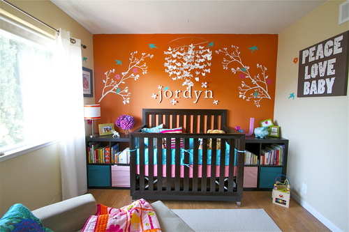
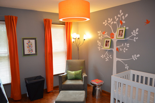
 Jordyn’s Room by jdv home staging & interior
Love the use of color! Orange mixed with a touch of turquoise gives this room a dramatic effect.
Click Here to View More Photos

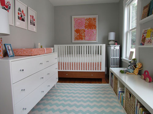
Zoe’s Modern Nursery by mscott218
The amazing use of space complements a colorful and playful design!
Click Here to View More Photos
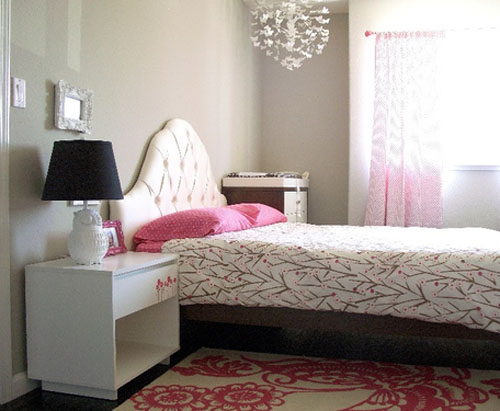
 Whimsical Toddler Room by swankyswell
This whimsical room takes your breath away. The use of a neutral palette with a punch of color gives this big girl room a classic feel with a modern twist.
Click Here to View More Photos
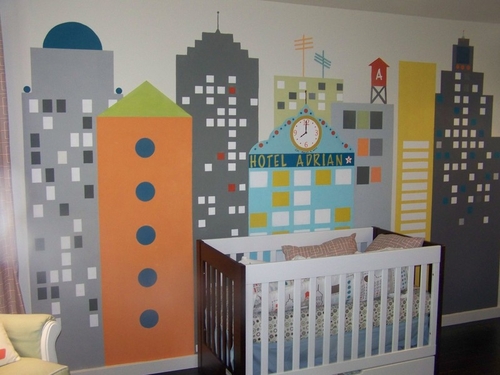
 Big City Nursery by Anita Roll Murals
This room brings new meaning to the phrase “big city living.” The design creates a space that is fun and totally interactive.
Click Here to View More Photos

Harper’s Nursery by Chelsi
Elegant and comfortable, this room covers all the details—from striped ceilings to a closet changing table. How could you not love this space?
Click Here to View More Photos
 Daddy-Designed Baby’s Room by nickscarpino
This amazing room creates a sophisticated and modern nursery that is a perfect fit for boy or girl.
Click Here to View More Photos
So now it’s up to you to tell us which room is your favorite! Vote below, and comment if you can because we’d love to hear why the room got your vote. Voting ends on the 31st of this month at 11:55pm PST. The winners of best room and party will be revealed on September 1st! Winners will receive a $50 VISA gift card from Project Nursery. Good Luck!
Vote for your favorite "Project of the Month":
- Whimsical Toddler Room by swankyswell (2%, 33 Votes)
- Harper’s Nursery by Chelsi (10%, 187 Votes)
- Jordyns Room by jdv home staging & interior (13%, 239 Votes)
- Zoe’s Modern Nursery by mscott218 (14%, 263 Votes)
- Big City Nursery by Anita Roll Murals (28%, 514 Votes)
- Daddy-Designed Baby’s Room by nickscarpino (34%, 630 Votes)
Total Voters: 1,866
*Finalist selections are chosen at the discretion of the Project Nursery team with no bias to the experience or training of the project owner. You may only vote once in a 24-hour period.
Interested in participating next month? Finalists are revealed on the 3rd Monday of every month. Upload your own projects to our Project Gallery now. Also, don’t forget to vote for your favorite Party Project this month!




Comments
Tara
these are all so great! would LOVE to know where they got the rocker and ottoman for Harpers room? and the butterfly mobile’s in 2 of the other rooms?! thanks so much P.N.!
Tammy Jones
Shame on the designers that showcased unsafe sleep environments!
Sleep related deaths are the number one killer of infants born healthy and soft surfaces are a known and documented hazard for suffocation. The American Academy of Pediatrics, National Institute of Child Health and Human Development (NICHD, among others recommend no pillows, blankets, sheepskins, or pillow-like bumpers.
http://www.nichd.nih.gov/sids/
No “look” is worth a baby’s life.
carol
Zoe’s room and daddy’s design both picture a safe crib. That is the most important feature of an infant’s bedroom! Too many babies are dying from unsafe sleep environments. An infant does not need pillows, blankets and bumper pads.
Tara
Zoe’s room is very attractive and modern. Love the contrast and colors. It is also a REAL nursery. There are too many nurseries that show bedding, bumpers, pillows which are unsafe for babies to sleep in. It shows off the walls, shelves etc. Yes, when you look at others its cute, but not priactical. Zoe’s room shows how you can decorate and still make it look cute without the unsafe bedding which is how a nursery is supposed to be.
Shawn Parcells
This displays a very unsafe sleep enviornment for infants and children under the age of 1. After 14+ years in Forensic Medicine, I am highly disappointed to see rooms such as what is seen above. There are too many pillows and other items in the cribs. These items increase the risk of sudden death in children under the age of 1, specifically under the age of 6 months. This is giving the wrong message to new parents out there. You can still have a nice room for your infant, but it must be done properly. If you have specific questions regarding that, please visit:
http://cribsforkids.org/cause-%E2%80%94-coalition-against-unsafe-sleep-environments/
Anita Roll Murals
I’m flattered to be a finalist in Room of the Month for August! Thank you very much Project Nursery Team. The bed was still being finished and things were stored in there while I was working. Nothing in there while Adrian is sleeping.
Pam
What a month for the PN gallery! Kristin, you had a difficult job narrowing it down. Well done and congrats to ALL the finalists!
Nancy
Congrats to all the finalists! Amazing work, time and talent went into each room. As for the comments regarding the “unsafe cribs”…I’m going to go out on a limb and say I’m sure the pillows/stuffed animals were added just for the pictures. I was tempted to do the same thing just for pictures. Having said that, I will say bumpers scare me… Nevertheless, awesome job finalists!!
Betti
They are all so colorful and inviting. I like Big City Nursery because it is interactive and also will be relevant to an older child as well.
hyacinth
I go for Jordyn’s room! I love the orange accent wall. And the orange and turquoise combination was a brave and daring choice, and it turned out really great!
bristol
I love the bold and bright colors of Jordyn’s room. I think it’s the kind of room that stimulates the mind, and encourages creativity and artistry.
Suzanne Brown
Zoe’s Modern Nursery! I NEED that rug I heart zigzag!