Where has the month of August gone? Before my summer officially ends, I wanted to share with you my son’s nursery, which was recently featured in American Baby Magazine and online at Parents.com. Unfortunately, I haven’t actually seen a copy of the issue. However, some of my pregnant friends have texted me shots of the page from their OB office’s waiting room, and it’s just as exciting to see.
I do know that I was in good company as they featured a few other really terrific home design bloggers such as Young House Love, Shop The B-line and Refresh Design Studio. Since I can’t show you a scanned copy of the full page feature, here’s a little scoop from the source…
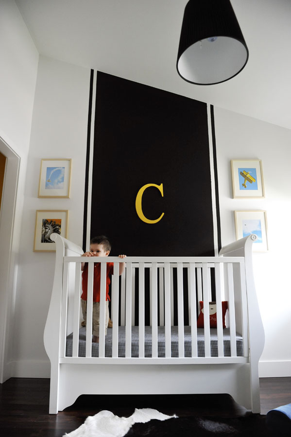
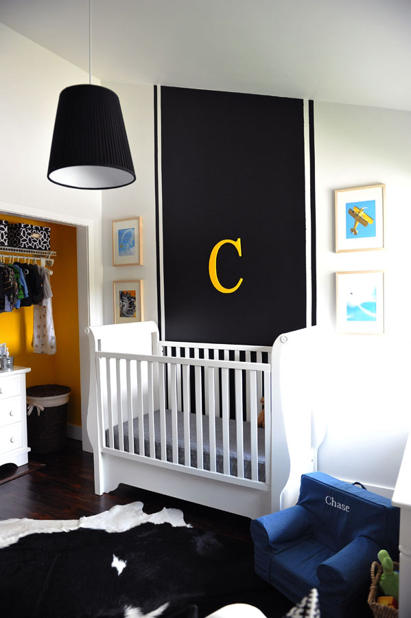
Way back when I came up with the simple yet bold color palette (note the black color is actually chalkboard paint!), I came up with this design board. At the time, I really wanted to transform the original “Modern Baby Blue” nursery into something completely different—I wanted to give my second son a “nursery personality” of his own. But most of all, I needed to do it for cheap. Yep, after blogging about great kid design for three years and having direct access to popular brands and retailers, I was using what I had. I just needed paint. Reason being, we are moving, and in fact, the house is going on the market in just a few days. I kept telling myself it would be foolish to splurge on this room or more like my husband was kind enough to remind me!
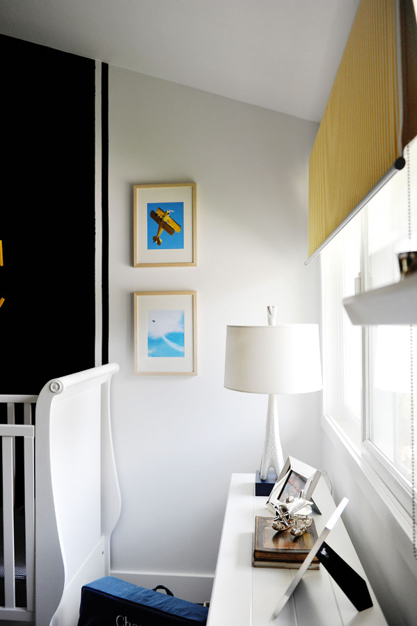
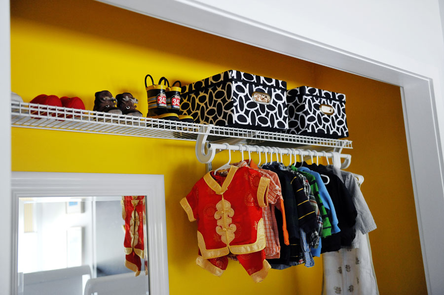
Here are a few highlights of the space.
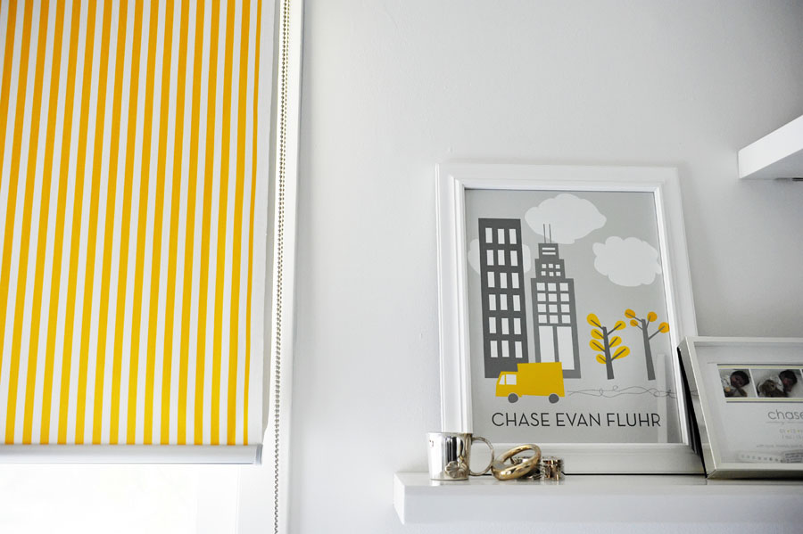
1. My $14, formerly damaged roller shade redo hangs behind a $400 Jonathan Adler giraffe lamp—talk about a high/low.
2. A contemporary and personalized print created by PN friend Stacy of Name Your Design.
3. Canary yellow closet with no doors—that’s my trick for saving floor space. The room is only 10×10; besides, I have a boy, so I don’t need to hang much in his room.
4. Uber-cheap lampshade-turned-hanging pendant—my first choice from DWR went out the window as soon as we learned we were going to move. Shelving and bookrack is from Pottery Barn Kids circa 2006.
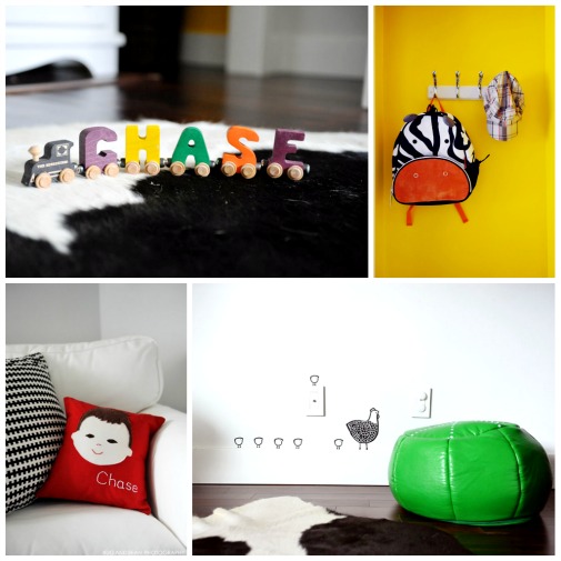
5. With so much boldness, it was important that I did not overload the room with accessories but of course I have my favorites to include Skip Hop’s zoo pack, Sarah + Abraham’s olliegraphic pillow and Wee Gallery wall graphics.
I can’t say I like the new nursery better than the old. It’s just different, and it reflects my current mood. The good news is, I no longer cringe when I have to place the pile of primary colored toys in the nursery. Now they simply complement the the room!
My next decorating stop is NYC. I’m looking forward to our cross-country move and pulling together all new rooms for my boys—Big City style!
For more photos of this nursery, captured by Nancy of Bug and Bean Photography, visit Chase’s Black, White & Yellow Nursery in our gallery. And P.S. If anyone here can snag me a copy of American Baby Magazine’s August issue, that would be awesome!






Comments
Susie
I love your chalk wall and Letter. Plus that train is really fun with your son’s name.
Rebecca
AMAZING pics!! I have an OB appt tomorrow, I’ll grab a copy for you (:
wenbow
I love the BOLD use of the letter C against the black! All the primary colors look so good as they are placed throughout the black and white backdrop. Awesome!
Jina
Congratulations on the feature!! What a GORGEOUS nursery… I especially LOVE the use of yellow in this b&w space… the “C” and the closet! Not surprised coming from such a fabulous mommy Melisa. ;)
Katie (Refresh Design Studio)
Love your little guy’s nursery! So fun to be featured in the same magazine as you. I also love the site re-design. It’s so clean and modern :)
Lisa Warnick
I love love love your nursery! Super cute! :)
Melisa
Thank you so much for the kind compliments everyone! Katie, ditto here on your nursery! Rebecca, I’ll take that copy! xo, M
Kelly Lyden
LOVE, love, love it!! So fresh looking! Congrats on the feature! xo
Becca (Cake.)
I love what you did with the nursery Melisa… the fact that you did it on a budget knowing it would only be a temporary space only adds to the wow factor. Really brilliant design.
rose
Congrats on the nursery feature. Hope they will do another feature once you’ve put up the new rooms for your boys! It’s exciting to decorate new spaces!
Valentina@baby quilts
I love this nursery; one more proof that black can be used in a nursery and still make it light and cheerful. Such an excellent idea and so well executed!