A few weeks ago, I was contacted by a client who wanted a nursery e-design in all white. Yes, all white. Aside from the obvious issue of stains in an all white space, creating a nursery in any single color (or lack of color) can be a challenge. Here are some guidelines for creating a monochromatic nursery.
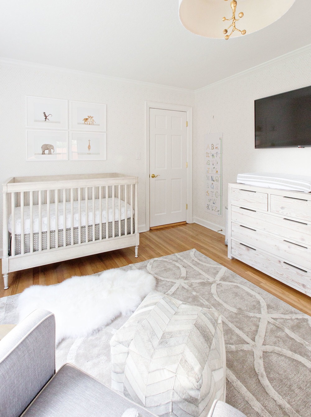
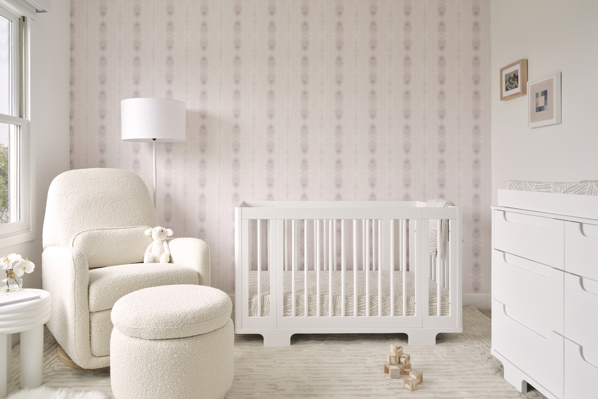
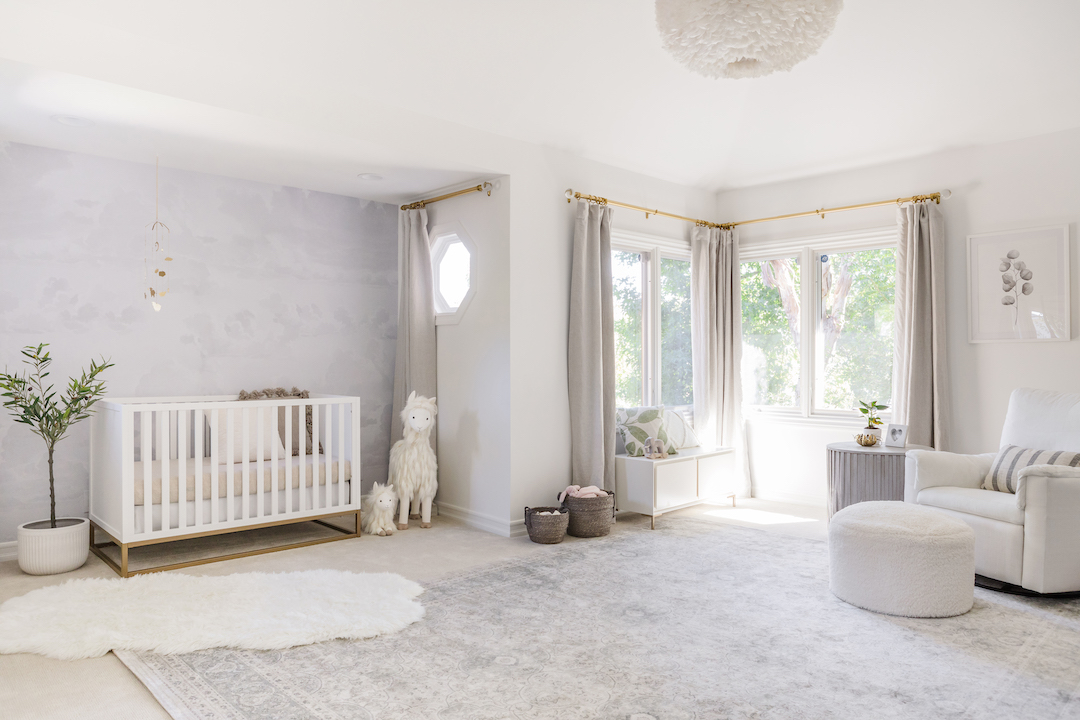
Not every variation of the color will be the same. If you look closely at the all white nursery below, you’ll see that there are actually quite a few slight variations of white. It’s impossible to find decor that is all exactly the same shade, and having a little variation helps bring a touch of contrast and interest.
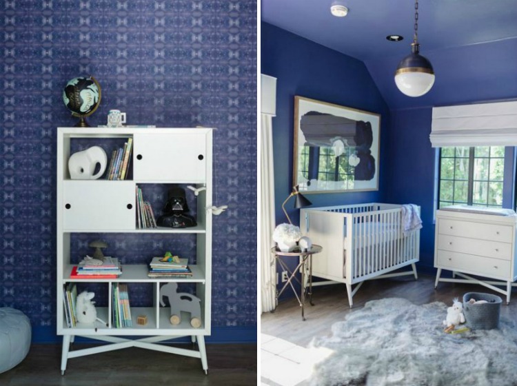
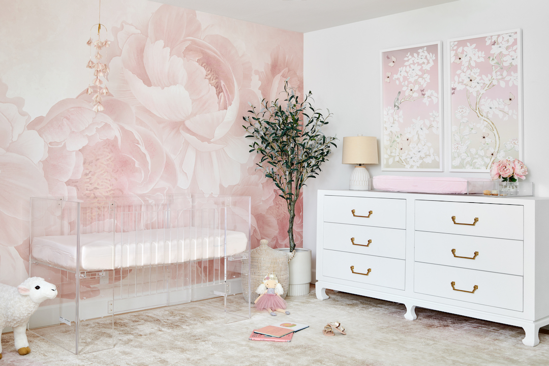
Consider using more than one color. Tiffani Thiessen’s nursery is mostly blue, but it also has white accents to create contrast. The space maintains a monochromatic look but doesn’t rely on blue alone. This is a great idea if your main color is dark or bold. Pairing it with white or another light neutral can help brighten up the space.
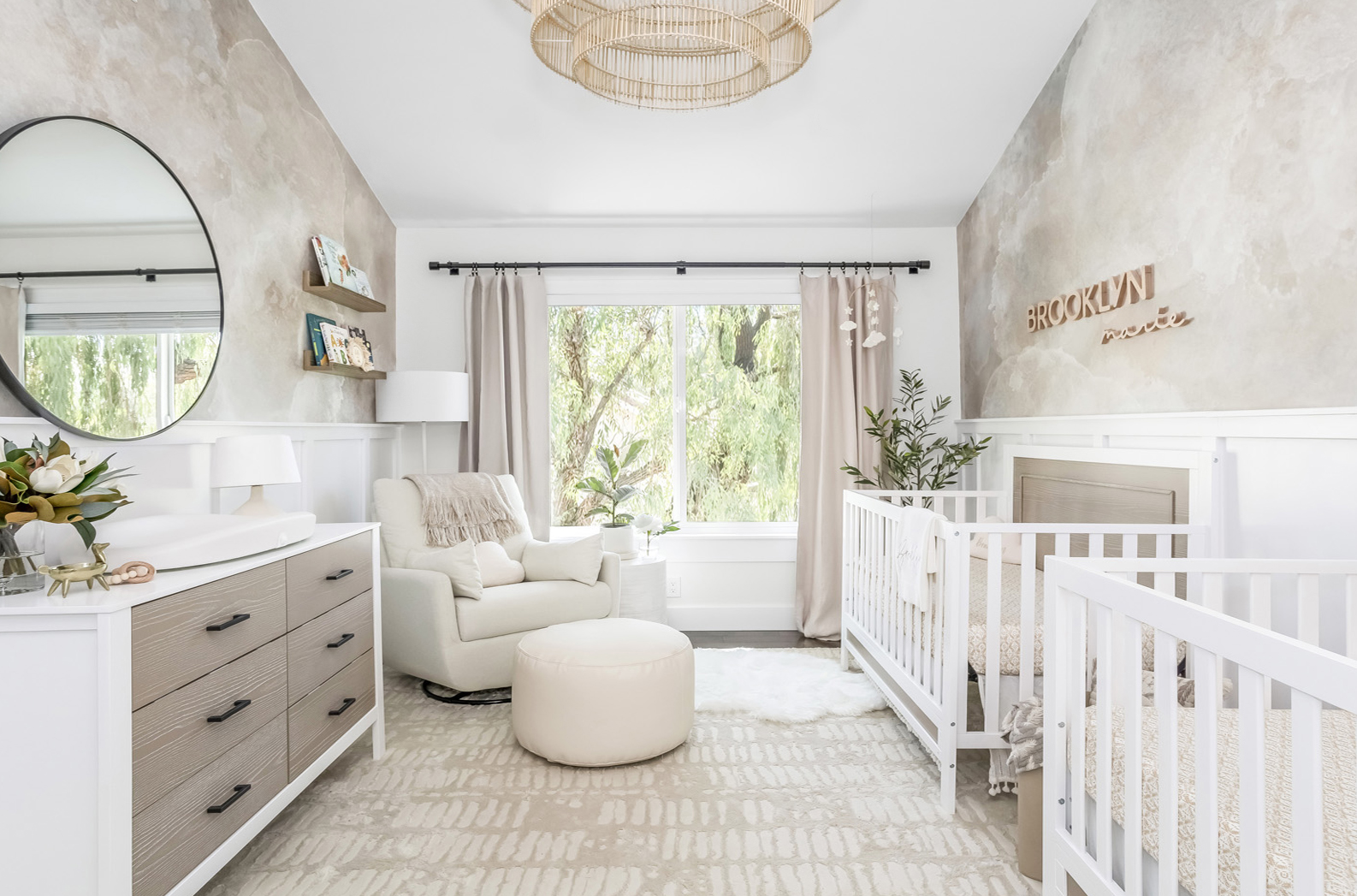
Mix neutrals. If you want a monochromatic nursery but can’t narrow it down to one specific shade, you can mix various neutrals together to achieve a monochromatic feel. The nursery below has whites, ivories and grays all used together. And again, none of them have to match perfectly.
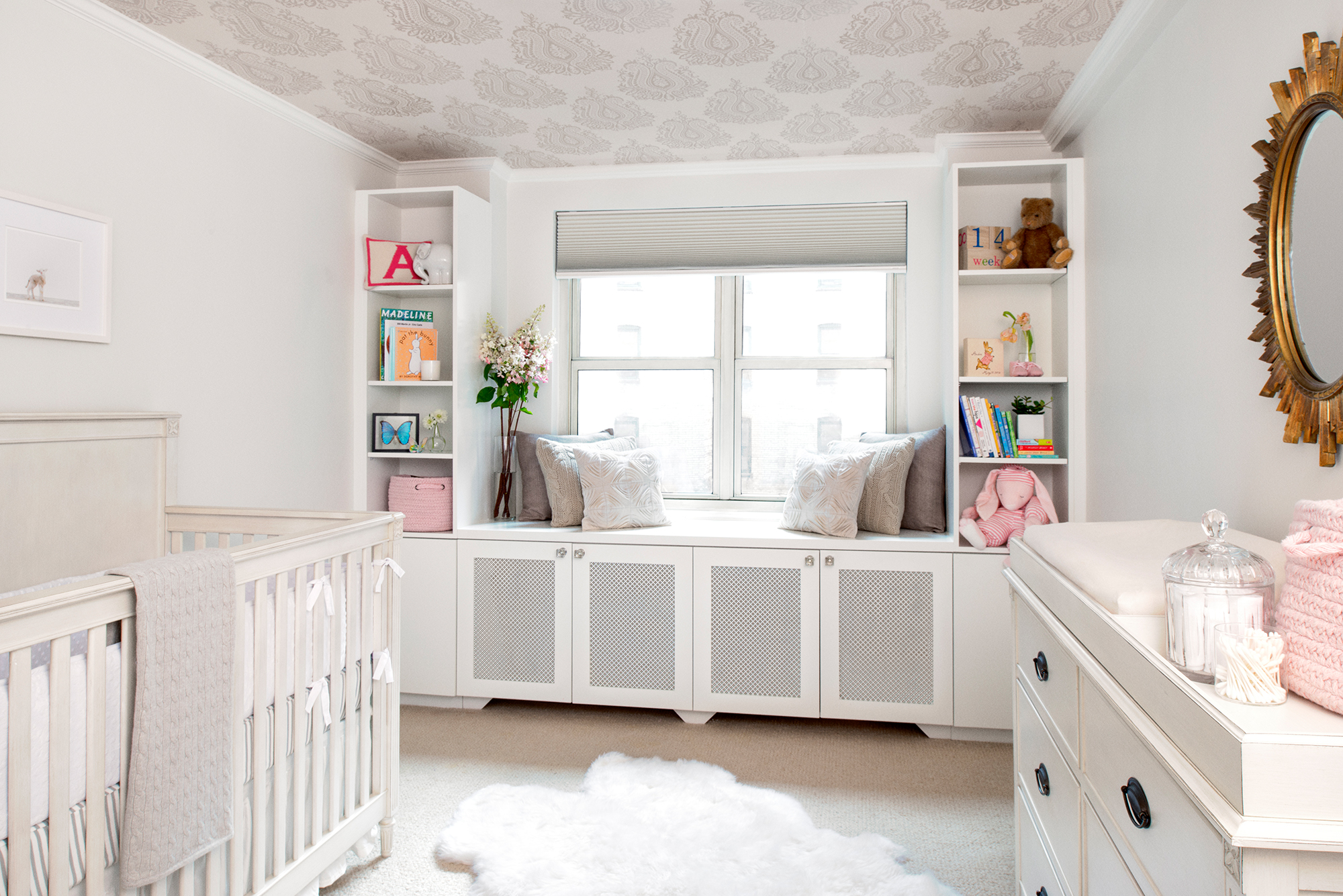
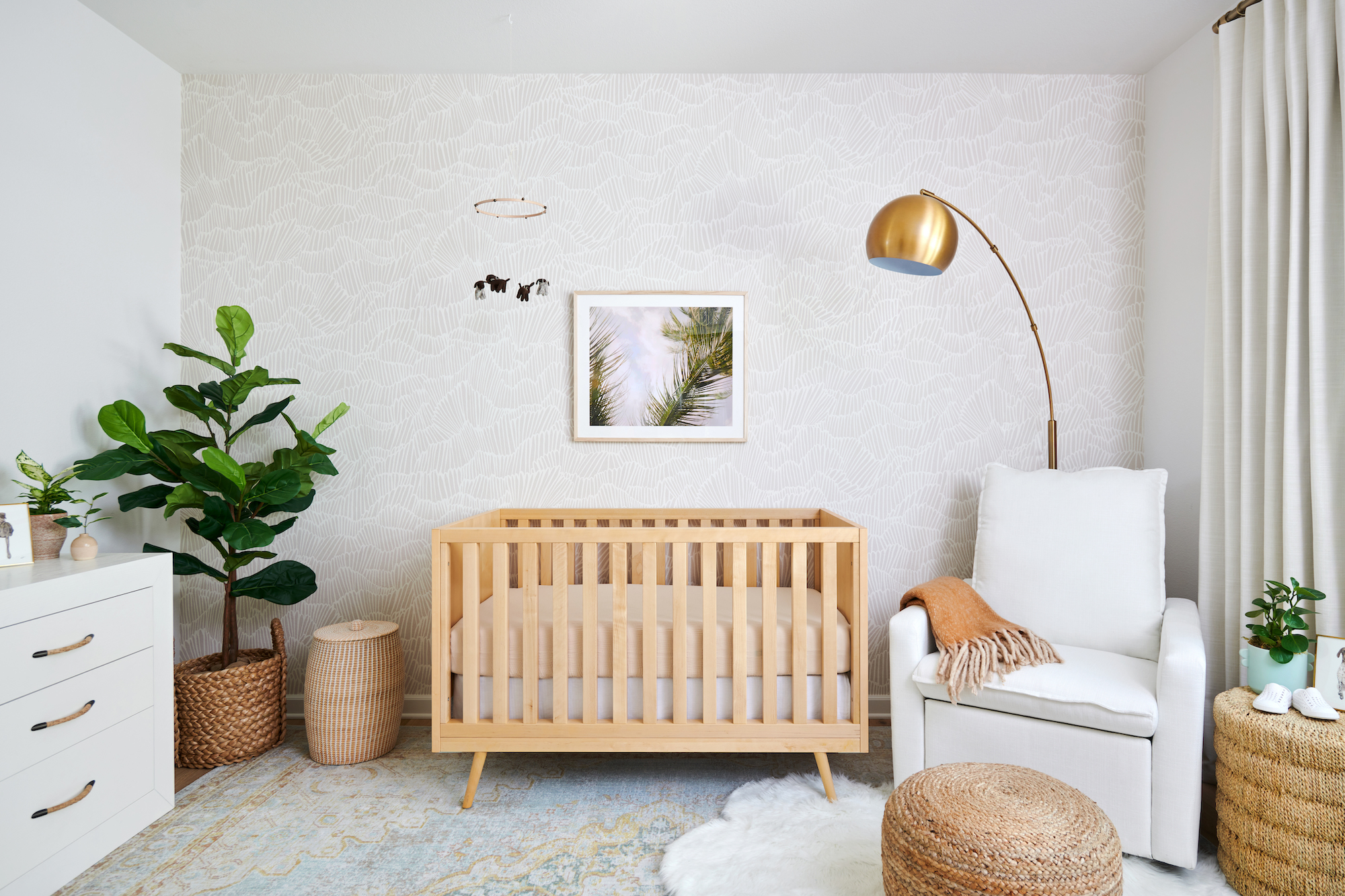
Don’t forget about the “stuff.” A lot of first-time parents design the nursery without realizing that it will be packed full of books, toys and other items in lots of different colors that often don’t match the room. If you want a truly monochromatic space, you’ll want to include closed storage to hide anything that’s brightly colored. Or you can choose to incorporate these items into the design, like in the space below. The nursery itself is very monochromatic in whites and grays, but the books and items on the shelves add color and warmth to the space.
Would you ever consider a monochromatic nursery?



Comments