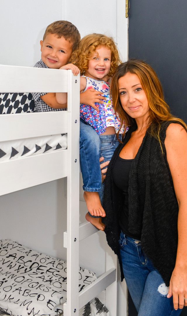
Lauren Deneroff, founder and editor of mama{love} NYC, first shared her kids’ room on Project Nursery when her son was a toddler and her daughter was just a baby. Now that Brody is four and Harper is two, Lauren upgraded them to a full-on big kids room, and she’s sharing the room with us today.
Tell us a little about mama{love} NYC.
mama{love} NYC is a lifestyle blog and resource for the modern city mama. I started the company with the hopes of creating a site where moms can find not only useful parenting information but also follow me as I chronicle my own journey. The site has evolved from a personal blog to a resource for anything from reviews of the latest products on the baby market to weekly lists of mama must-haves to listings of my favorite places in NYC for families.
I have been a teacher for a decade, and I continue to love what I do. I live on the Upper East Side of Manhattan with my kids and phenomenal husband, Joe, I adore New York City and plan to be a city mama for life!
Tell us about your design process. Did you start with one central item or idea that served as your inspiration?
I started to see a lot of black and white spaces for kids (including on Project Nursery) and decided that this would be the perfect aesthetic for a brother and sister.
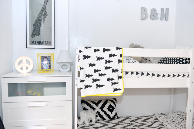 White elephant throw pillow lined in silver sequins from Home Goods, NÄVIVVA and LAPPLJUNG RUTA pillows from IKEA
The room was impacted greatly by what I do because as a blogger/writer, I constantly have my eye on the latest trends for kids. I wanted my kids’ space to reflect that passion and also exhibit our family’s love for New York. It has tons of urban-inspired accents that pay homage to our city
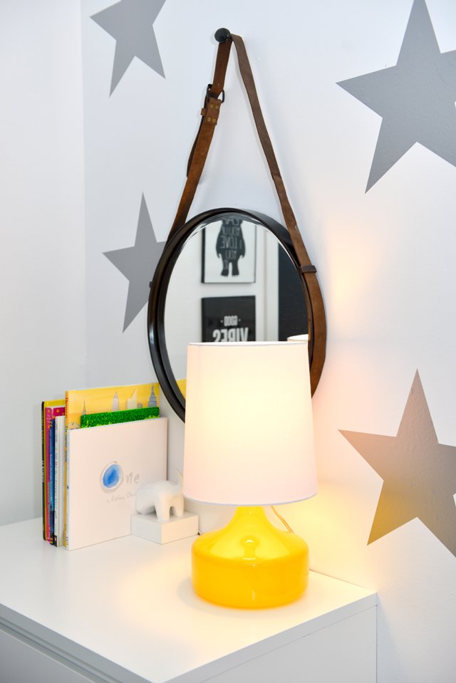
What was the most important thing you wanted to achieve when creating this space?
The most important thing in creating this space was maximizing it. With only 56 square feet for two kids, you have to keep it looking as large and uncluttered as possible.
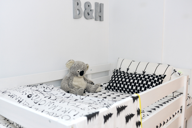 EIVER ORD duvet cover at IKEA/Little Woolf arrows pillow case and triangle print fitted sheet
What’s the first thing people notice when stepping foot into this room?
Honestly, how big the space appears despite its size, and they love the playful black and white décor and unique touches.
 Artwork from: Febystan, The Motivated Type, ThimbleTypeCo
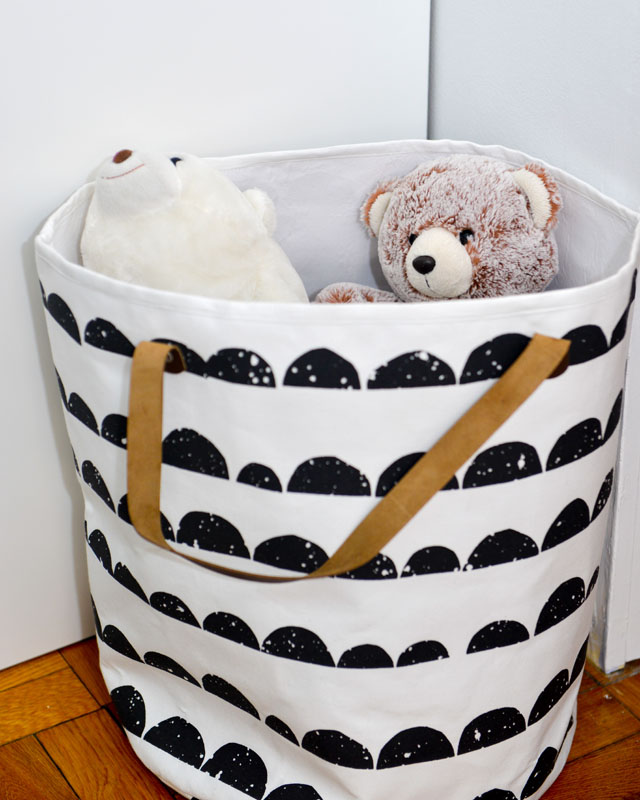 Storage Bin from Ferm Living
I love modern, minimalist and mid-century. The kids’ room is a true depiction of that style—ultra modern, while our home is gradually transitioning from classic to contemporary.
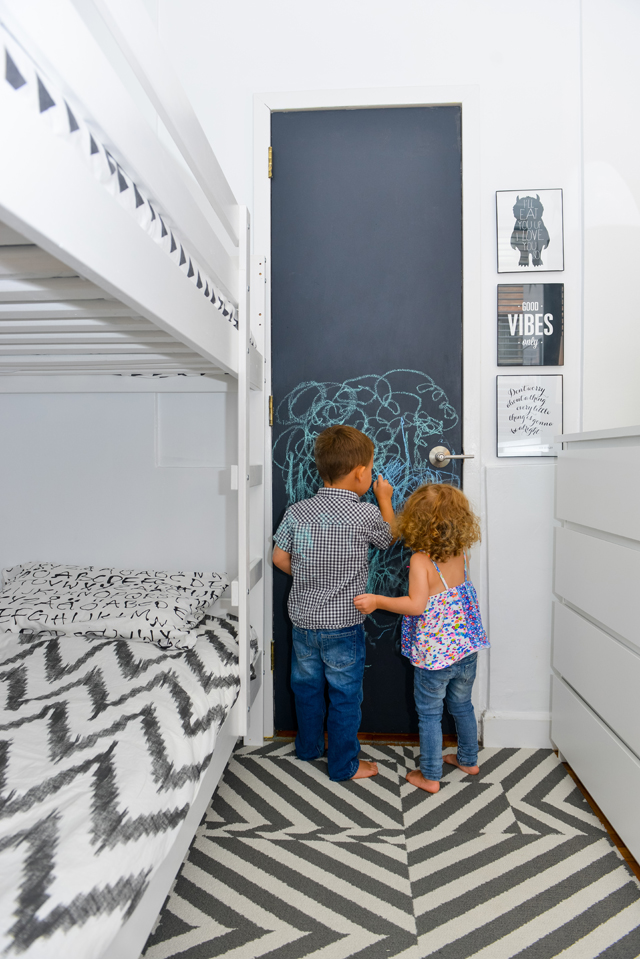 FLOR tiles in Jim Dandy in Titanium and MALM 4-drawer dresser
Do you have any words of advice for other designers and parents?
Never sell a small space short—it is amazing what you can do when you research, plan and get creative. Any New Yorker would agree.
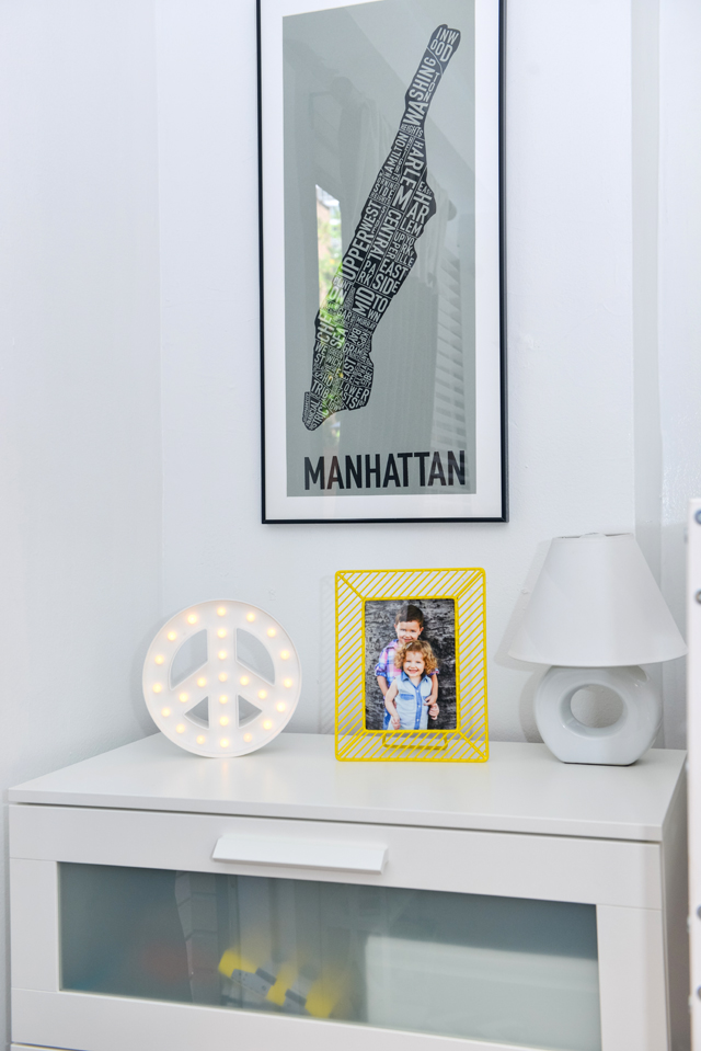 BRIMNES 4-drawer dresser from IKEA and Peace Sign from Target
Now that the accent walls have dried and bedding is neatly tucked, what is your favorite thing about the room?
I love the IKEA MYDAL bunk bed the most. The kids absolutely love it, and it really was the one piece that allowed us to have two big kids sleeping comfortably in such a small space. It was such a labor of love making the bed happen. A standard bunk bed measures approximately 75 inches long, but we only had an area that would accommodate 70 inches. We decided that if we could trim the length of one of their simpler, wood models to 70 inches, we could make it work. We were able to accomplish that (with a lot of help), and it truly is the centerpiece of the space.
Seeing my son’s face when the bunk bed was assembled was a moment I will never forget. It was like all of his dreams came true.
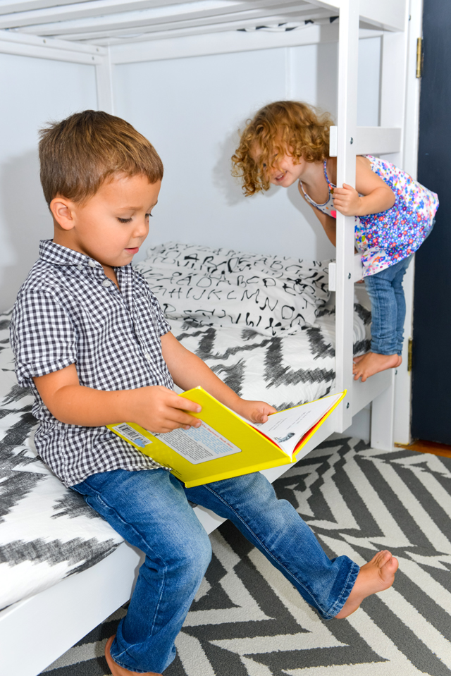 West Elm’s Organic Chevron Duvet Cover in Slate/EIVER ORD pillowcase at IKEA
Photography by Steven Schnur


