This is our interview series in which we bring you the nurseries and kid rooms of successful designers, entrepreneurs and moms. Through this series, our featured guests will divulge some of their design secrets and share stories of how their nurseries came to be.
Francine Delarosa—a mother of four, wife, daughter, sister, friend and entrepreneur—describes herself as passionate about life. Passionate about design, photography and travel, she is thankful every day and calls herself a total perfectionist. Her customers have enjoyed her talents for over ten years, and while she began her retail career in 2000 as a home decor shop owner, she transitioned her focus to baby and kids items in 2005, launched Give Wink online and the brick and mortar shop opened in 2008.
Give Wink prides itself on helping families prepare for one of life’s most exciting journeys—the arrival of a baby. By understanding each family’s individual lifestyle, the Give Wink team recommends products that are right for them—they offer everything from furniture to personalized gifts. You can learn more about Give Wink in our vendor guide.
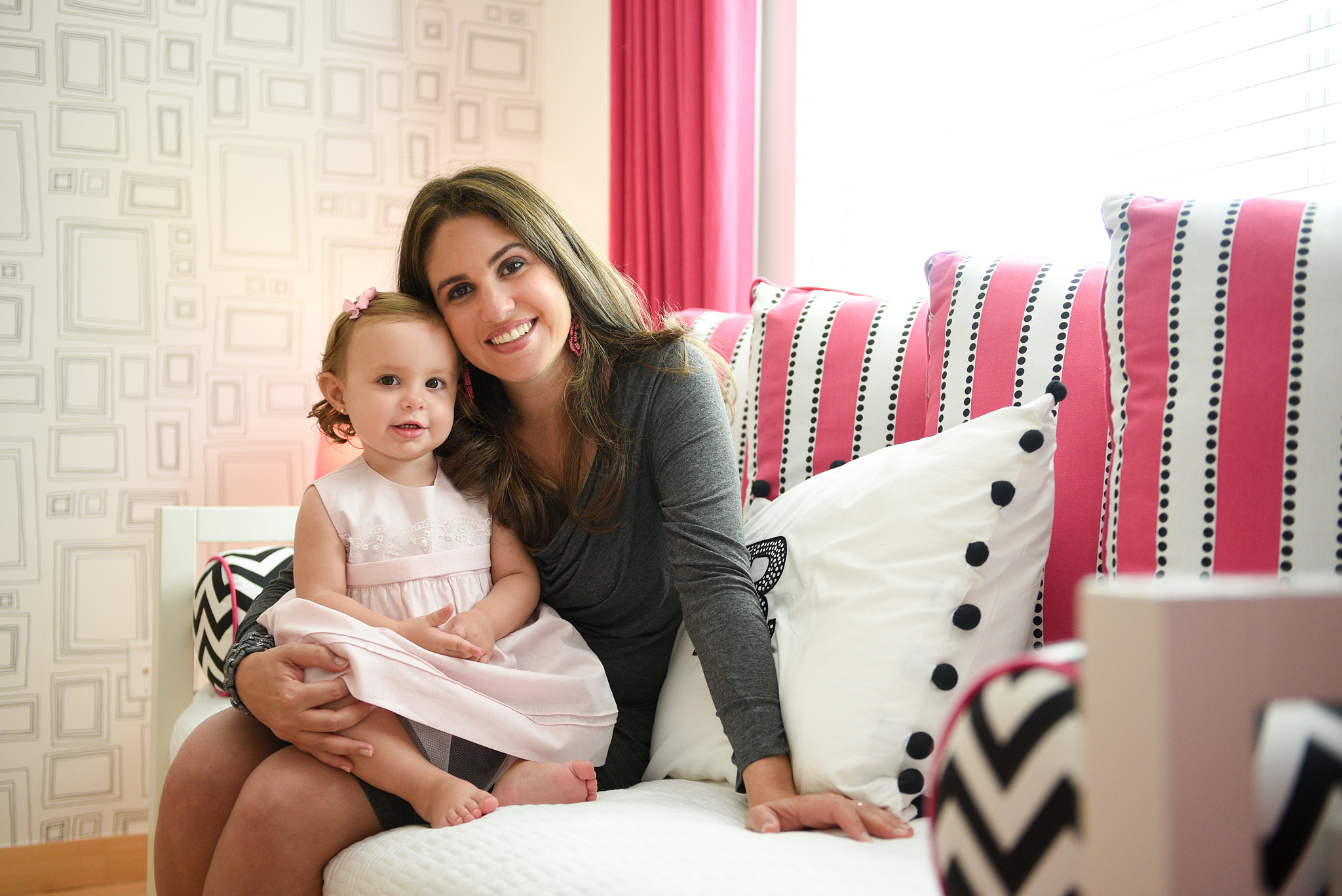
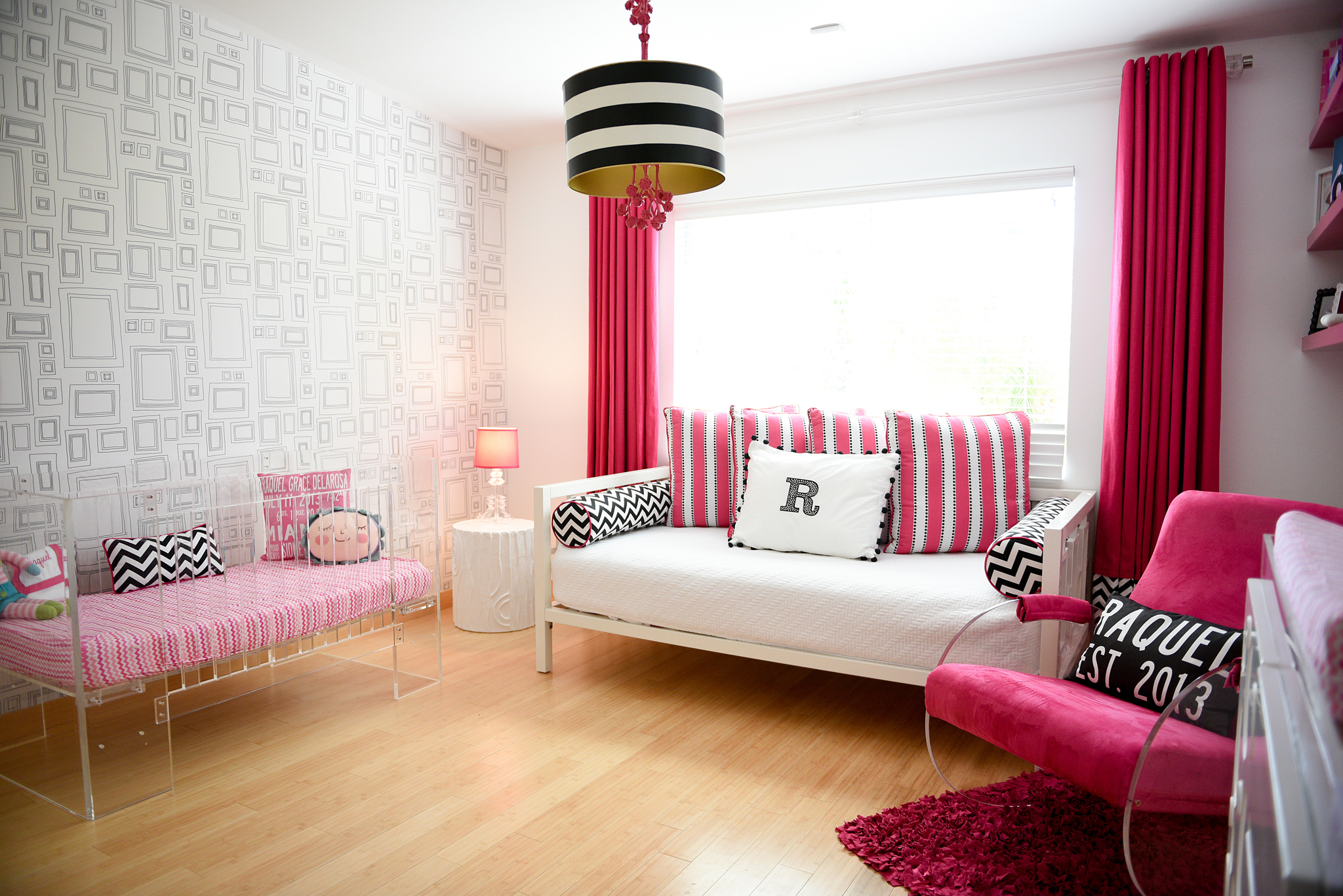
Francine’s daughter Raquel joined three big brothers when she was welcomed into the family. Thank you for sharing Raquel’s modern hot pink and white nursery with us, Francine, and for answering our questions!
I’m a very decisive person, and since I spend my days designing nurseries, I figured designing mine would be easy. But when it came to putting my ideas down on paper and deciding on a concept, I froze. I was torn between many different directions and color schemes, so the most difficult part was settling on the general concept. Once I figured that out and stepped outside of my comfort zone, it came together quickly.
Tell us about your design process. Did you start with one central item or idea that served as your inspiration?
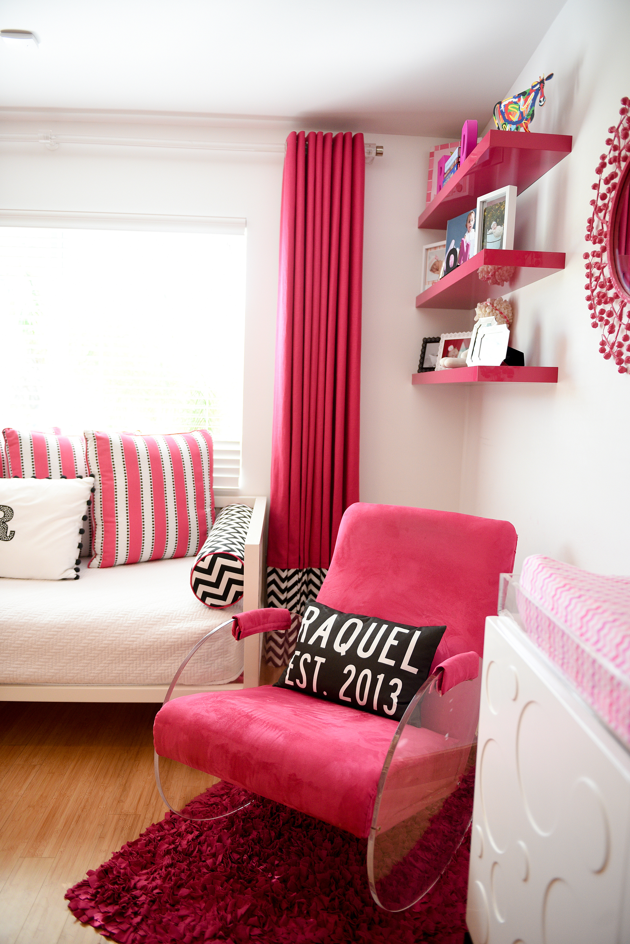
I normally start with one predominating design element such as color, theme or a particular piece of furniture. With this project, I had a hard time organizing my thoughts. If I could have, I would have designed three nurseries. Once I came to terms with the design style (modern and bright versus classic and soft), everything came together quickly.

What was the most important thing you wanted to achieve when creating this space?
The youngest of my three boys was six when I got pregnant. We never planned on a fourth child, so designing another nursery for our home was not something I had given any thought to. I wanted to replicate the feeling I give our clients when they walk in their nurseries for the first time—a dreamy, peaceful and sacred space.
What’s the first thing people notice when stepping foot into this room?
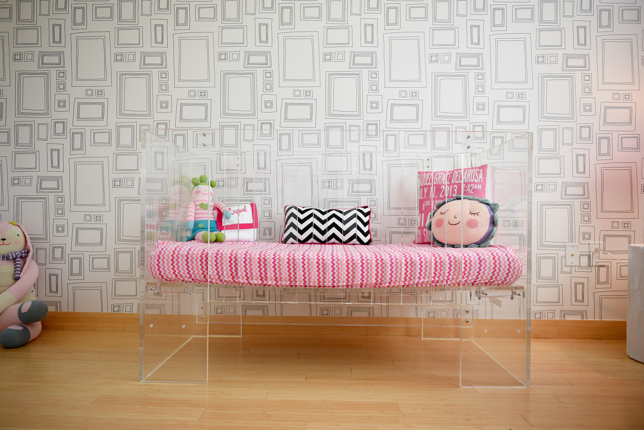
The crib—it still takes my breath away every time I walk into the room too. It’s unique, and most people have only seen it in pictures, but it’s even more impactful in person. Also, for those who know me, I am not a fan of black, so the fact that I used it in my color scheme is unexpected.
Did you have any unexpected obstacles when creating this room? How did you overcome them or spin them to your advantage?
Being in this industry and having access to unlimited options became my unexpected obstacle. The bar was set high by colleagues, vendors, customers and, most of all, myself.
What did you enjoy most about the design process?
Seeing it come together in a way I never imagined. With my prior pregnancies, I always gravitated towards soft palettes and colors, so the starkness of the room and designing outside of my comfort zone was fun.
Do you have any words of advice for other designers and parents?
Follow your instincts. Don’t try to please everyone or follow a trend. Take your own feelings/tastes into account. When you see something you like, you’ll know.
Photography by Courtney Ortiz


