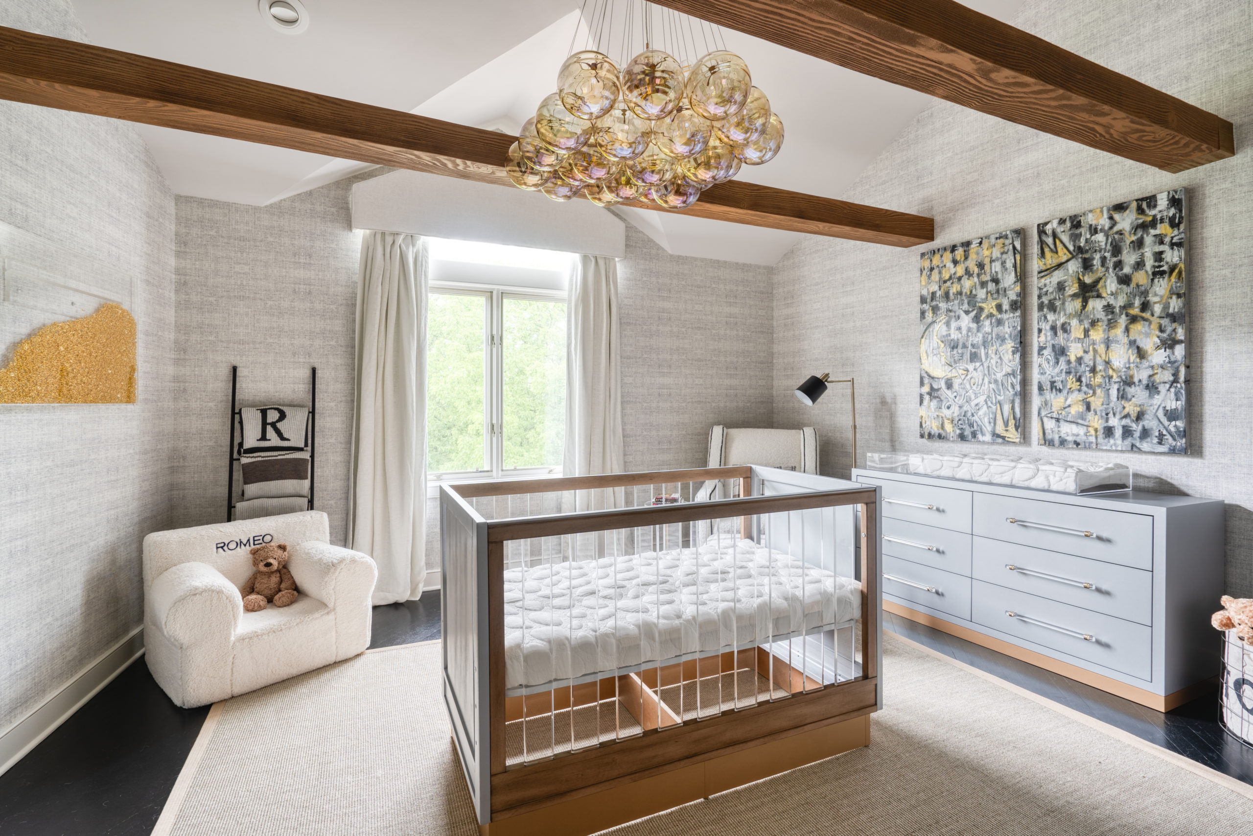
Today we are sharing a gorgeous new nursery design by Stephanie at Rockabye Mommy. You’ll love this nursery for its neutral tones, sophisticated design and subtle safari theme touches. Personally, we love the diagonal shiplap wall for a chic take on an old favorite. We’ve got all the details from Stephanie herself, and you can read more about the design below. Thank you, Stephanie, for sharing with us; we’ll let you take it from here!
I’m so thrilled to be sharing one of my favorite nursery designs completed this year—a neutral and modern concept with just enough playful details for baby to feel cozy and welcome. My client knew she wanted a peaceful, calming space. As a first time mom-to-be and planning on more children, she was looking for a neutral concept that could eventually transition to a room for baby number two. I presented several concepts, and ultimately they fell in love with the idea of this all-over white and neutral palette—a serene space wrapped in the softest shade of gray. It’s really one of the most versatile color combos and a true classic that works beautifully for a gender neutral space. The rest of their home was accented with gold hardware and décor, so I carried that into their nursery as well.
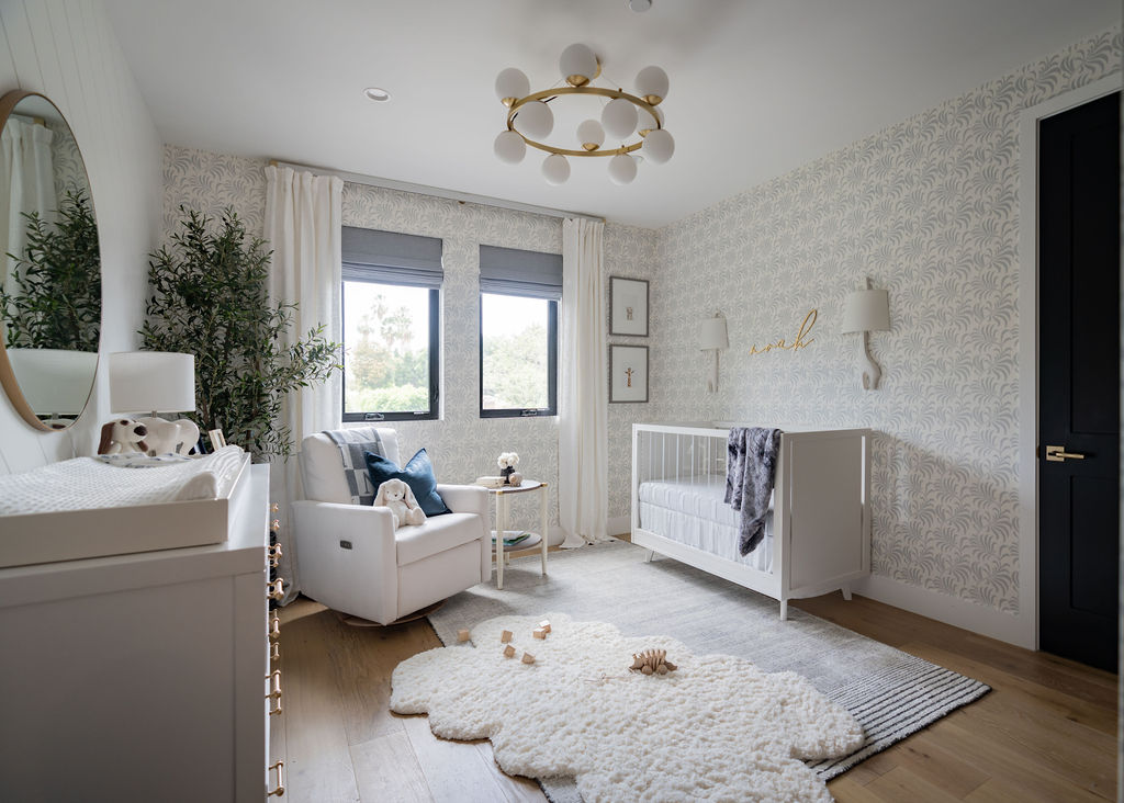
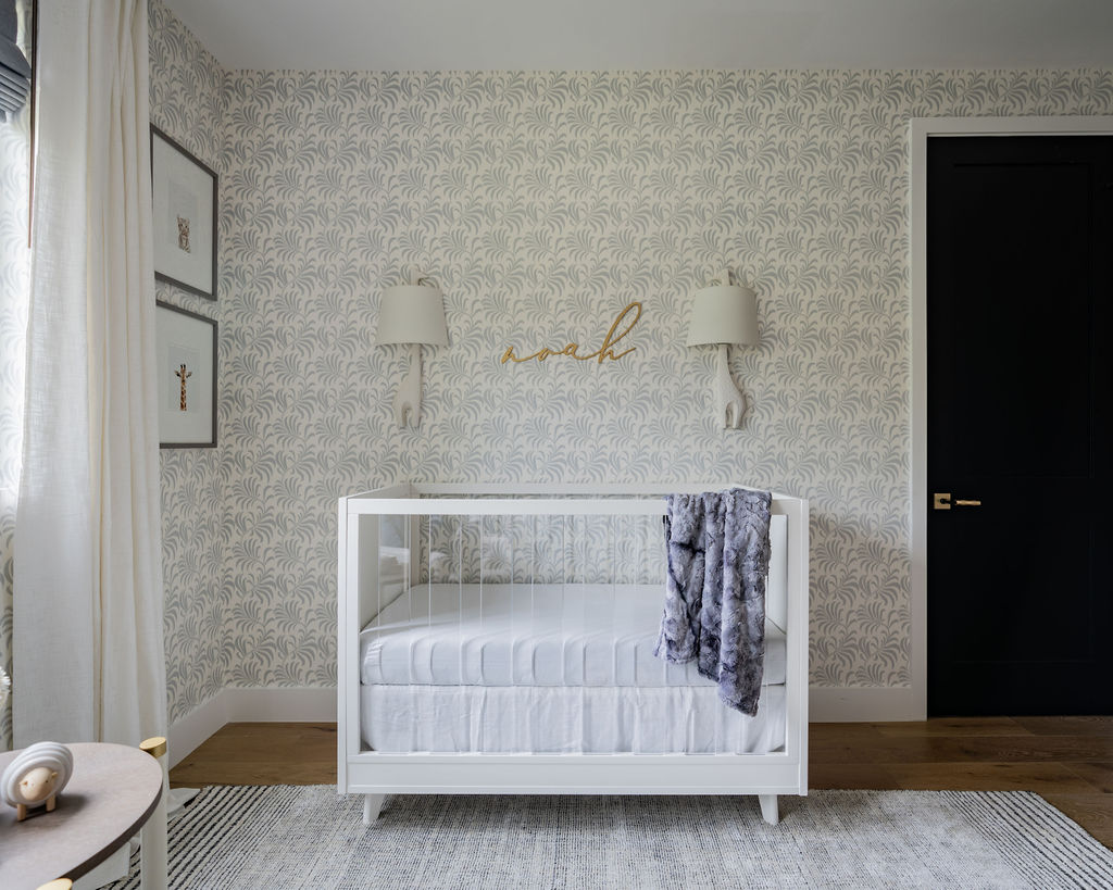
The room shines with personality through a patterned wallpaper in a leafy vine motif. My client absolutely loved this pattern when she saw the sample in person, and honestly, I think this was one of the first decisions made. It’s a great companion to the eye-catching diagonal shiplap wall. The combination of both elements adds the right amount of texture while striking the perfect balance. Adding whimsical accents like the baby animal art, elephant table lamp and, of course, the adorable giraffe wall sconces keeps the room feeling youthful.
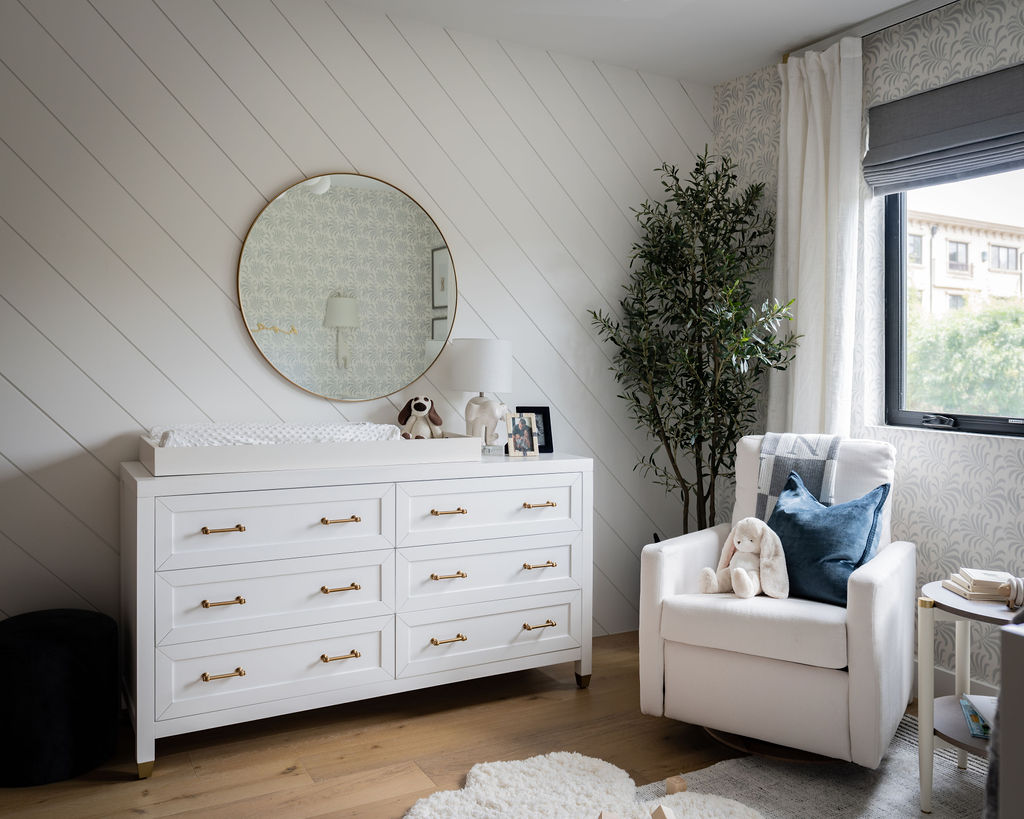
Facing the front of the house, this bedroom receives a flood of natural light through the small windows, which is great, but we did need to address the all-too-important need for complete darkness during nap time—cue the blackout shades! We used beautiful cascade roman shades in a gray textural blackout fabric. This style stacks nicely and looks great when in a completely open position and when lowered, provides the darkest coverage possible. To soften the overall look, I love to layer draperies. We chose an ivory linen pair to frame the windows, which can also be used for extra coverage in the event the tiniest little bit of light filters through the shades.

To create an elevated space, I turn to the same designer furnishings and fabrics that are typically used in my residential projects. It’s important to consider longevity when designing a kids space so that you won’t need to replace furnishings right away. This is why I recommend opting for a full-size dresser and adding a changing tray topper to use as your changing station, if the space allows. The topper is removable, and the dresser can stay until their teenage years and beyond. I especially love the gold hardware on this dresser, making it stand out in the room, especially since it’s against a white wall.

To ground the room and add additional soft surfaces, we layered two area rugs to make the floor a plush delight. Pro tip: If you don’t have the space for additional seating, this is a great way to make the room inviting for grownups as well by offering a soft surface to sit and play a while. The rectangular area rug has a subtle stripe in a beautiful slate and alabaster color combo. And for that extra soft topper, we layered a faux sheepskin rug, which added so much texture. This rug is not only pretty, but it’s incredibly fluffy under your feet! Bonus, it’s also vegan, which was really important to my client.
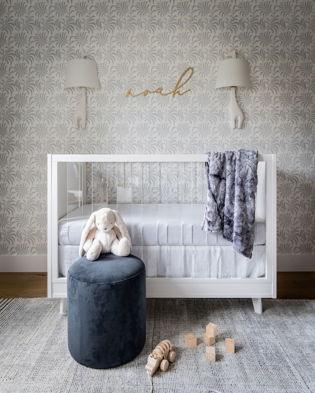
The nursery evolved into such an adorable space and I truly enjoyed working with the family throughout the process. This room can definitely be transitioned for years to come, and hopefully, even turn into a new nursery with just a few minor swaps and additions.
Photography by Hugo Landa Garcia
*this post contains affiliate links*




Comments