We’re touring Millennial Miss Chelsea Scott’s baby boy nursery today. We love the mix of black and white with natural wood tones for a modern yet laidback vibe—just perfect for relaxing with baby. Chelsea is a lifestyle blogger and first time mom, living with her family in South Florida. You can follow along with her and her family on her site and on instagram! Thank you, Chelsea, for you sharing your nursery with us!
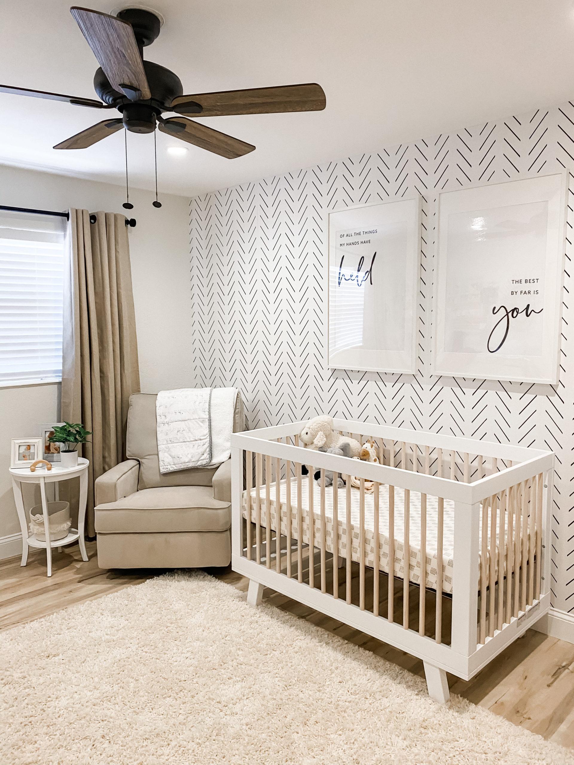
Where did you pull inspiration for your nursery design?
Pinterest, of course! The week I found out I was pregnant I hopped online and started pinning away (can you tell I was excited?). The simple and neutral inspiration immediately spoke to me and that was the route we decided to take. We are so happy with how the nursery turned out!
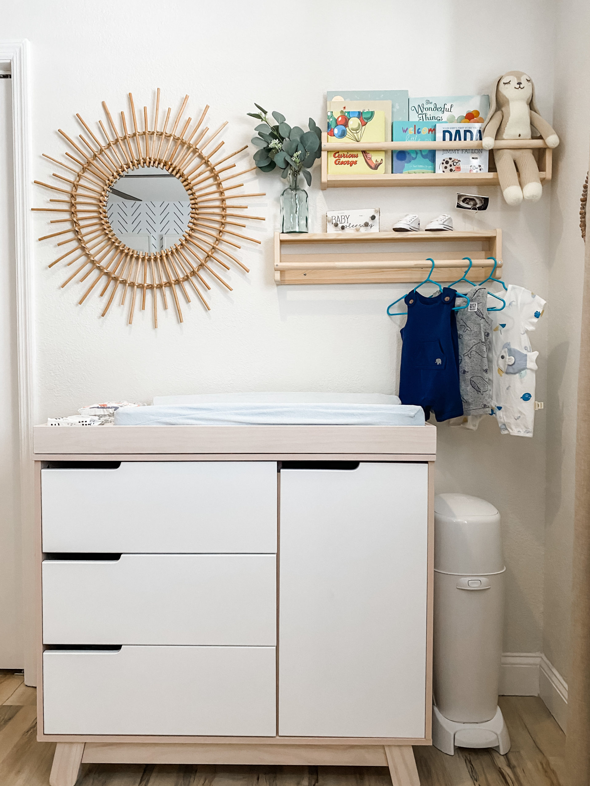
What part of the design process did you enjoy the most?
Picking out each item was a blast, but the part I enjoyed the most was spending time in there decorating and daydreaming about what his smile would look like, what it would feel like to hold him for the first time and how our life as a family of three would be! It sounds sappy, I know, but as you’re decorating your little one’s nursery, take a minute to look around and soak in the bigger picture.

What is your favorite part or detail in your nursery?
My husband’s framed jersey is my favorite personal detailed of Brody’s nursery. To us, it represents our family and the importance of us being a team. It is a symbol of motivation and to never give up on your dreams.

What is one thing that you would tell other parents to consider when starting their own nursery design project?
Storage is key and being able to navigate through the nursery in a functional manner will make your life 10x easier!
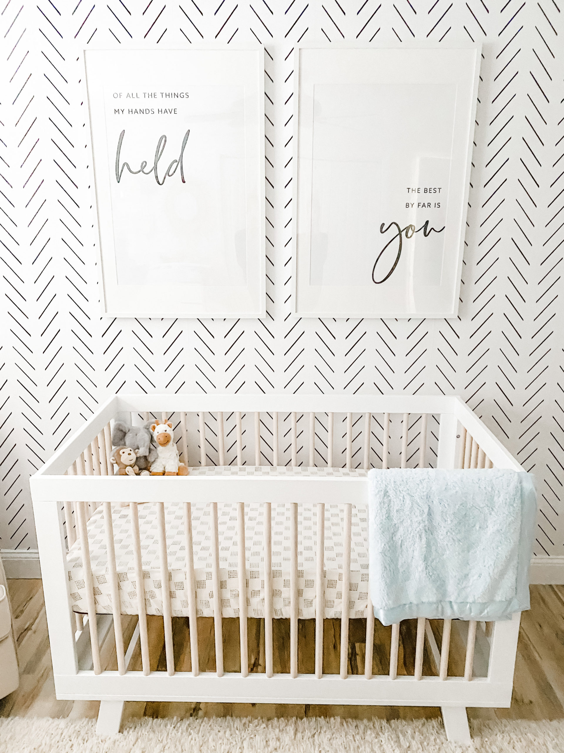
Photography by Chelsea Scott
*this post contains affiliate links*



Comments
Ashlie
What paint color did you use on the walls?