If you thought Raffaela Jenkins’ design of her daughter’s toddler room was amazing, you are going to love this nursery. Now, Indi’s room is 100% girly and feminine, but Raffaela manages to work her whimsical magic in her son Ollie’s nursery space in a whole new way. She’s a master at layering textures and decorative accents without it looking overly cluttered. Instead, she gets an eclectic look that is always changing as she adds and removes pieces. You definitely want to start following her on instagram to watch the magic unfold. Thank you, Raffaela, for sharing your children’s spaces with us!
My name is Raffaela and I am a mother to Indigo Rose and Ollie. We live in Melbourne, Australia and are big supporters of handmade/small businesses. I love to share my passion for quality products and support the brands that are making special items for the little people in our lives, as well as my love of interior design and photography.
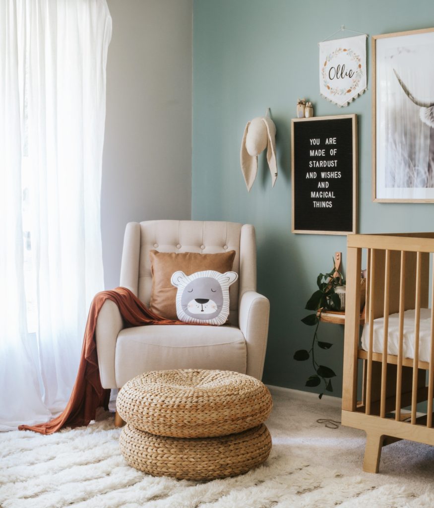
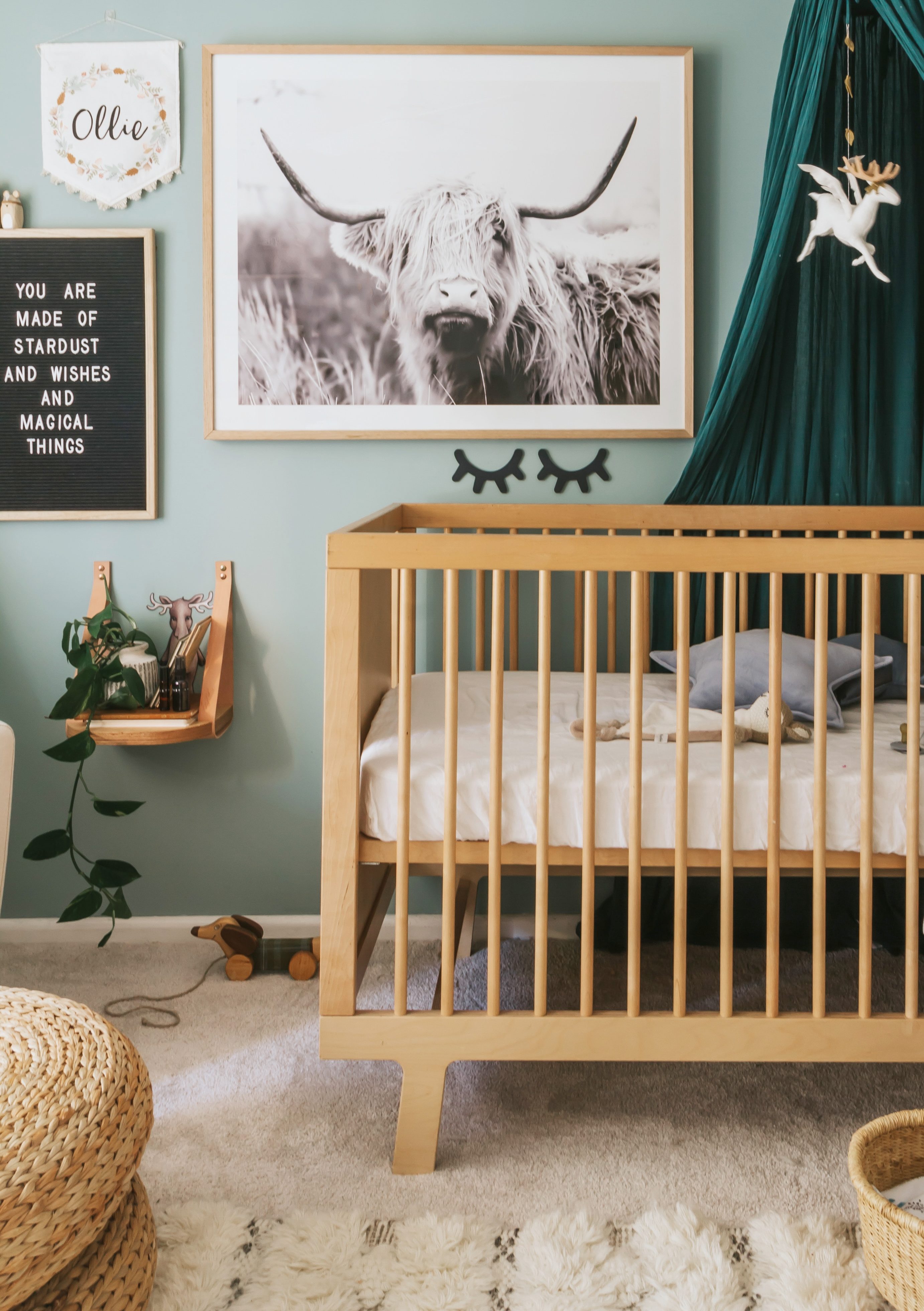 Hanging Side Table | Highland Cow Photo | Crib | Sleepy Eyes
Where did you pull inspiration for your nursery design?
I am a pinterest lover, so I used that as a platform of inspiration. I also get a lot of inspiration from the art and decorative pieces I have chosen for Ollie’s room.
What part of the design process did you enjoy the most?
Once I have sourced all the products and pieces for the nursery, I love putting it all together. My love of interior design and styling runs deep, so seeing it all come to life is my favorite part. I use apps like eraser and canva to create a mood board so I can see what it will look like together and check to see if it all works.
What is your favorite part or detail in your nursery?
I love Ollie’s wall color and canopy together. They both work so well together, and of course, they are my favorite colors, too.
What is one thing that you would tell other parents to consider when starting their own nursery design project?
Planning a nursery can be overwhelming, so start by thinking what style or feel you want to go for (eg. whimsy or boho Scandi). I started by choosing a few key elements—the crib, artwork and nursing chair. That will give you a good base to to start with. Also go with what you love! It’s so easy to get thrown by other incredible nurseries, especially if you like many different styles like me. But at the end of the day, it has to feel authentic and you.
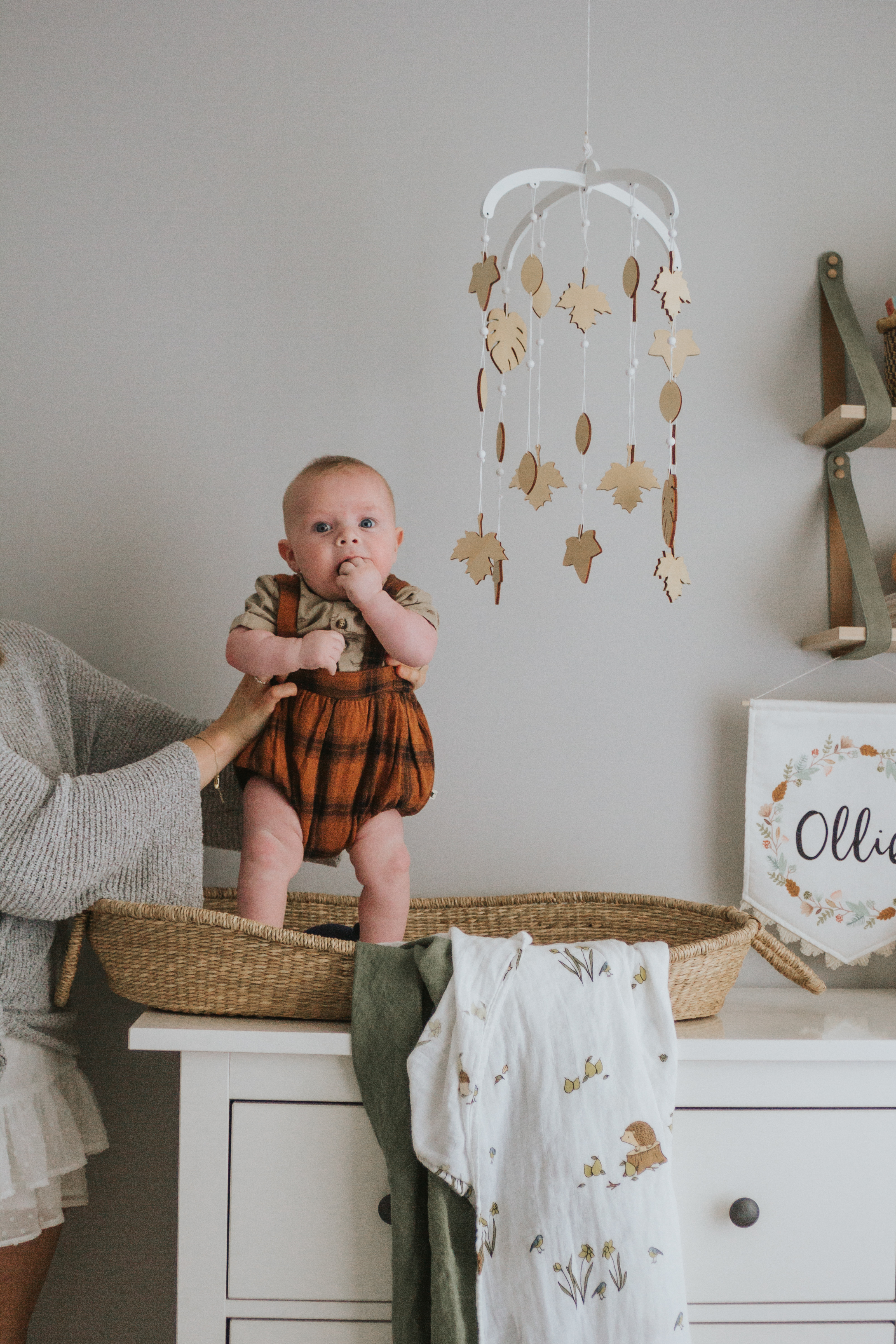
 Rug | Crib Sheet | Rocking Horse
Photos by Raffaella Jenkins
SaveSave
SaveSave
SaveSave
SaveSave
SaveSave
SaveSave




Comments
Michelle
What was the paint colors used for this nursery!? Super cute!
Tristen
What is the wall color?! I love it!
tatiana
What is the wall color?! I love it!
Katie
What is the paint color?
Bea
What is the wall paint color?
Christina
Anyone ever hear about the paint color for baby Ollie’s nursery?
Kim
I’d also love to know what paint colour she’s used.
Beth
Hi everyone, It’s Dulux Duck Egg Blue, but she’s located in Australia. Maybe you can get someone to match it?
Em
Hello! Could you share where I might find that canopy? The color is perfect for my son’s reading nook!
Scottie
Where did she get the canopy from? I love the colour.
Bailey
Glad the comment sections agree, I needed to know that wall colour and would also love to know the source of the canopy (the colour is amazing)!
Megan Davis
I was wondering if I could receive a link for the canopy?