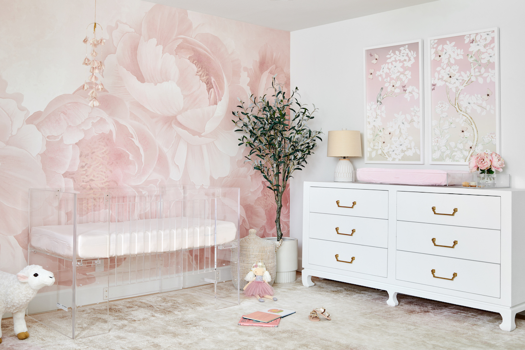
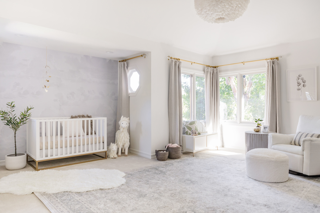
My latest e-Design for Project Nursery was such a fun one to work on! My client had a bit of a unique situation—she wasn’t sure if she wanted to create a nursery on its own or move one of her other children into the same room and create a shared space. My first task was to create two versions of her floor plan, so she could decide which direction she wanted to go in.
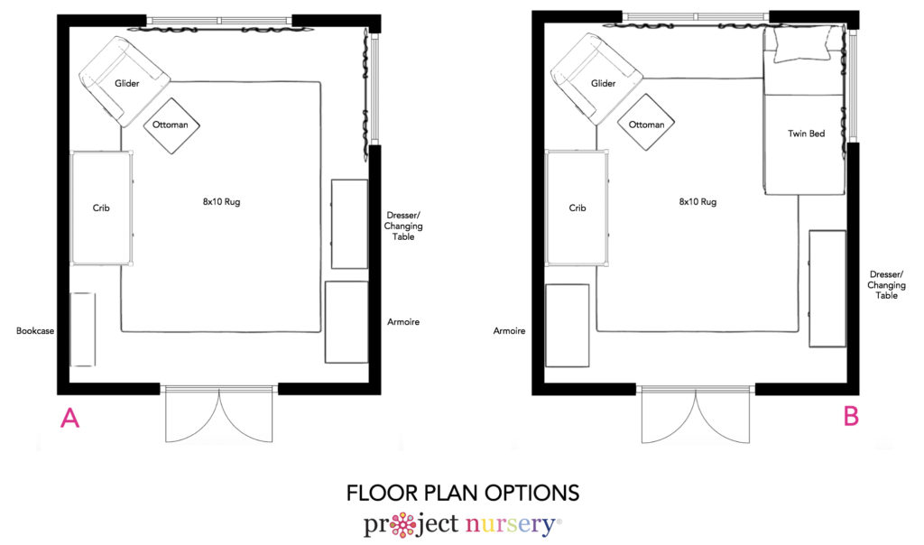
On the left is the floor plan for a nursery only. Since there is no closet in this room, it was a priority to include as much storage as possible, so I included a dresser, bookcase and armoire. There’s open space in the top right corner for a play area as well. On the right is the option for a shared space with a twin bed added in. Storage is still paramount here, so the dresser and armoire are still included. In the end, she decided to go with the shared space option. With that decision, I moved on to the design!
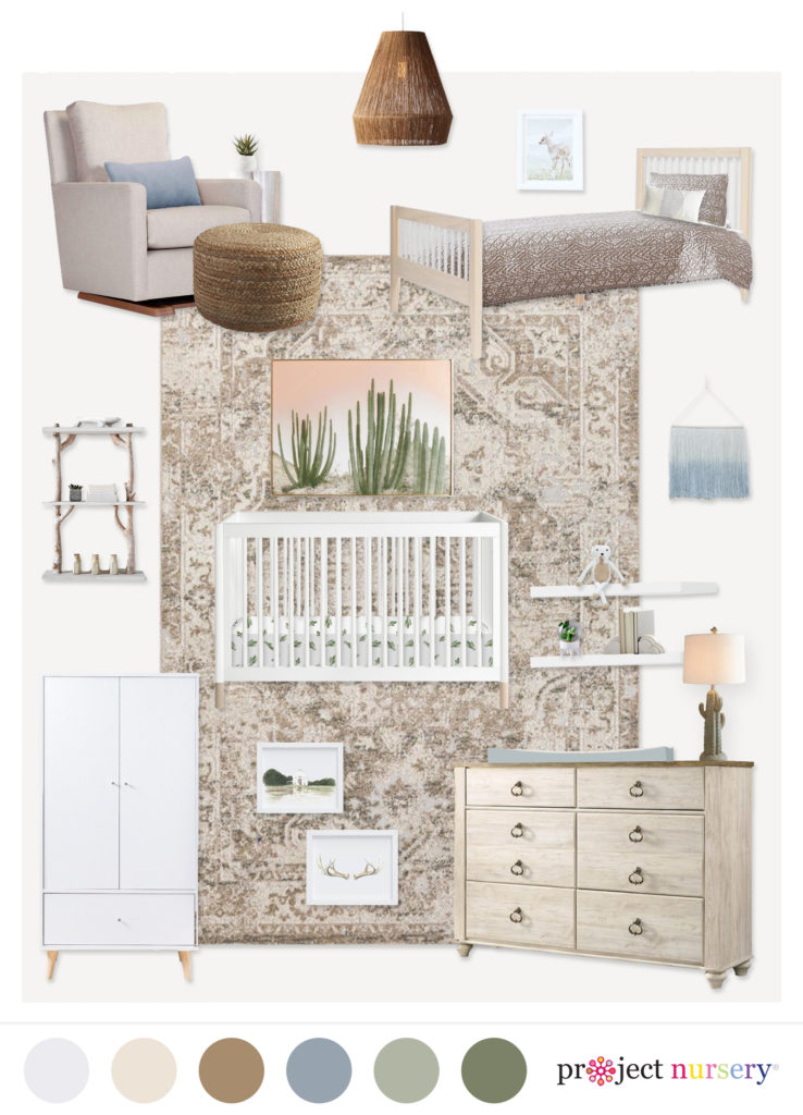
Crib | Dresser | Armoire | Rug | Wall Shelves | Branch Shelf | Glider | Ottoman | Twin Bed | Pendant | Deer Print | Cactus Print | Wall Hanging | Antler Print | Landscape Print | Cactus Lamp | Twin Bedding | Crib Sheet | Cloud Bookends
Design-wise, she wanted the room to be neutral with some subtle green and blue accents and some cactus themed items. In her questionnaire, she told me her family loves nature and rustic touches, so I included lots of natural finishes that are mixed in with the more modern furniture. I chose a variety of textures such as wood, seagrass and rattan to give the space an eclectic feel. The cactus pieces are subtle as not to overwhelm the space, but they still make an impact!
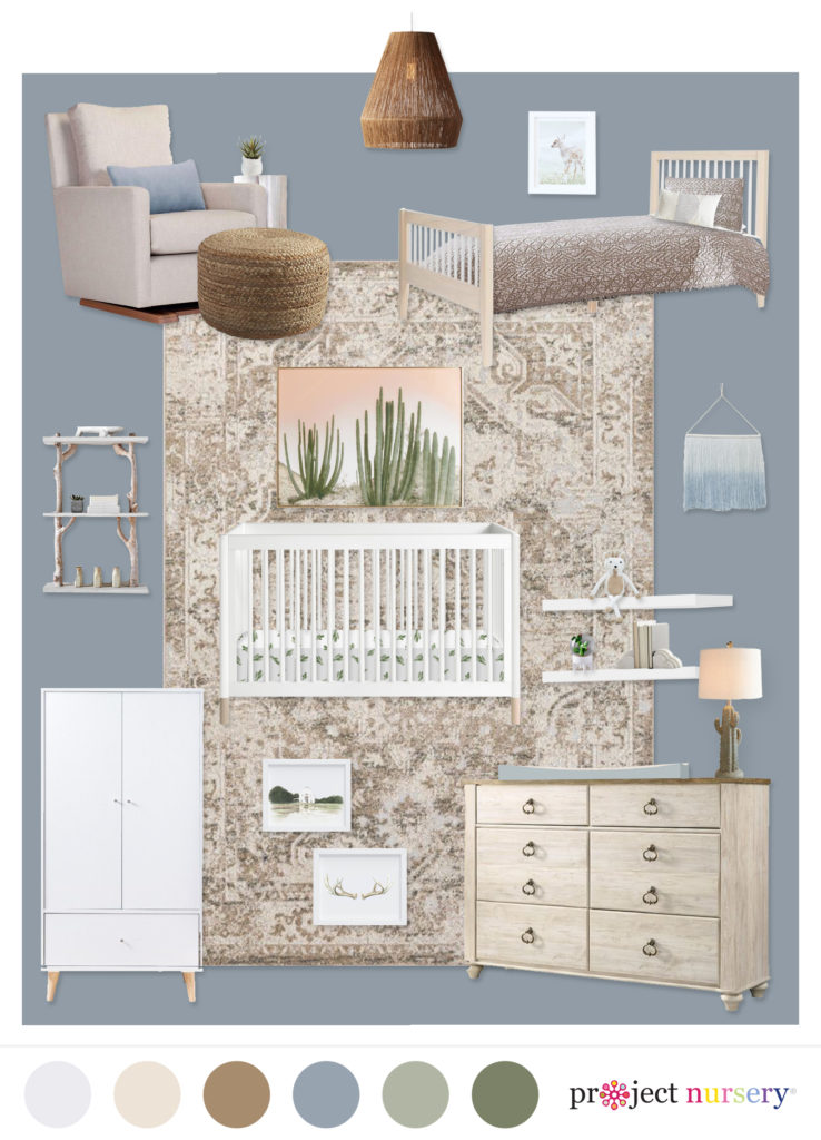
Her existing walls were this beautiful slate blue color, and she wasn’t sure if she wanted to keep the blue or go with the lighter off-white to brighten up the space. I created an additional design board option so she could see both, and she ultimately decided to go with the lighter color to maximize on the natural light.
For more information on e-Designs, check out The Project Nursery Shop!
*this post contains affiliate links*
SaveSave


