A few months back, you may have seen my post featuring an all-white nursery e-design reveal. Lucky for me, the e-design customer was actually fairly local, so I was able to have the nursery photographed. After I submitted the final e-design to my customer, she requested a few changes, such as the chandelier and side table. I made the few revisions, and she set to work putting the nursery together!
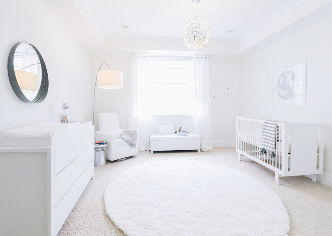 Crib | Changing Table | Rug | Glider | Mirror
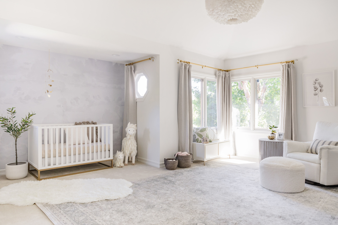
My customer had requested a nursery design in all white, with a few touches of silver or gray and a very subtle celestial theme. I chose pieces that were sleek and modern but that were also functional and easily cleaned.

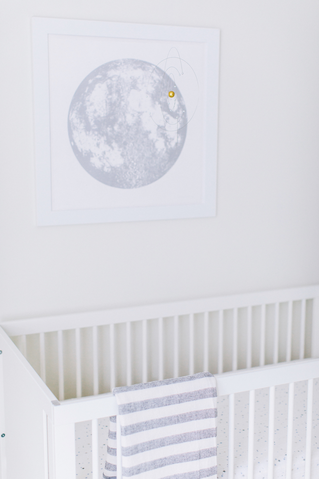
She already owned the white crib and didn’t want to go overboard with fabrics in the room, so we opted to do only a fitted sheet on the crib and forgo the skirt.
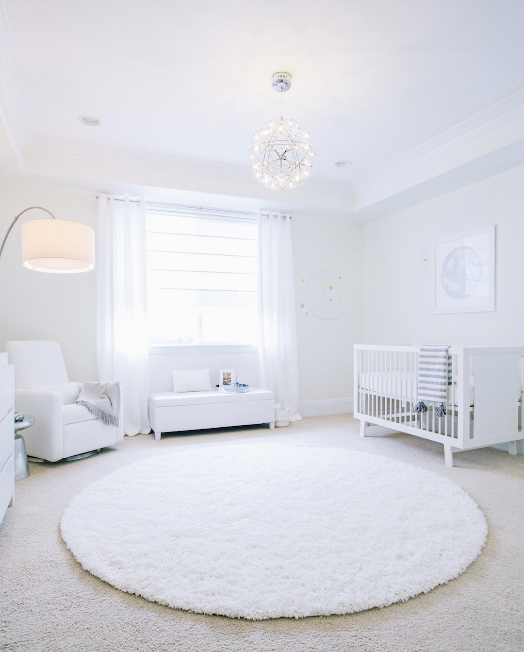
This nursery was on the large side, so we had plenty of space for additional furniture items, like the storage bench under the window.
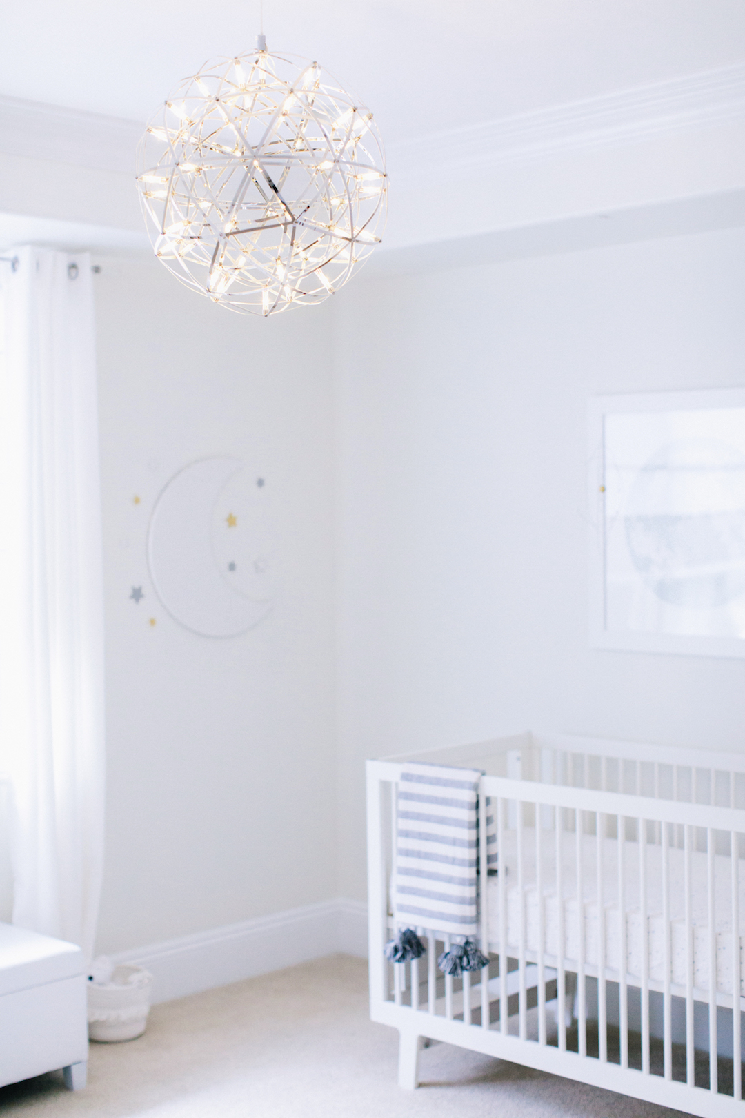
The silver celestial chandelier adds so much to the space and also creates fun shadows on the wall at night!
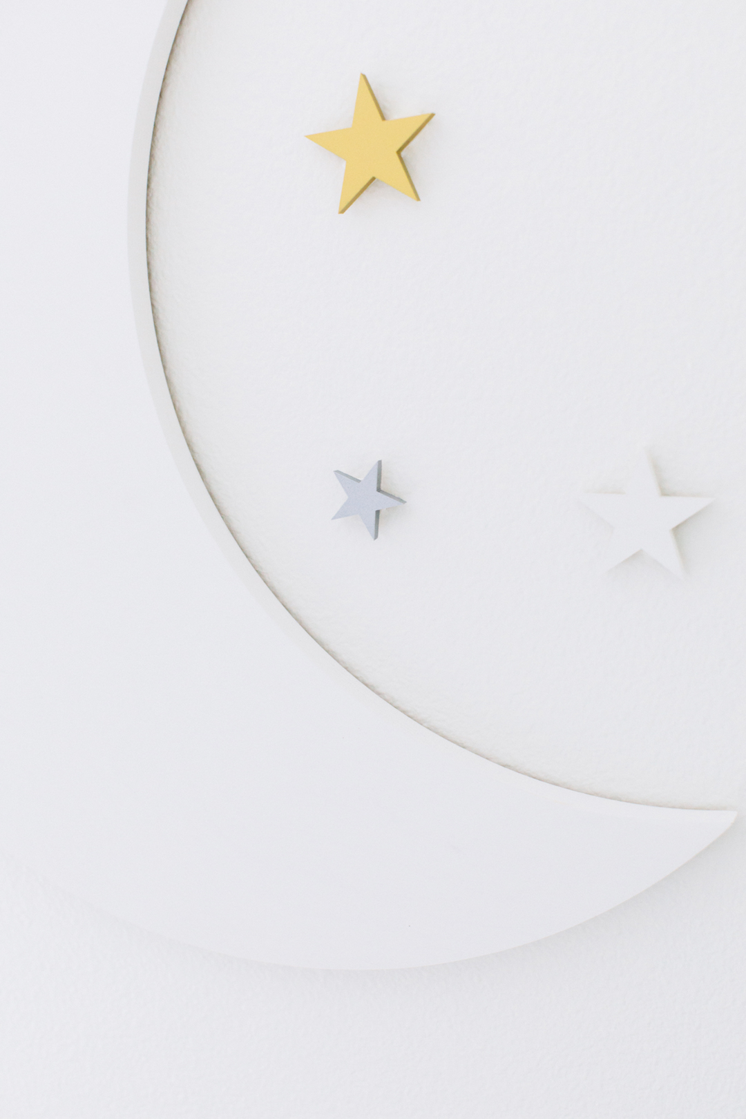
I love using details that are dimensional in a nursery, so to add to our celestial theme, I used some custom cut wood moon and stars in her chosen colors.
The main statement artwork is a beautiful silver moon print with a shimmering metallic finish. It mirrors the tiny little stars on the crib sheet.
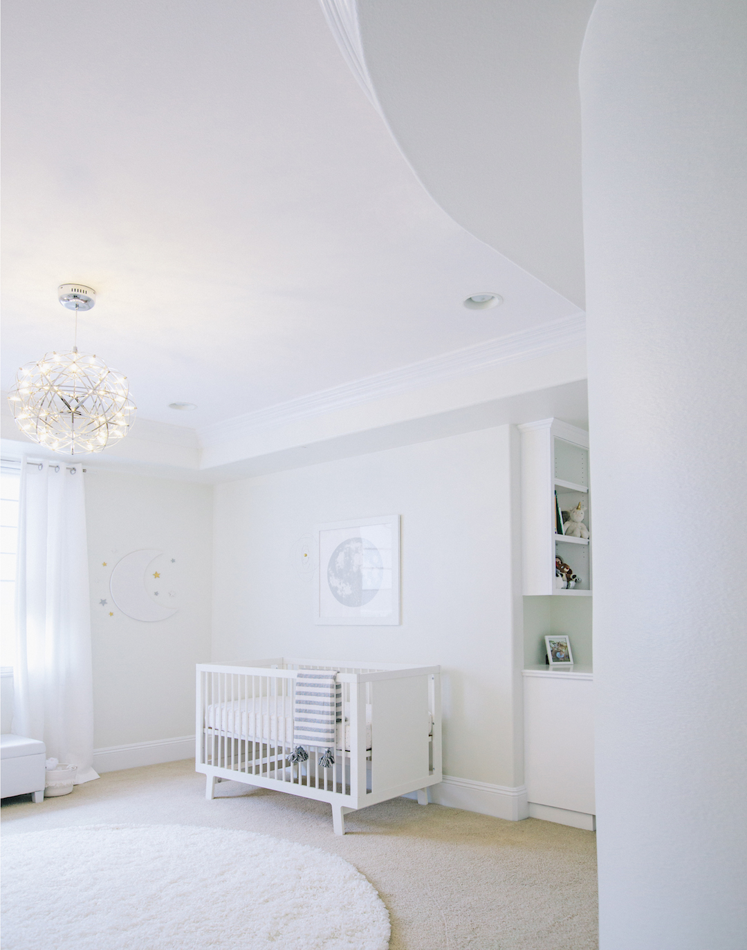
This room also had a large curved wall and high ceilings, which fit perfectly with the celestial theme.
Find out more and book your own nursery e-design package in The Project Nursery Shop.
*this post contains affiliate links*
SaveSave
SaveSaveSaveSave
SaveSaveSaveSave



Comments