Today we’re taking you back into the modern “Walk in the Park” nursery that our very own Kristin Saulsbury, Marketing Director and Modern Nursery Designer Extraordinaire, created for her son Blake. But since we know you fell in love with this gorgeous space when we first revealed it, this time we’re talking details. After all, we all want to design beautiful rooms for our beautiful babes, but incorporating a few key pieces into your nursery design will make life with your little one so much sweeter. From her favorite design element in the room to her modern nursery must-haves, here’s Kristin with some valuable insight on how she created her son’s nursery design.

You know we’ve been smitten with your modern nursery design since we first laid eyes on it! What was the most important thing you wanted to achieve when creating this space?
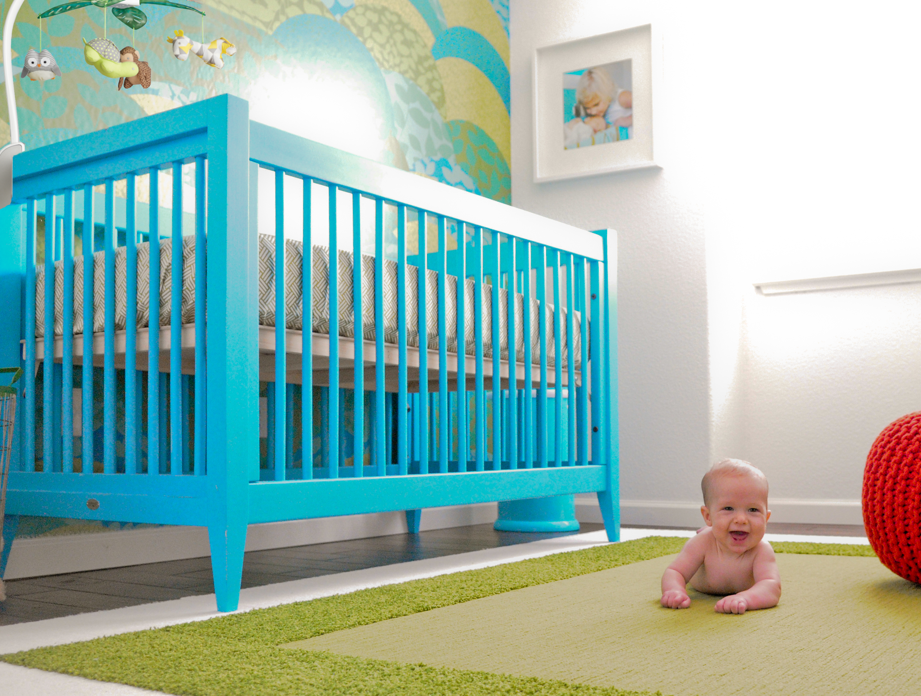
I knew I wanted Blake’s nursery design to be modern, but I also wanted to create a calming space that both Blake and I would enjoy. It also had to include elements that added a little bit of fun—it is a nursery, after all! My vision was a space that was bold yet simple, and I love every last detail. I especially appreciate the clean lines and simplicity—I feel a sense of peace every time I enter the room. And I think the bold, playful color palette is what makes it Blake’s happy place.
What was the biggest design risk you took to achieve your nursery vision?
The wallpaper! At first I was a little nervous about incorporating it, but now I’m so glad I did. It adds a bold design element to the room and makes the whole space pop. It also made furniture shopping a lot more fun because it gave me the opportunity to choose some really unique pieces. The Bahama Blue crib and changer tie in with the wallpaper perfectly.
What are your modern nursery must-haves?
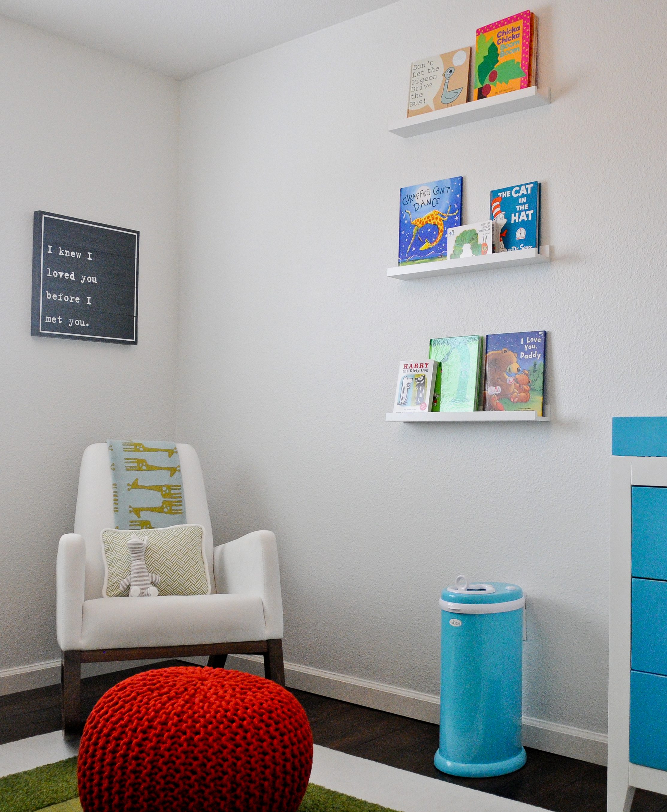
I couldn’t live without my rocker! It’s my favorite place to snuggle and bond with Blake, and it looks amazing—so amazing, in fact, that I can’t wait to use it in another room in my home once Blake has outgrown the nursery.
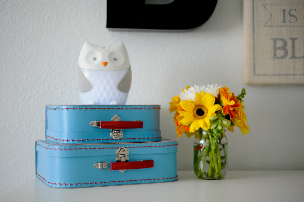
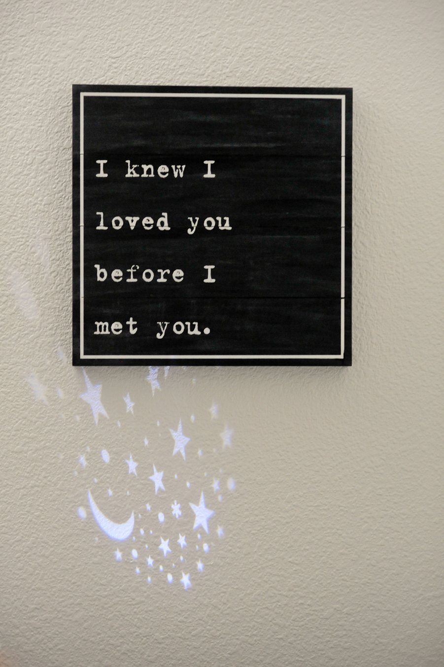
I also adore the owl nightlight—it’s just about the cutest little nightlight I’ve ever seen, and it blends perfectly into Blake’s modern nursery design. The glowing belly provides just the right amount of dreamy light, and there’s even an adjustable projector so he can gaze at a starry sky while he’s drifting off to sleep.
Flor tiles are an amazing choice for any nursery, and I used them to create a rug with clean lines that I could completely customize to the space. I think it adds to the modern, less-is-more vibe in Blake’s room.
How was designing a nursery for baby #2 different from your first experience?
Everything was different! There are so many more choices now, making my modern nursery dreams easier to achieve. Things have come a long way in the past four years—I mean, come on, the mobile has a remote control! This time, I also took my own style into consideration when designing the space, and I wasn’t as afraid to take risks. Oh, and I knew to definitely invest in pieces that can be reused once baby outgrows the nursery.
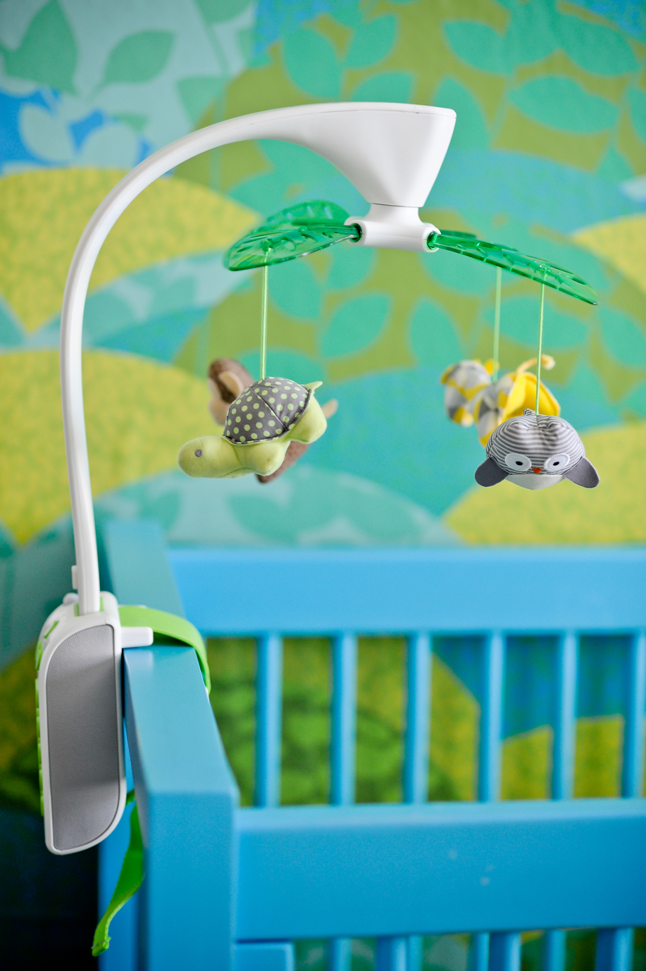
We couldn’t have said it better ourselves—thanks for sharing your insight, Kristin! We may be biased, but we think Blake is one lucky little guy—his mama is amazing and that nursery is just so gorgeous. If you love it as much as we do and you’re hoping to create a similar look in your little one’s space, we’ve pulled out some of the key elements of Kristin’s nursery design for you to have at a glance. Enjoy!
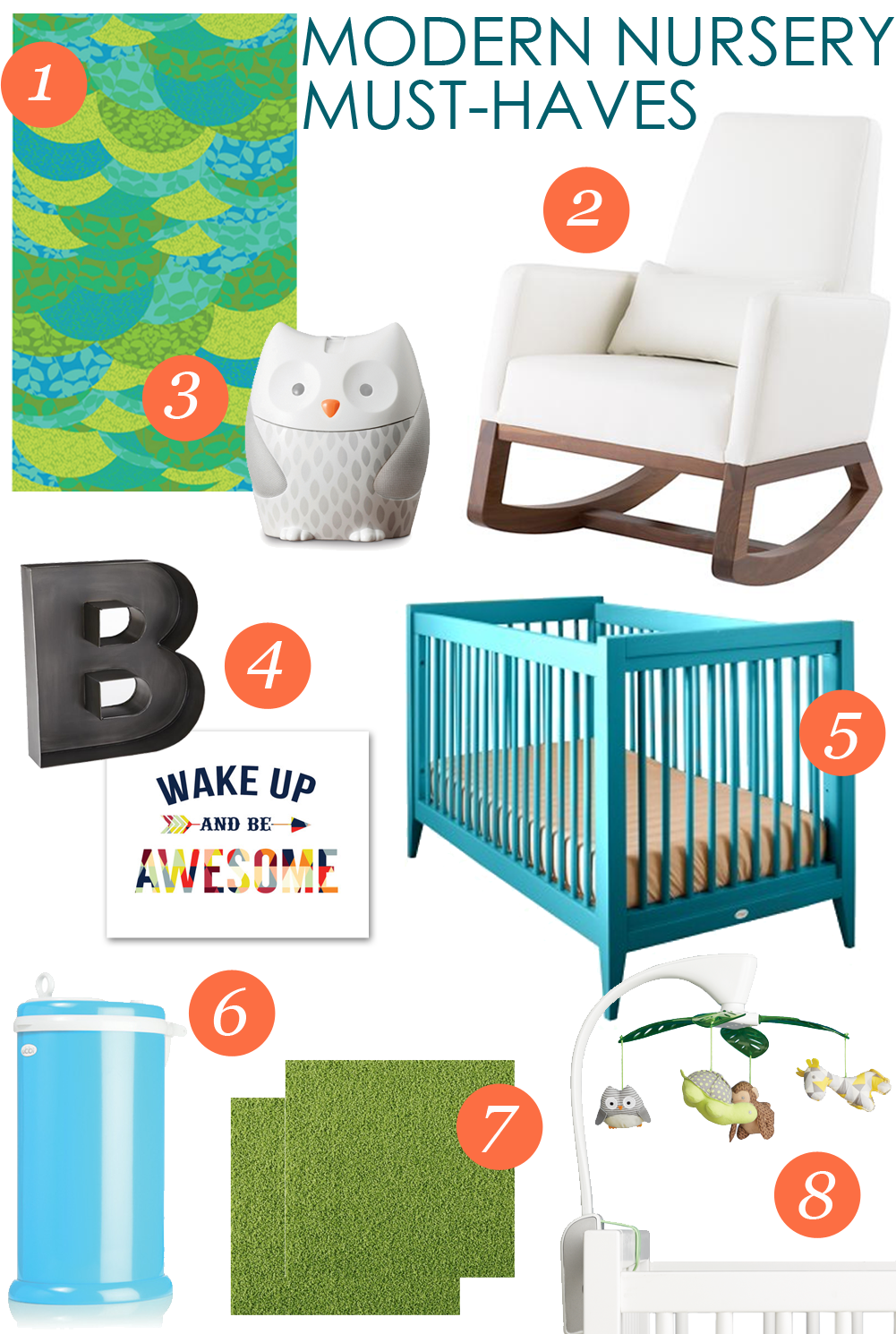 1. A Day in the Park Reusable Wallpaper 2. Joya Rocker 3. Nightlight Soother 4. Metal B and Wake Up and Be Awesome Art 5. Devon Crib 6. Diaper Pail 7. Flor Tiles 8. Projection Mobile
Nursery Photography by Lynda Kennedy Photography
Editor’s Update: There was a recall on the Moonlight & Melodies Projection Mobile on December 16, 2015.
Products and/or samples were received but all the opinions are my own.
This is a sponsored post. Thanks for your support
in our effort to bring you exciting content.



Comments