We know you’ve seen upholstered cribs, but have you seen an upholstered wall? That’s right, designer Vanessa Antonelli is at it again with another remarkable nursery design. I guess since we knew she could pull off a wall covered with roses in a nursery, an upholstered wall should seem like no trouble. We are wowed all the same. The modern boy’s nursery mixes soft and hard with the upholstery complemented with the crisp lines of the crib and daybed. Here’s Vanessa to share more about the space. Thank you, Vanessa!
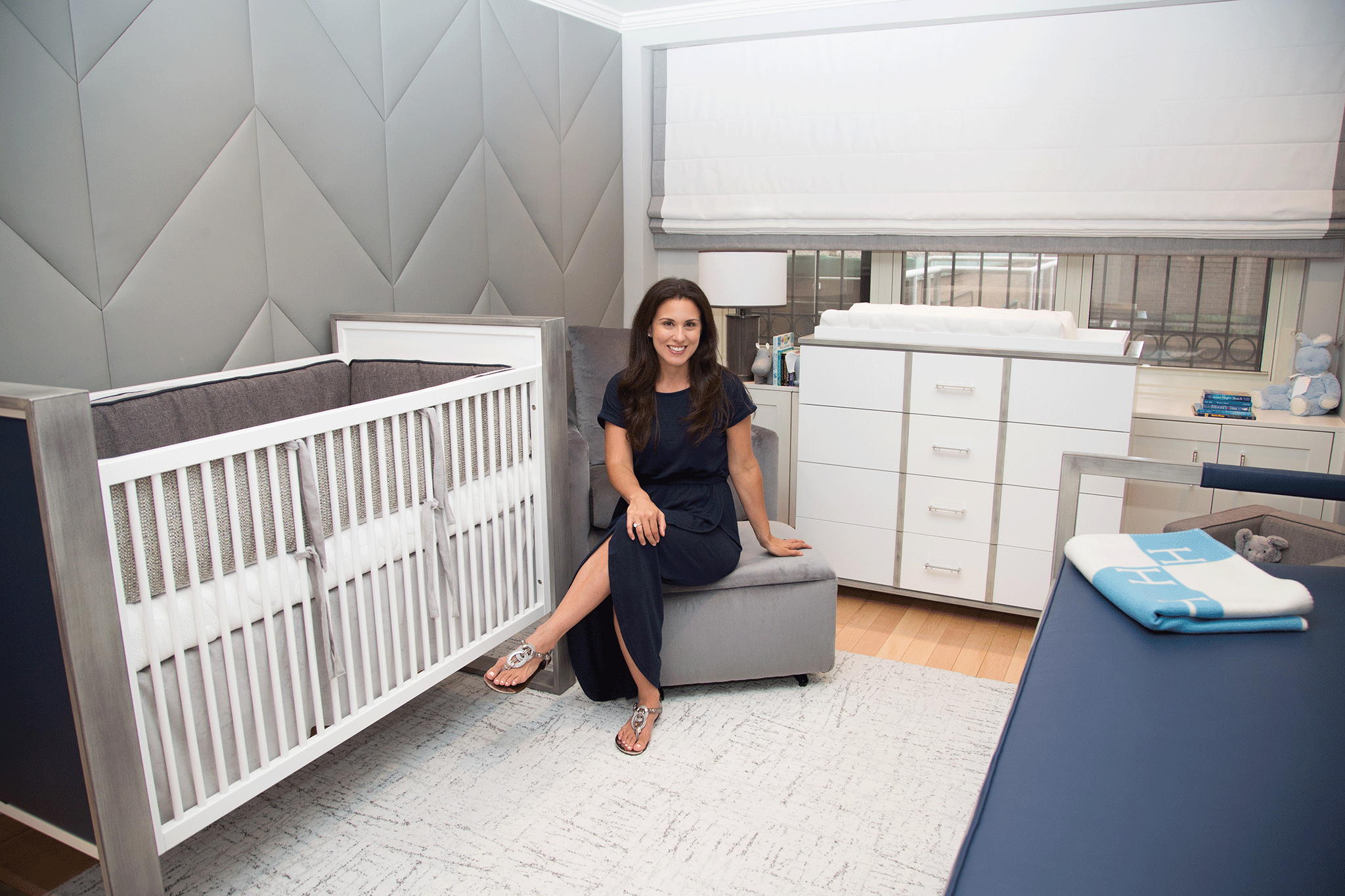
My clients said they wanted something really cool behind the crib. I have always been a fan of upholstered walls. Eight years ago I did one in my own son’s nursery and haven’t since then. I said, “How about an upholstered herringbone wall?” and they said, “Let’s do it!”
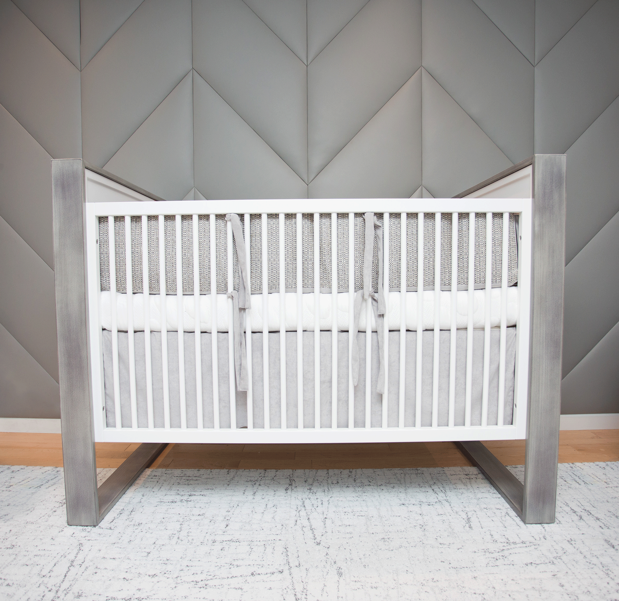
I think when you hit on something really early and everyone is really excited about it, the energy gives the project momentum and everything else comes together really quickly.
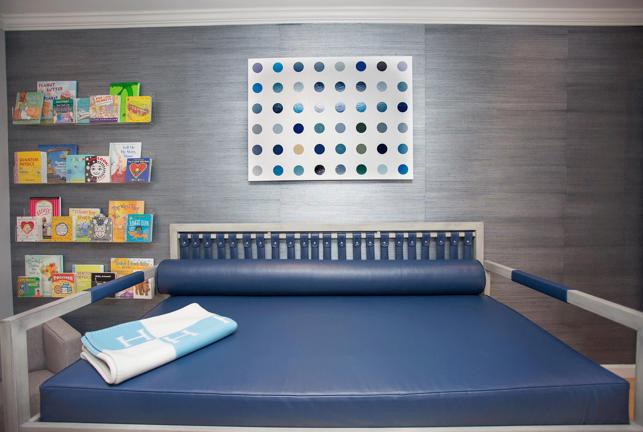
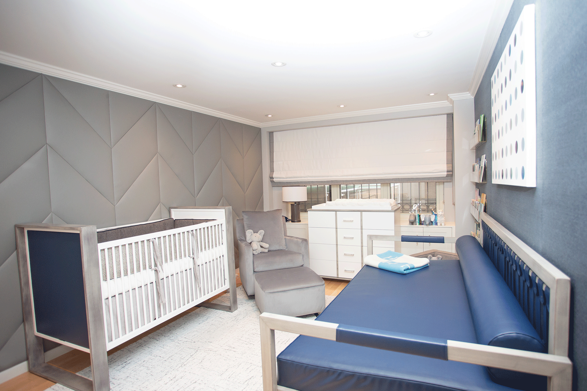
The shape of this room was a challenge because we needed to get a crib, changing table, day bed, chair, ottoman, side table and reading nook into the room with walking space.

If your floor plan is something that you are stuck on, try creating a flat drawing of your room and cut out pieces of furniture to scale. Move them around until you think it feels right. Once you’re happy, tape everything out on the floor of the room. If it feels good then you’re good to go with ordering the furniture.
Photography by Lezelli Studios



Comments
Ashley
Where is the crib from?