We are stepping into the nursery with Brooke Christen of Nesting with Grace to take a peek at her son Finn’s nursery. Mom to Ella, 8, and Lola, 5, Brooke isn’t new to the mom gig, but this is her first nursery for a boy. Brooke partnered with Wayfair to create this eclectic boy’s nursery with plenty of daydream inspiration for her little one. Thank you, Brooke, for sharing with us and telling us more about the sweet space for your son.
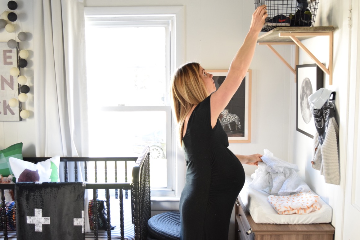
Design inspiration can come from anywhere—what inspired your nursery design?
I had the idea to put wallpaper on our ceiling as a fun contrast and something baby would enjoy looking at. Once I found the astronaut and star wallpaper designed by Aimee Wilder that was the jumping off point.
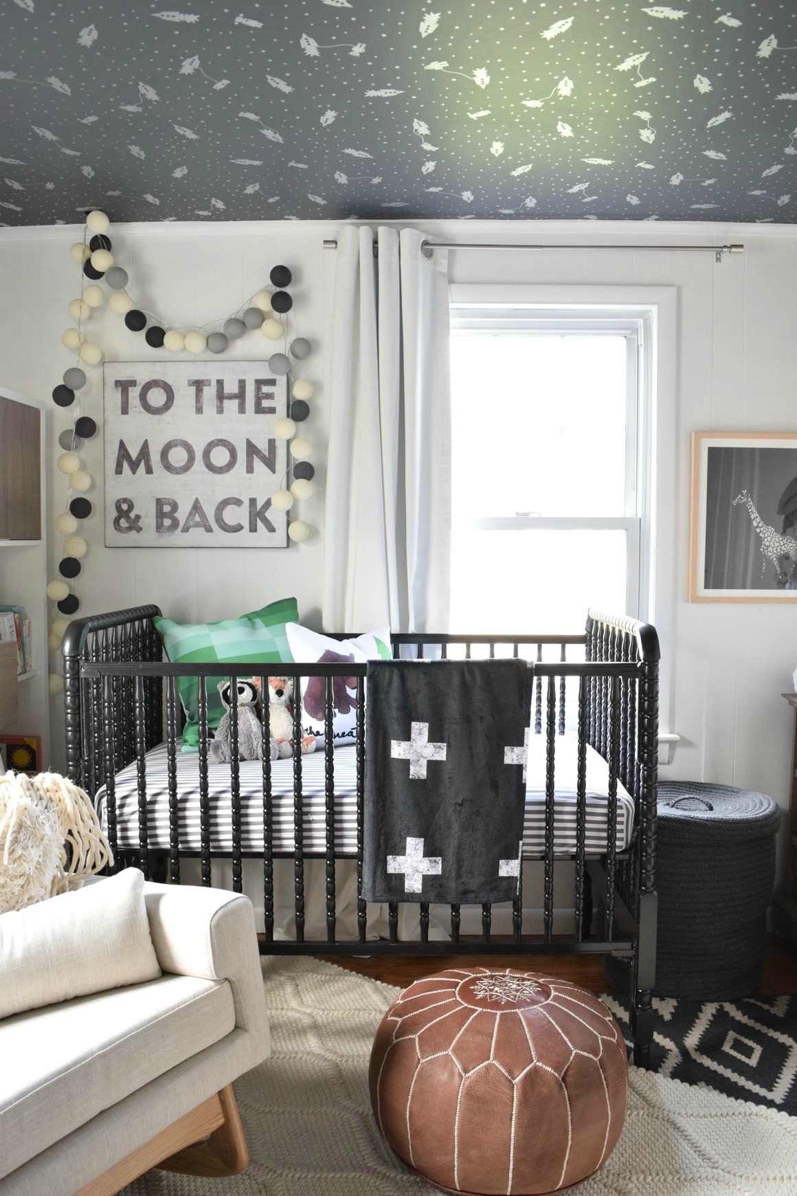 Crib | Crib Sheet | Swiss Cross Blanket
How did your personal style influence your design choices?
I love using color and some interesting contrast along with keeping the larger pieces neutral. I kept with that same style in his nursery. I like to have the option of moving things around my home and having the larger pieces be more timeless.
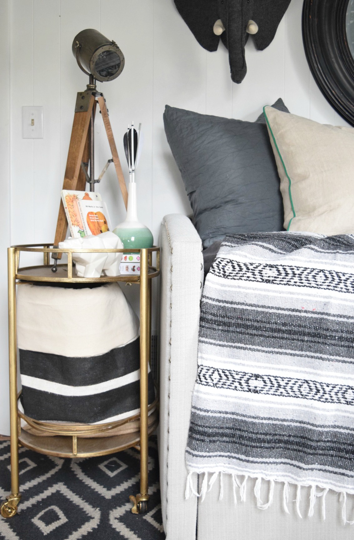
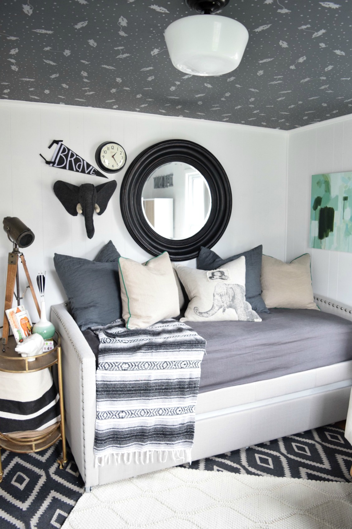 Daybed | Elephant Pillow | Felt Elephant Head
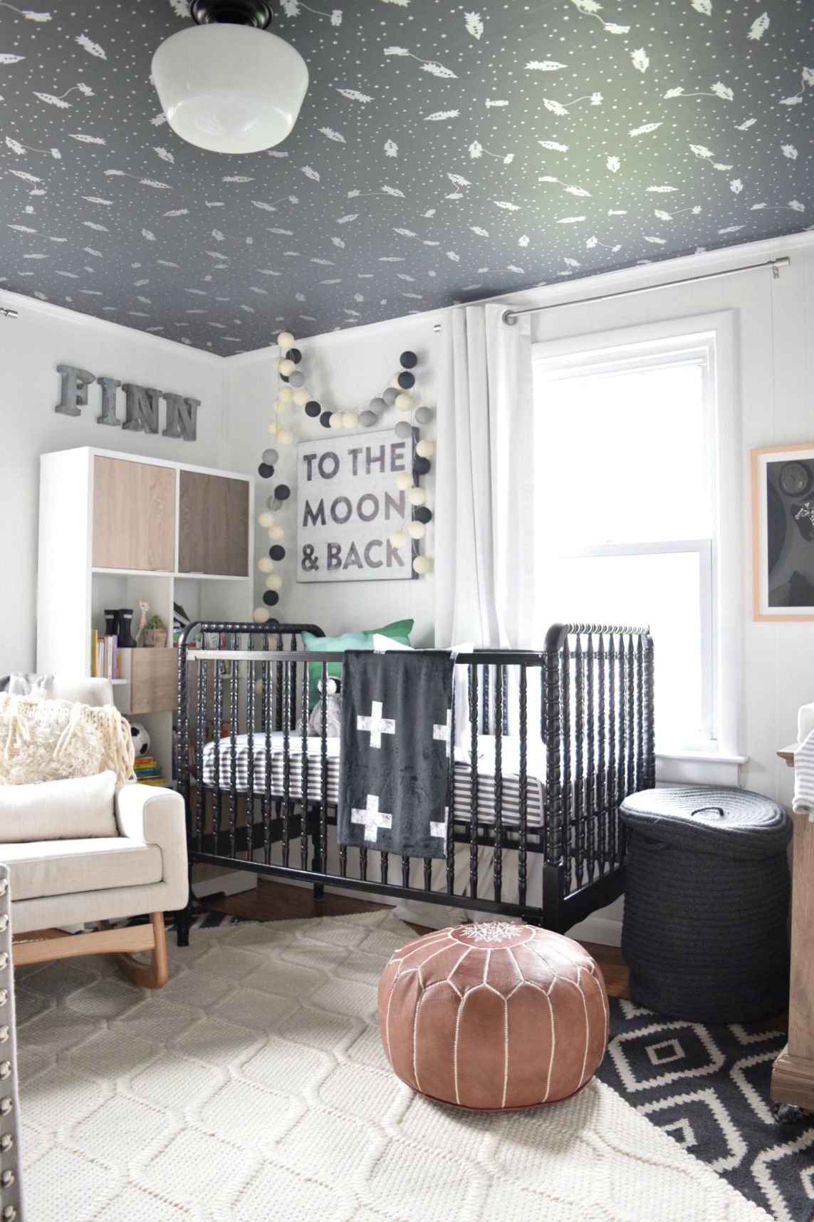 Metal Letters | Ceiling Wallpaper | White Rug
Did you have any unexpected obstacles when creating this room? How did you overcome them or spin them to your advantage?
We live in a 1950s Cape style home that is 1100 square feet. I had the challenge of making the nursery also functional for extra guests to sleep in. It ended up working out really nicely, everyone always wants to be where the baby is, so now we have extra seating with the day bed that I worked into the plan.
Now that the room is complete, what was your favorite part of the process? And what do you love the most about the finished design?
My favorite part of the his nursery is the wallpaper and the contrast it adds to the room. I loved watching all of the pieces that I ordered from Wayfair coordinate so well with other pieces that I had already and new items that I had bought.
What is that one thing that everyone mentions when they step into this space?
Everyone always says how much larger the room feels from when it was a guest room and had a queen bed in it. I have so much more in the room but the queen bed took up so much space that it actually feels larger.
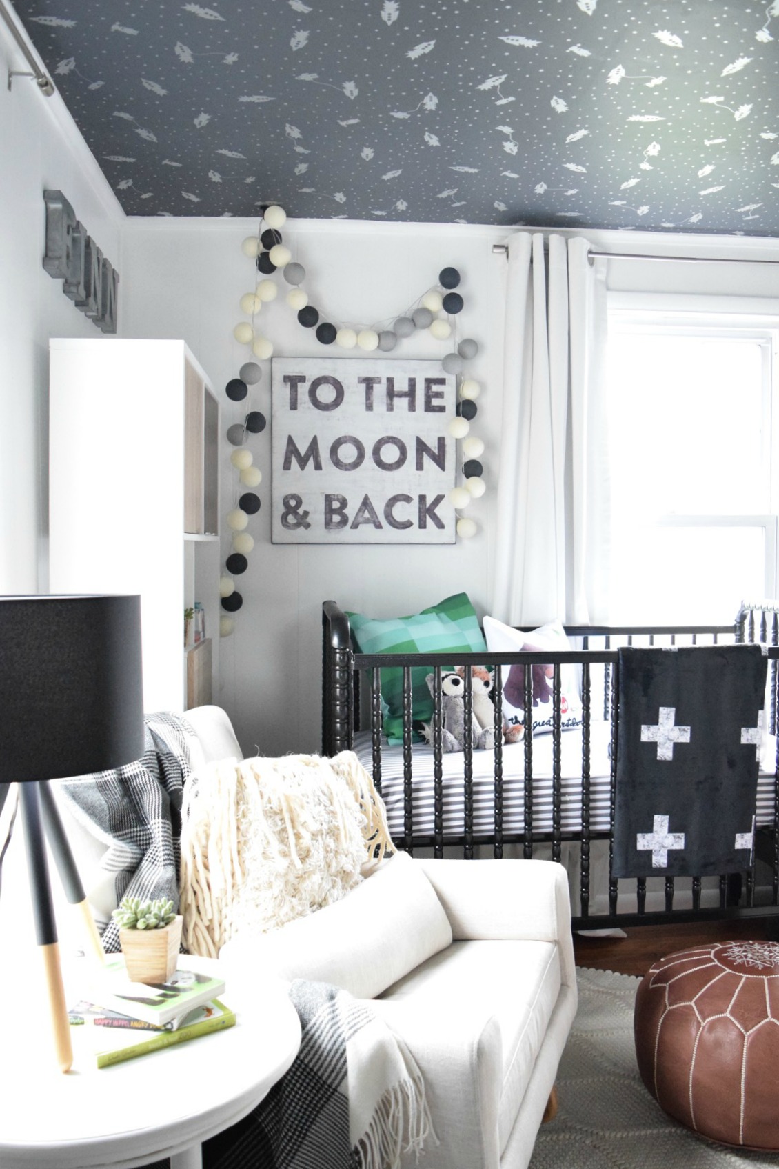 Ball Lights | To the Moon and Back Print
If you had to choose one aspect of the design that is uniquely you, what would it be?
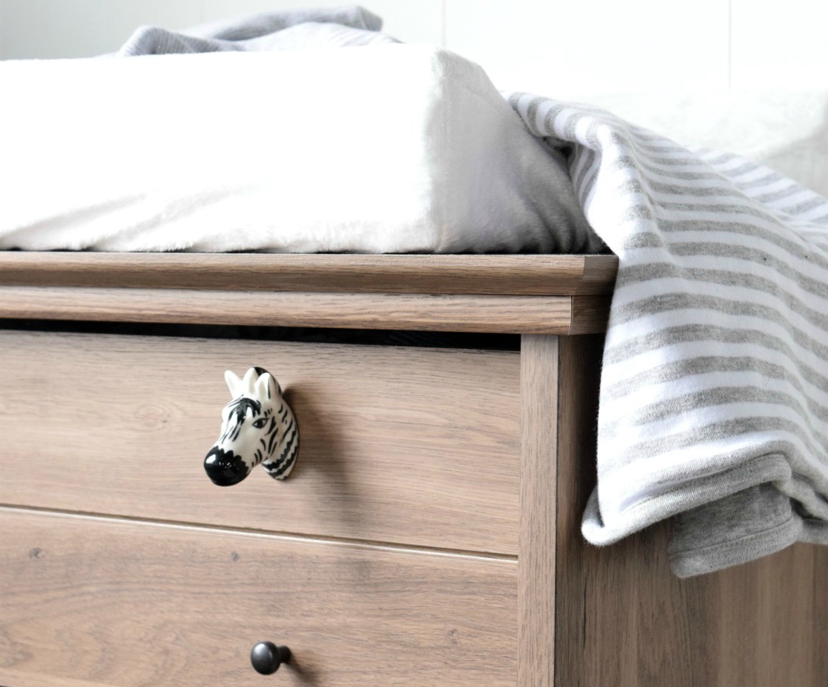
The one aspect of his nursery design that is unique to my style and design is his changing table. I like to find pieces that have great style and design and then make it function for the area where I want to use it. I found a dresser from Wayfair and used it for a changing table. It was too short to be used as a changing table, so I added wheels to the bottom, a changing pad to the top and wallpaper to the inside of the drawers, making it more custom to our needs.
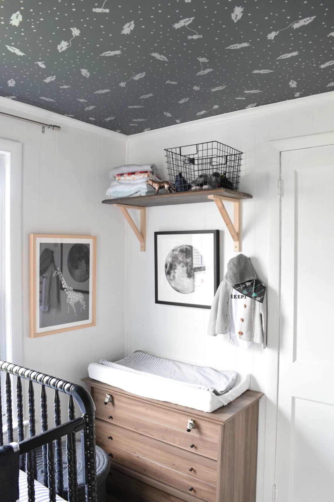 Giraffe Print | Moon Print | Dresser
What are your nursery must-haves?
Our must haves for his nursery was a nice bookcase to store all the baby books and a comfy rocking chair to snuggle our little sweetie in and read to him.
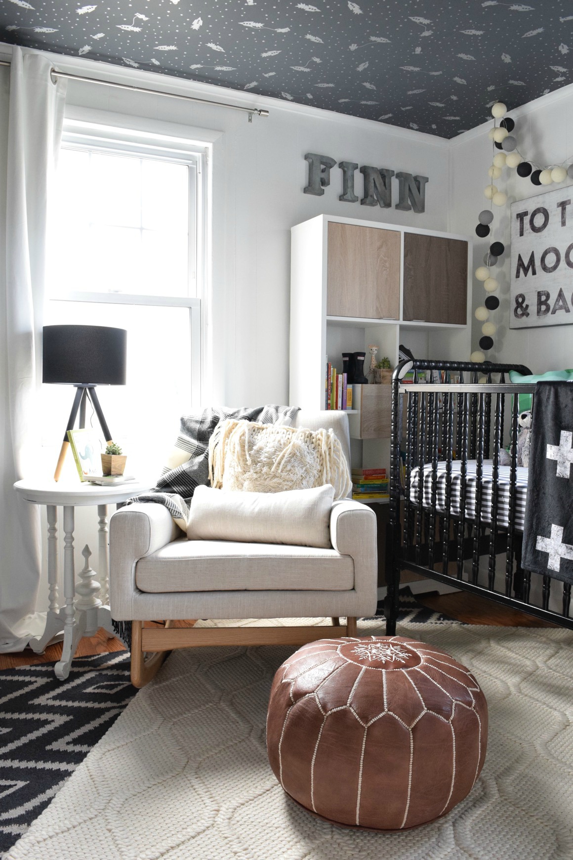 Rocker | Pouf | Table Lamp
What is the one thing that you would tell other parents to consider when they’re starting their own nursery design projects?
I would tell other parents to not go with a “theme” in their nursery. Although my nursery might seem like it has a theme, every piece could stand alone, still look great and grow with him as he gets older.





Comments
Modern Furniture
Actually Black and Gray Looks good…I like the color combo.