A few years ago, I designed a floral nursery for Jessi Malay‘s daughter, Alessandra. Well, Alessandra has a new baby sister who also needed a nursery, so I worked with Jessi over the past few months to design the perfect space. Jessi wanted to go in a different direction for Isabella’s nursery—much more neutral with some natural touches.
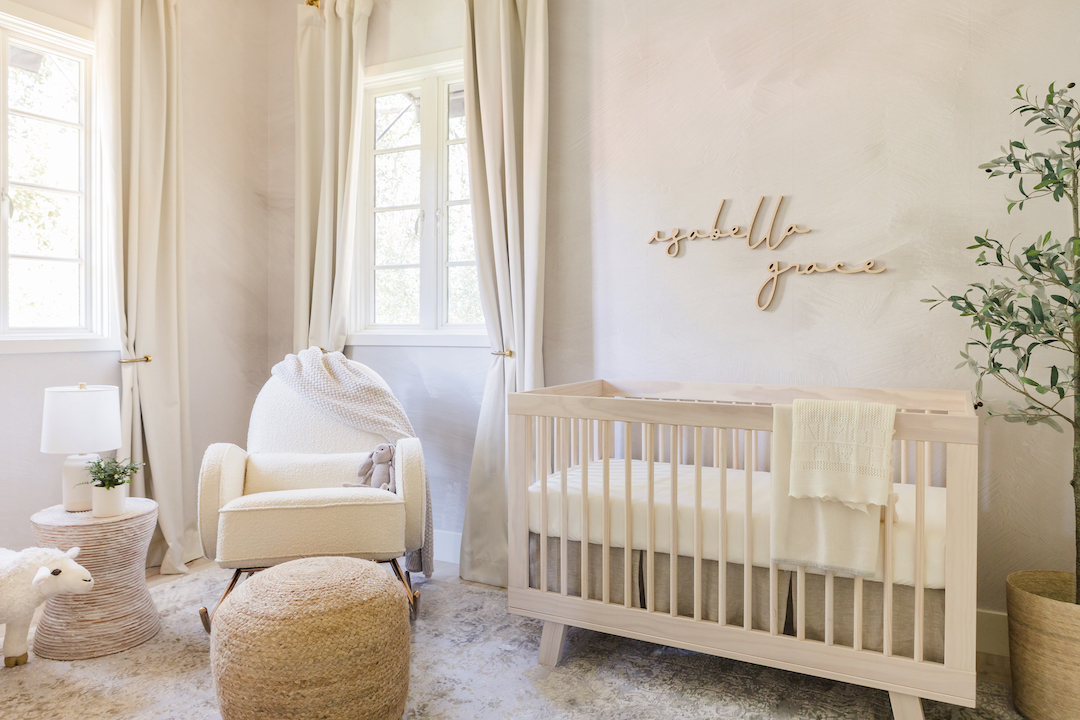
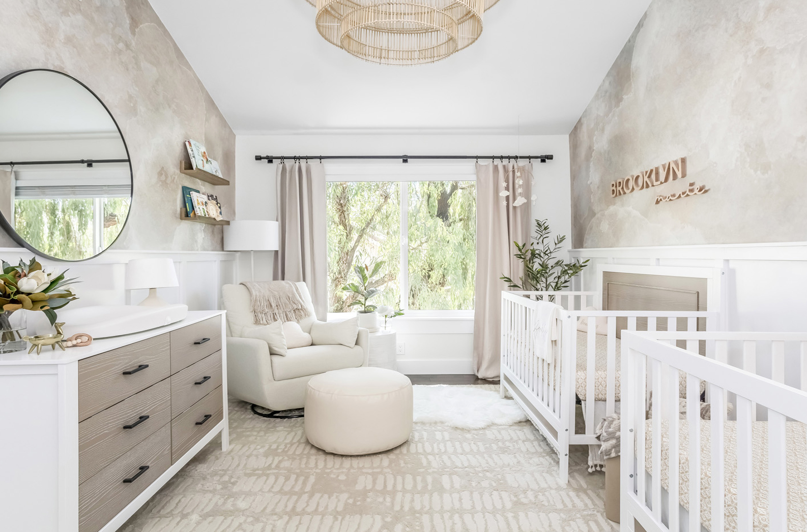
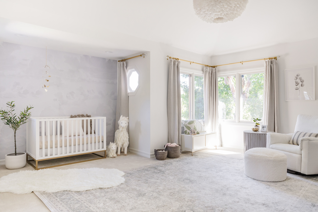
There were high ceilings in this room, so we wanted to highlight the walls. We chose a removable wall mural that has a gorgeous printed texture to give the room depth. It’s so soft and subtle in person, but it adds so much to this natural neutral nursery.
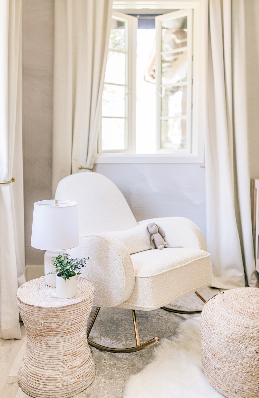
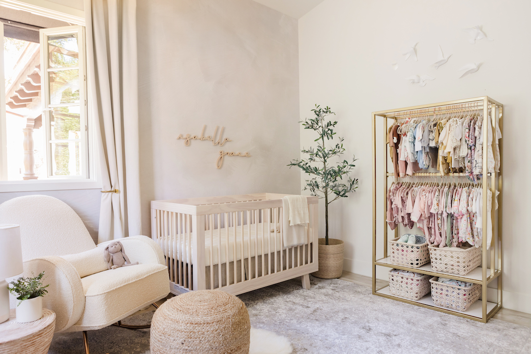
Jessi really wanted a rocking chair with a boucle fabric, so we chose a the Compass Rocker. The fabric is super soft and cozy, and it adds even more texture to the room. We added a neutral side table and a woven ottoman to layer in those neutrals.
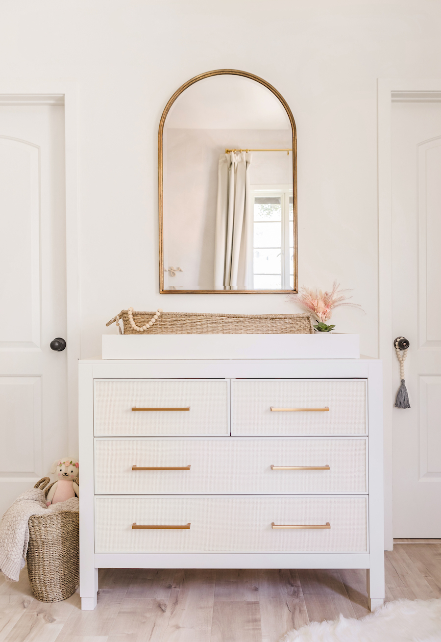
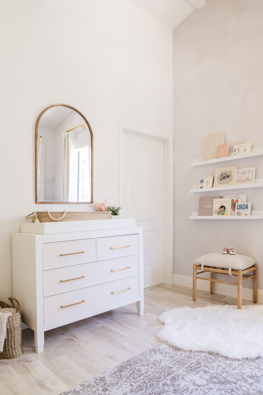
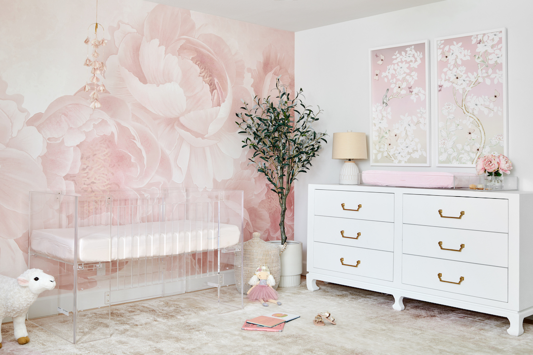
On the other side of the room, we had a small space between two doors to add a changing table. The dresser was the perfect fit. Since Newport Cottages has custom finishes available, we went with soft whites for both the frame and the caning, and of course, gold hardware! We added the changing tray as well for a little extra organization. The gold arched mirror above the changing table really helps to open up the room and bounce the light around.
One of the unique challenges with this room was finding storage for clothing. The closet in the room was already being used, so we needed another option. We found this amazing custom clothing rack on Etsy that looks amazing in the room and provides tons of storage for Isabella’s clothes!
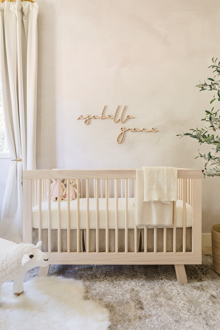
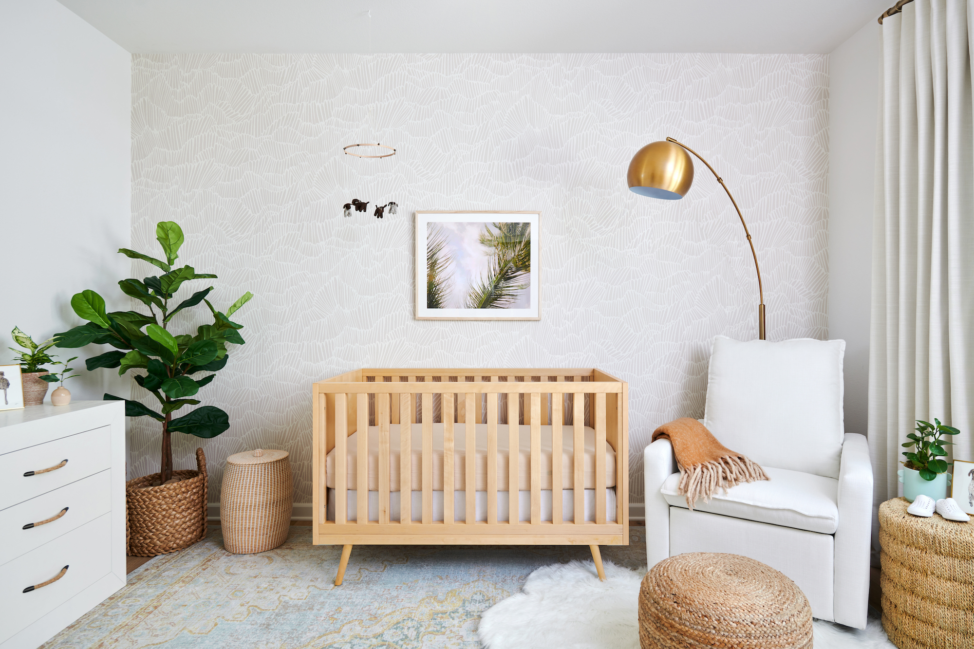
We didn’t want to add a large piece of artwork over the crib, but rather something that highlighted the wallpaper and made a subtle sophisticated statement. We went with this maple wood wall name in a sweet cursive font. It complements the natural wood crib so well. You can also see the detail in the rug in this shot—it’s absolutely gorgeous! It has neutrals, whites and metallic gold and it shimmers in the light.
We had a little spot by the bathroom door to put some additional storage, so we added wall ledges for a few of Isabella’s favorite books. We added a small ottoman underneath for a guest to sit, and it really makes that little corner come together. You can really see how the wall mural highlights the high ceilings!
This room really feels amazing in person—there is so much natural light and the soft colors and neutrals feel relaxing and serene.
Photography by David Casas
*this post contains affiliate links*



Comments
Sarah
What is the name of the paint color on the wall? It’s exactly what I’m looking for!!
Stacey
Beautiful!! What’s the name of the font you used? Thank you!!