In case you haven’t noticed, neutral nursery designs have been trending more and more over the last few years. Maybe it’s the fact that a neutral space is calming, relaxing and so versatile. In a nursery especially, versatility is super important. I’ve been getting so many requests for neutral nursery designs from my clients, and I’m so excited to reveal my newest design—a neutral and gold nursery!
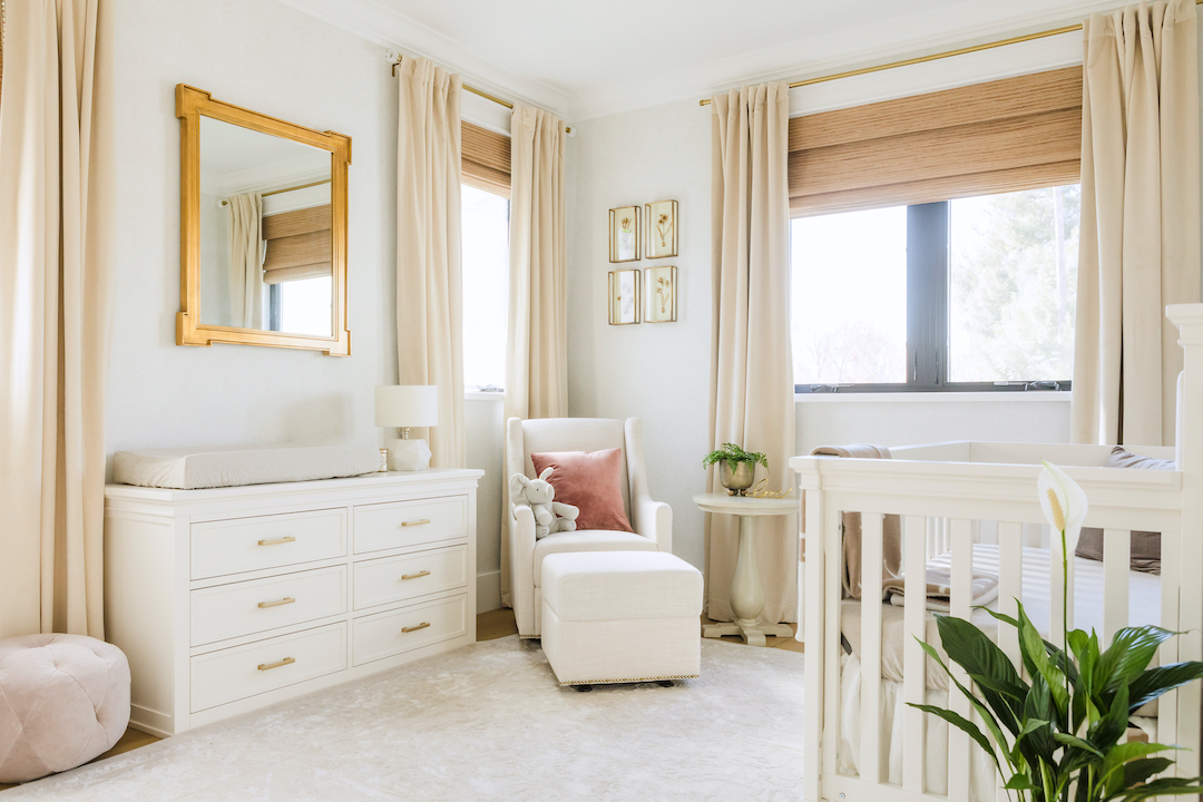
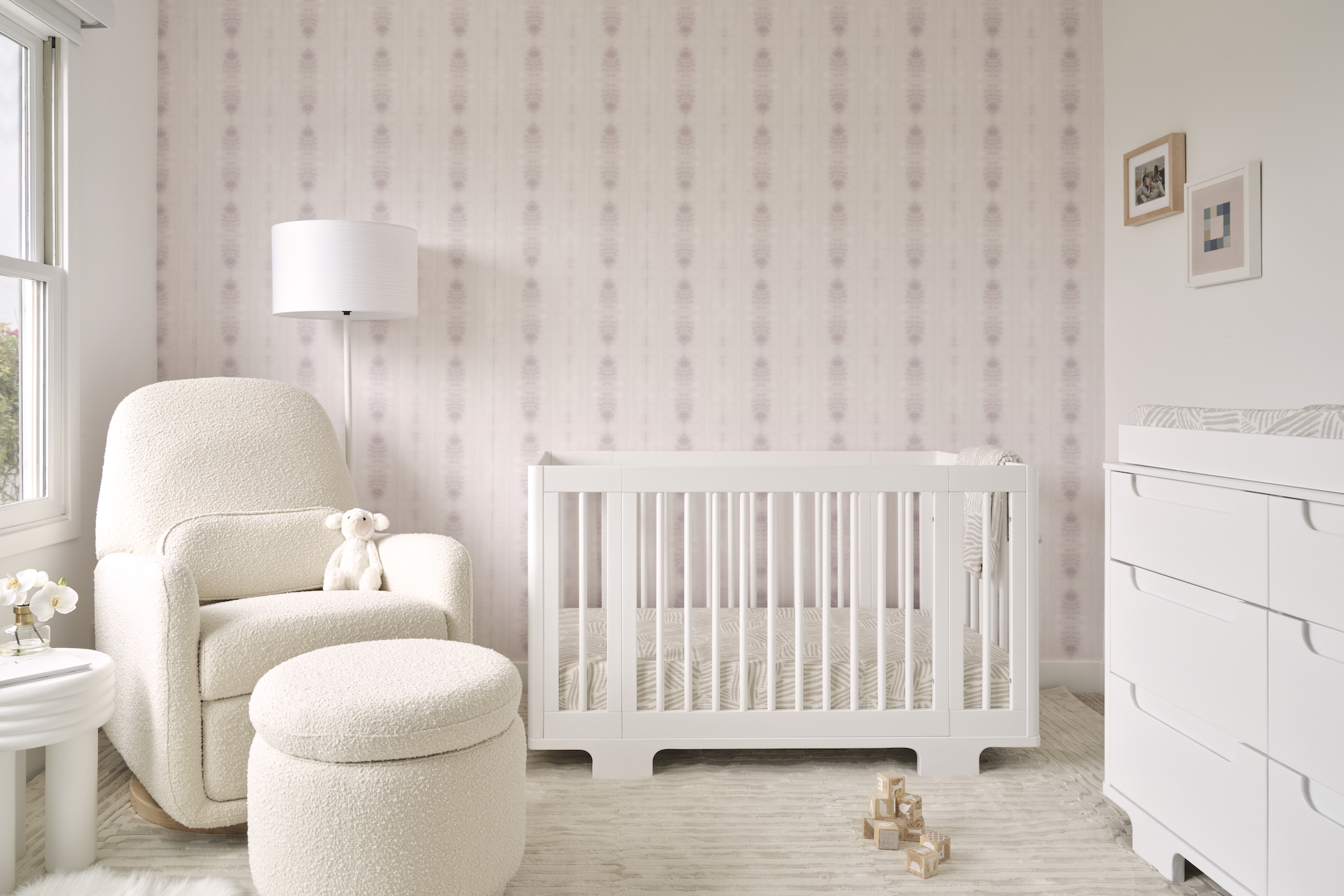
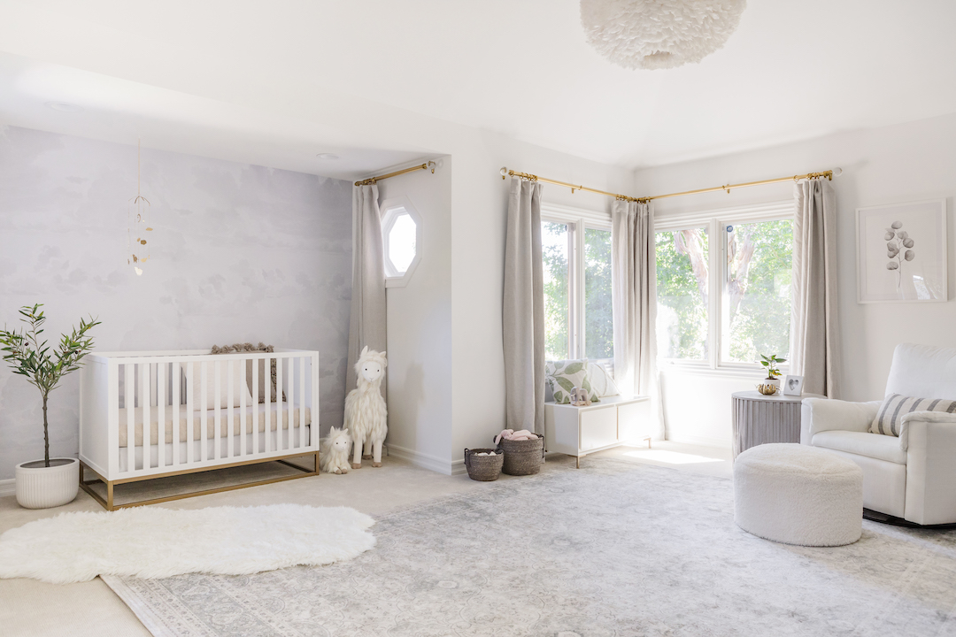
This nursery belongs to Naomi Boyer, and you can see even more details of this gorgeous space on her YouTube channel. When Naomi contacted me, we first laughed about having the same first name and then got to nursery talk. She wanted a neutral and soothing space for her baby girl. I started by sending her some wallpaper options, and we finally decided on a stunning paper from Schumacher. It’s hard to see in the photos, but it’s absolutely stunning in person!
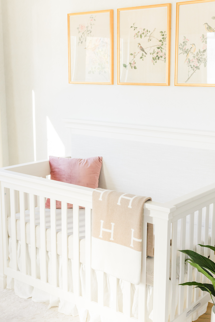
We then moved onto furniture. We chose the Darlington crib and dresser. The crib has a soft neutral upholstered panel, which brings a softness to the space.
We chose the glider and ottoman because of its gorgeous neutral design and the gold nailhead accents that give the piece a more refined look.
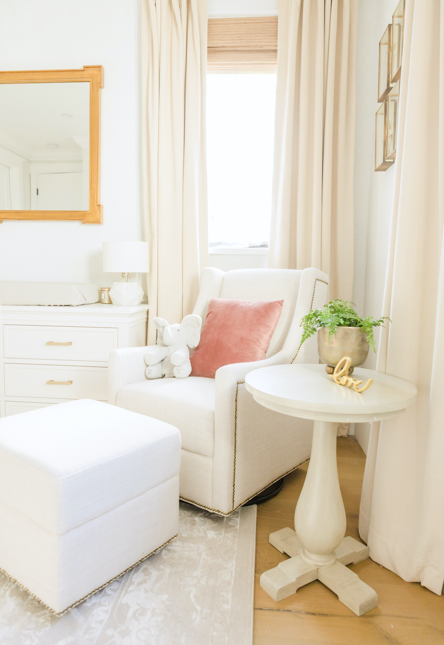
We rounded out the whole room with a gorgeous neutral rug, which pulled the entire design together. It has a mix of neutral tones, which give it texture, and the pattern adds visual interest to the floor.

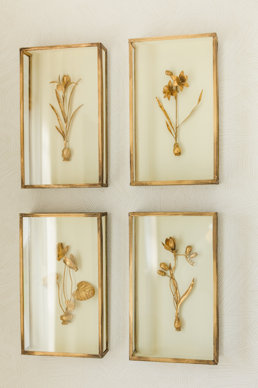
You can definitely see the wallpaper better in the shot below. It has such a soft and subtle pattern, but it adds so much to the room in person. Neutral, beautiful, and versatile!
Nursery Design by Little Crown Interiors for Naomi Boyer
Photography by David Casas


Comments
Tracey
I love this nursery! Do you mind sharing the size of the art above the crib? 11×14 or 16×20? Thank you!