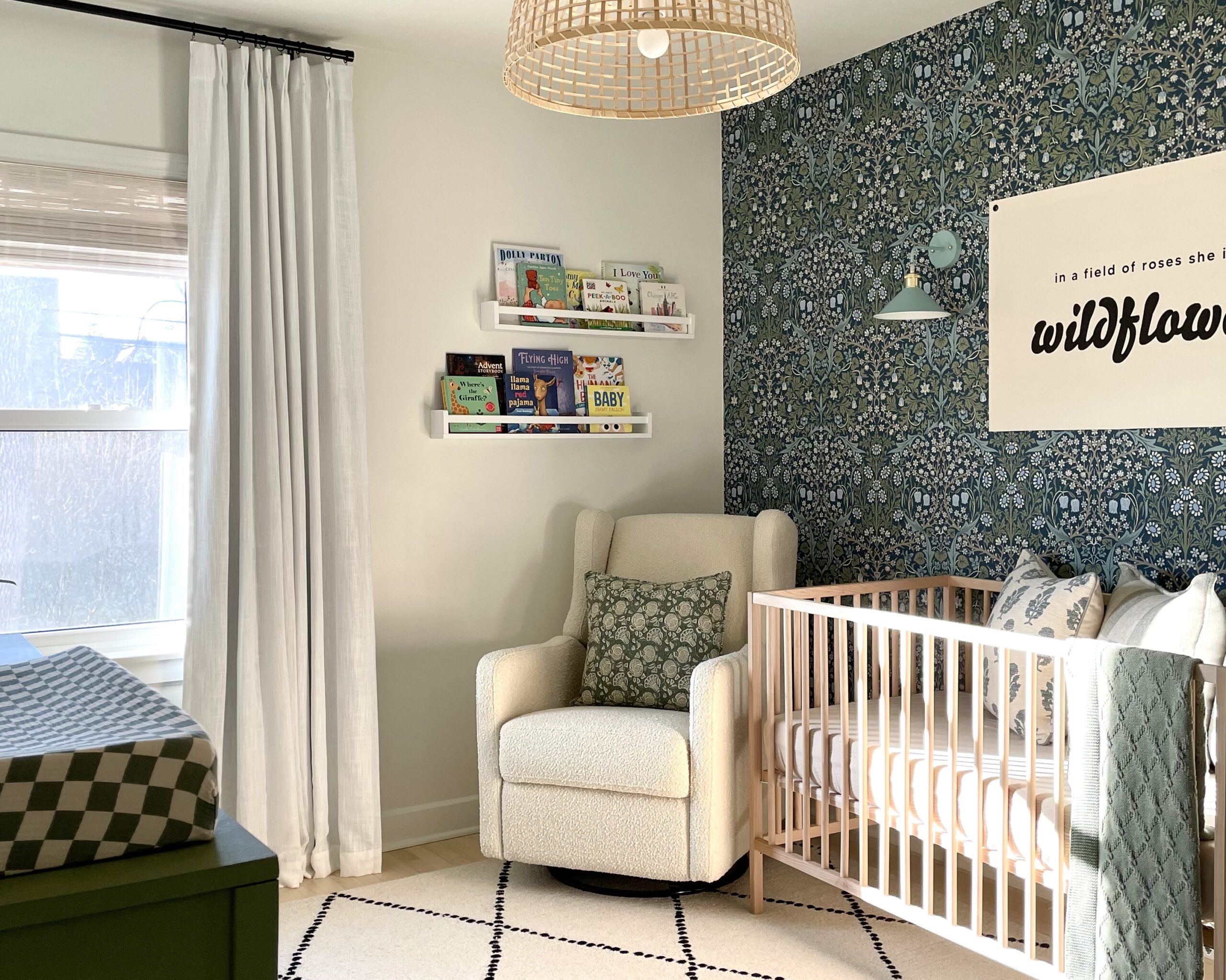
We are big fans of Helmsie Baby as you can see in our shop, so when Residents Understood shared this gorgeous green nursery design with us, which uses wallpaper designed by Helmsie for Hygge & West, we jumped at the chance to share it with you. In our opinion, green can be a tough color to get right, but boy, oh boy has Residents Understood got it just right. We are loving everything about this green nursery from the dreamy wallpaper to the family heirloom lovingly incorporated. Designer Kiera Kushlan is sharing the details with us below. Thank you, Kiera!
What inspired this nursery?
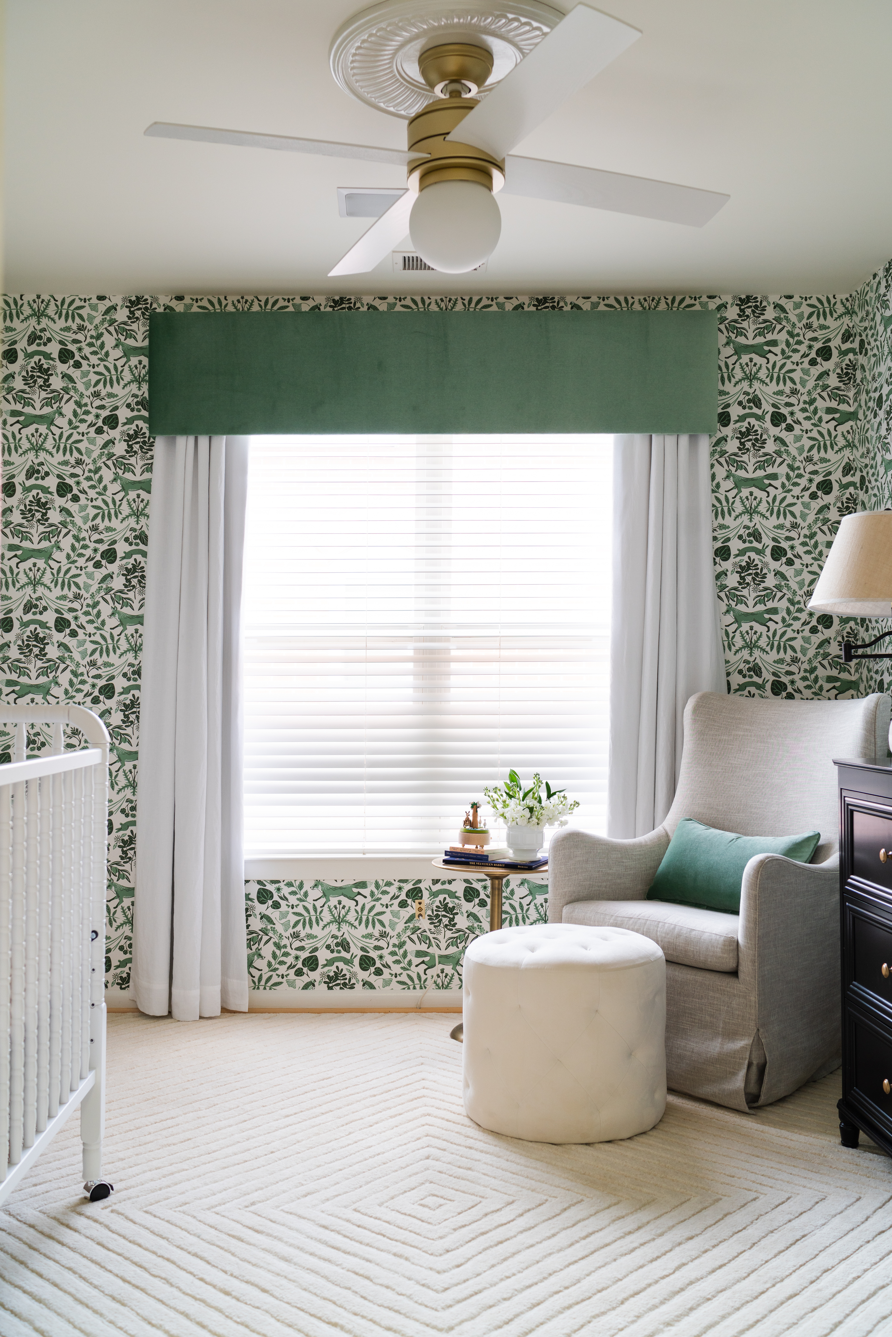
After meeting the DC couple having their first child, we knew we wanted a touch of whimsy without feeling too themey. The Hygge & West wallpaper was our jumping off point for a splash of color and a nod to child-like wonder. From there, we wanted to layer lighter tones and textural pieces to create a serene haven for the new family.
What do you love most about the finished space?
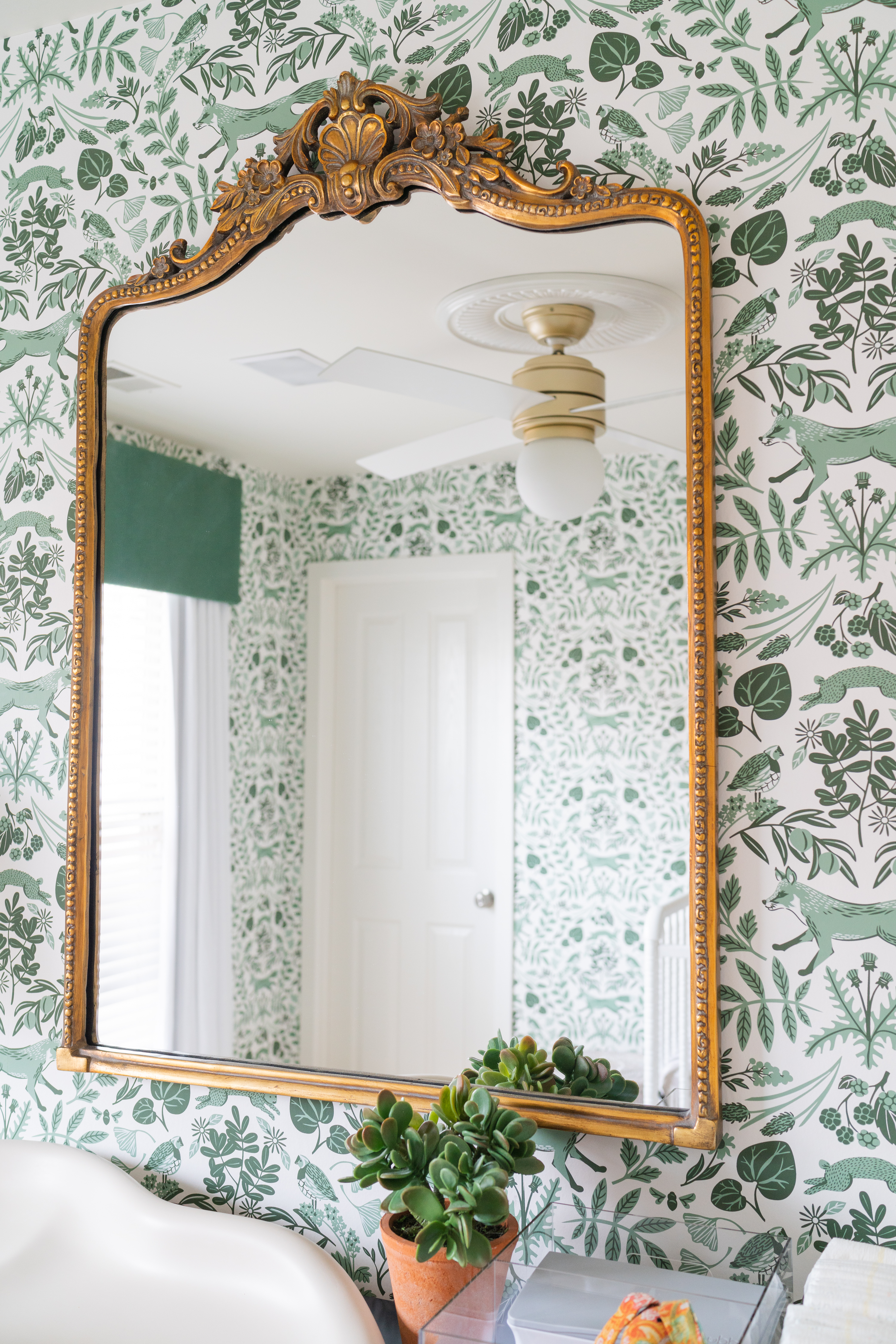
We love the balance of tranquility and child-like whimsy in the space. Soft neutrals and the distressed black dresser offset the more playful energy of the wallpaper.
Did the parents have any specific requests that you had to incorporate?
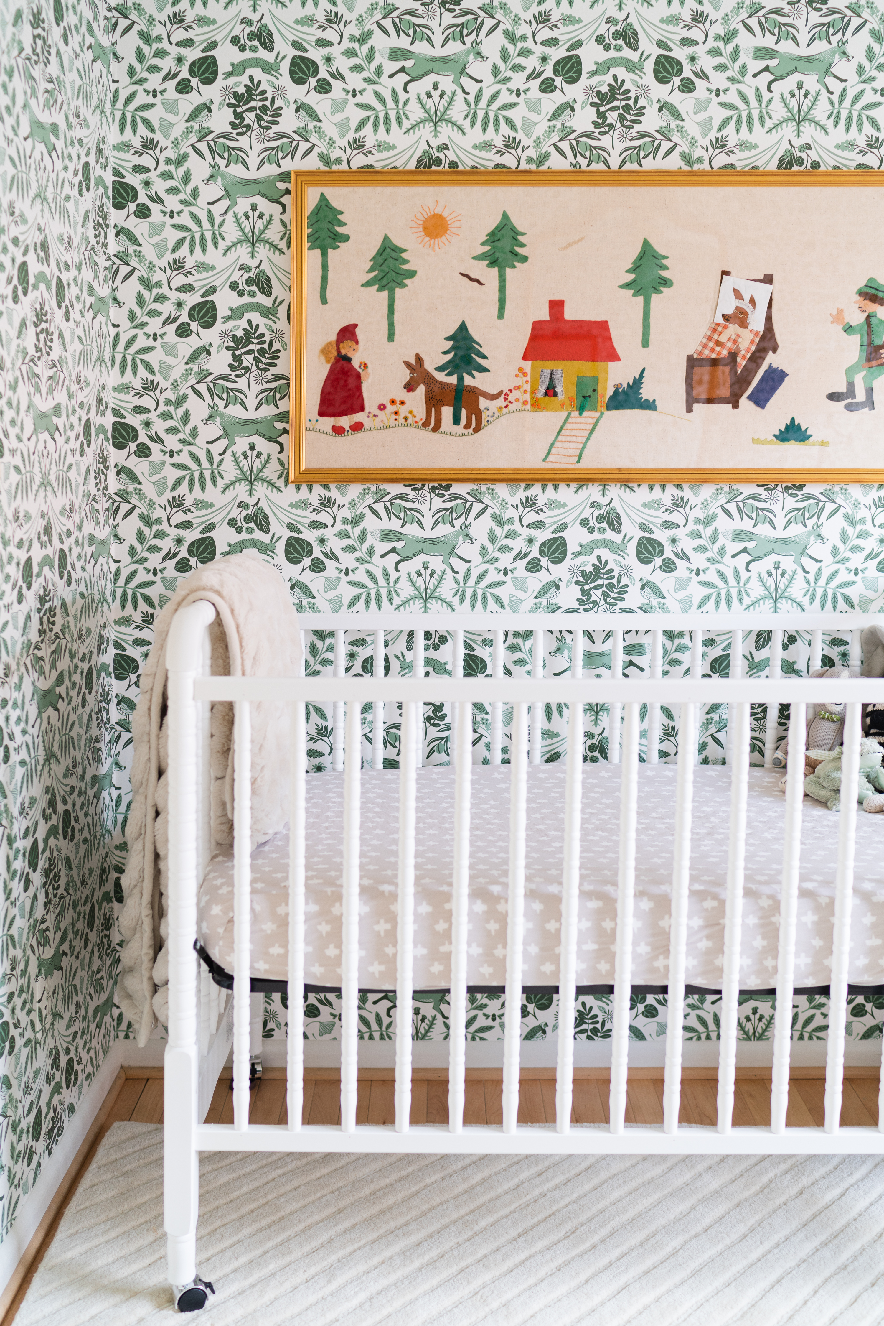
The client had a tapestry that his grandmother had hand-sewn and had been passed down. We had it custom framed in brass and used it as jumping off point for color tones to incorporate into the space.
What’s your advice for parents starting a nursery design of their own?
Nurseries are a great place to mix price points. We splurged on the custom valance with Schumacher fabric and saved on the standard Pottery Barn drapery below. We splurged on a comfy Room & Board glider knowing Mom and Dad would be spending many hours here and saved on the Target ottoman and other small accessories.
 Glider | Ottoman (similar) | Changing Pad
What are your tips for incorporating current trends in a nursery space?
We love incorporating current trends because nurseries are spaces that are inherently temporary. So we encourage clients to use things they really love in a nursery even if it might not be something they would try in the rest of their home. You can experiment and push yourself in a nursery design and go with timeless concepts in your larger living spaces.

Were there any design challenges that you had to overcome?
Black in a nursery seems a bit harsh in theory; softer tones feel more natural when creating a baby’s space. Once the room is put together, you see that black used sparingly has a punchy, highlighting effect and elevates the room overall.
Photography by Bonnie Sen
*this post contains affiliate links*




Comments
Tammy jordan
Would you be able to share where the rug is from? Would really appreciate it!