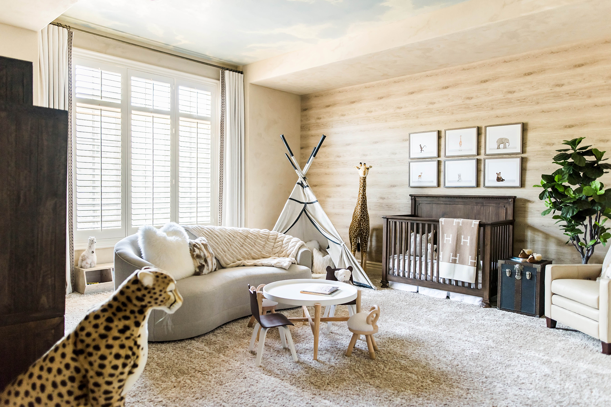
When Stephanie, of Rockabye Mommy, reached out with news of her latest safari nursery design, we jumped at the chance to share it with you all. Stephanie never fails to impress us with her beautiful and cohesive designs. This neutral safari nursery really has it all—multiple play places, a cozy snuggling spot, plenty of seating and storage to boot! While you may not have a large enough nursery to pull off all the elements in this space, there is a plenty of inspiration for the nursery or even your playroom here. Thank you, Stephanie, for sharing this lovely nursery with us. We can’t wait to see what you pull off next!
What was the jumping off point for the nursery?
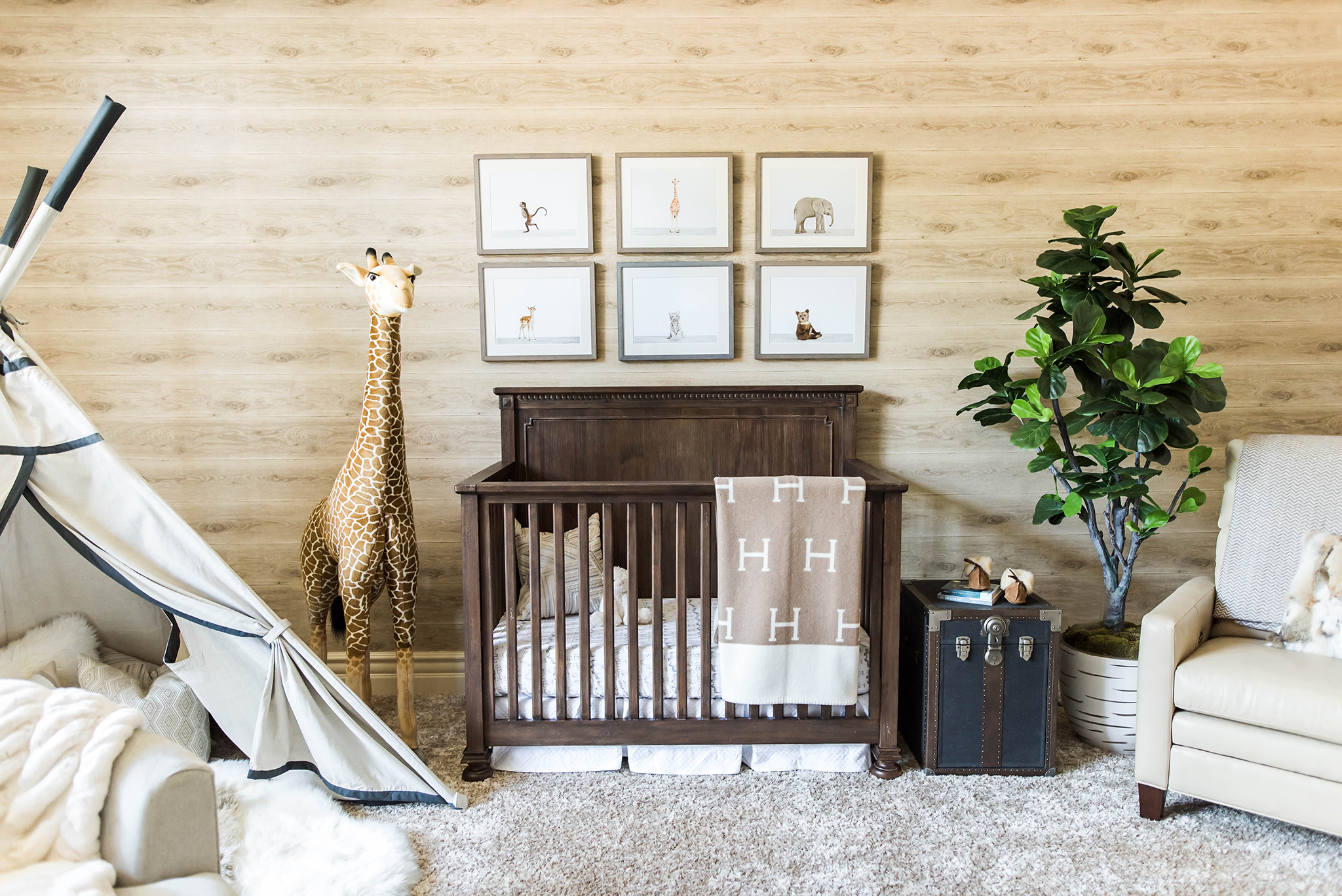
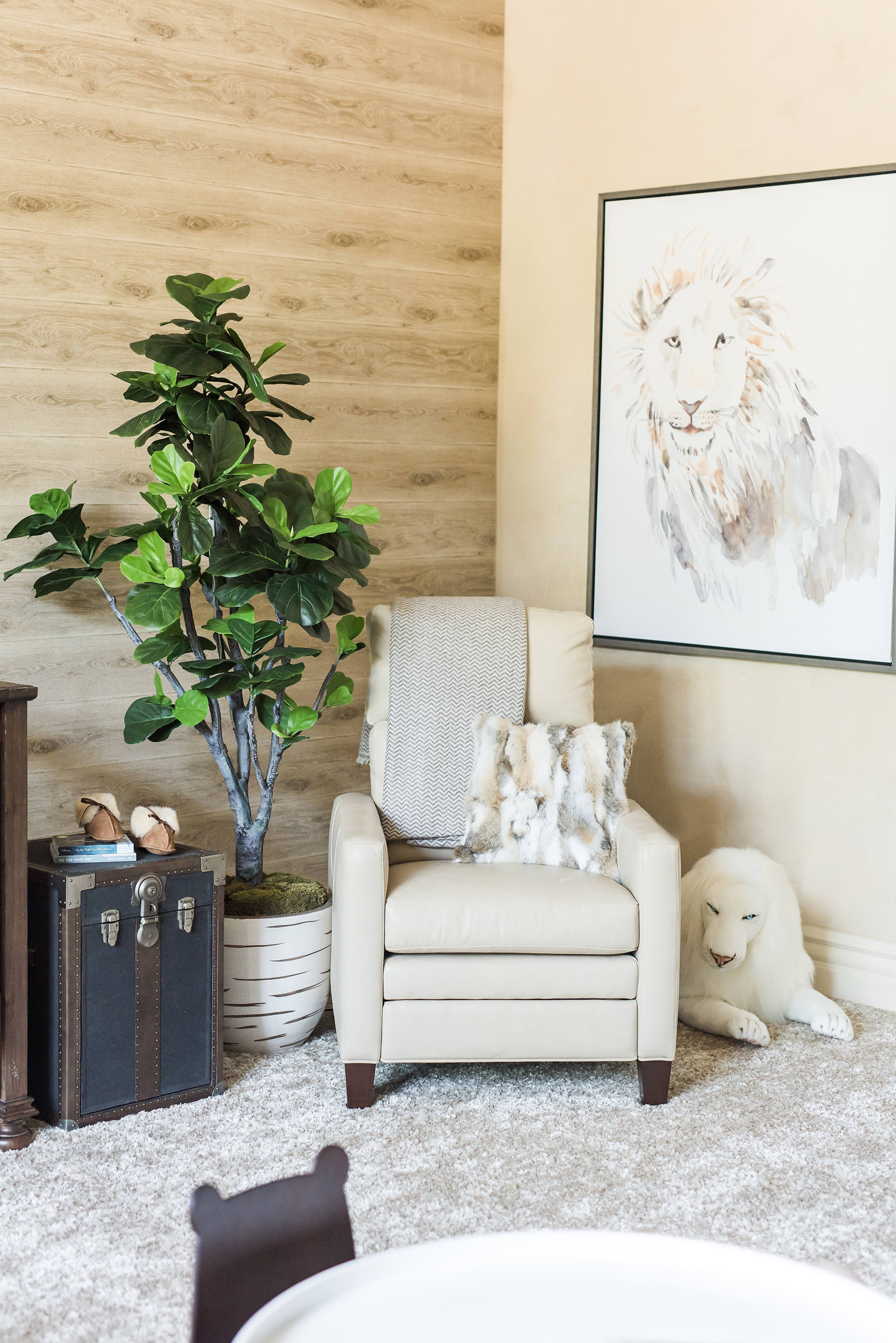
This was the second nursery that I designed for this client. Their first nursery was completed just over a year ago, but they were moving into a new home and were excited for this new space. I thought it would be a quick transfer of all of their furnishings, which were pretty much brand new and maybe come up with a new concept for their wall mural. Instead, they wanted a completely new look. Although they loved their previous Peter Rabbit nursery, they wanted a warmer color palette this time. So I started off with a warm beige, neutral color palette with a vision of plush, cozy fabrics, blankets, pillows and a texture on the walls.

Did the couple have specific requests?
They specifically wanted warmer tones and wood plank wallpaper incorporated somehow into the design, but allowed me to run with the rest of it.
We love the idea of a more elaborate sitting area in a nursery when space allows. Tell us some of the other ways you worked with the challenge/benefit of a very large nursery space.
Larger spaces are always nice but can be challenging when working on the layout and how best to fill it without leaving any unused space. When I first stepped into this particular space I was drawn to the center of the room right away. I think this was because there is an inclusive feeling at the center, rather than feeling off to one side of the room and distant. I knew that centrally locating a seating area for conversation, relaxing and watching their son play would make this room most comfortable and functional.
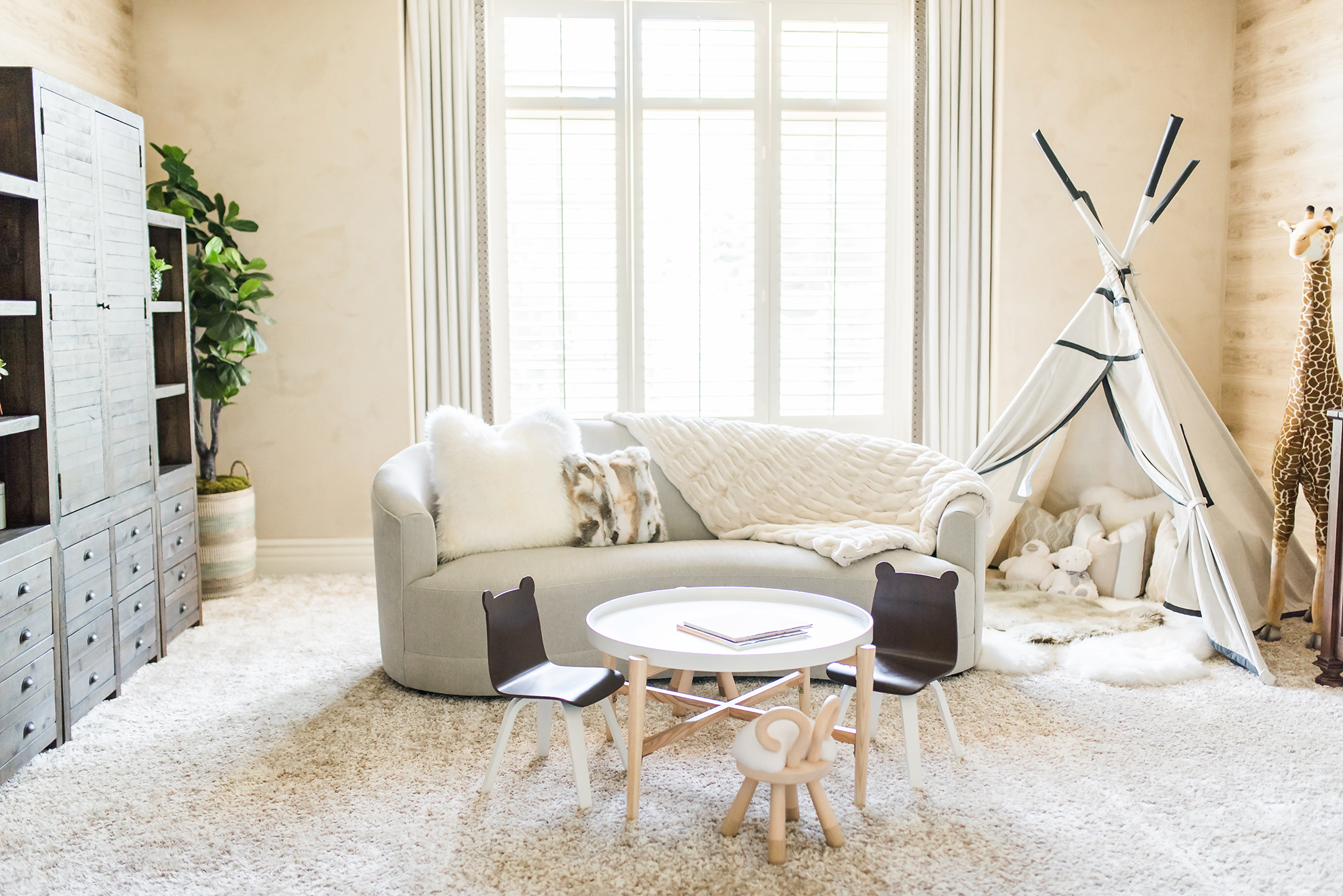
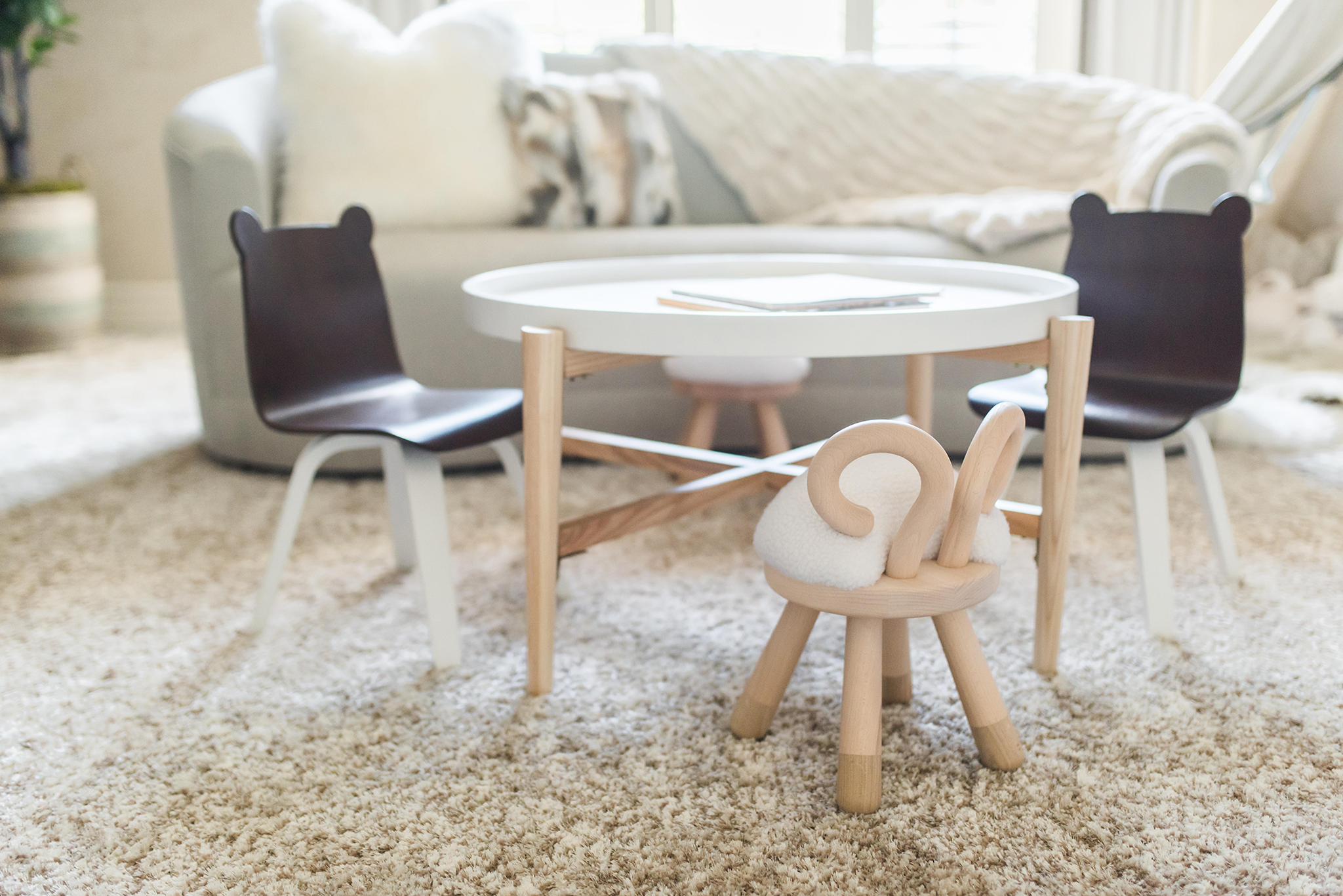
If I think back on previous nurseries that were large, I realize that I have used a play table at the center in all of them. It’s a great way to draw the activity and focus to the center of the room. I’m a big advocate of creative seating areas so if the layout allows, also consider a daybed or sofa bed for extra seating or overnight guests that may be willing to stay and give you a few hours of alone time.
What did the couple love most about the finished product?
They loved the warmth and the layout that allowed this space to be a dual nursery and playroom for their son. In one of the most recent messages from my client, she said, “I really do love it! It feels so cozy and I’m obsessed with the soft neutral colors! Once again you nailed it!”
How about you?
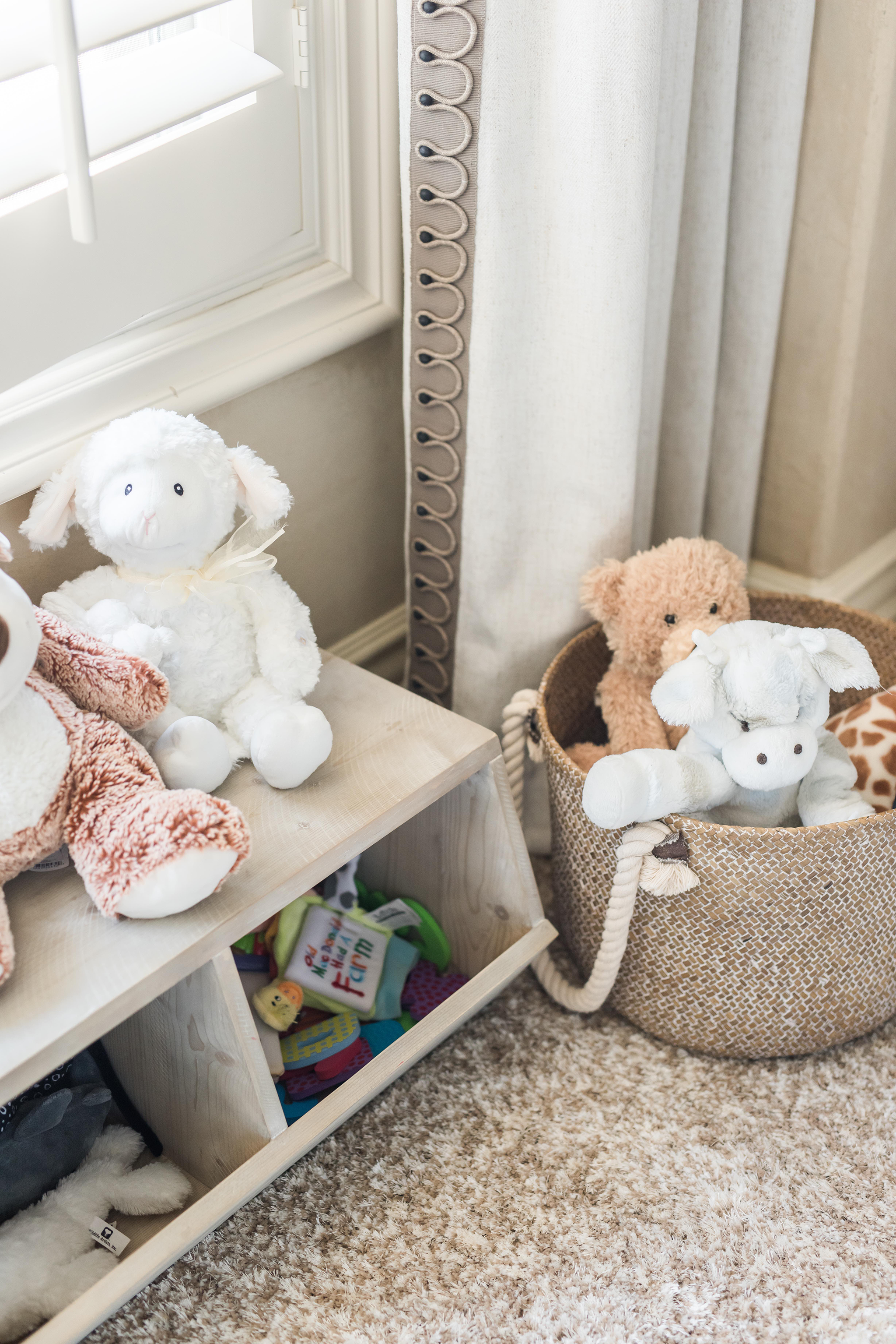
There are so many details that I love about this room from the fun teepee play area to the large plush animals sprinkled around the room. I think what stands out for me most is the ability for mom and dad to sit comfortably at the center of this space on a gorgeous comfy sofa and watch their son play in a room that he will undoubtedly be able to grow into for years to come.
What design advice can you give to parents about designing their nursery big or small?
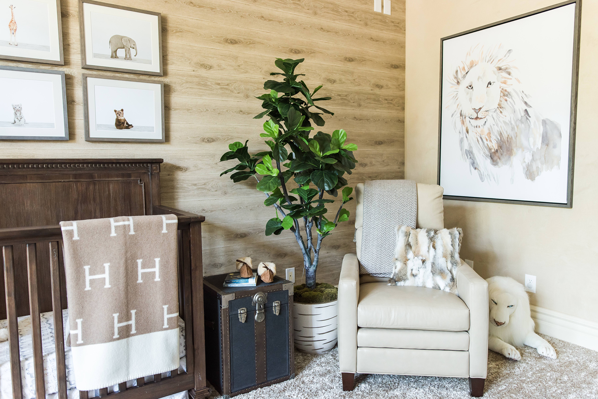
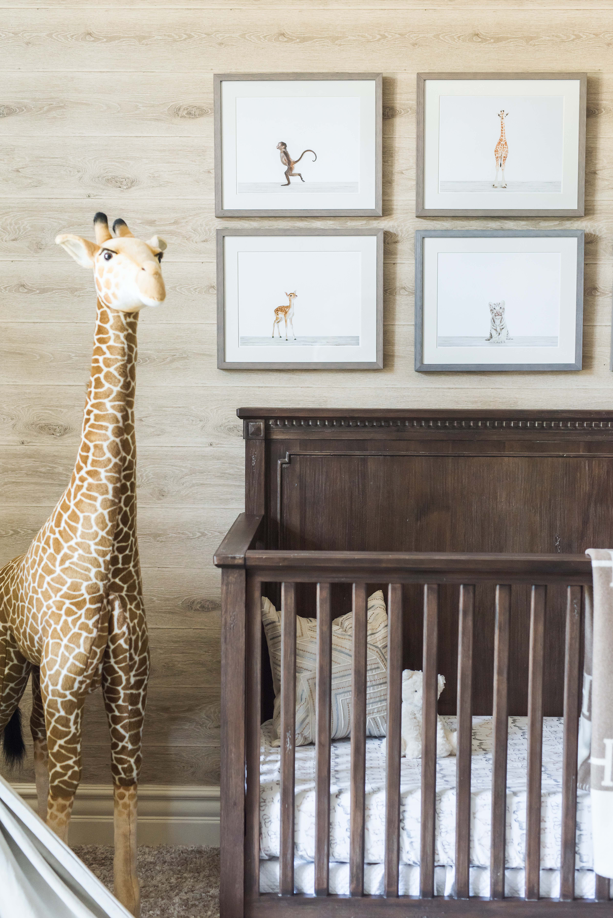
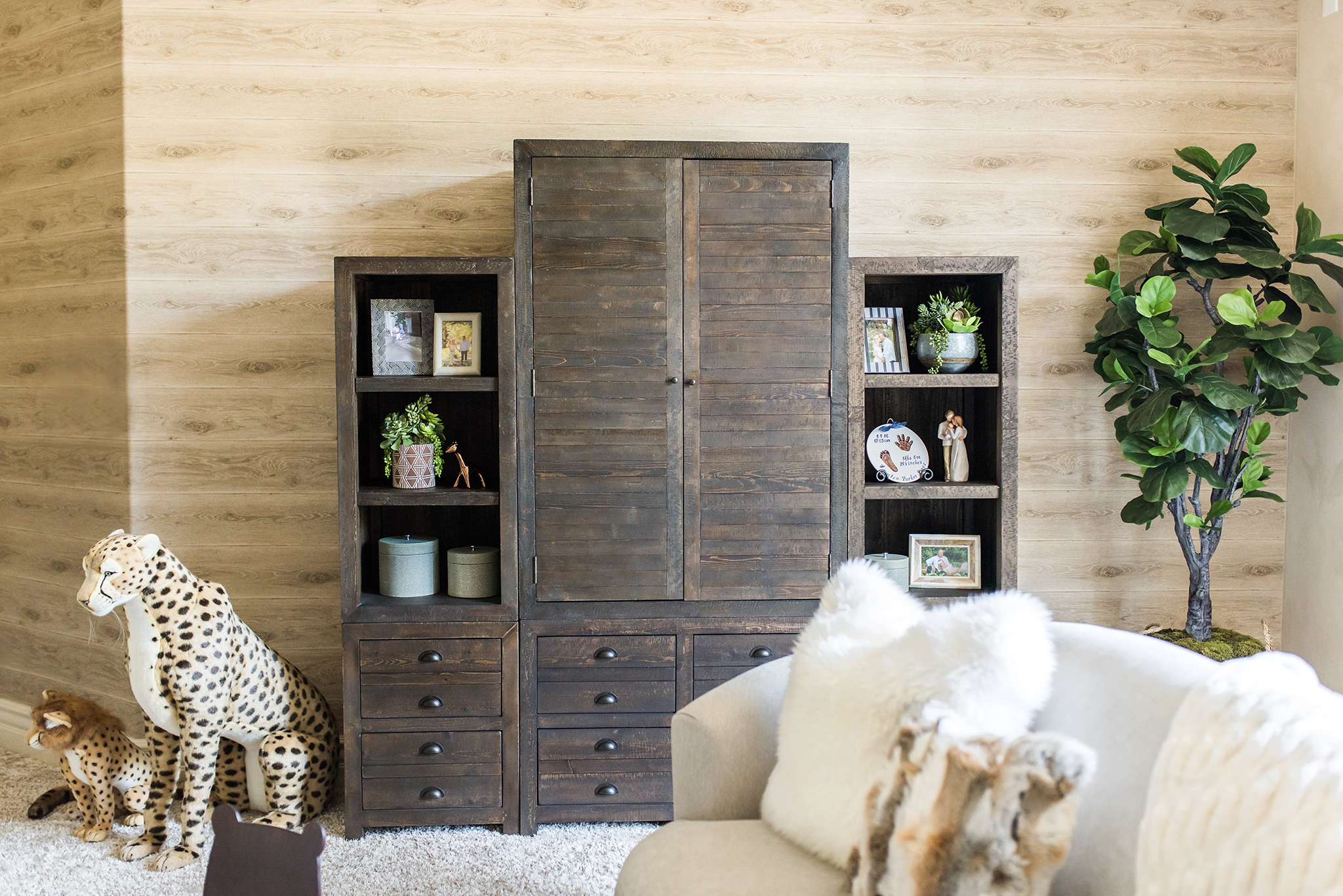
After determining your style and color palette, be sure to choose items that are functional, safe and have longevity. I understand that there is a lot of time, effort and money spent on furnishing any space in your home so make sure that your efforts and results are not only pretty, but work for the needs of your family and occupant of that space. For example, the crib chosen in my Safari Chic nursery was selected with upcoming years in mind. It converts to a toddler bed and then a full size bed. The steamer side table next to the crib opens up providing a storage space where we placed their books. The recliner for mom has a motorized function for reclining and lifting the leg rest for maximum comfort. Instead of a changing table, we opted for a storage unit that they will be able to utilize for years to come.
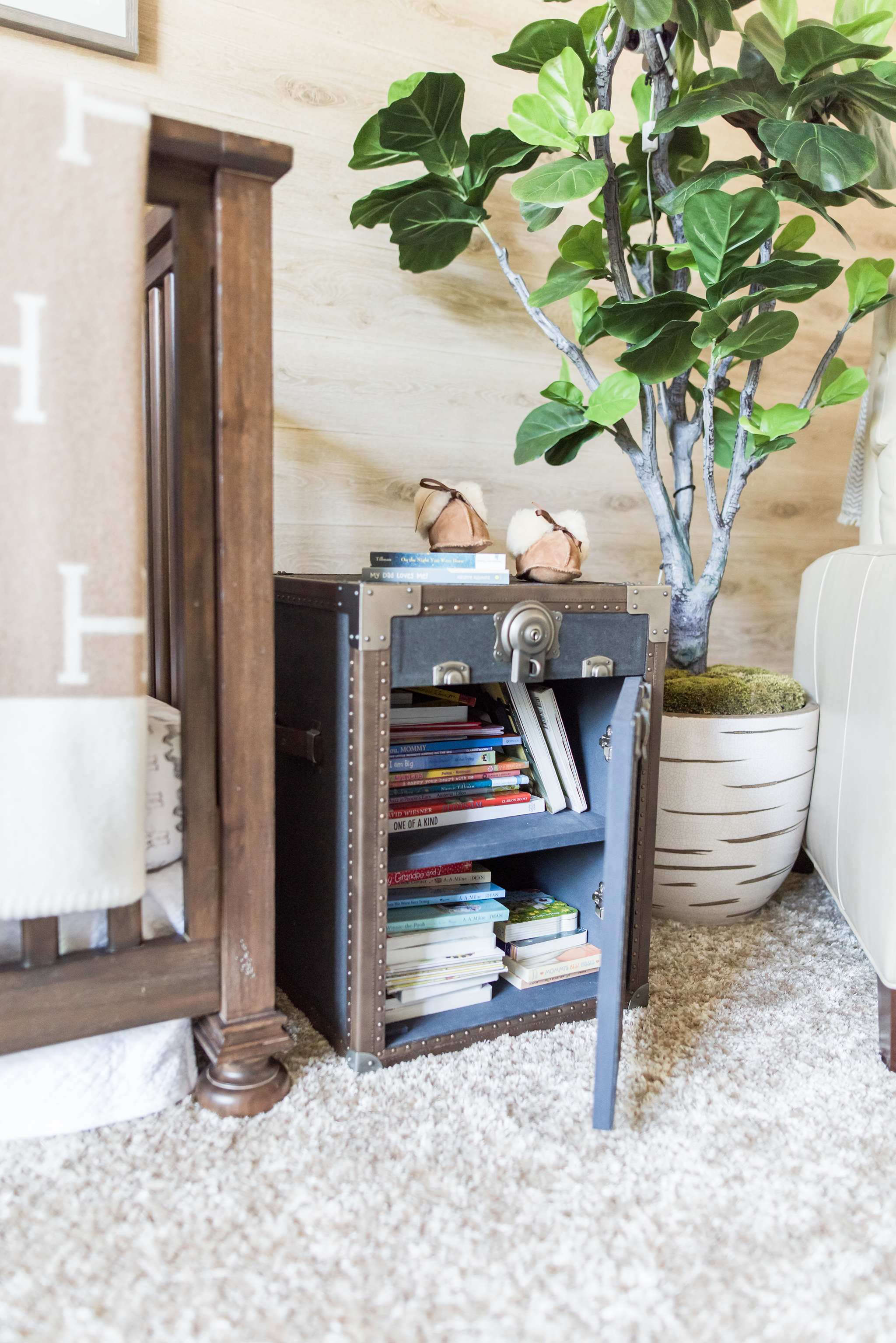
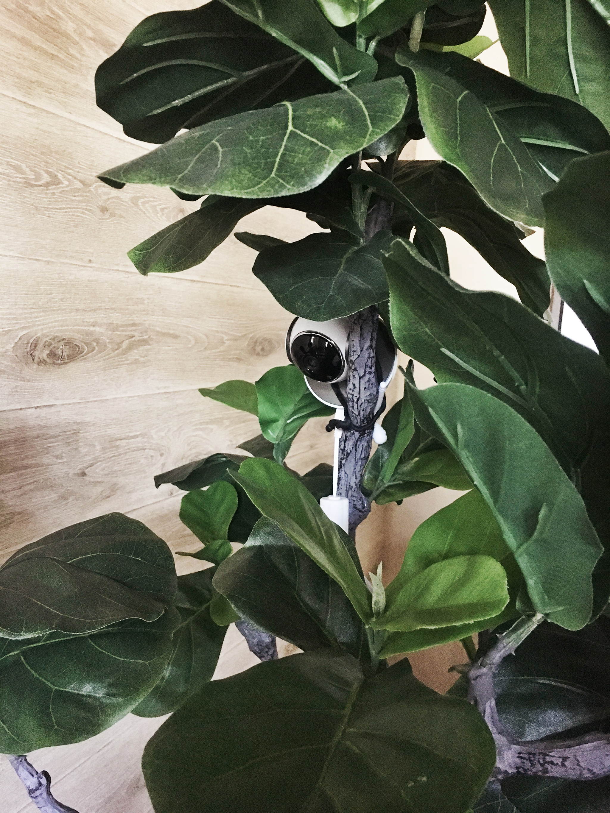
A behind the scenes fun fact: On installation day my client cleverly attached their baby monitor to one of the branches of the floor plant next to the crib. It was so well hidden that no one would even notice it was there. Rather than mounting it onto the crib wall, making holes in the wallpaper and seeing the dangling white cord, she was able to secure it to the tree at a height perfect for viewing their little guy yet keeping it hidden. Genius!
Images by Alexis Alana Photography



Comments
Marissa
love this! where is the crib from?????
Diana
Absolutely love the crib and furniture in this nursery! Where is it from??
Sara Miranda
Where is the wallpaper from? Thank you!
Colleen
Where is the wallpaper and what paint did you use?!