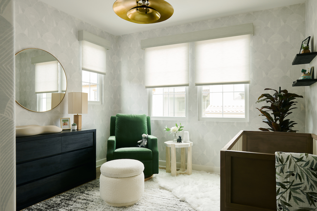
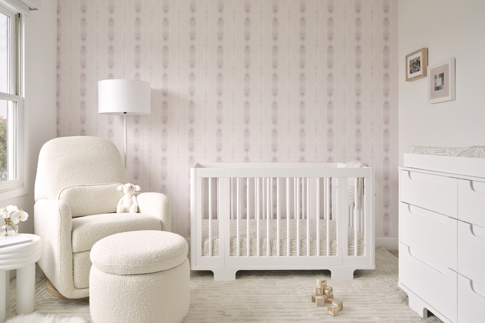
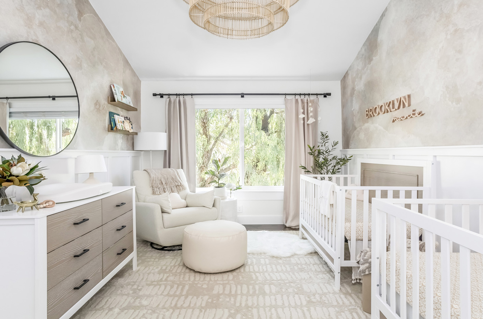
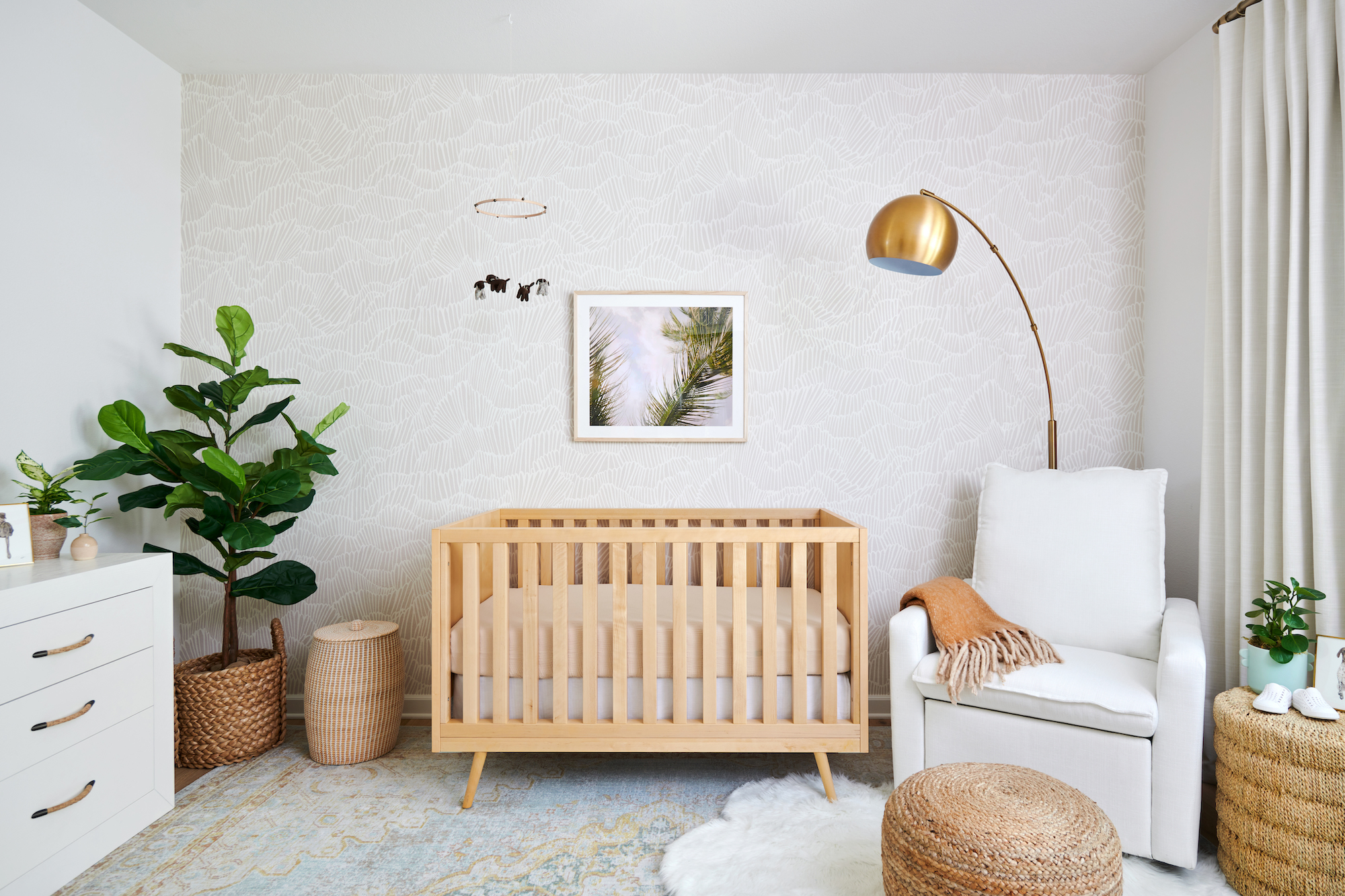
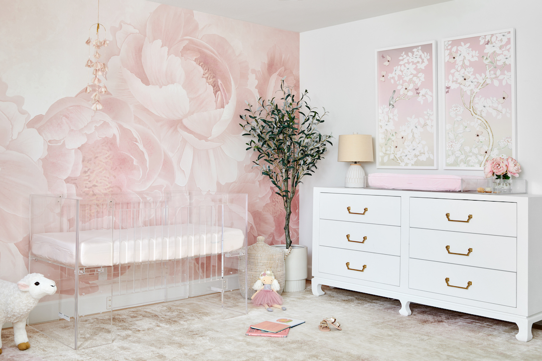
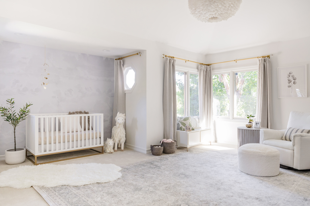
It’s been several weeks now since the launch of Pottery Barn’s new Modern Baby line, and I still feel inspired by the sleek new pieces. I put together a nursery design board with some of my favorites. At first glance, the line is very tailored and minimalistic in scope, but I was able to design the entire space from just the new Modern Baby line (except the plants, which are all from West Elm). This definitely has a curated feel, but there are enough options to create a design in lots of different styles.
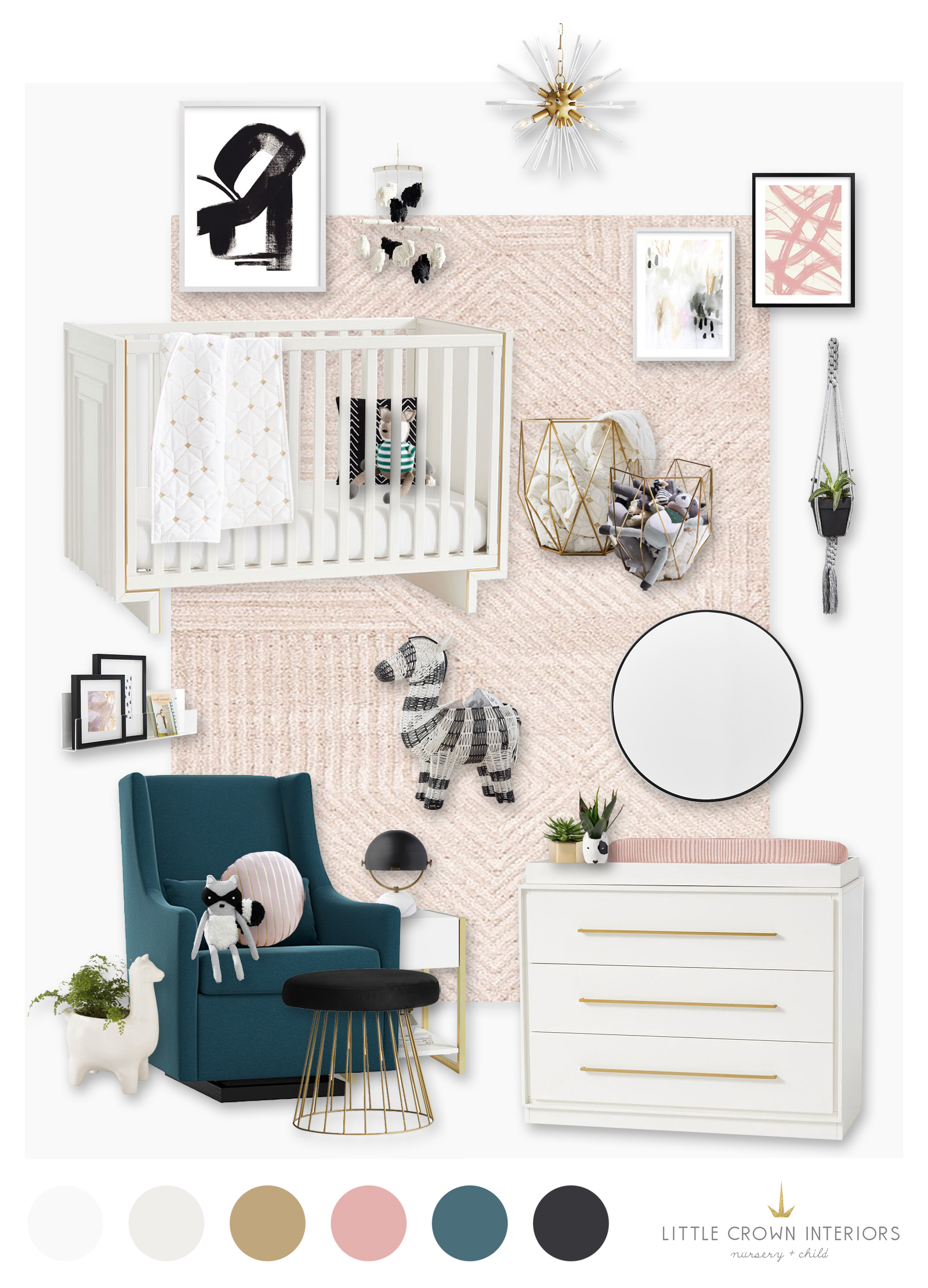
One of the line’s main color schemes is black and white, which I would imagine is influenced by the success of the Emily & Meritt line for Pottery Barn Kids. But they also have these gorgeous accents of blush, gold and even teal, which I absolutely love. The glider in that teal fabric is gorgeous!
Design Board Sources: Crib | Dresser | Glider | Ottoman | Chandelier | Mirror | Rug | Side Table | Table Lamp | Black & White Art | Pink Abstract Art | Pastel Abstract Art | Acrylic Shelf | Zebra Bin | Round Pillow | Black Pillow | Metal Baskets | Sheep Mobile | Quilt | Changing Pad Cover | Raccoon Doll
SaveSave
SaveSave
SaveSave
SaveSave


