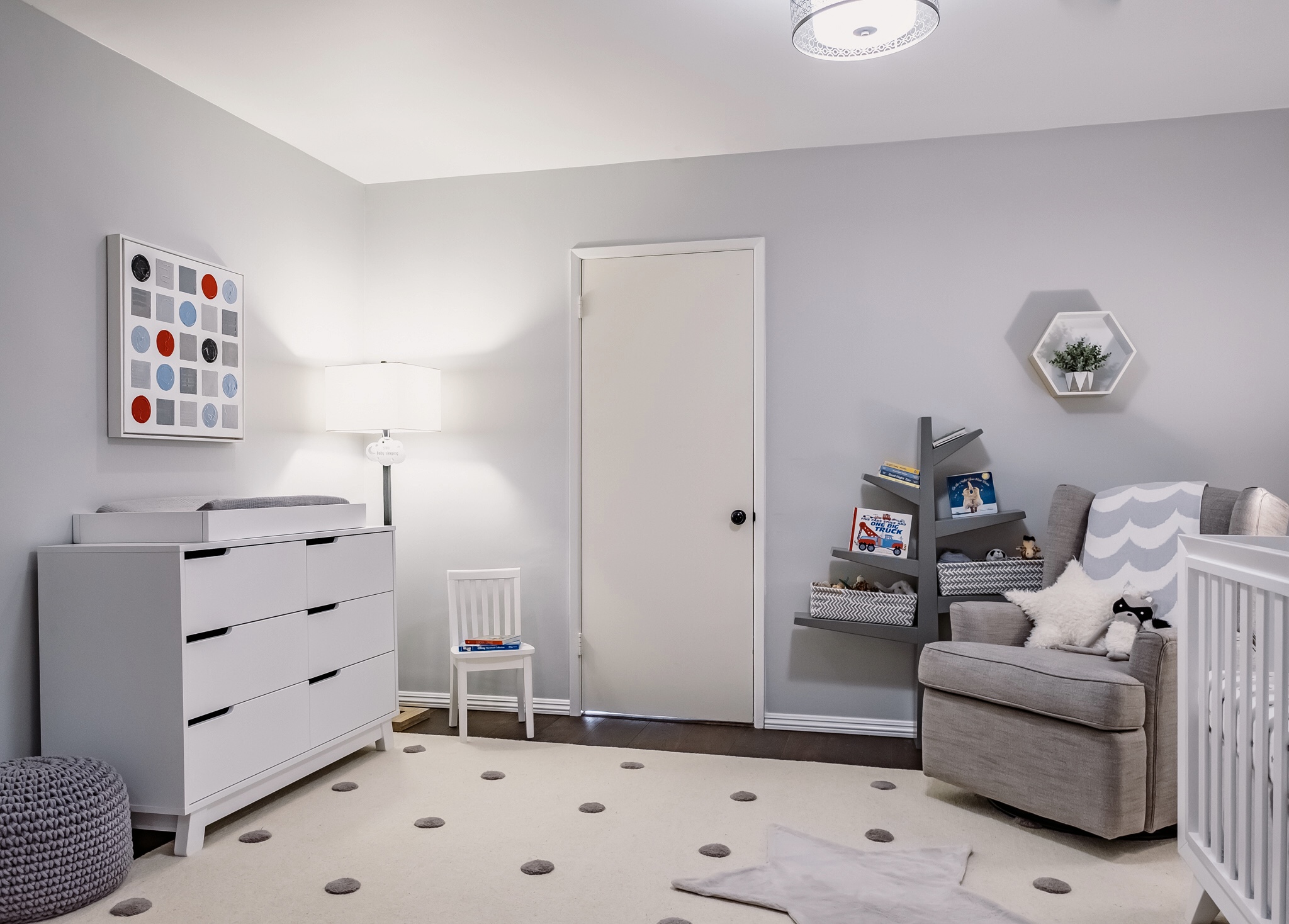
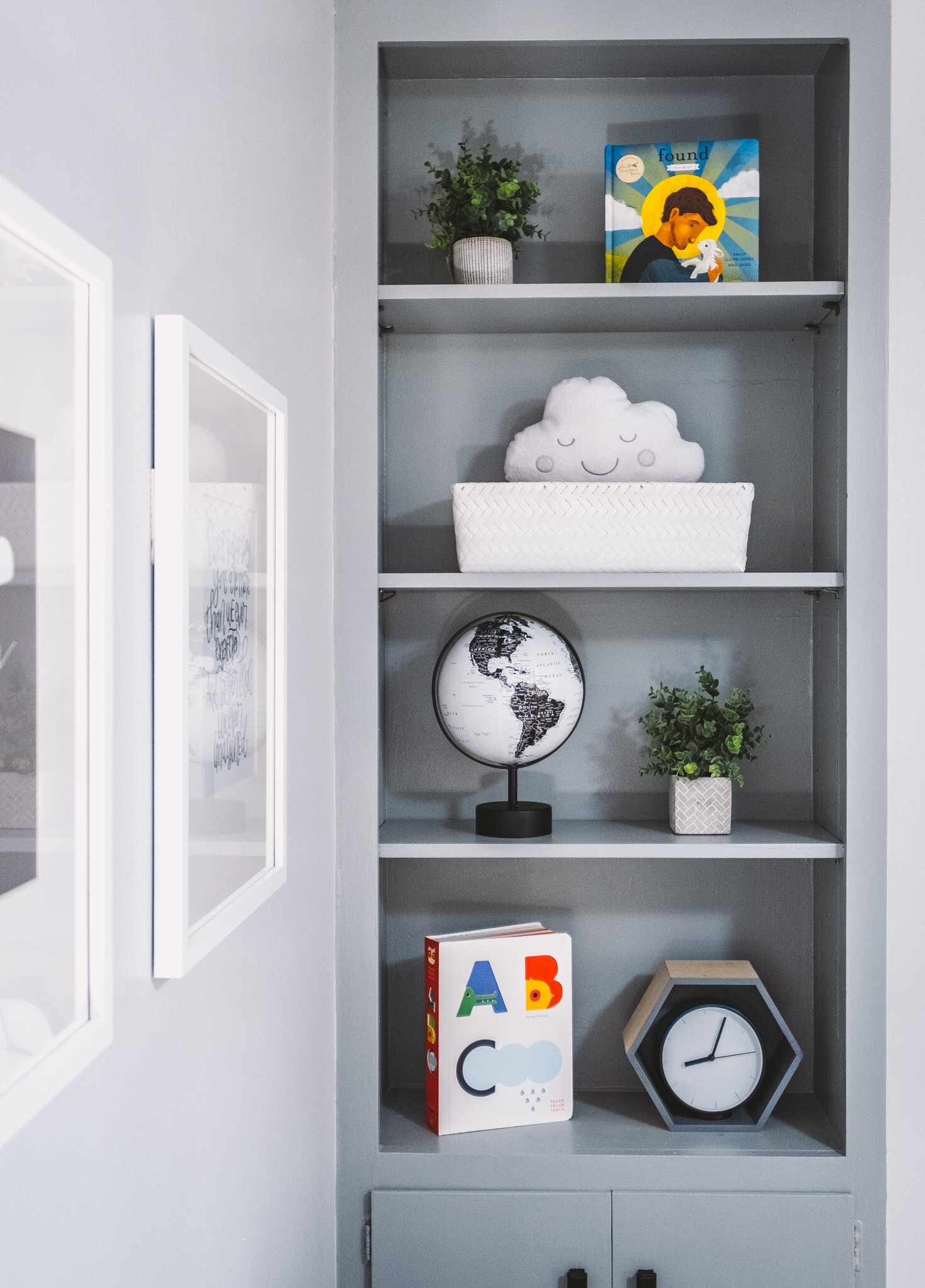
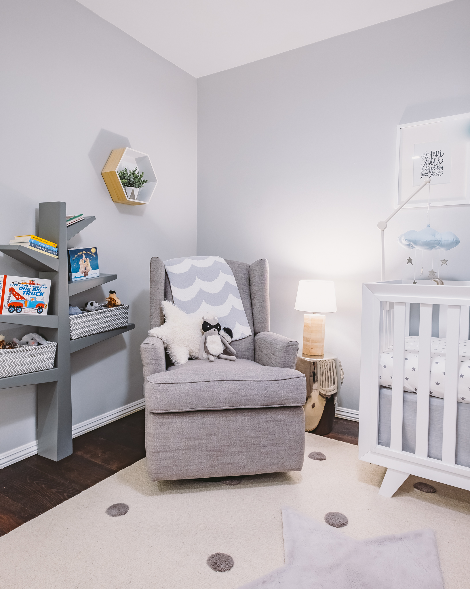
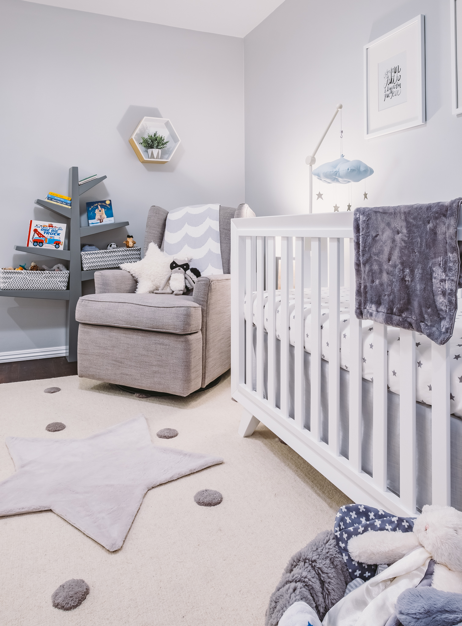
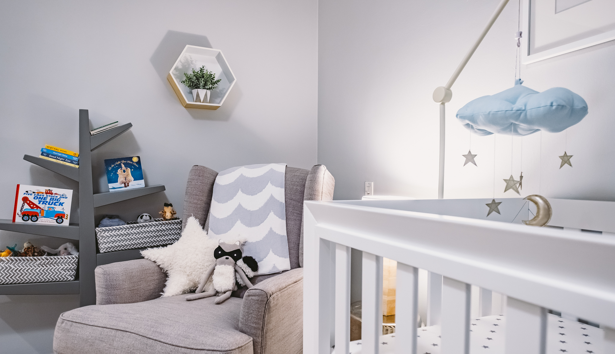
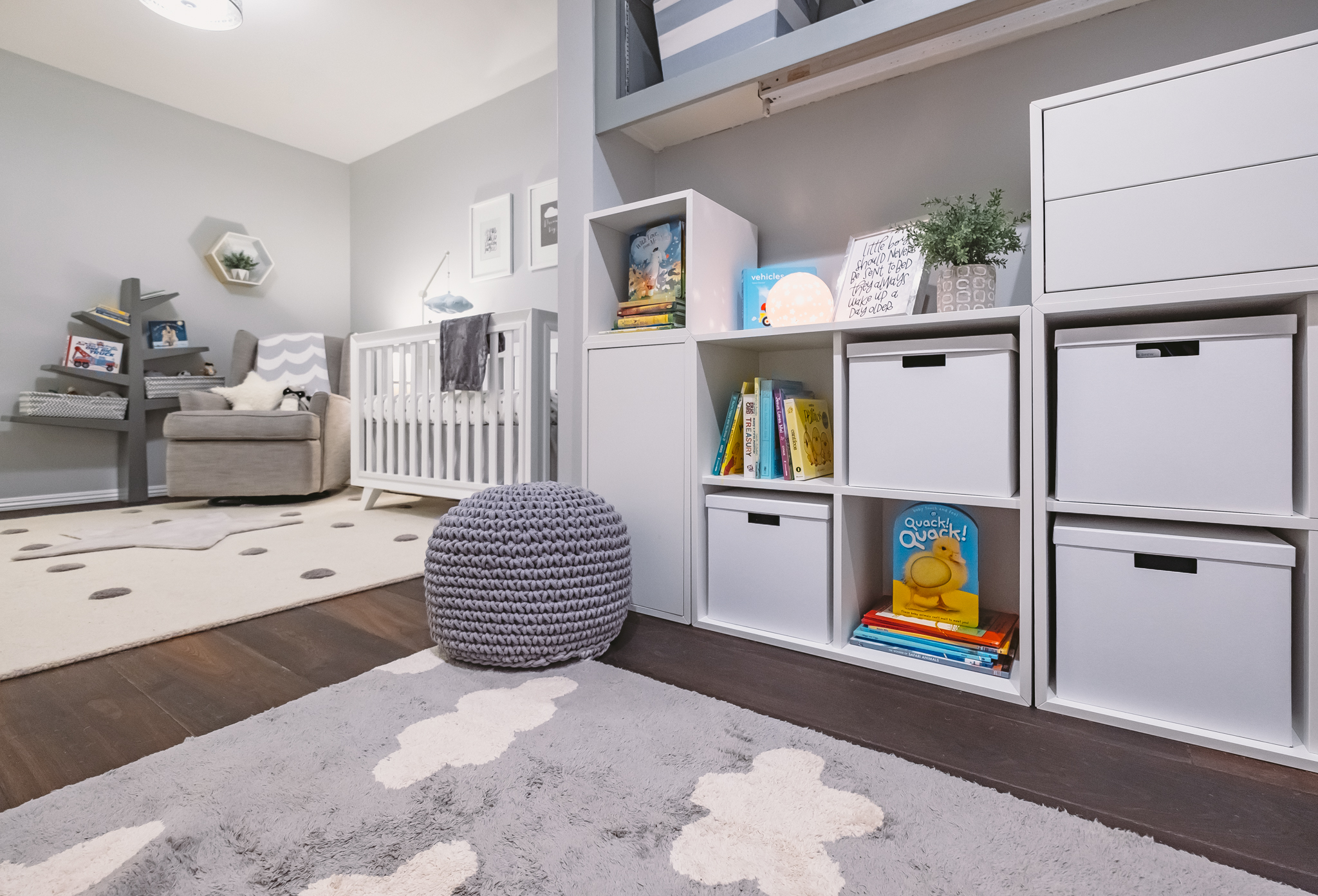
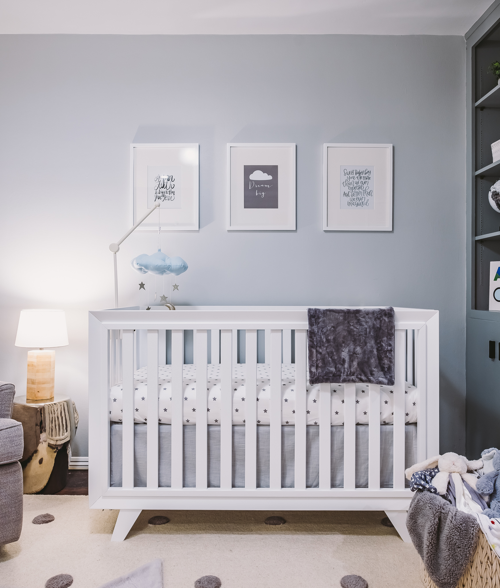
We’re so excited to tell you about this special nursery that we’ve been keeping under wraps (hint: you may have caught a glimpse of it over on People.com). Today we’re touring the nursery of American Idol winner Jordin Sparks! Not only that, but we’ve got the behind-the-scenes scoop directly from the nursery designer (and Jordin’s cousin!) herself—Laura Wiedmann of Laura Wiedmann Interior Design. She’s graciously sharing these gorgeous pictures and all the details of the space! We are beyond thrilled that Jordin and Laura fell in love with so many items from The Project Nursery Shop. See if you can spot them all, and click the links to shop them and other items for yourself! Thank you to Laura for sharing with us, and congrats to Jordin and Dana on your adorable new addition of DJ!
Design inspiration can come from anywhere—what inspired the nursery design?
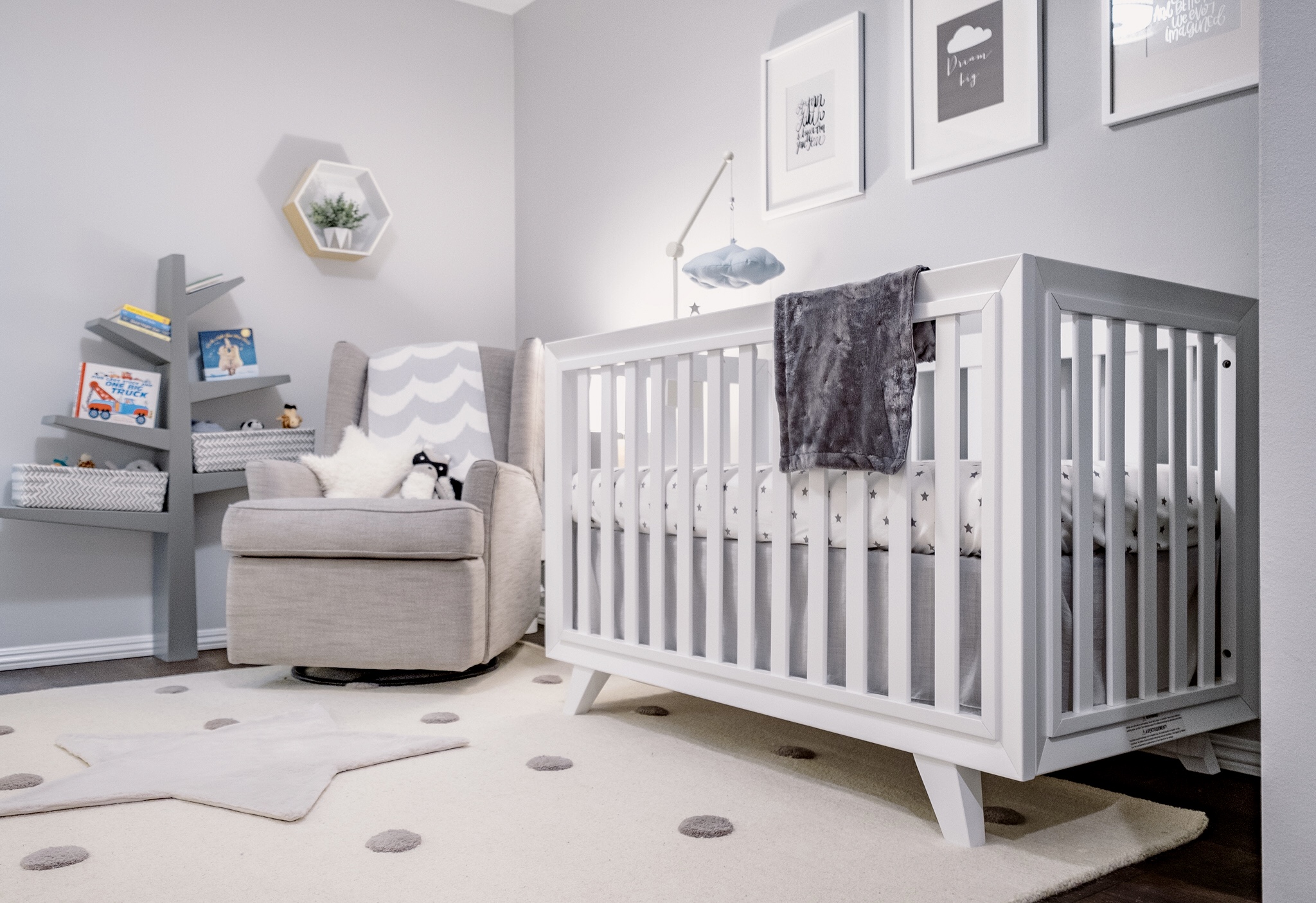
Jordin has always appreciated nature and animals, so I wanted to create a space that brought the outdoors in for a calming retreat for her and baby DJ. I knew she would want something very timeless and classic, so I used neutral hues with shapes like suns, moon and stars. Stuffed animals and books were used to accessorize, bringing color into the space and adding texture.
Did Jordin have any specific requests for the space?
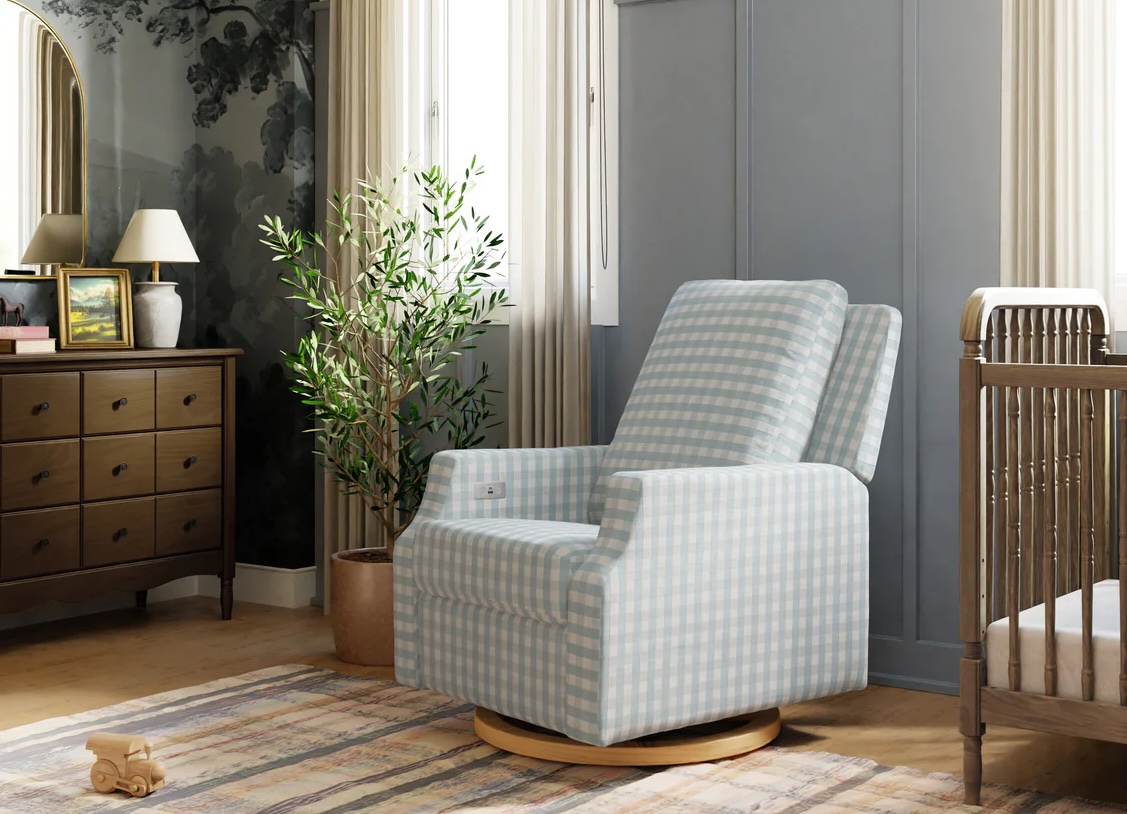
She wanted it to be relaxing and an escape. She asked that I find a nice recliner to glide and rock in. It was important that she had a place to rest and nurse the baby. She also insisted that the room have a lot of light coming in, and she wanted that to be dimmed down somehow—I found the perfect solution!
Did you have any challenges when designing the space? How did you overcome them?
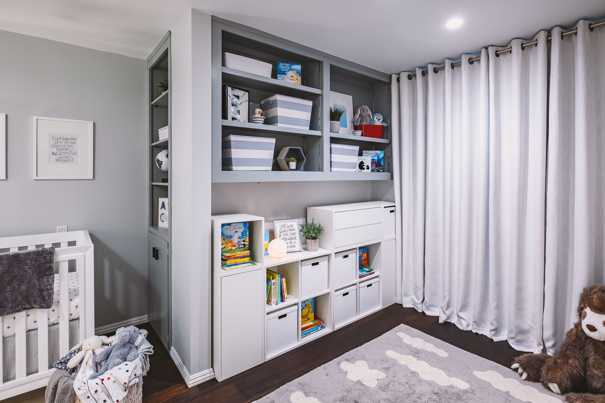
Because there was so much light flooding in the north window, I created a wall of blackout-lined draperies that cut the light out for optimal sleeping conditions. It also added a soft texture to the space using the natural fibers of linen and cotton. I feel drapery panels can really create a “warmth” in a design, and I knew that this would add a cozy element to the space.
Now that the room is complete, what do the parents love most about the space? And what do you love the most about the finished design?
Jordin and Dana love the fact that this design is a space that DJ can grow into. Jordin described the space as peaceful and serene. The color palette is soft, yet has a few punches to add some graphic elements and edge, which is a trademark of my design style. I like to play with femininity and masculinity in design—I believe it always shakes out in the end to create a well-balanced space. I love this room for its timeless quality and sophistication. I used many different textures with neutral tones and then built the color up through pops of red and blue in accents. This way they can transition to an alternative color palette as DJ grows. It is a design that is flexible.

What is the one thing that you would tell other parents to consider when they’re starting their own nursery design projects?
Have fun with the design! This is a moment to get a little crazy and incorporate a splash of whimsy. I feel that the stereotypical style would be to keep everything very light and quiet baby. Nursery design has come a long way, and it is okay to incorporate and mix more mature items and even adult furniture into the design. Pops of color with deeper tones can add dimension and depth to the design, creating a space that will provide more longevity as the child ages.
Photography by Kevin Sutton
*this post contains affiliate links*



Comments
Kasia
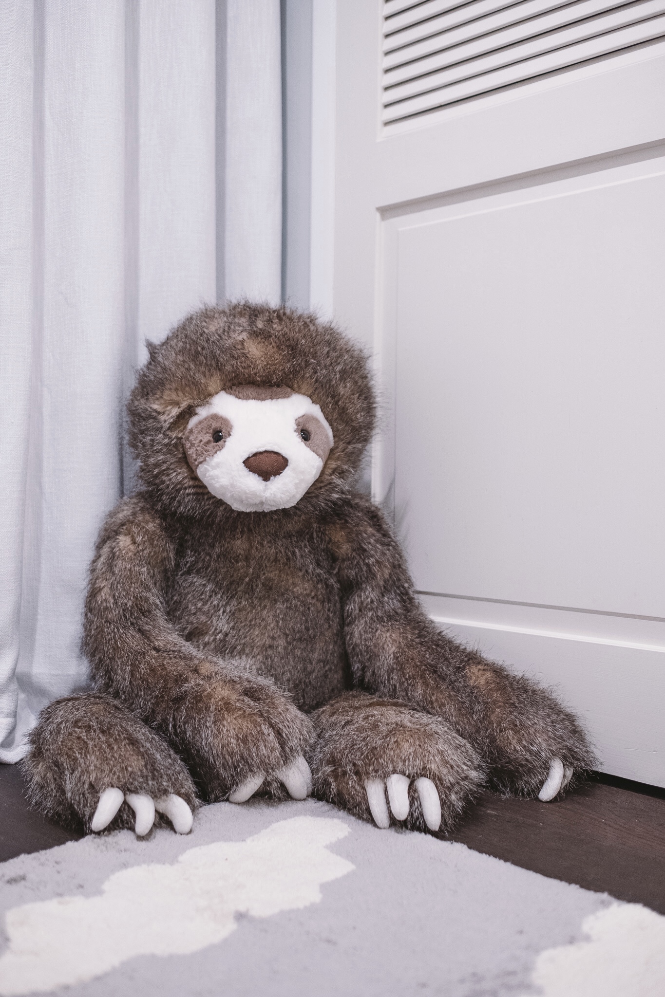
Love! Where is the sloth from I’m dying to know!!
Lindsey Clemen
So adorable! Where is this baby chair from/what is the name of it?
Terese Robinson
What is your paint color?
Jennifer
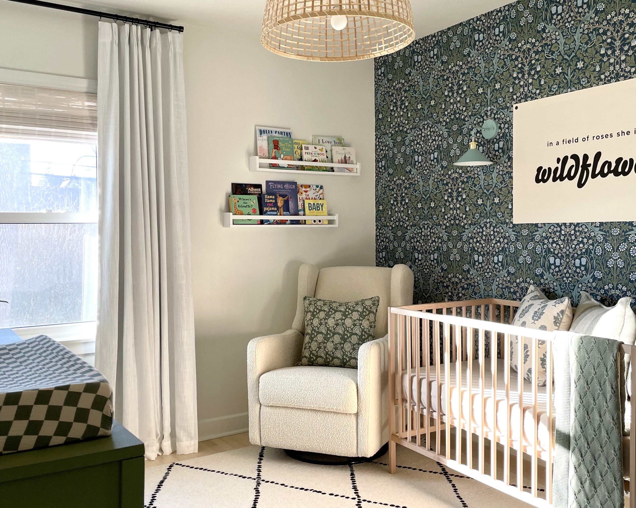
Where is the Glider from?