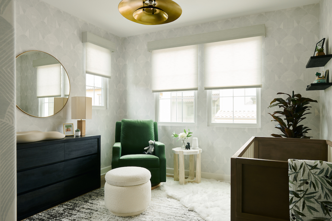
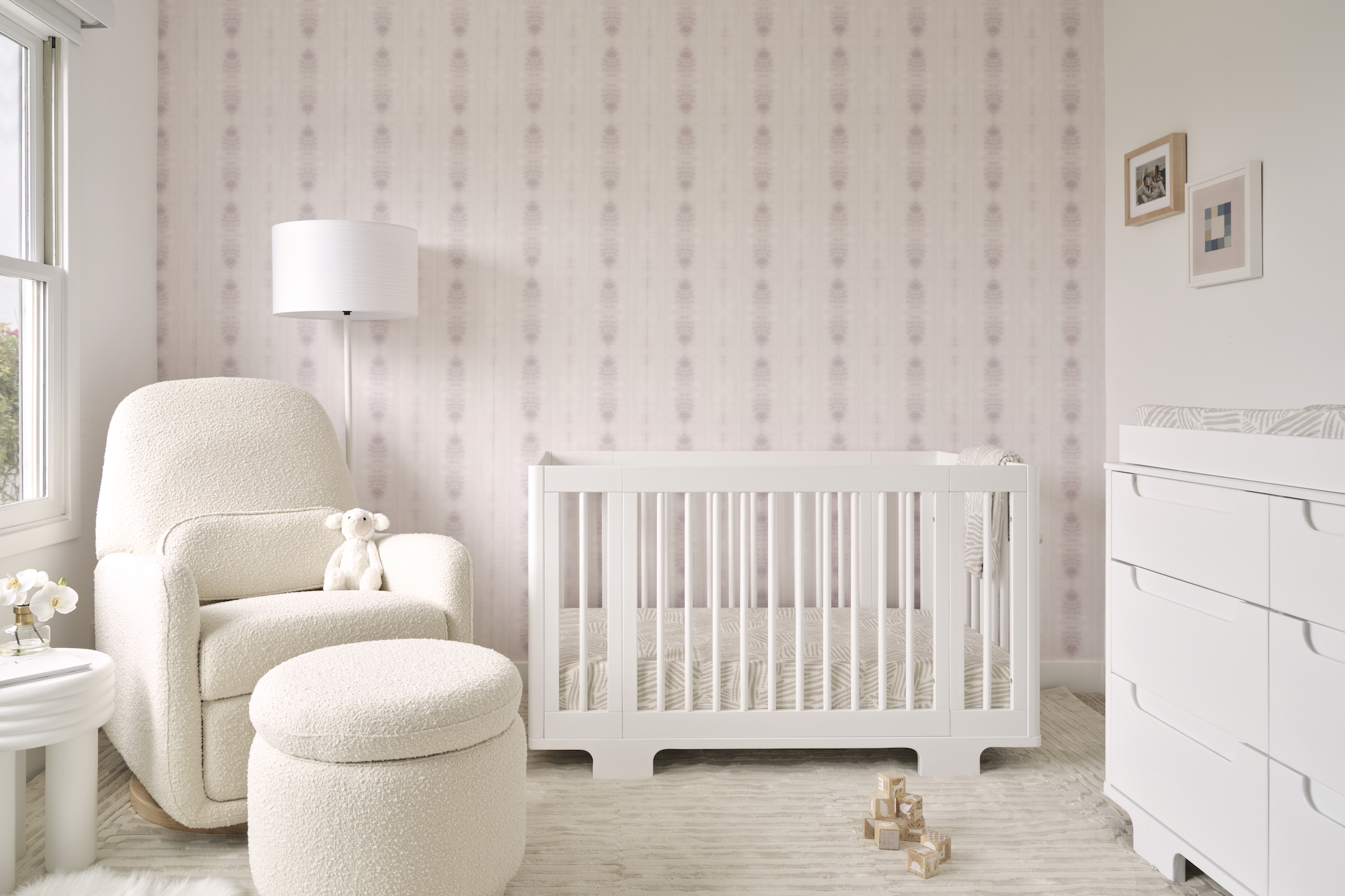
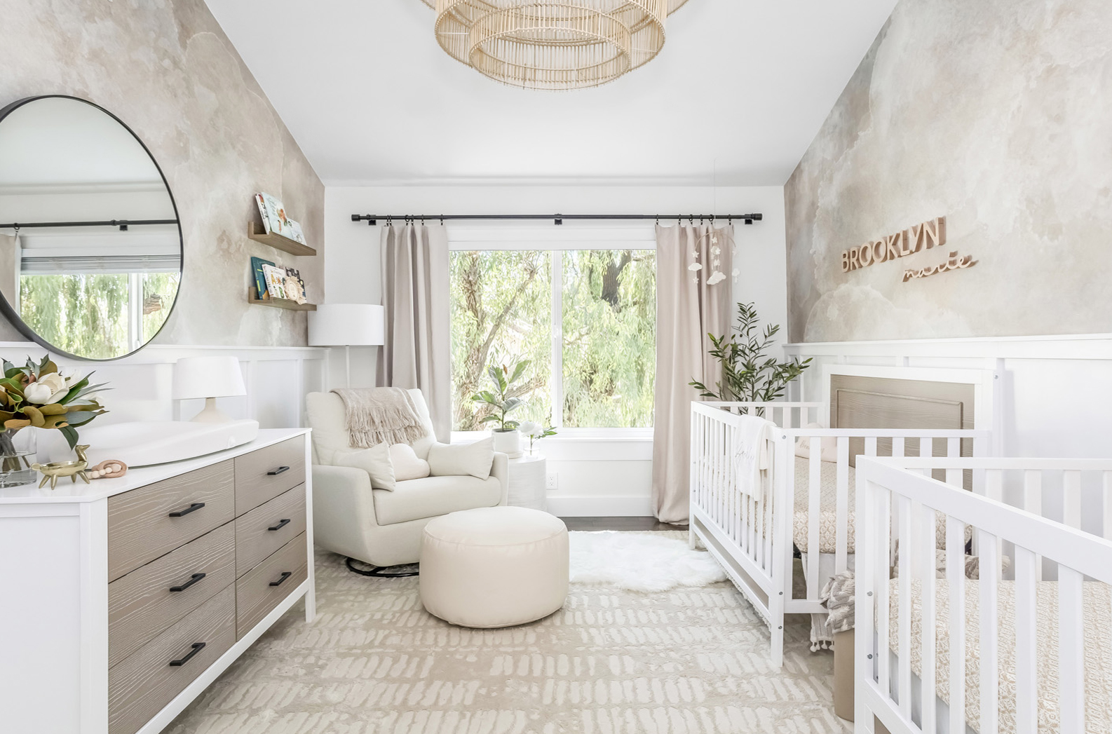
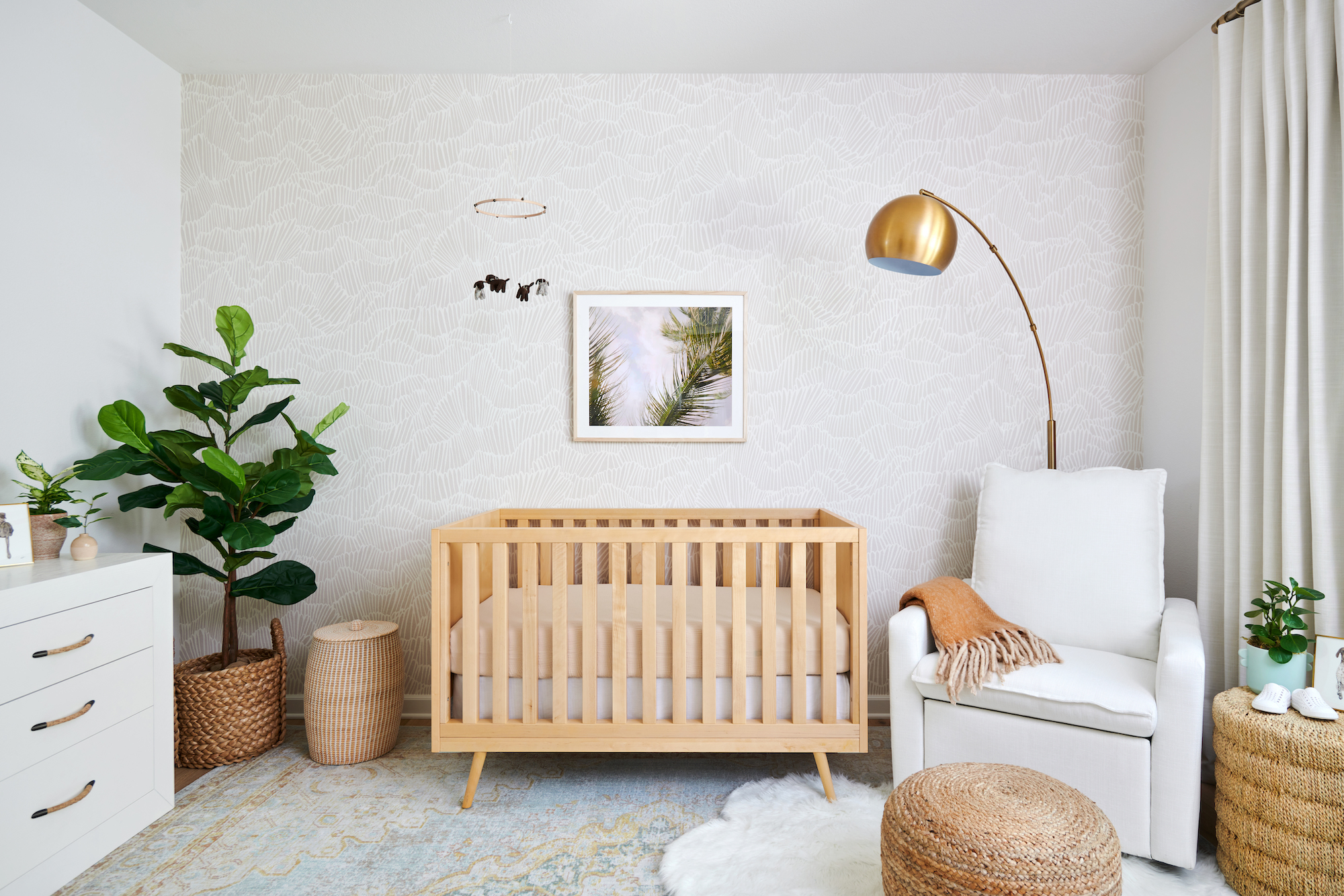
We’re thrilled to announce that we’ve added the design services of Naomi Alon, of Little Crown Interiors, to The Project Nursery Shop! Our e-design packages are created with parents in mind, giving you access to her talent, expertise and knowledge while designing your nursery or child’s room. Here’s an example of her latest e-design.
I was contacted recently by a client in Central California who was in need of a nursery e-design for her baby girl. She explained to me that she wanted the room to feel colorful, vibrant and fun without feeling overwhelming or crazy. Her main design inspiration came from Kate Spade and Jonathan Adler—two very fun designers!
She already owned her crib and dresser, which were given to her by a friend. The first thing I did was to make sure the model of the crib was current and met all of the safety standards (since you never know with used cribs). Then I moved on to the floor plan to see what other pieces would fit in her space.
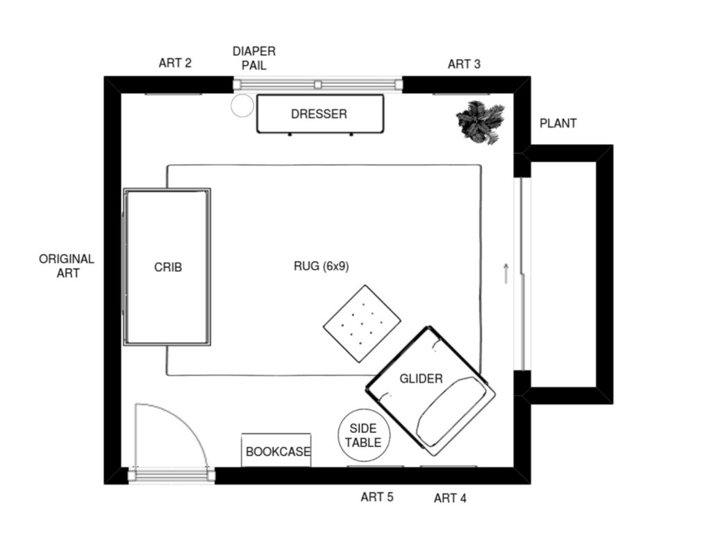
Her nursery space was not large, and there were a few challenges to get everything to fit. It was better to have the crib on the left wall so it would be visible from the hallway, but there wasn’t quite enough room in the corner next to it for the glider. I ended up placing the dresser under the window and the glider in the bottom corner near the closet. It will block a tiny bit on the closet door, but it won’t affect closet access.
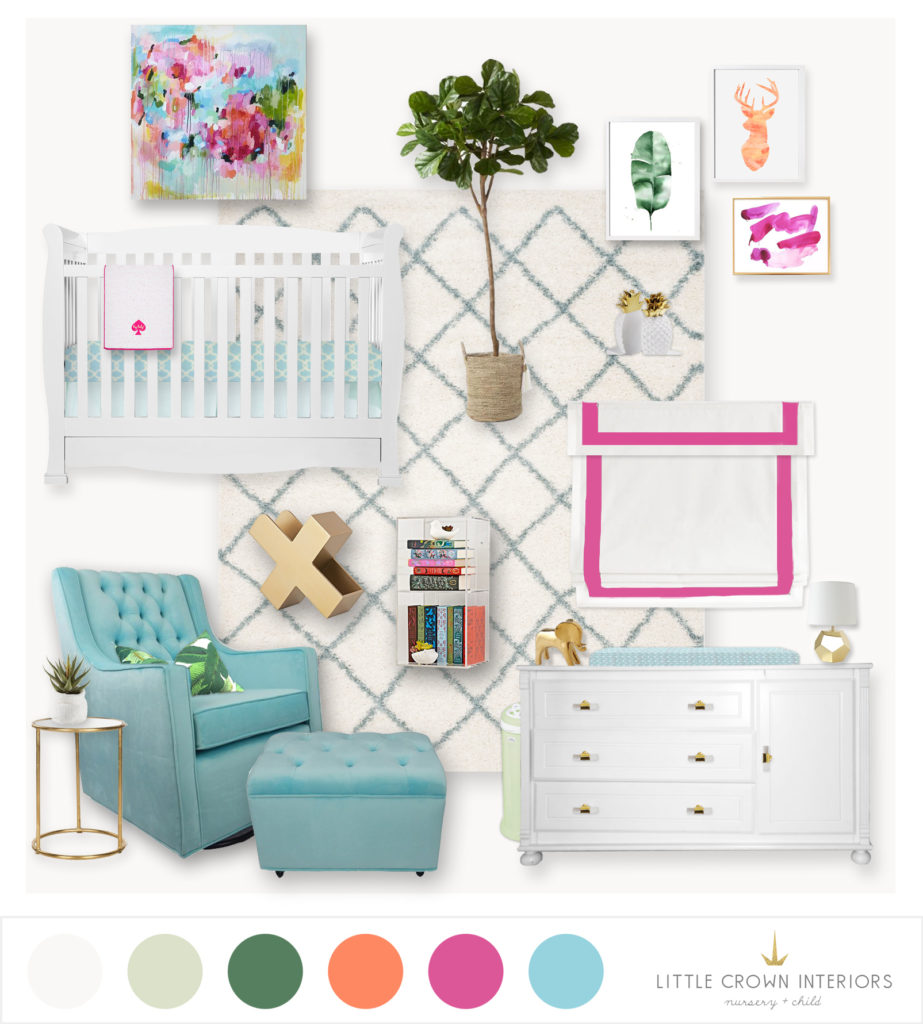
Faux Fiddle Leaf Tree | Banana Leaf Art | Deer Art | Pink Art | Pineapple Bookends | X Book Holder | Acrylic Shelf | Glider | Side Table | Rug | Gold Lamp | Gold Elephant | Lucite Knobs | Palm Pillow | Crib Sheet
I centered the color palette around the beautiful abstract art piece over the crib, which was something she already owned and loved. I chose a rug with a little color and pattern but nothing too bold since there is a lot of color elsewhere in the room. The aqua glider really adds a fresh feel, and the tufted design is both modern and transitional. For that signature Jonathan Adler feel, I added some lucite and gold elements, like some new knobs on the dresser, an acrylic shelf and a great gold “X” book holder. She opted for custom-made roman shades, but I gave her a full recommendation on how to get that done, and how to choose her fabrics. I absolutely love the way this nursery e-design turned out!
Find out more and book your own nursery e-design package in The Project Nursery Shop.
*this post contains affiliate links*
SaveSaveSaveSaveSaveSaveSaveSaveSaveSave
SaveSave
SaveSave
SaveSave


