Nursery design should be light-hearted, but it’s not something to be taken lightly—just ask Kiera Kushlan, owner of Residents Understood, an interior design company based in Washington DC. No matter what room she’s designing, you can be sure that it will be absolutely gorgeous, and never is that more true than with her nursery designs. Kiera believes that it’s one of the most personal and special spaces in someone’s home, and we certainly agree.
Not only is she a talented interior designer, but Kiera is also a brand new mama to four-month-old William and a self-proclaimed wallpaper addict—wait until you see the whimsical pattern she chose for William’s modern black and white nursery. Actually, just wait until you see the whole space. It strikes the perfect balance between bold and neutral, and we think you’re going to love it just as much as we do. Thanks for sharing, Kiera!
When it was time to design a nursery of my very own I found it just as difficult if not more so to design a space that would live up to my own expectations and dreams. I spent months planning and re-planning every detail (let’s just say the ceiling was painted more than a few times in an attempt to find the perfect color).
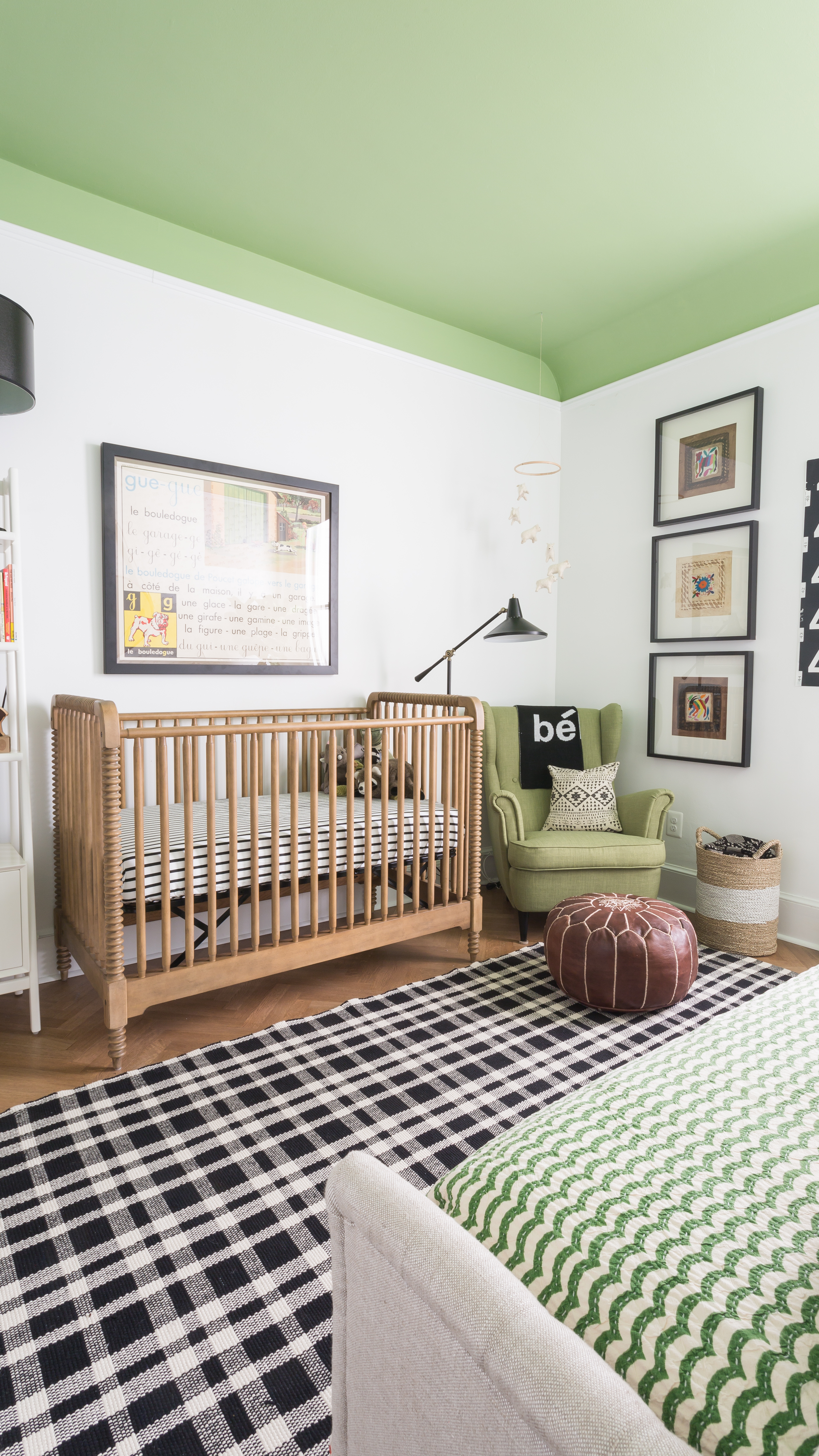 Crib | Chair | Rug | Wall Color | Ceiling Color
Design inspiration can come from anywhere—what inspired your nursery design?
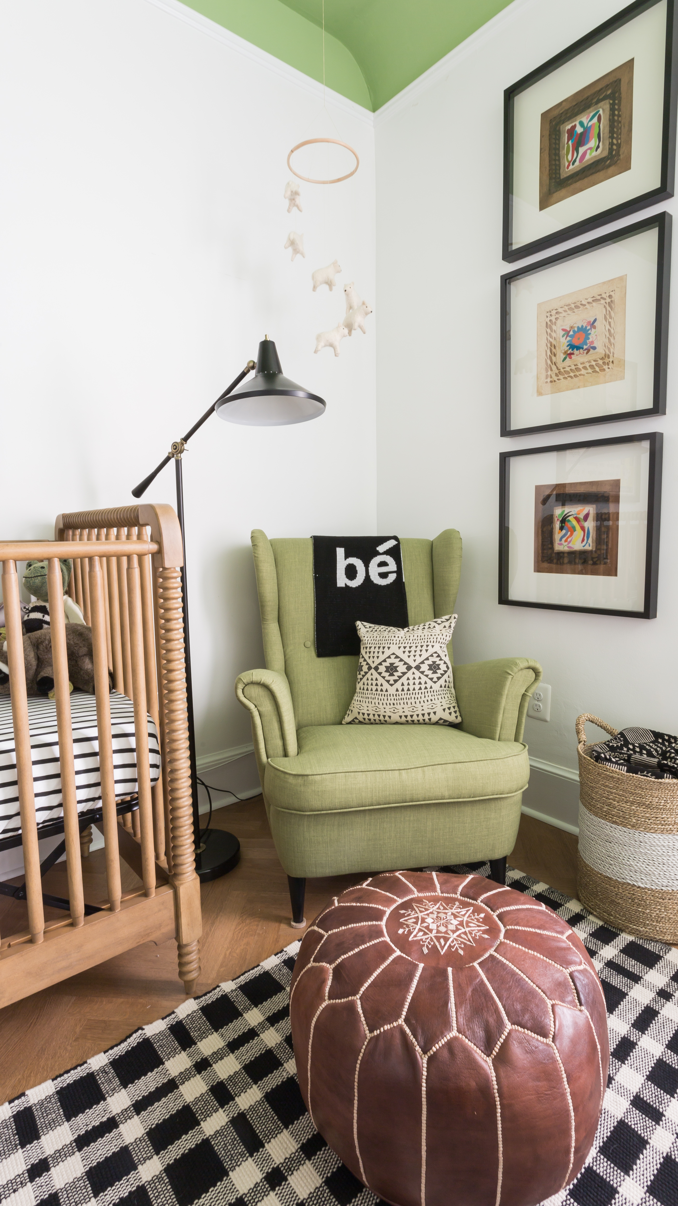
I wanted a space that felt modern but not cold, that was youthful but could grow with our little boy, and masculine without being covered in trucks and dinosaurs. By keeping the color scheme relatively simple and mostly black and white, the room reads pretty modern overall. But by layering in multiple patterns, it helps to keep things fun and fresh. The pop of green lends itself towards a more masculine-feeling space without making the room an overtly boy room.
How did your personal style influence your design choices?
Black and white is my absolute favorite color combination—I’ve had a black and white color schemed room for as long as I’ve been able to choose my own things!
Did you have any unexpected obstacles when creating this room? How did you overcome them or spin them to your advantage?
Finding the perfect shade of green for the ceiling was a LONG process—at one point I think we had around 20 samples on the ceiling. And the whole thing was painted a few times because I kept changing my mind—I don’t recommend picking paint colors when you’re nine months pregnant.

Now that the room is complete, what was your favorite part of the process? And what do you love the most about the finished design?
Painting and wallpapering the room with my husband and dad was a great project to take on ourselves, and because it was so hands-on, the whole family really feels like they created the room together.
What is that one thing that everyone mentions when they step into this space?
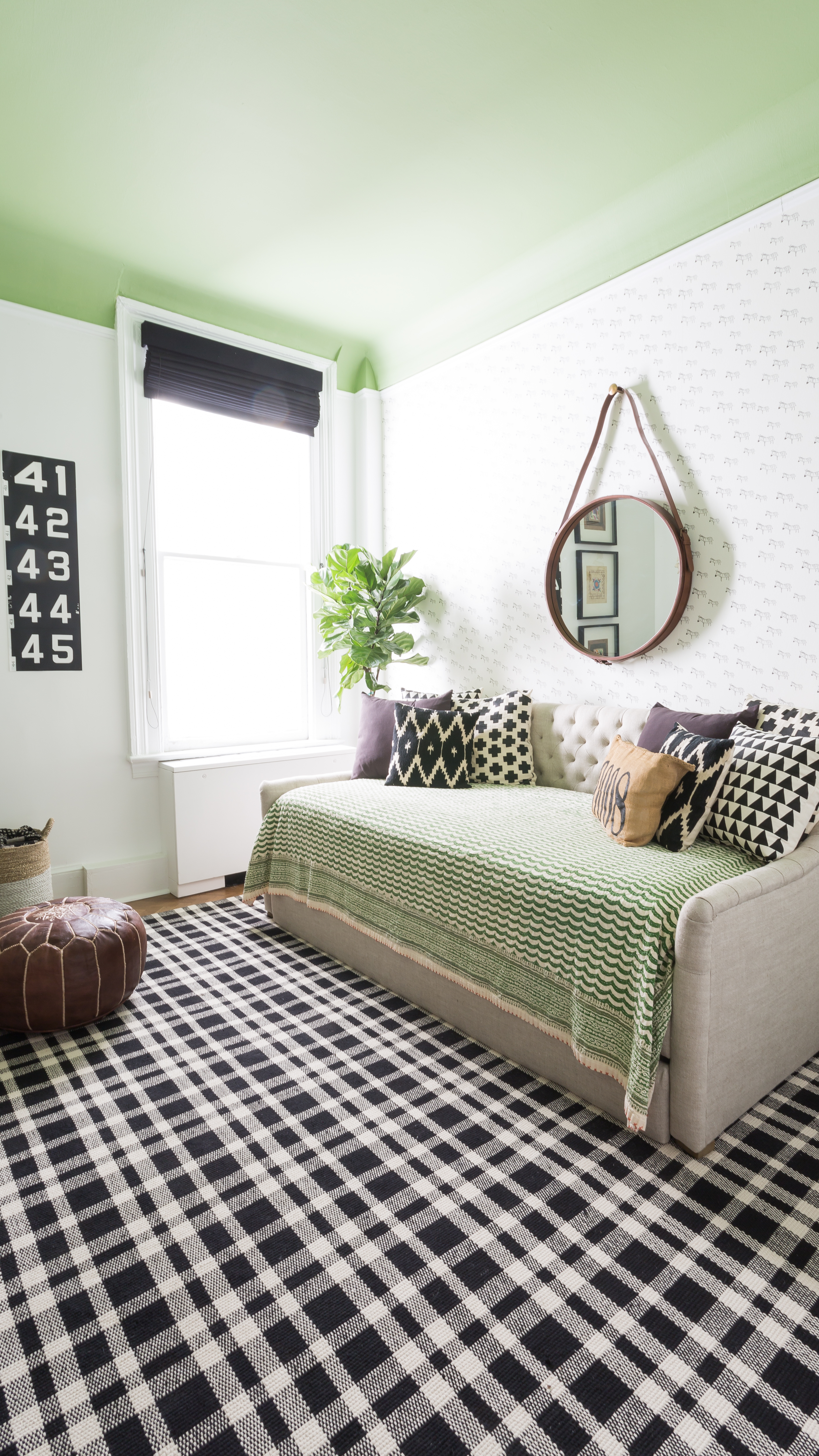
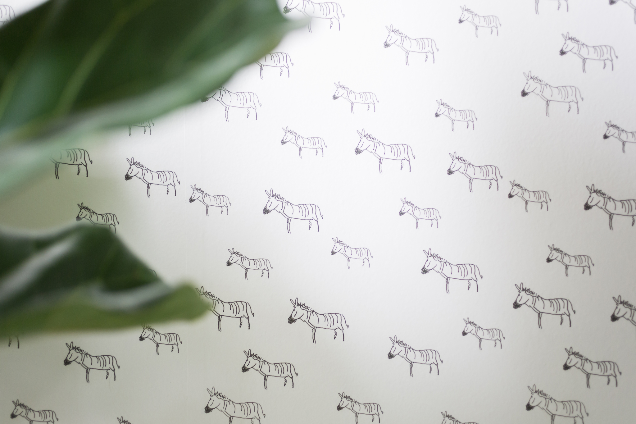
The zebra wallpaper is far and away the hit of the room! One of the last trips we went on before becoming parents was to Africa for a safari. I fell in LOVE with the zebras there—they’re so incredible up close and personal. So I loved being able to incorporate them into the design of the room.
What were your nursery must-haves when you started? Has that changed since you started using the space?
Because we live in a relatively small condo, we needed the nursery to still be our guest room too—we knew the baby would mean even more guests than usual. So the number one priority was to fit a daybed (with a trundle) into the room. That meant that we didn’t have room for the changing table/dresser in the actual room, so we reconfigured the closet to hold a long dresser which doubles as the changing table. And as we suspected, the room has never seen more guests, so we’re happy we made the decision early on to incorporate the beds.
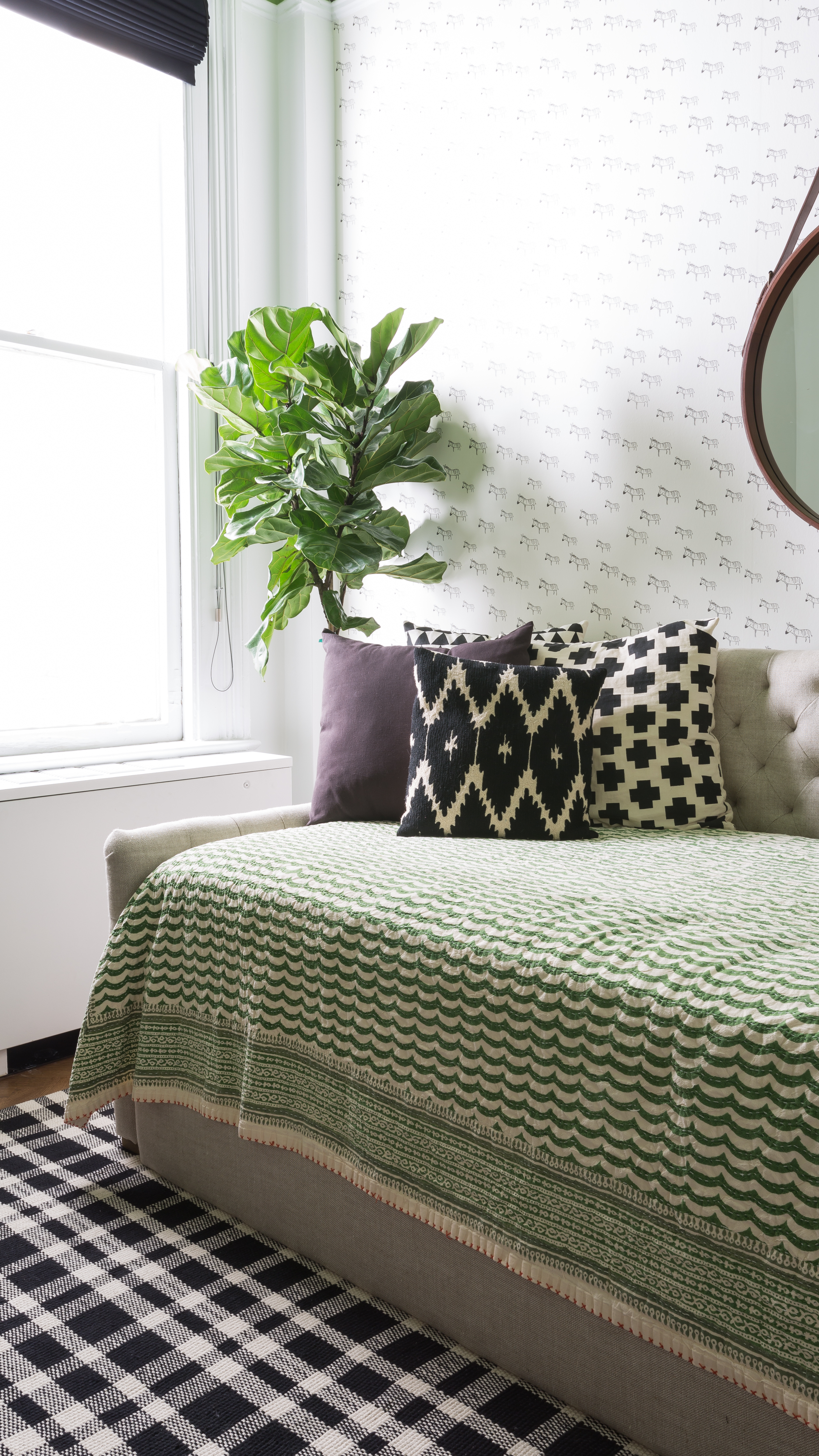 Daybed | Swiss Cross Throw Pillow | Triangle Pattern Throw Pillow
Photography by Bonnie Sen




Comments
Dana Decals
Of course the crib is beautiful, and we’re also drawn to that green. The ceiling edges are nice and crisp, and the color really helps not just as an accent color, but also as a way to bring the focus to the crib. Beautiful!
Mary Beth
Would love to know the source on the crib! The current link in broken. Many thanks!
Beth
Hi Mary Beth, It was the Brimfield Crib from The Land of Nod (now Crate & Kids). It doesn’t appear to be sold at Crate & Kids anymore.
Alyssa
Hi! What is the ceiling color? it’s perfect!! The link is not working:/
Beth
Hi Alyssa! Thank you for letting us know about the link. Looks like the ceiling paint is Central Park by Benjamin Moore.