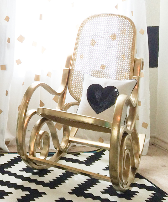
“Whatever you think.” Those words are music to a designer’s ears! I knew this nursery was going to be fabulous when the mommy-to-be didn’t question my idea to put black and white stripes on the focal wall. A bold pattern like that can sometimes seem intimidating for a nursery design, but I think the scripty gold monogram, ruffled crib bedding and that gorgeous bent wood rocker give it the perfect girly touch, don’t you? Black, white and gold in the nursery is amazing, but don’t forget to add that pop of color too! We picked aqua, and I’m pretty sure we NAILED it.
 Remember, texture is everything in design, and combining wood, fur and metallic fabrics is a wonderful way to add texture to the room. I’m obsessed with this bold black and white printed rug from Ikea, and we softened it with a small white rug just under the crib.
Move over chevron, there’s a new trend in town and it’s GOLD. I love how perfectly the gold dot sheet and bumpers complement that amazing aqua ruffle crib skirt (all from Caden Lane, of course!). The pop of color in the bedding ties together the painted furniture, adding just enough color to the black, white and gold combo. And ya’ll, a gold rocker…does it get any better? We work with the most amazing furniture designer Tracey’s Fancy, where she finds old pieces like this bent wood rocker and adds a modern touch. What’s old is new again (and even more fabulous than before).
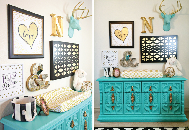
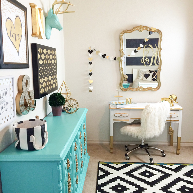
Nursery Design Tip: When designing your focal wall, make sure it will work with a bed too! Trust me, you will be thanking me in two years when you don’t have to paint over your hard work.
I love how this gold wood monogram works perfectly over a crib or queen sized bed!
 To see more pictures of this gorgeous nursery and find out where to get everything in the room, make sure to check out the entire space in our project gallery.





Comments