This is our interview series in which we bring you the nurseries and kid rooms of successful designers, entrepreneurs and moms. Through this series, our featured guests will divulge some of their design secrets and share stories of how their nurseries came to be.
This week’s featured designer is Lindsay Pinchuk, founder of Bump Club and Beyond, the largest social event company for moms and moms-to-be in Chicago and several other major cities. Their mission is to connect the women in their communities with the best products, resources, experts and, most importantly, each other. BCB is also one of the sponsors of Out with the Old, In with the New Year, an event that’s hitting four major cities—Chicago, San Francisco, New York, Newport, CA—tonight, January 23, 2014. “Out with the Old” is the 2014 Sustainable Nursery and Play Space Design Open House where guests will enjoy design previews, exclusive discounts, snacks and drinks. Be sure to RSVP if you live nearby!
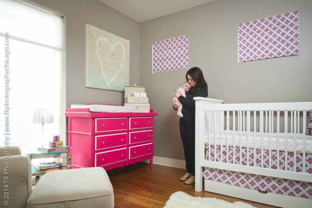
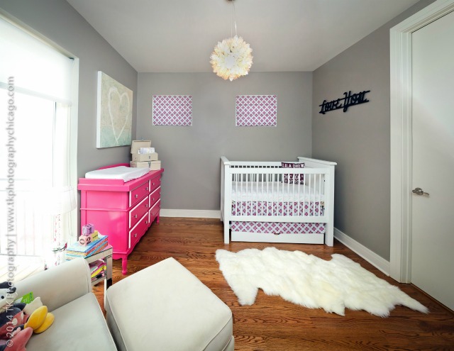
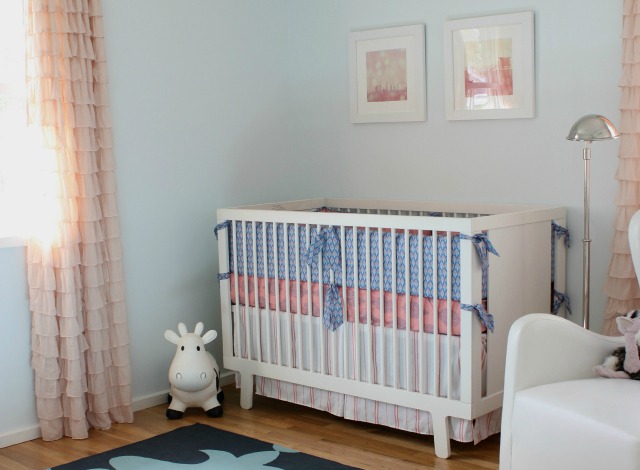
With someone like Lindsay, who has seen everything that’s on the market for baby, we are always excited to see the big nursery reveal. Lindsay recently welcomed her second child, and she invited us to check out the modern fuchsia and gray nursery she designed, with the help of Sprout and Newport Cottages, for the newest addition to her family.
What were your initial ideas for this nursery?
When I found out we were having another girl, I immediately knew I wanted her room to be different from Jordyn’s, but I still wanted the design to complement the style of our home. Never one for traditional baby pink, I knew that after creating an entire lavender/plum room for Jordyn, we would have to come up with something different. Over the last few years, I have come to love the color fuchsia. Because it is bold fun and girly, I knew fuchsia was the color I wanted to center Lila’s room around.
What’s the first thing people notice when stepping into this room?
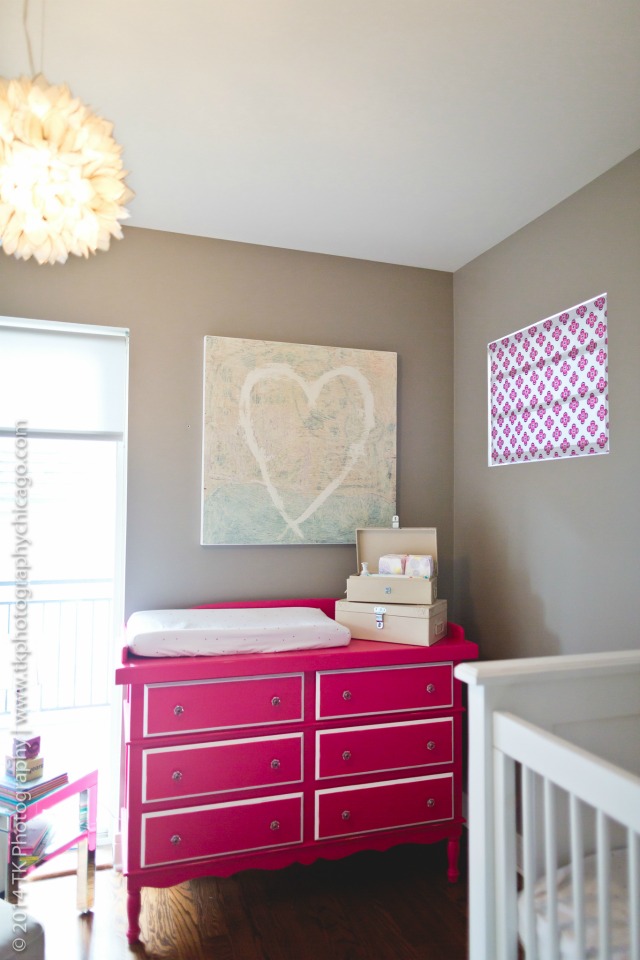
The raspberry Celine dresser from Newport Cottages and the incredible chandelier.
Did you run into any unexpected obstacles when creating this room?
The biggest obstacle was the layout of the room. For some reason, when our home was built, the builder only thought of the contemporary aesthetic and not the functionality of the space. There is very limited wall space in Lila’s room as there are big windows to contend with, a closet on one wall and a bathroom door that eats into another. Meredith, from Sprout, worked with me to create a layout that made sense given the limited space to place furniture against the walls.
Is there anything you learned when designing this nursery that will help you with your next room update?
It doesn’t necessarily take a lot of added money or effort to create a sustainable and healthy room. My baby’s nursery is not much different in terms of aesthetics from my older daughter’s room, yet I am confident that the items Sprout helped me pick are some of the healthiest and safest in the marketplace.
Photography by TK Photography
Do you know of a fantastic nursery or big kid’s room designed by a successful designer or business owner? Please send a photo of the room to Adrienne@ProjectNursery.com for consideration.




Comments
Oopsy Daisy Art
Gorgeous nursery! Looooove that Newport Cottages dresser! ♥
Tara E
what is the paint color please!
Beth_PN
Hi Tara, the paint color is a gray by Benjamin Moore, but unfortunately Lindsay no longer has the name—it was painted several years ago. Maybe if you visit Benjamin Moore, you’ll be able to narrow it down.
PamGinocchio
Really love that raspberry Celine dresser. And of course I love that Serena & Lily fabric. My daughter has it in her room too. xx