There are some design elements that always seem to lend a certain something special and add dimension when included in a child’s room. Here are some of my favorite design details that never fail to take a special room to the next level and make it magnificent.
Window seats in a nursery or child’s room are always fabulous. I adore them in a little girl’s room like this one, filled with an array of pillows and fun fabrics. The seat draws attention to the window treatments and makes an ordinarily dead space interesting while giving the room more depth.
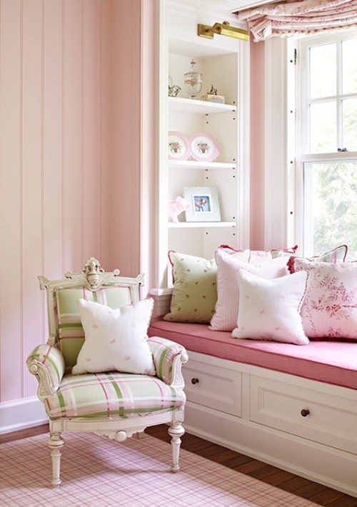 Image from Traditional Home
Adding a canopy over a child’s bed or crib creates a dramatic effect without a lot of fuss. The designer in this space used the canopy as the total solution for decorating the space. This one element carries the entire room.
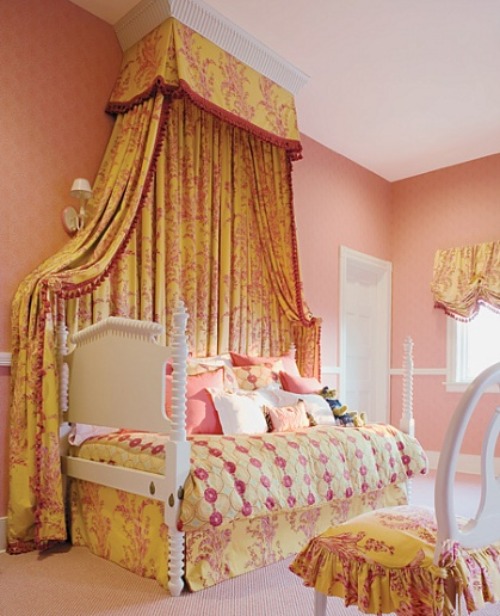 Image from Architectural Digest
Deciding how to decorate the walls of a room often sets the tone of the space. Murals are one of my go-to staples to complete the look of a nursery or child’s room. Not only do they lend interest, but they also give the room a one-of-a-kind flare. Whether you pick something daring like this room or a more simple design in a small area, the mural is always a welcome touch.
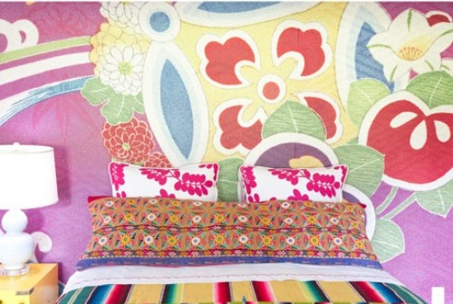 Image from House Beautiful





Comments
Jeanette Simpson
I agree….window seats are fabulous and a favorite of mine too. The child-size chair, pattern use and color combination complete a great window treatment. Thanks for sharing! One of the nicest uses of pink and green I have seen in a while.
avalon
Yes, you are right. Window seats are fabulous. I have always wanted one. And I sooo agree with your title. It’s all in the details!!!