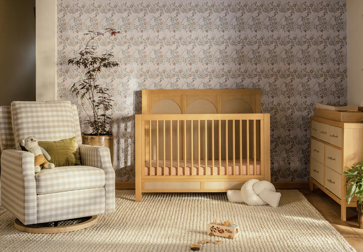
Interior designer Christina Salway shared with us the sweet nursery she created for her New York City based clients. Drawing inspiration from the colors and patterns of fabrics by Dwell, Christina was able to pull off a beautiful nursery with time to spare and a few dollars left over. We were lucky enough to interview Christina to find out all the details on how she and her firm ElevenTwoEleven Design achieved this luxe nursery while staying true to her clients vision and budget!

Did your client have a particular vision or design they asked you to execute?
For this project, my client had certain practical objectives she wanted to accomplish, like creating a nursery that also worked simultaneously as a guest room, and finding a way to incorporate an armoire she had removed from the master bedroom. When I created my design for this project, I needed to work around those particular stipulations, but had total freedom regarding the actual aesthetic of the nursery.
What was your inspiration?
My inspiration came from many places… I think the root of my design came from the vintage-style alphabet animal prints, which I playfully matted and framed, and hung between the two windows. This sweet set of images (see below) was a unique way to link my color scheme, bringing together the rich browns from the Zebra stripe rug and Chocolate Micro-fiber sleeper sofa to the pale pinks found in the Dwell bumper set and window treatments. We then set this collection of colors against the faintest blue backdrop, creating a nursery that was sweet and feminine without being overtly girl-y, or babyish, which wouldn’t have appealed to my clients aesthetic.


Did your client have a budget?
A lot of people don’t realize that you can couple creative thinking and good resources and come away with great design! I always try to emphasize to my clients that the best way to approach a project is to decide where the splurge is going to be, if there is one, and then figure out creative solutions for everything else. So, in this instance, we all loved the Stokki bed, Dwell bedding and window treatments, and decided those were going to be our splurges– and then we got creative. We re-purposed an intricate dresser they were planning to give away, and turned that into an amazing changing table by buying a topper from Pottery Barn Baby. They already had a little wooden side table: we repainted it an antiqued white and replaced the drawer pull. We bought the beautiful chocolate colored micro-fiber sleeper sofa at Room & Board, from their stock-materials to keep costs down, and bought two playful brown and white print pillows separately- to add a splash to the sofa. A Pottery Barn Zebra rug was so inexpensive ($350.00, and fit almost wall-to-wall!) that there won’t be any crying over spilled-milk while it serves in the nursery.

Your favorite piece?
My favorite piece- well pieces- were the Pottery Barn Rattan Chandeliers. These two fun light fixtures were super-easy to install, and cast a wonderful light through the rattan shade. We had them installed on a dimmer, so they can really light up the room or be used for much softer accent lighting. They’re currently on sale at PB Kids, for $49.99 a pop- which is a bargain price for any light fixture!

Your furniture finds?
Room & Board – Encore Sleeper Sofa
Pottery Barn – Rug
Room & Board – Throw Pillow
Pottery Barn Kids – Lighting
Dwell & Stokke – Bedding and Stokke Crib


Comments
Diana
The design is really pretty, and I hate to sound like a crankypants, but I think you’re going to have to make a few changes once a baby is in there. You won’t want to put a crib next to the blinds. Even if they are cordless blinds, the strings come out the back when pulled on and baby can strangle. That dresser has metal wrapped around it and has sharp edges, and you have to check that the drawers can’t be pulled all the way out and fall on baby. Also the frames will need that plastic Velcro stuff that you buy at Target for mounting to the wall so baby can’t pull them. Also, I don’t think you want the diaper pail or garbage next to baby’s head in the crib. That Tiffany style lamp with the cord is going to come crashing down. And I personally wouldn’t feel comfortable with all the toxins and offgassing of a new sofa in a baby’s room. Don’t hate me! I have a baby and they find new and creative ways to get hurt all the time! Sorry–one last thing. I personally don’t like exposed light bulbs because baby is on its back staring up at them a lot. I used white paper oriental parasols to cover our ceiling lights (cut off the handle). I do really love the palest paint!
Little Apple Design LA
I just LOVE the large zebra carpet in baby’s room! You have a sweet hip and modern animal theme without being themey. I am going to order the same now for my son’s toddler room now that I’ve seen it. I too have an “exposed” lightbulb in my son’s nursery. It was never a problem and as long as it’s not hanging directly over the crib, I think you are just fine. It also helps as ours is on a dimmer.
Air
I like the simplicity of this room. It feels airy and the zebra rug is incredible!
Air
Also I think I will be ordering one of those chandeliers for above my dining table. Just seems like a fun fixture and $50 is a steal!
Christina
As the designer, I would love to respond to Diana’s concerns…
I wonder whether she’d be interested to know the window shades have hooks high above the baby’s bed to wrap the solar shade cords around (and no cords down the back as she suggested), the pictures are in fact held onto the wall with poster tape from below, the drawers of the dresser do not pull all the way out, and the tiffany lamp is also fixed to the table to prevent it from slipping. As for the bare bulbs, they are almost invisible through the rattan-style shade, and neither hang directly above the baby’s crib. Although many of Diana’s concerns are very valid, I’m astounded that she would go immediately to such negative thoughts without considering the possibility that they’re wrong.
I’m so thrilled to see the page is up– it looks super and I’m honored to be featured on your website.
Diana
I know it is hard to read the tone of something in text, but I really didn’t mean to be negative. I think your room is very pretty. My thoughts just went to ideas of safety, which I don’t think is negative. Why not mention your safety tips, since many people will be copying your look and won’t know to incoporate them? I absolutely applaud your work, and my own worries about being totally safe have kept me paralyzed on finishing my nursery, and my baby is two and a half! I know lots of people have foam changing pads and upholstered furniture in their nurseries, which I personally think are very bad to have in a baby’s room because of the offgassing and fire retardant and cancer-causing chemicals once the foam breaks down (also the backing on carpets, while I’m at it). I’m just mentioning it because it is something I strongly care about, and I didn’t mean to attack you personally. I wish everything for babies would be made safer!
J
Wow, this room is lovely. However, reading Diana’s comments I started thinking we were supposed to post our criticisms! My only advice would be to Diana, in regards to reading tone in tex. Diana, if it sounds negative when you read it, it probably sounds even more negative when others read it. Just a thought. lol
calabus
I would love to find out the brand and color of paint used in this gorgeous room. Also, who makes the window treatments?
Little Apple Design LA
Calabus – I just got the scoop from Christina for you…
the paint for our Upper West Side Nursery was Benjamin Moore’s “Seafoam” 2123-60, and the shades are made with Dwell Fabric, sold by The Shade Store, which is based in Manhattan, but available online at http://www.theshadestore.com/
calabus
Little Apple Design, thanks so much for the paint and shades info! I’m going to purchase them right now! :)