Whether it is the springboard of inspiration for your baby’s nursery or the final touches on your toddlers room, art pieces for their walls can make a big impact for your overall design.
When shopping for art for my son Brandt’s nursery, I found that some pre-made or pre-framed art that was geared towards a children’s room was also very “child” in size. One way to scale in the right size that you need would be to purchase a poster/print and then adjust the mat and frame size accordingly. Getting a print custom framed is always an option, but to do it yourself is a lot less spendy. Also, finding the perfect print that coordinates oh-so-right can really add that last little bit of WOW to your space.
One key element in picking artwork is to make sure that it is the correct scale or proportion in relation to the wall it is being hung on. For example, a wall that does not have any furniture on it may need some larger pieces in order to maintain the balance of the room while art hung above a dresser, changing table or glider should not overpower the furniture piece. Here are some tips for hanging art.
Space Planning Art in the Nursery
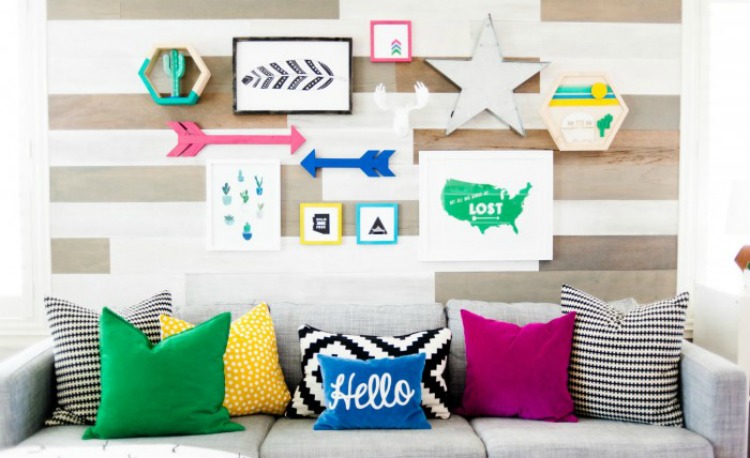
Make sure the spacing of the art is not too far apart, if it looks wrong, it probably is. Although you may have three different pieces on one wall you still want to try to arrange in a grouping to create unity. Too much space between pieces adds too much interruption to the eye and can be more distracting than appealing.
What Height Should You Hang Your Wall Art?
Hang art at approximately eye level. Most people hang their art too high; the art should be a part of the total design. If eye level is not an option, hang the piece(s) based on the relationship to the furniture it is hung above.
How Much Art Should I Hang?
When I work on redesigns, I usually scale back the amount of various pieces of any given wall or walls. Each wall does not need a piece of art. It is perfectly ok to have blank space. Having a focal wall is great, so plan out your pieces accordingly. Groupings are also great, but just make sure that they make sense. Again, if something looks off, try rearranging it until it looks and feels just right. You can save time by positioning the pieces on the floor in various arrangements before actually hanging them.
Remember, measure twice, hang once!


Comments
Kim @ The TomKatStudio
Great Post, Rebecca! And Brandt’s nursery is fabulous! I didn’t realize that was yours! Great job! We still need to meet up for Starbucks one of these days!