Shop Suggestions
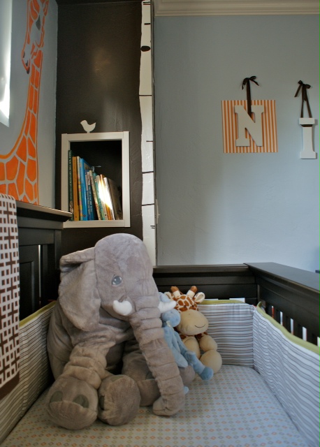
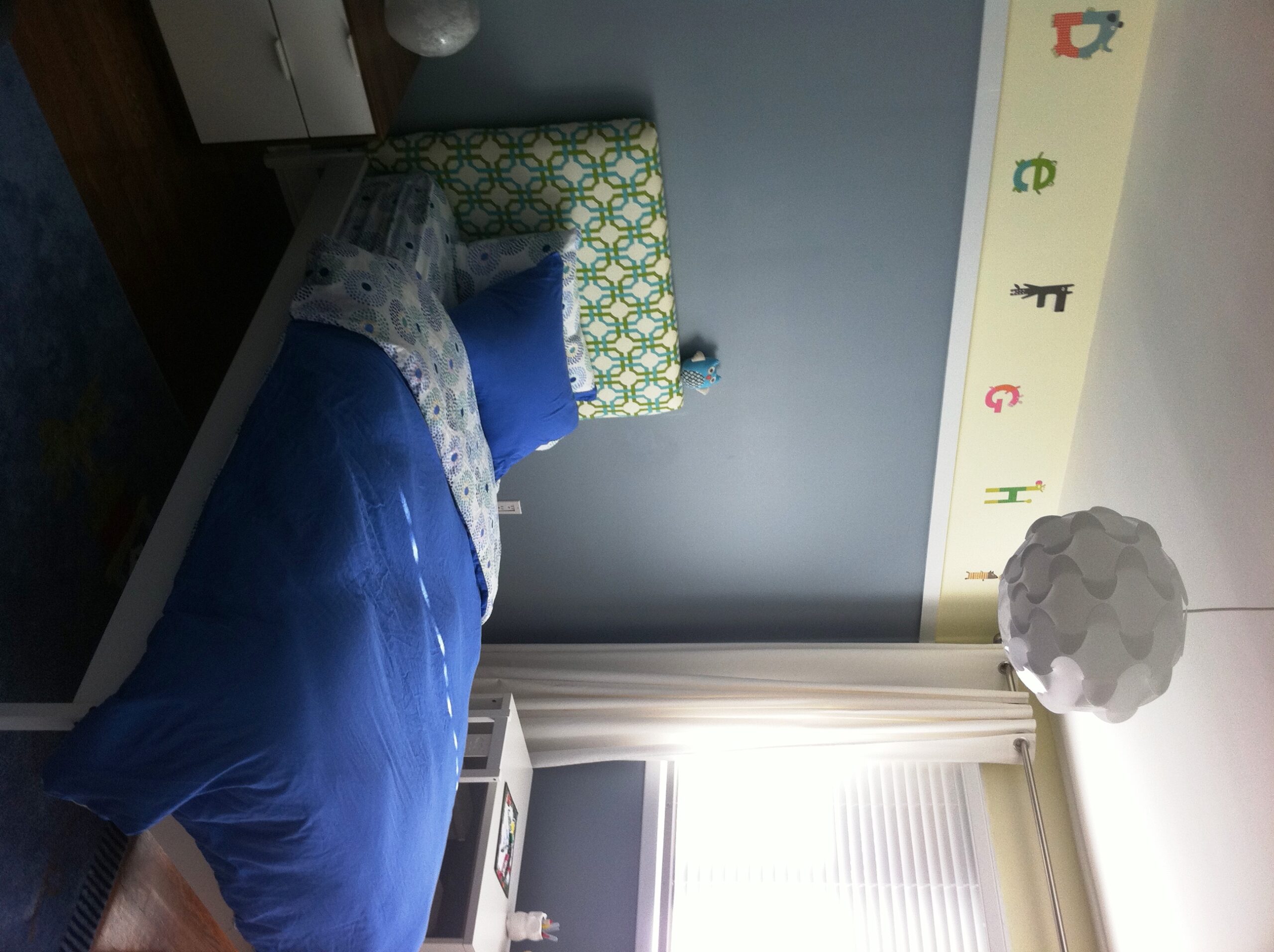
We have a small house where the nursery is very visible, so I wanted to create a design with a style and colors that would blend in with the rest of the house. Translation: Avoid “babyish” themes or colors, while still creating a space that is peaceful, fun, and functional for a child. This is a small room–about 10×12–so it was a challenge to fit in the needed furniture and storage space as part of the design. We didn’t have room for a dresser, so built removable shelves in the closet to keep clothes, toys, and the plethora of baby “stuff” you need nicely organized. As his clothes get longer, we’ll remove shelves to extend the space for hanging clothes. I also added baskets throughout the room (including some great ones on sliders under the crib to store extra diapers!) to add storage that is movable while also bringing natural textures to the room. We wanted the primary color of the nursery to be gray to mix it up because the rest of our house is based in browns, but I left some natural browns in the room (baskets, wood knobs, silk lamp shade) to tie in the rest of the house and balance the cool tones in the room.


Comments
hawahawa
I like that your nursery doesn’t look baby-ish with the dominantly grey and white colors. That kiddie rocking chair is way too cute, too!
Adult Toys
I’ve always wondered about this. Do women feel like adult toys are as good or better than doing it when a man?
12andcounting
Are those paintings or prints above the changing table? They look interesting.