Shop Suggestions
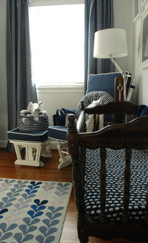
What started out as a mellow, sea blue, sandy beige and white, beach inspired nursery concept for our first little one, evolved into a unique room with more pop when my husband said something like, “It is a kid’s room after all…a little more color wouldn’t hurt.” I was concerned that the room would be too boring initially, so once he said this it confirmed the direction I wanted to take. This room was a very bland guest room waiting for a baby and itching to be transformed.
sea-renity
Blessed to be the wife of 7 years to the most wonderful husband, friend and partner in life; to be a mommy to be to a baby boy that we already love so much; to have a wonderful family, extended family and circle of close friends; to have a career that I love and to have a little free time here and there to fit in my hobbies of home design, party planning and living a fit and healthy life.


Comments
Zsa Zsa
Love how this room looks extremely peaceful and relaxing. I can sleep here all day!
Dandelion
Clean, bright and airy. And I think that blue-and-orange is a really unique color combination. Not to mention challenging.
Emerson Grey Designs
I love this serena and Lily set…I have a client that used it. It really does bring such a fun pop of color and starting point for all accessories to come. Great job!
Ann
Love the room! Curious as to a resource for the celing fixture? Looking for somehting similar, thanks!!
Becky Thomas
I love your nrusery–we are basing ours off of the same crib sheet. How did you get the matching blanket and changing table cover though??