Vanessa Antonelli of NessaLee Baby has been busy, busy, busy! Earlier this week we revealed the nursery that she designed for JP and Ashley Rosenbaum, and today we’re sharing not one, but two more of her amazing designs.
Kendra Wilkinson welcomed baby #2 last May, and that meant two room designs were in order—a nursery and a big boy room for big brother Hank. You’ll fall in love with the modern, nature-inspired space that Vanessa designed for baby Alijah, and after you get a taste of Kendra’s son Hank’s bold lego-themed big boy room, you won’t want to miss the full reveal over on Project Junior.
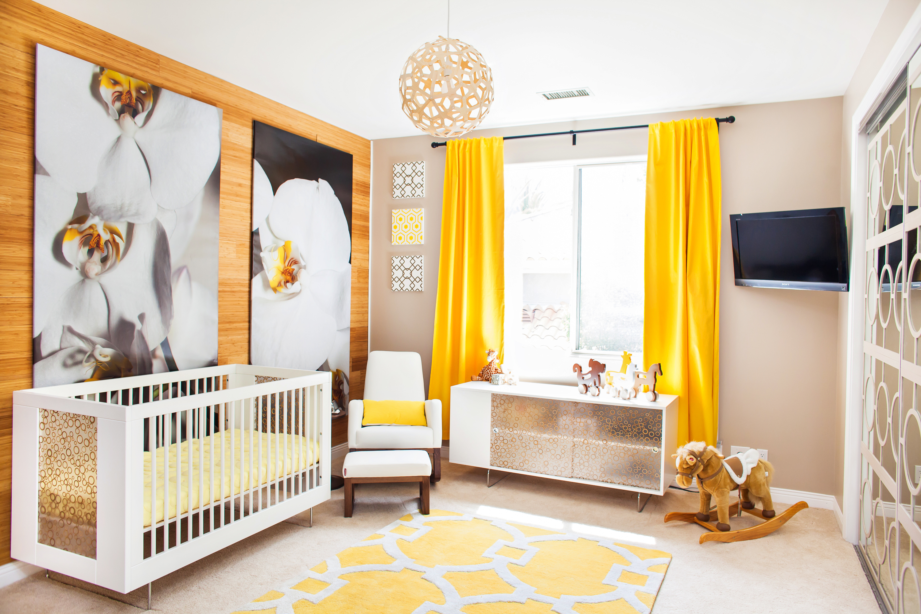 Alto Crib and Credenza by Spot on Square, Joya Rocker and Ottoman by Monte Design, Chandelier by David Trubridge, Imagination Squares by Renditions by Reesa, Push Toys from manny and simon
What was it like working with Kendra Wilkinson? Did she have any specific requests for the new baby’s nursery or her son’s big boy room?
I loved working with Kendra because she was so easygoing and not at all afraid to try things that aren’t traditional. She loves bright and happy colors, so instead of choosing traditional girly hues, she was excited to try the yellow, white and tan color palette we went with. She also wanted the space to feel like it had a little bit of nature in it because they are a family that loves the outdoors.
Kendra actually didn’t know about her son Hank’s room. I worked exclusively with Hank Sr. to surprise Kendra and their son. Hank wanted to make sure the room had things in it that his son could enjoy now but also grow into, so there’s a table for his Legos as well as a desk. Dad is a big guy, and Hank Jr. is growing rapidly, so a big bed was a must. He could be 6′ tall by the time he’s in 6th grade!

We love the boldness and colors of both of these rooms. Can you give any advice to our readers who might be hesitant to go bold?
Don’t be afraid of color! If you’re worried but are itching to go bold, start with a neutral backdrop and pick one bright color. Start bringing in accessories and pieces in that color slowly. Step back and look at the room to decide where more color would make sense. You can always add more—just take your time, and it will come together. Also, take photos of the room. Sometimes you will see it better looking at it on a screen than standing in the space.
 Peel & Stick Solid Wood Planking by Stikwood, Flower Murals by Murals Your Way, Pebble Mattress by Nook Sleep Systems, Monogram Blanket by Butterscotch Blankees
Did you face any challenges when designing these two rooms?
There are always challenges when it comes to completely redesigning a room. I am a big believer in knowing enough to know when you don’t know. That means that when it’s important, hire a professional. For these spaces, we needed to do that for hanging wallpaper and doing electrical work.
Clearly Kendra’s son loves Legos. Any advice for our readers on how to best use a theme without going over the top?
I wanted to give Hank a room that he would love right at this moment, but I was also very aware of the fact that even as early as next year, that passion could change. So the panels on his wall that feature the giant Legos are easily removable. His parents can take them off completely, and the room will be left with the really cool brick wallpaper. They could also choose to recover the current panels with his next favorite hobby. I think that’s the best way to do it. Make sure the the theme isn’t permanent or a very expensive part of the room, and don’t let it consume the space. It can really shine in just one or two areas.
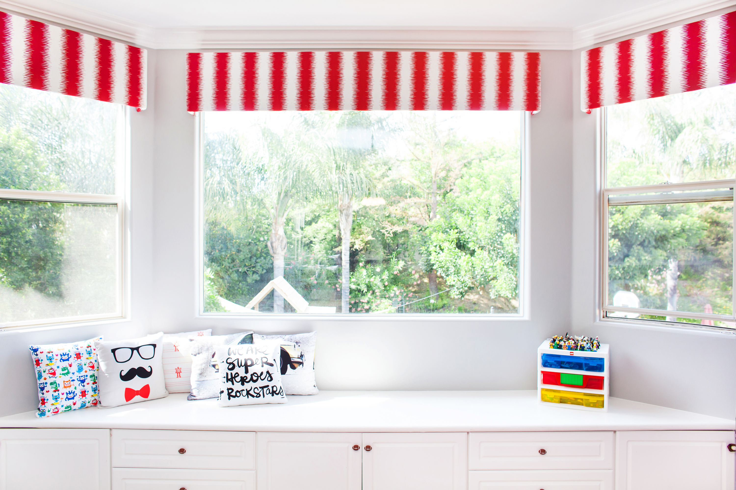
To see more of Kendra’s son Hank’s bedroom, head over to Project Junior for the full reveal.
Designed by Vanessa Antonelli, NessaLee Baby
Photography by Christine Farah Photography



Comments
Joyce
where did you get that cool clear lego table?