Are you looking for a unique way to give your nursery character, drama and personality? All you need to do is look up!
Ceilings are all too often overlooked and painted basic white when they should really shine. From classic designs to motifs on the modern edge, here are some prime examples on how to make your ceiling dazzle and take center stage.
Modern triangles take a fresh approach in this nursery design featured in Babiekins Magazine. Find the perfect wallpaper to create your look or paint them yourself!
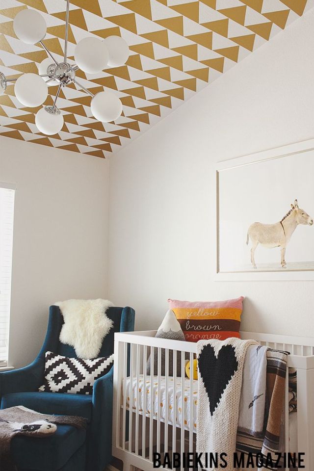 image from Babiekins Magazine
Painting the ceiling is probably the least expensive way to dress up your ceiling. These green stripes liven up this mostly neutral nursery with an unexpected pop! Tip: We typically like to see stripes roughly 15″ wide.
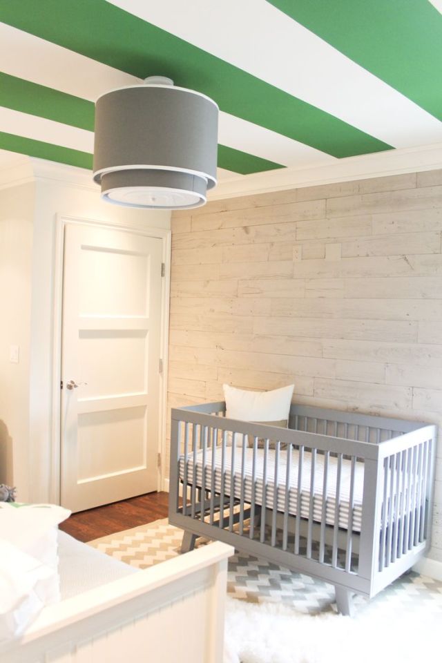 Nursery Makeover by Oh I Design
This classic wallpaper design inspires a classic, restful look. The crown molding finishes it off perfectly.
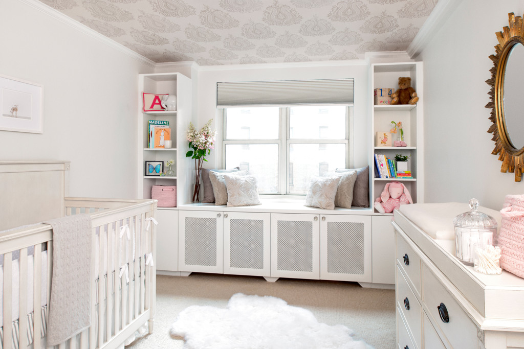 Upper East Side Neutral Nursery by Amy Elbaum
The textural feel of the wood on the ceiling gives this nursery a cozy feel—perfect for a hipster vibe or cabin in the woods look.
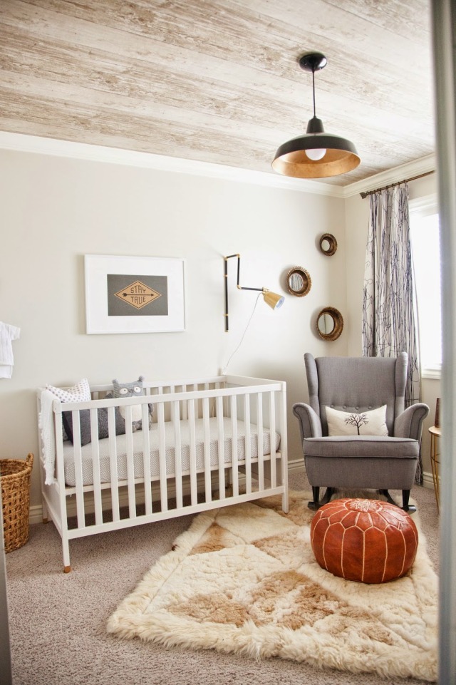 image from Design Dump
Found in the gallery, these stars are a classic way to update your ceiling, and they are gender neutral!
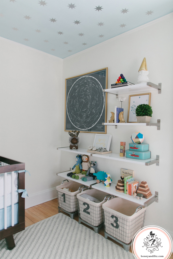 Reed’s Starry Retreat by Honey & Fitz
We hope we’ve inspired you to dress up your fifth wall—the ceiling! With a little bit of elbow grease, you can turn your room into an escape your baby can grown into for years to come. Have you turned your ceiling into a work of art? Share it with us!


Comments