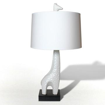
When it comes to designing a nursery, I prefer to add touches of a theme rather than repeating a particular design element throughout the room over and over. For our third and FINAL nursery, I was drawn to the simple, modern image/outline of an elephant. Plus, one of the colors I used was gray, so I thought it fit nicely into the scheme. Although not available in an elephant motif, I have always been in love with this Jonathan Adler Giraffe Lamp.
I was hard-pressed to get my hubby to commit to repainting the existing nursery for bambino #3 let alone spend the moola for a (fabulous) lamp! It was time for me to get creative. So with that inspiration in mind, I set out in search of a fixture that could fit into my non-existent budget. I looked everywhere until I stumbled upon this lamp, singing to me (lalalalala) from the clearance shelf at Babies R Us. Wait…it’s pink and brown—ahhh, nothing a little magical spray paint and new shade couldn’t fix. So, off of the shelf and into my cart it went. This lamp retails for around $50, and I scored it for $19. Not sure why it was on clearance, but I knew that a glossy coat of fresh white paint would take care of any blemish this little gem may have had.
Here is the before—super cute, but unfortunately, we are not having a girl, so the pink and brown just wouldn’t work.
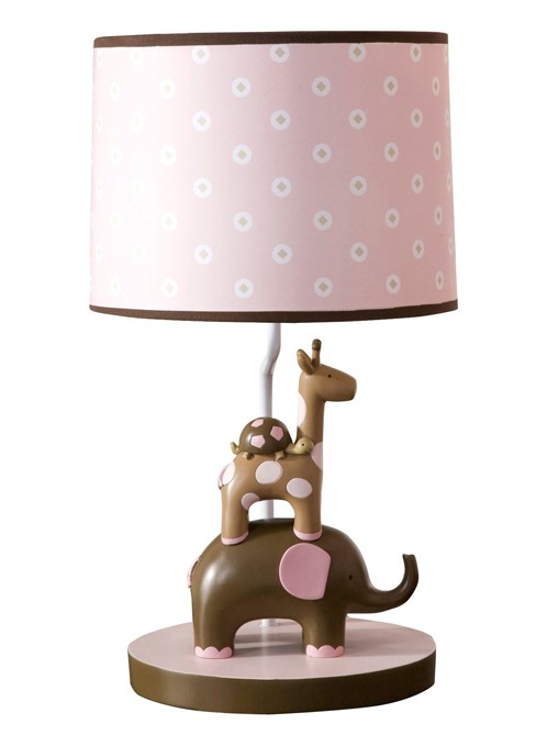
The Emma Lamp by Lambs & Ivy
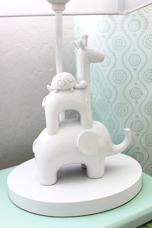
And here is the after! All it took was a $7 shade from Target and a can of glossy white spray paint, and I was able to create a similar feel to the high-end lamp I have swooned over for such a long time.
My design tip? Always start with some sort of inspiration in mind; this will help keep your final project on track. There are so many fabulous nursery items out there, and without a plan, a first time mama can be easily distracted or overwhelmed and end up with too many design elements in one room.
Do you have that one item that completed your nursery? Please share!






Comments
Beth
Love how this lamp turned out, Rebecca! I’m totally inspired to try something similar.
Melisa
Who is smarter than you! I LOVE this. xo
Pam
I just love this Rebecca. You are just so good at these DIY projects. Kisses to the baby!
Sarah
I have had my eye on that Jonathan Adler lamp for a while-what a smart idea!
Lidia S
wow i love that!
Ashley Brooks
Love! Might I add I’m really loving the drapes as well, thought it was wallpaper at first!
Amanda N
That is beautiful!
Zsa Zsa
Totally inspiring! One of the cutest lamps I’ve seen so far :)
Jess (The Cozy Reader)
Way too cute! Great job!
Rose
Very pretty! It totally looks high-end, as if it just came from the same Jonathan Adler line. So jealous! How come I never get across bargains like this?!
winsy
This totally inspires me! I cant tell you how many times I have considered biting the bullet with the Jonathan Adler lamp! Can you tell us a little more about the drapes? Are those custom-made? Exactly what I am looking for!
GREAT IDEA FOR A GIRL'S NURSERY!
This could also work for a baby girl just as well!
I don’t particularly like the brown and pink color combination of the lamp. It’s cute but it screams “cliché” and it looks very much like an item from a big box store (which it is) rather than something unique or sophisticated.
Painting it in white gloss and replacing the shade completely transforms the lamp into a piece you would buy at an expensive boutique store.
It looks so much better and more chic and stylish. And you have the advantage of being able to use it in any other child’s room regardless of gender. This would even work for when the baby gets older or could be used in an older sibling’s bedroom because the glossy white is very age-neutral.
I’ve noticed the more gender neutral a nursery is, the more chic and stylish it looks. Lighter brighter neutral colors just look so much better and appealing than super duper boyish colors or super duper girlish colors. And then from there, you can add boyish or girlish touches in smaller details. But I love a neutral base for nurseries – they just look so much more chic!