Shop Suggestions
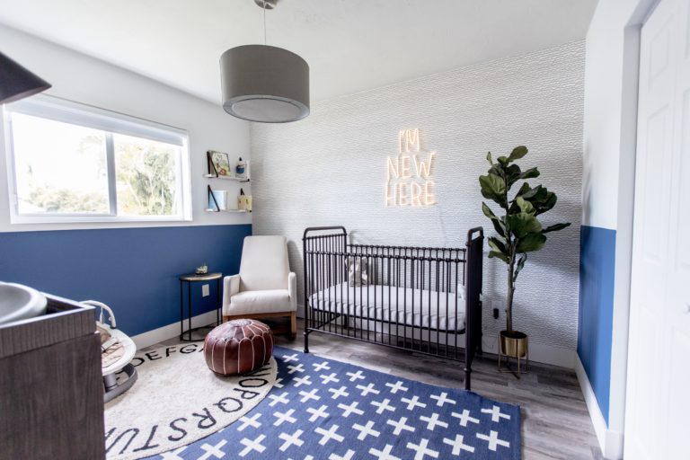
When my friend and fellow Miami Mom Blogger and creative, Geri Del Vento, asked me to collaborate with her on her baby boy’s nursery, the answer was a definitive yes! I knew Geri would be willing to take some design risks that some clients aren’t willing to take – wallpaper, eclectic lighting and untraditional decorative accents – which makes projects so. much. fun. And I was right!
This space was inspired by some of the boho and mid century designs I’ve seen lately but also, I was driven by making various textures, furniture and elements work together within a relatively small nursery. And Geri is super creative and had a vision and inspiration as well (ahem, how about that neon sign #amiright?!). From black metals to industrial lighting and dresser, blending mid century with current design was in full effect here.
My advice and tips are similar to any project – there are no design rules! Decorating spaces and space planning are not black and white projects. There should be true creativity and pushing status quo to make a space feel differentiated and personal. We started with a somewhat traditional Restoration Hardware changing table/dresser and I was adamant that I not “match” the rest of the space. Instead, I wanted a design that represented baby Leo and his parents, regardless of what the design rules say! So, HAVE FUN AND TAKE RISKS! And don’t be afraid of wallpaper and neon signs ;)
Photo Credit – Yesi Flores @simplylively
Designed by – Ann Ueno @annuenointeriordesign


