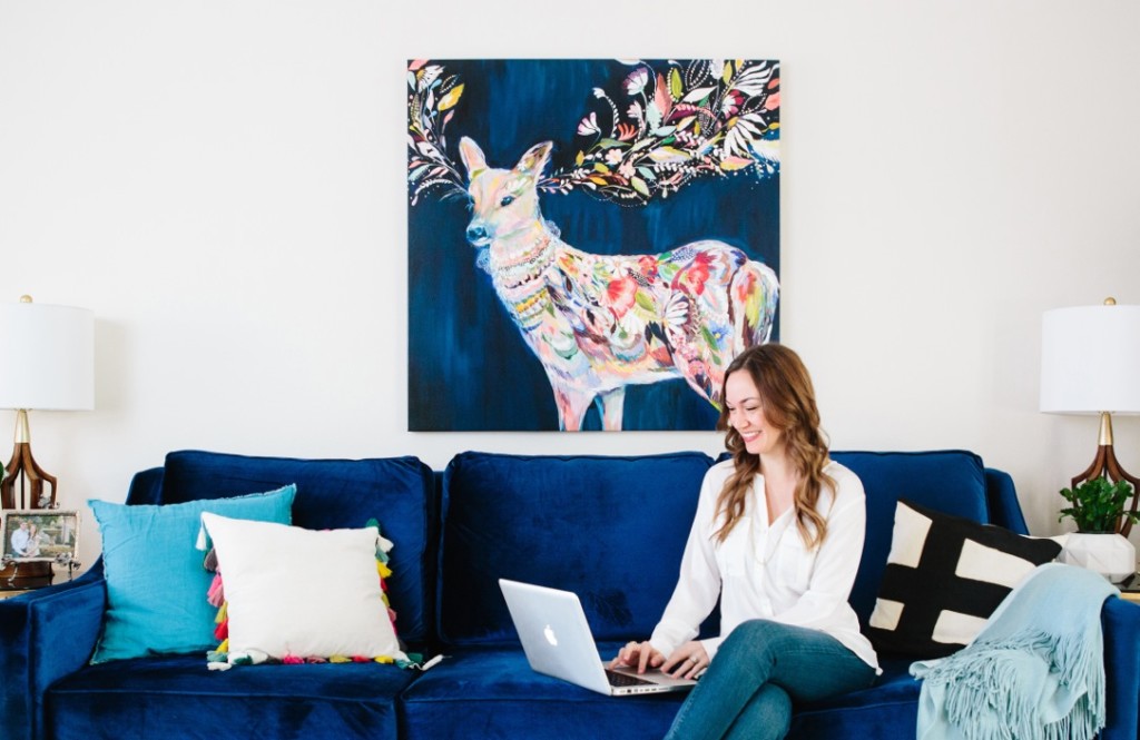
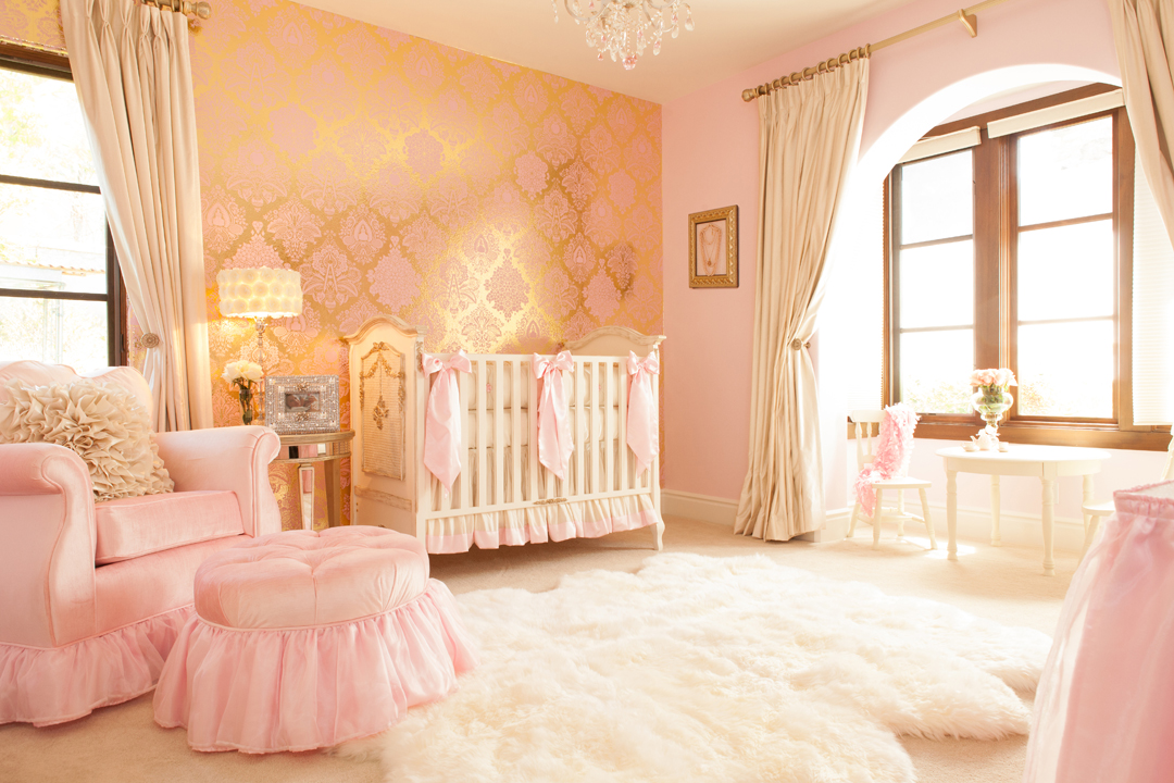
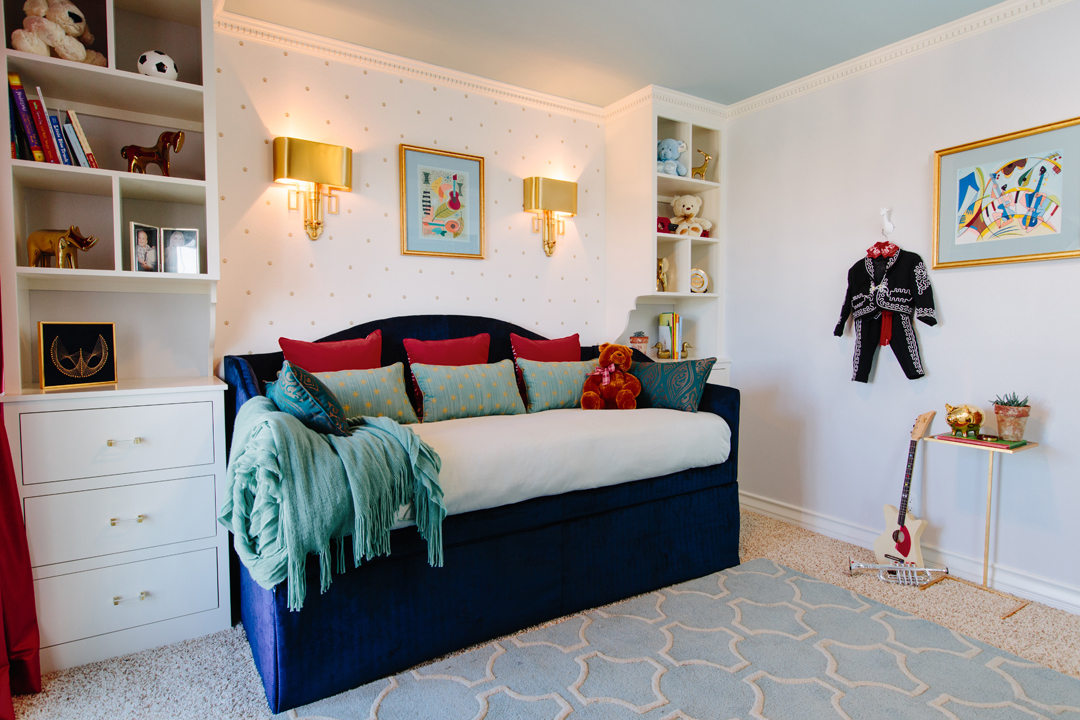
Project Nursery’s design partnership with Decorist is in full swing! We launched our collaboration with our favorite online interior design service a couple of months ago, and things have been ramping up ever since. We’re excited to continue our series featuring a Decorist designer each week, so you can see firsthand some of the fabulous talent their designers are bringing to the nursery. Now it’s time to feature our dear friend Naomi Alon, whom you already know as Project Nursery contributor Little Crown Interiors!

What is your design style? How do you work it into children’s design?
My personal design style is modern eclectic. I love clean lined modern pieces but with dashes of bright color, vintage accents and a touch of glam. But when I’m designing for a client, I really try to figure out what their own personal style is and reflect that in their design. That can range from traditional to modern and everything in between. I take whatever design style my client wants and put a subtle “juvenile” spin on it since I work with nurseries and children’s rooms.

What trend past or present would you love to see in children’s design?
I love seeing the use of large accent wallpaper, which has been trending for years now, and I’m hoping it never goes away! I think using a bold print on an accent wall adds so much to the style of a room, and because there are so many options now for removable and temporary wallpaper, it doesn’t even have to ruin the walls.

We know the basics—crib, glider, dresser/changer—but what’s your nursery must-have?
Storage, storage, storage! The nursery will fill up quickly with clothes, books and toys, and it’s important to include storage for these items. I usually suggest a bookcase or armoire if space allows, as well as storage bins or baskets for the closet. If the nursery is tight on space, wall shelves and under-crib storage bins are great options.
What is your number one piece of advice for parents when it comes to kid’s design?
Remember that your child will grow out of it. Sometimes overnight! Children can love something one day and hate it the next, so I usually like to approach kid’s rooms with a grain of salt. It’s a good idea to keep the expensive items in the room neutral, and let them play around with their likes and dislikes by changing out easy and affordable items, like wall art or bedding.

Let us know your solution for working with a small space when it comes to children’s room design.
Designing a nursery in a small space can seem challenging, but there are a few tricks that can make things a lot easier. 1. Start with the essentials. You know you’ll need a crib, so start with that. There are even “mini” cribs available. 2. Take advantage of vertical space. Put up some wall shelving or book ledges without using up valuable floor space. 3. If something doesn’t fit, consider putting it in another room of your house, like the glider. You can also keep a toy box in the living room. 4. Add a wall mirror to create the illusion of more space—just make sure it’s not over the crib and is securely hung on the wall.
Shop your nursery design today.
Make sure to meet all the Decorist designers featured in our series.


Comments
Tots Teens
This bedroom looks amazing!