Shop Suggestions
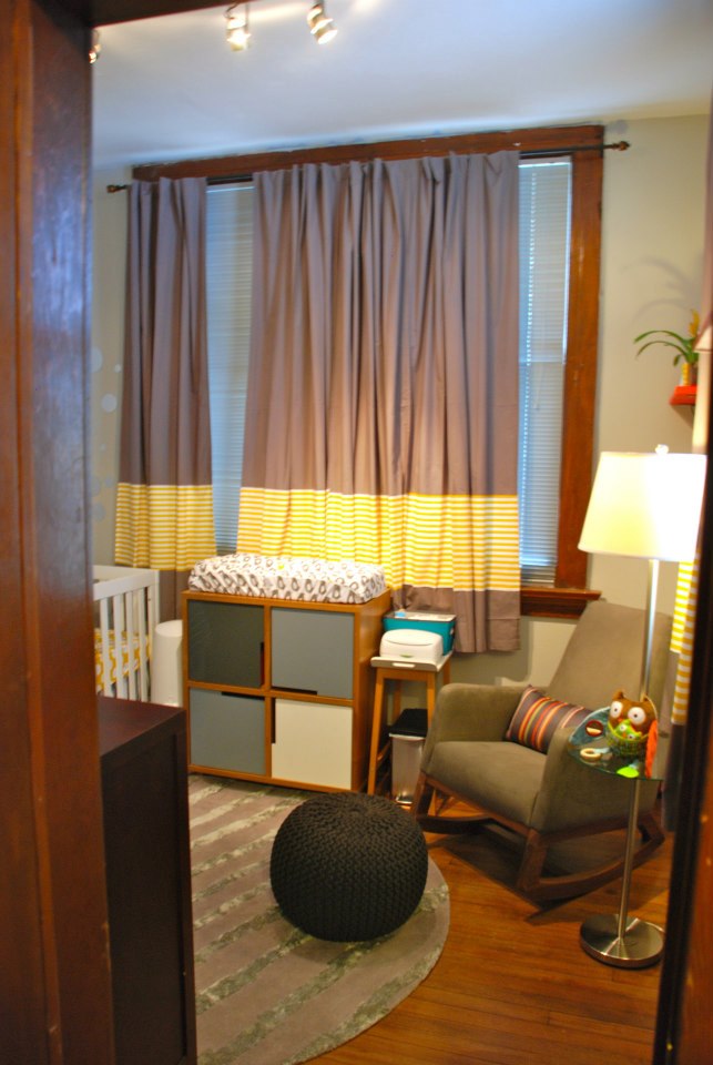
I spent a lot of time thinking about how I wanted to do our little man’s nursery. I was trying to steer clear of a “theme”. Instead, I played around with colors, while keeping the base color a modern gray. I’m thrilled with the results!
rosenholl


Comments
PW in Mpls.
I love the colors that were used! They are modern while still having a very masculine feel. The theme colors were nicely used throughout the room with the toy storage, children’s books and wall art. This little man will be a very happy baby in his beautiful nursery! Great job Kansas City!!
Alison Mar
Simple and light. Just the way I prefer nurseries to be.
Lisapeck
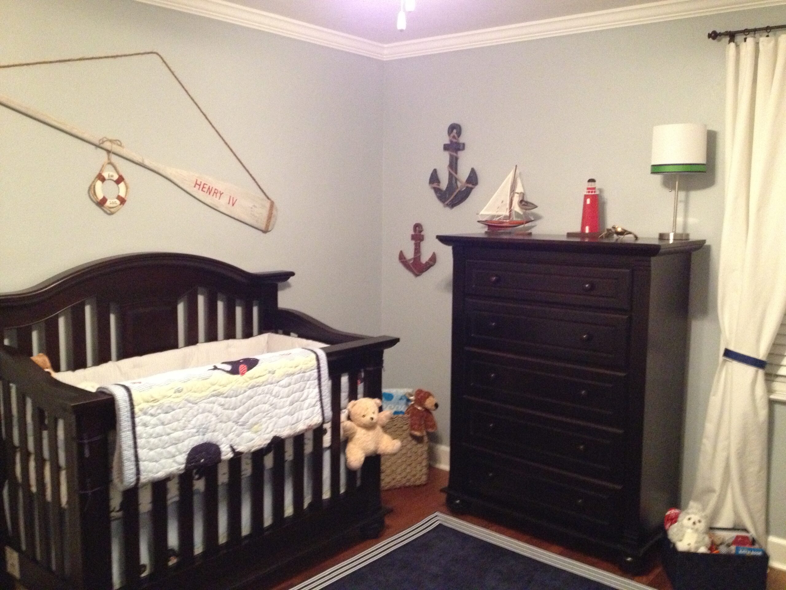
it’s great how you balanced the severe look of the crib and the dresser with the whimsical accents you have together with the softer colored shelf and sofa. Where did you get that stuffed giraffe?
jw
This is the most beautiful baby room i have ever seen. I would like to give it 6 stars.
Jean
Love the room! What color paint is that on the walls?