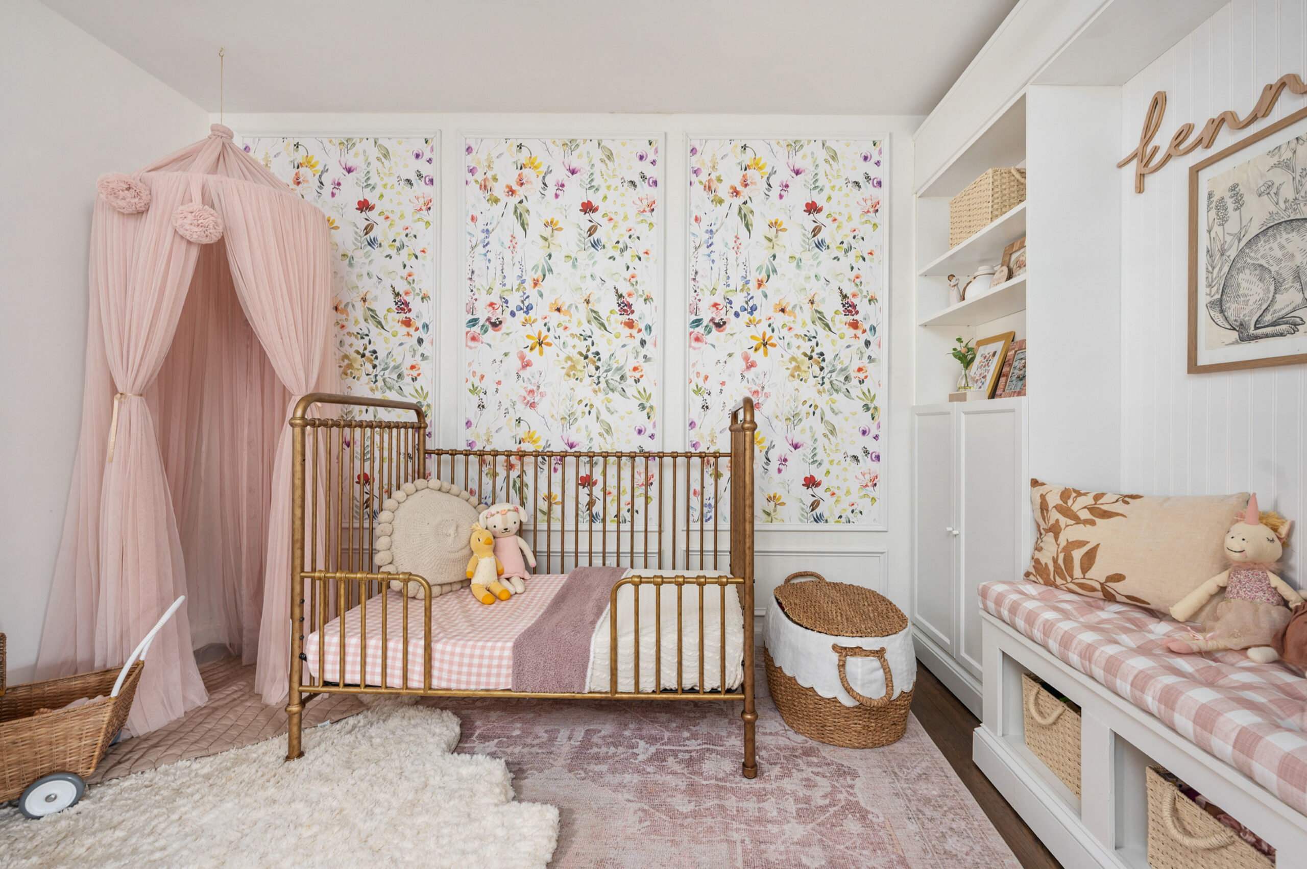
It was love at first sight when we saw this baby girl nursery. I mean how gorgeous are those DIY framed wallpaper panels! We love the dramatic impact they make behind the vintage-inspired gold crib. Alexa Mahaffey designed this beautiful space for her two-year-old daughter, Kennedy. Lucky for us, Alexa shared the framed wallpaper tutorial on her own blog, Alexa at Home. Make sure you follow along with her there and on instagram to find more of Alexa’s design, style and DIYs there. We are so excited to be sharing this pretty floral nursery with you all today. Thank you, Alexa, for sharing all details about the space below!
Where did you pull inspiration for your nursery design?
My goal for all the spaces I design is that they are timeless, cozy and welcoming—the perfect balance of old and new with lots of character.
I designed Kennedy’s toddler nursery to be botanically-inspired, whimsical and charming with girly and vintage elements. I pulled inspiration from Pinterest and home design accounts on Instagram, but the wallpaper paneling, and starting point for this design, was something I dreamt up in my own head!
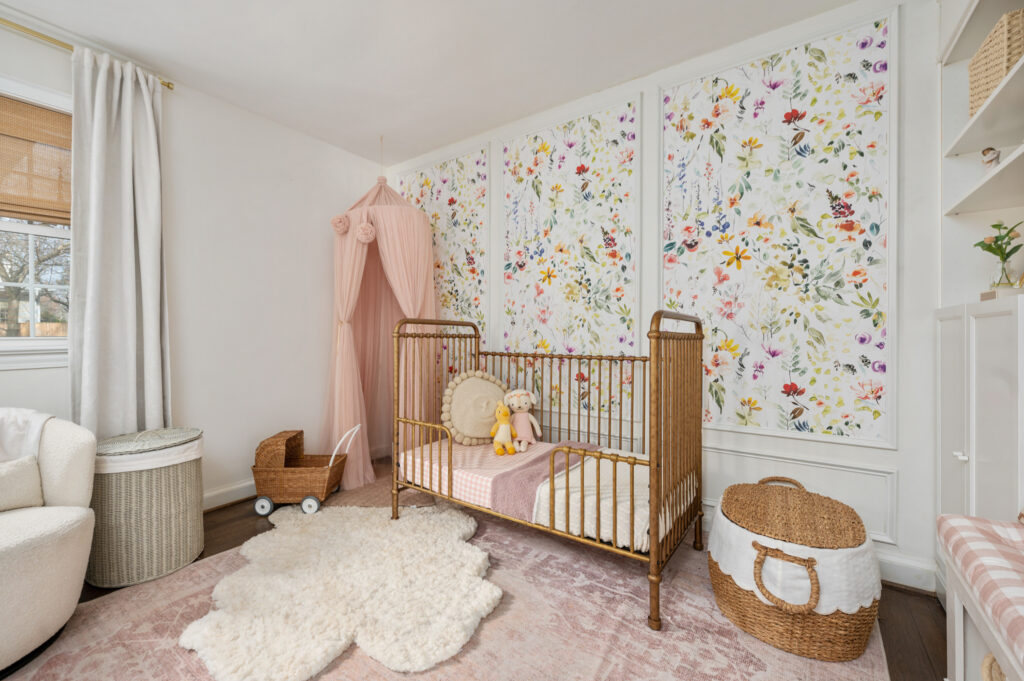
I knew I wanted an accent wall, and I couldn’t decide between paneling or wallpaper so I sketched up this design for DIY framed wallpaper panels, and I love how it turned out. I documented the steps to this beginner-friendly DIY on my blog.

What part of the design process did you enjoy the most?
Getting creative with the design elements to provide functional storage. When I found out I was pregnant with baby number two (Noah), we had to combine Kennedy’s new room with her play space, as her brother would be occupying her old room. I started researching ideas for built-ins and came across a few DIY ideas on Pinterest using IKEA billy bookcases.

I sketched out some ideas and ultimately landed on a design with a built-in reading nook because Kennedy loves books. My dad is super handy, and he helped me bring my vision to life! The bookcases are less than a foot deep so they really maximize vertical storage without a large footprint, and the lower doors hide the clutter, which my organization-loving self loves.

What is your favorite part or detail in your nursery?
Definitely the wallpaper details—both the framed wallpaper panel accent wall and the little piece of salvaged bunny wallpaper from Kennedy’s original nursery (framed in her reading nook). When I redid her original nursery space for her brother, I wanted to preserve part of it forever for her new big girl room, so I kept a piece of the wallpaper and framed it. I plan to do this with all my kids’ nurseries and eventually use them in a gallery wall in a playroom one day.

What is one thing that you would tell other parents to consider when starting their own nursery design project?
When designing a space, you don’t need to choose between beauty and functionality—you can have both! I always think about how I want a space to function before I design it, and then I layer on the pretty details. For example, Kennedy’s room needed a lot of toy storage, but kids are messy and I know from experience open shelving can easily look cluttered. The bottom doors allow me to tuck away the mess when she’s not using it. The top shelves remain open for displaying sentimental items and pictures.
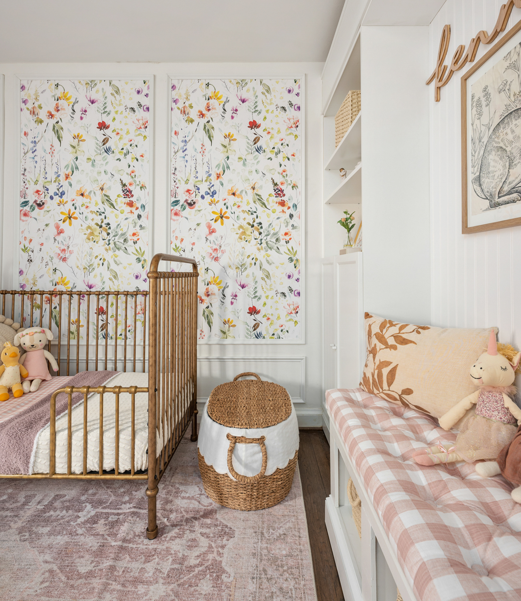
Similarly, I chose a crib that could be converted to a toddler bed. We adore her 3-in-1 vintage-inspired crib that has grown with her from babyhood to toddlerhood and is equally as beautiful in each configuration.
Photography by Cynthia James Photography
*this post contains affiliate links*


