Designer Vanessa Antonelli is sharing her latest nursery design, and wow-oh-wow, we love it! Vanessa took the idea of a traditional blue nursery turned it on its head and created a beautiful modern and sophisticated blue nursery. Thank you, Vanessa, for sharing all the details below. We especially admire the lengths you go to in order to create the perfect space for your specific clients. We’ll let you take it from here!
I went through a few years where clients wanted nothing to do with blue or pink. It was right around then that black started trending, gender neutral was becoming more than just yellow walls, and Scandinavian was all the rage. This year I’ve seen it come full circle with the resurgence of “traditional” colors. I have had more requests for pink and blue spaces this year than any other year of my career.
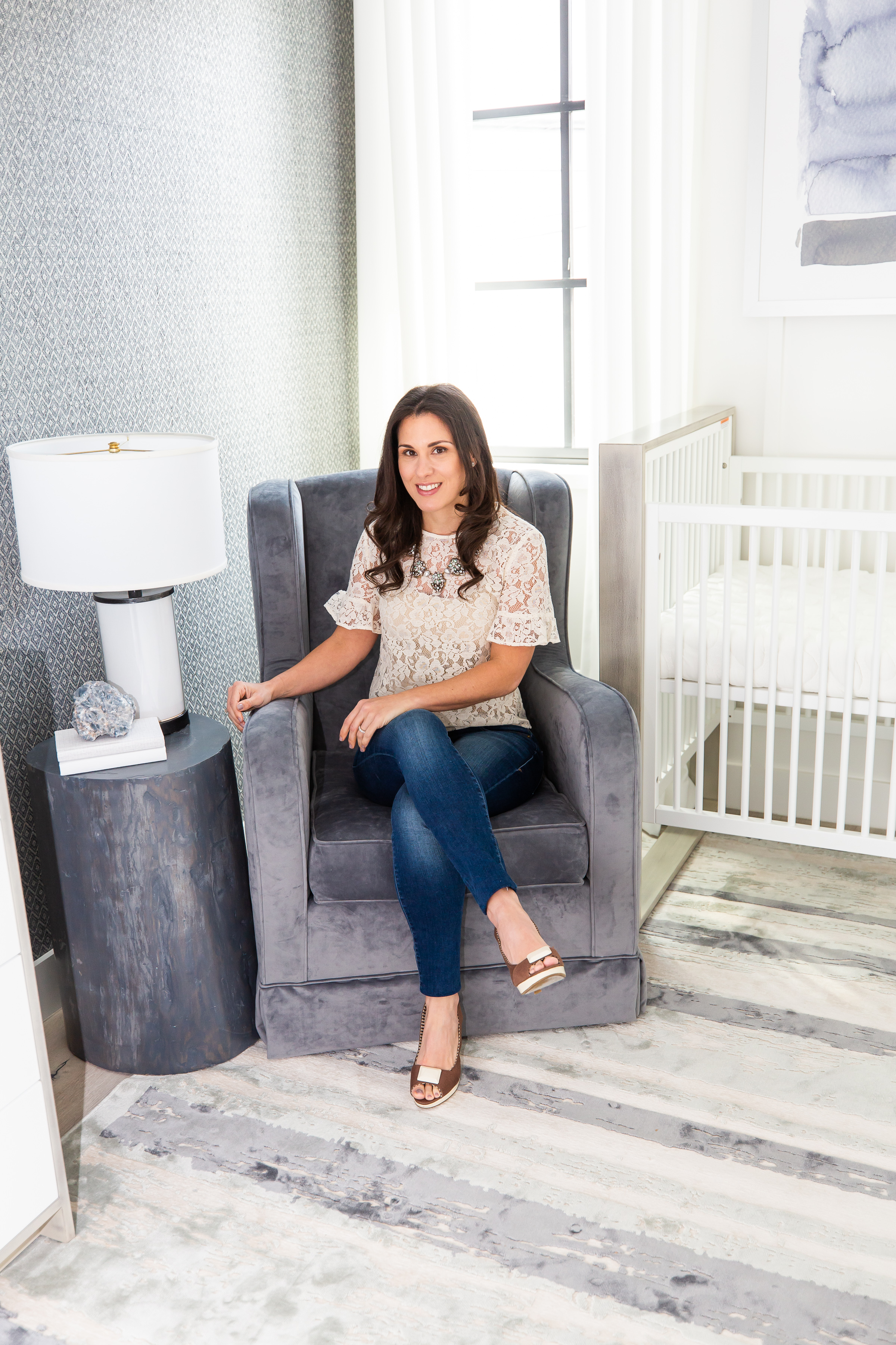
So, you can imagine when I send out my client questionnaire, and it comes back with pink or blue circled as the must-have, I have a teeny little moment of panic. Making each design feel new and exciting while using the same colors can be a challenge, but I really pride myself on giving clients their own unique space that reflects their home, life and personal style. So as I’m designing, I always keep my eye on who the clients are. I believe it’s what drives each project to look very different, even if the colors are trending.
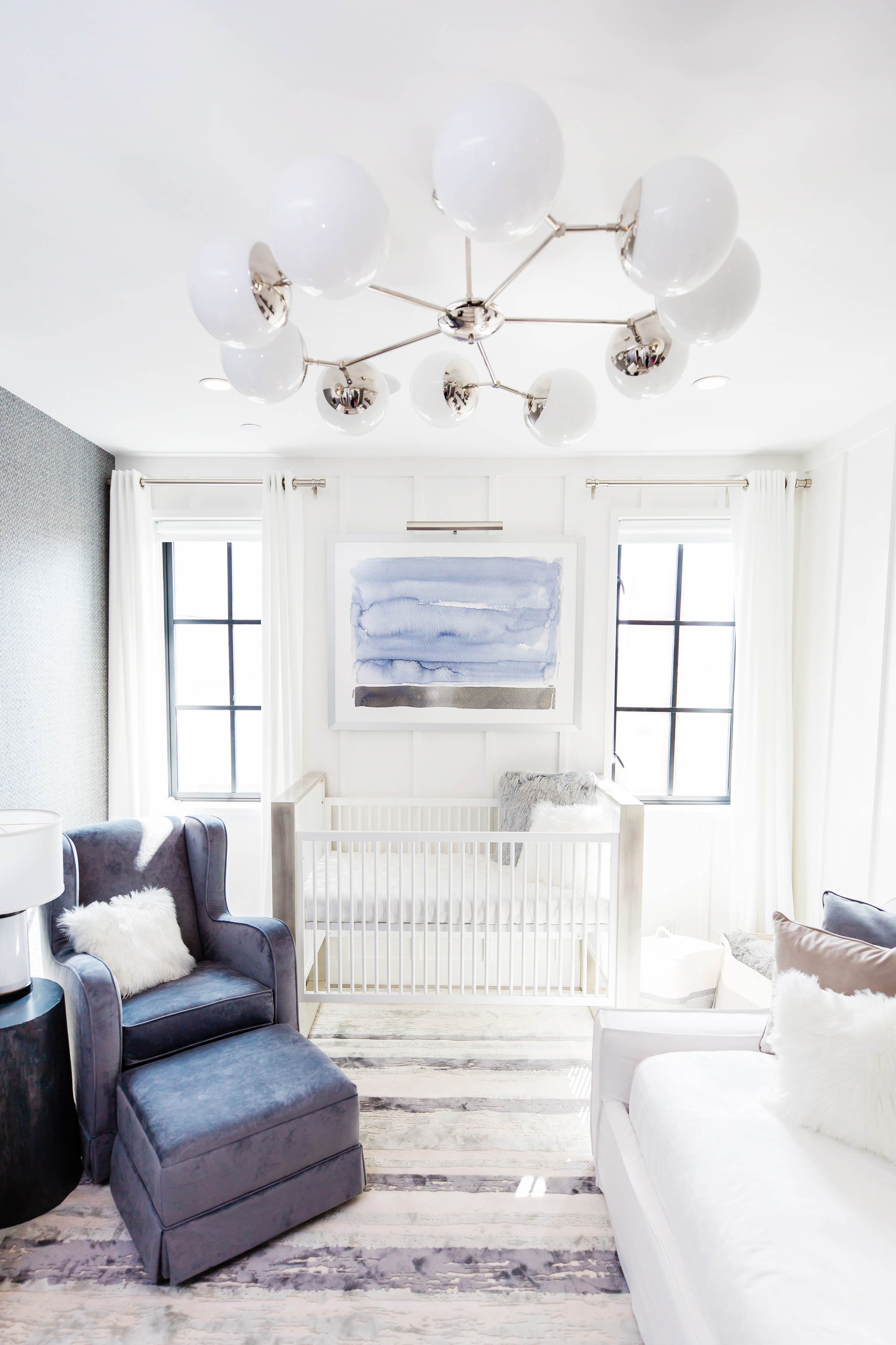
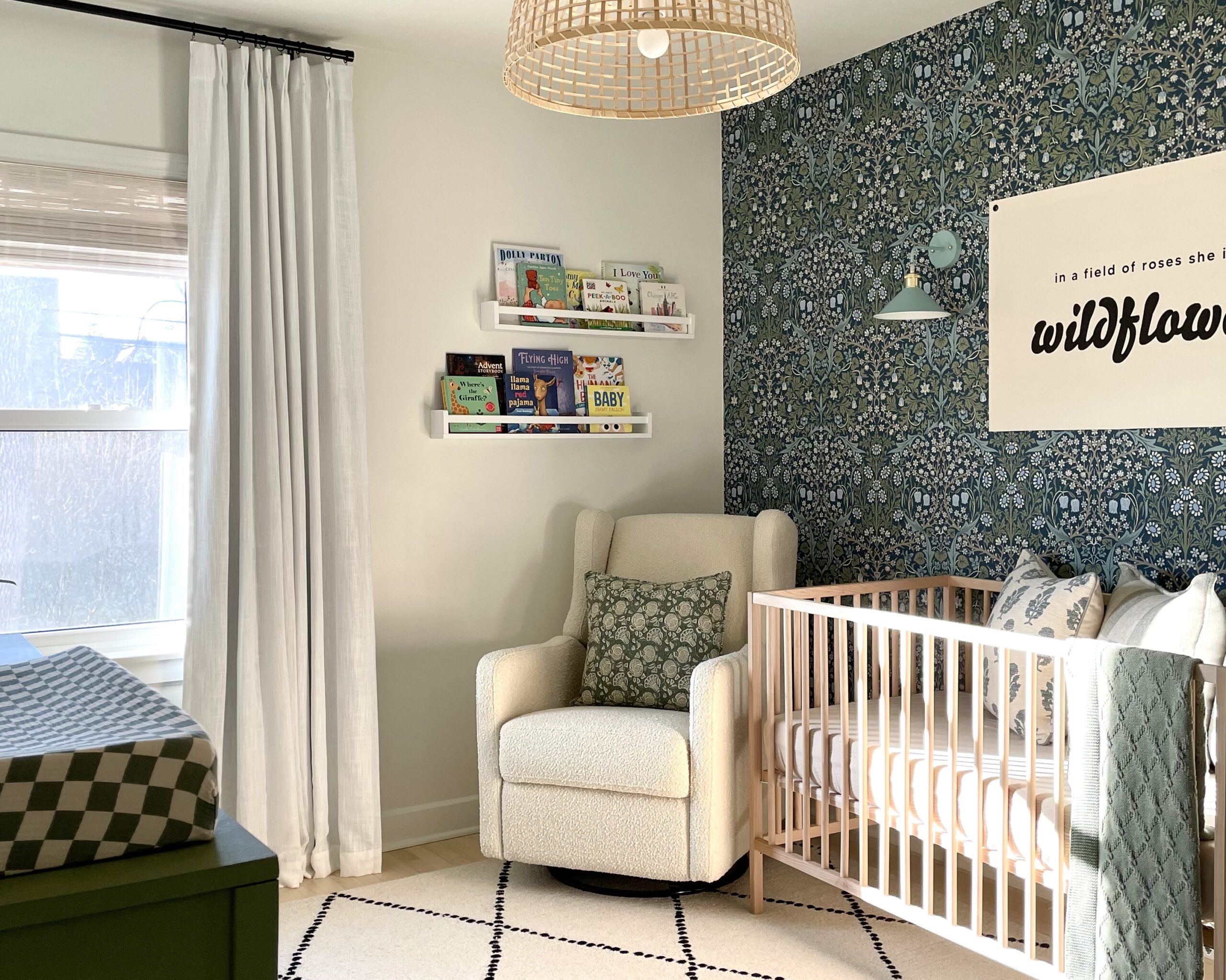
This family has a GORGEOUS light, bright and airy house near the beach in California, and I wanted the nursery to seamlessly flow with their laid-back vibe and the rest of their home. We filled the nursery with bright white, weathered gray, ivory, dusty blue and subtle greens and incorporated lots of textures.

I have so many favorite things about this room. It’s hard to pick out just one! I love the wall paneling, the woven wallpaper, the real tree stump side table, the artwork and the way it all comes together. The wall where the crib is, was designed by the architect for a full-size bed to fit between the windows. PRO TIP: If you choose a crib with a frame that doesn’t have much excess width beyond the mattress then it will always fit in a space for a full bed. That’s why convertible cribs can convert to full size beds—because the crib rail and headboard are the same length.
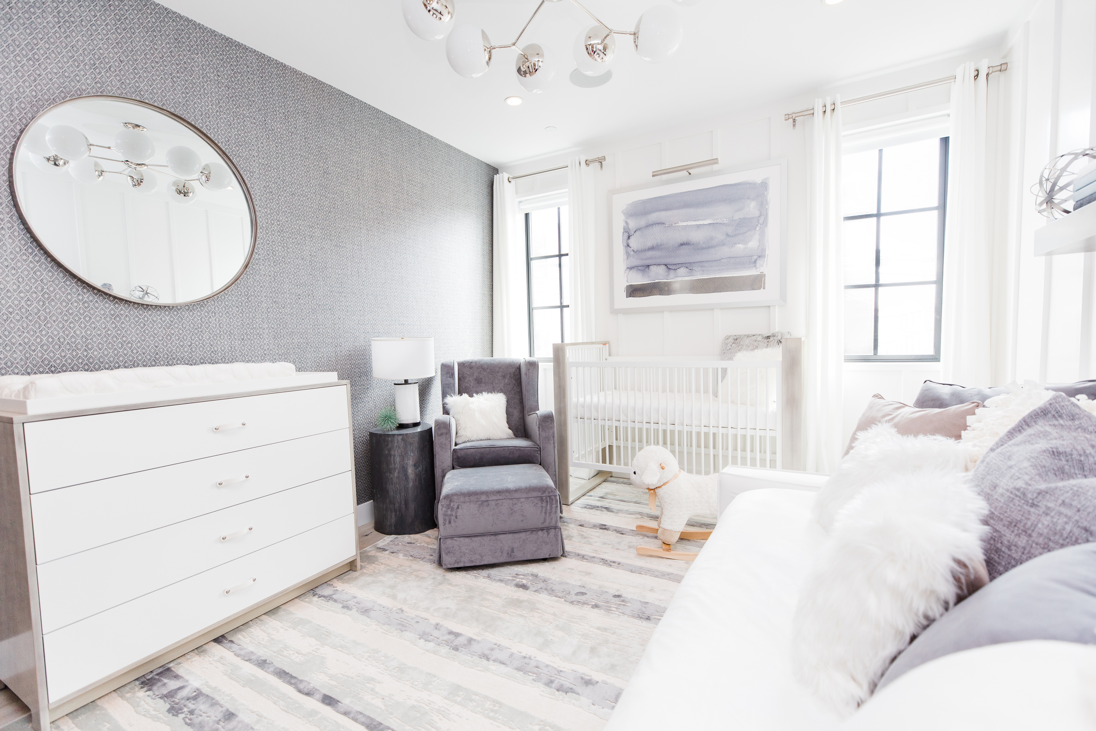
To me, the mark of success in design is if it blends fashion and function. I’m really dedicated to making sure it doesn’t just work for the big and exciting reveal but also down the road. I NEVER want my clients to start using the room and then at 3 am when they’re rocking a restless child or changing a diaper, be cursing me because they realize that the dresser height requires rock solid thigh muscles to squat while you change or the super cute round pouf doesn’t have enough surface area to hold one leg, let alone the two that most of us have.
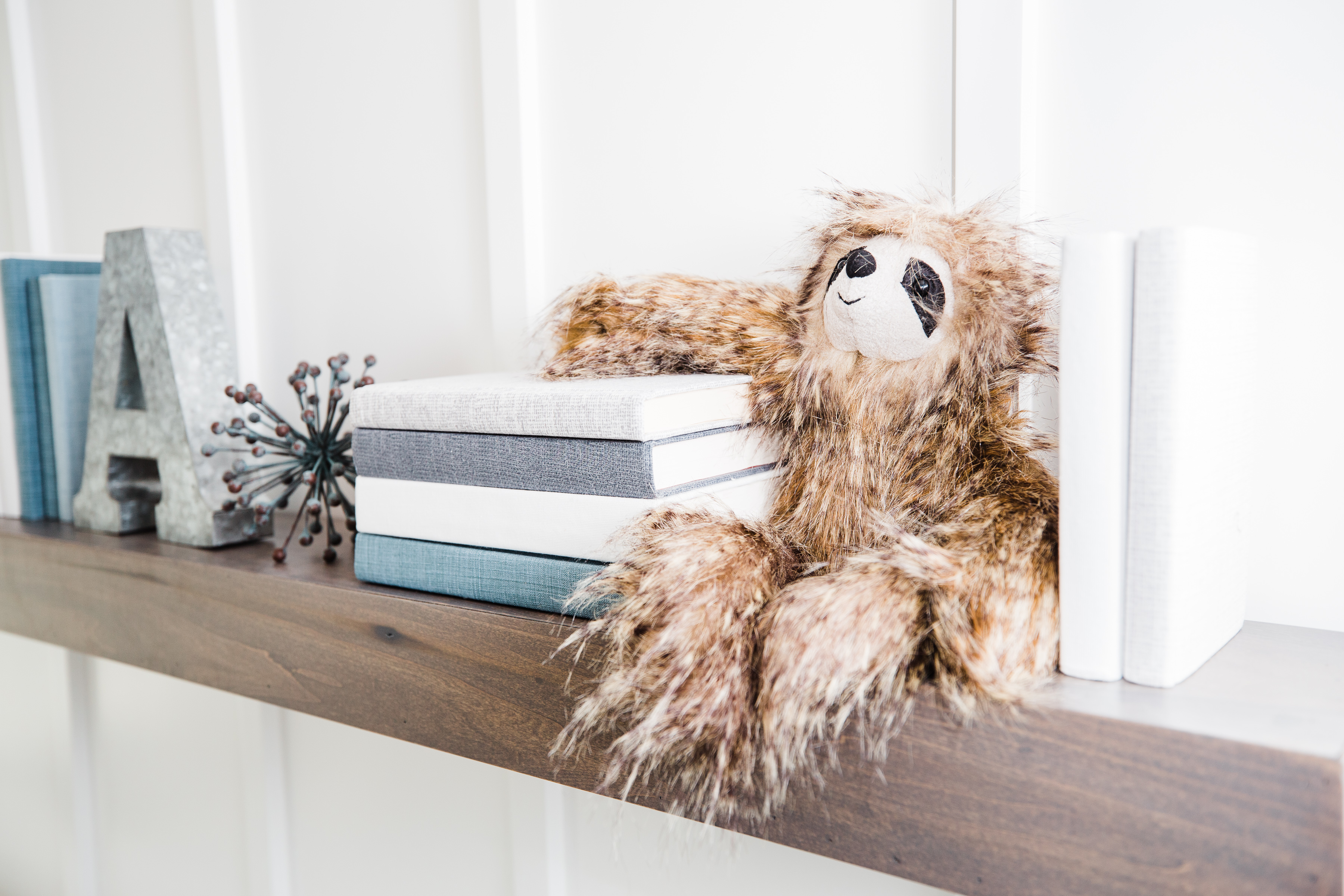

These specific clients are tall, so their crib, dresser and book ledges are all higher than average, and when hanging the mirror I based it on their heights—not my shortie self (who almost has to jump to see in it). It’s so important to pay attention to the details beyond the visual ones when you’re planning out your nursery.
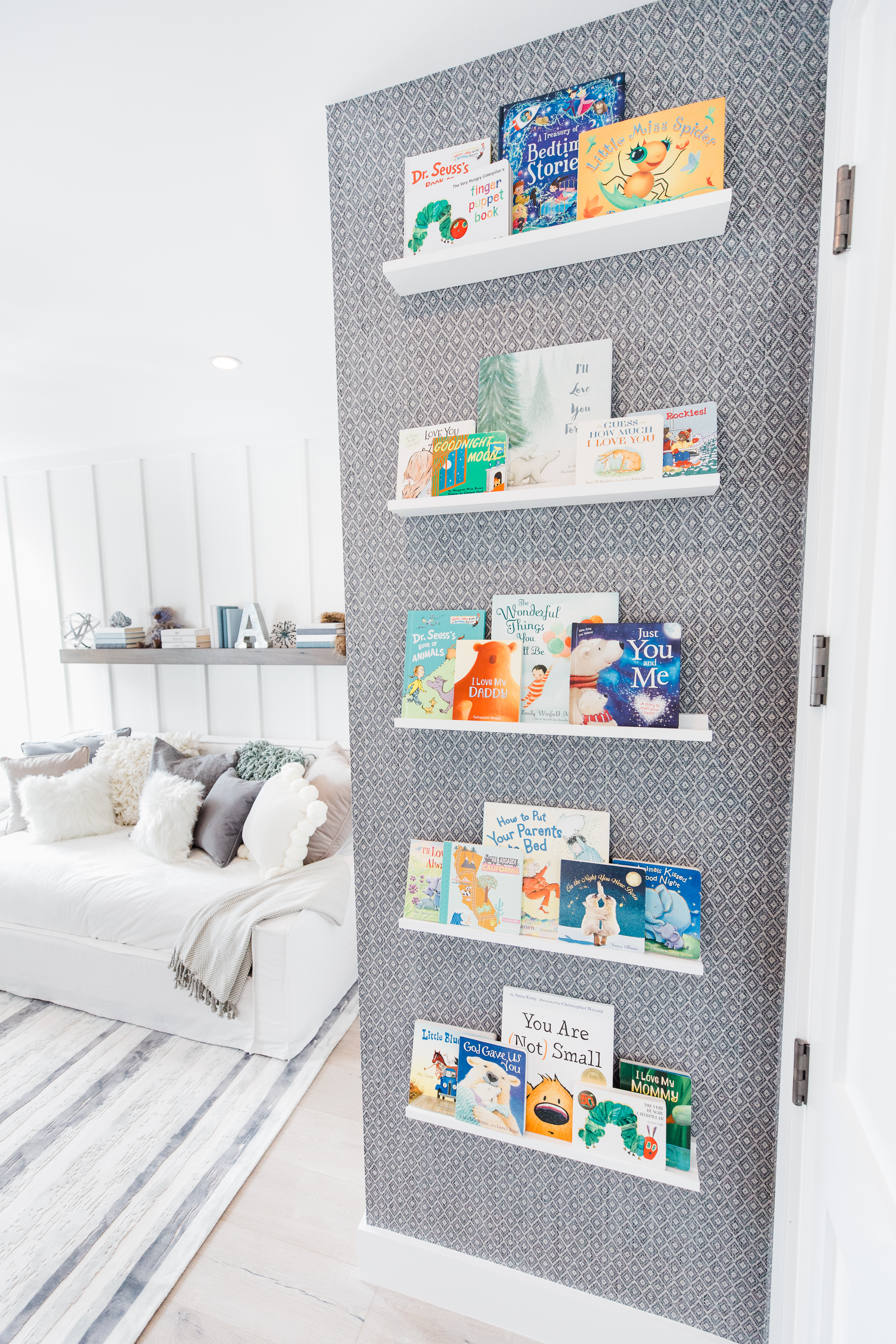
Photography by Christine Farah Photography



Comments
Anne McCormick
Who makes that chandelier and rug?
Karolina
Hello,
Beautiful nursery!
Could you please let me know where the wallpaper is from?
Thank you.
Kind Regards,
Karolina
Cindy
Where is the crib from??
Tiana
Hello – I am hoping to find out what wallpaper you used here.
Morgan Saffron
Hello! Where are the crib and dresser from?