Designer Vanessa Antonelli is back to share this amazing girl’s nursery. It’s cute, it’s cool and it’s perfect for a little girl to grow up in. Vanessa gives all the details on her favorite pieces in the room, the challenges of working with a unique layout, and you’ll never guess where she got the inspiration for that awesome hand painted design on the walls. Thanks, Vanessa, we’ll let you take it from here!
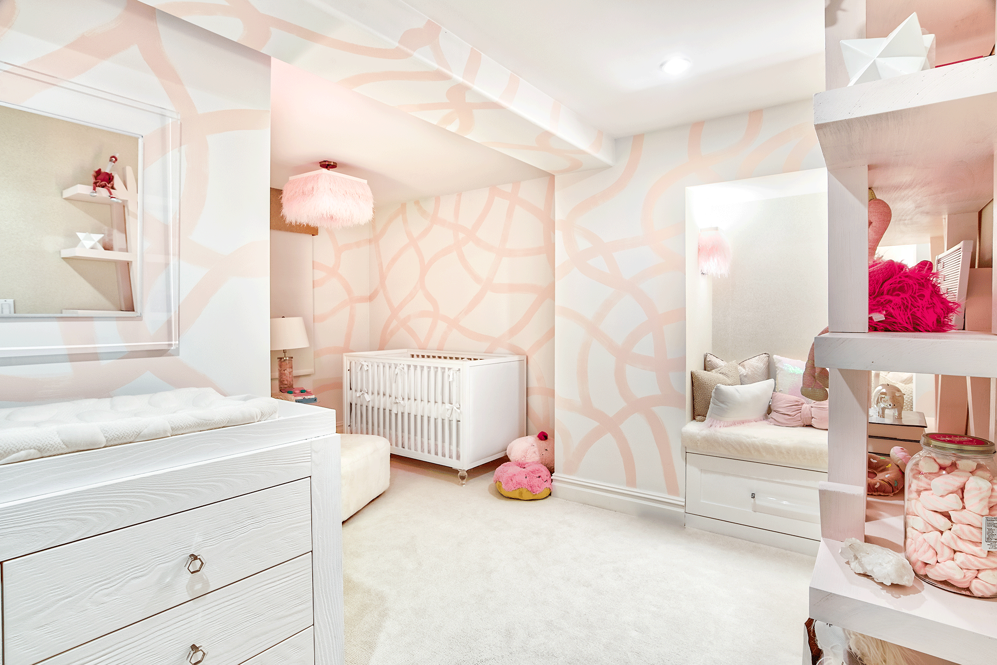
I often find the most unique layouts in projects that I take on in cities because families renovate and move walls to make the space that they have work for their family. This room was previously for three children, and my client (the new owner) was going to be using it for one child. It has an L-shape, and it was important to make it feel like one room as opposed to two separate spaces. I take notice of everyday movement through a room when I am laying it out, and I knew that if we didn’t put the crib as far into the space as we could that the area would be less visited, making it a forgotten zone. By putting the crib and chair there, it guaranteed that the entire room is utilized daily and gave the entire L a more open feel.
I’m the first to admit that I shy away from pink. That’s extremely difficult when your niche is children’s spaces because a large majority of the time, little girls or parents of baby girls want pink. When this super stylish mom-to-be said she wanted pink, I wanted to take it in an unexpected direction. In order to create a color palette that works, my suggestion is swatch, swatch and more swatches!

Plan out every single piece of the room before moving forward with any of it. This allows you to carry around your paint swatch, your fabrics, your wood and anything else to make sure everything you are choosing complements each other. It’s often hard to see if a gray reads green or a pink reads orange until it’s next to other colors in the same family. You don’t want to put colors together that don’t work, so do not be hasty! Order those swatches and view them together on a neutral surface in all different lighting, both in and out of the space.


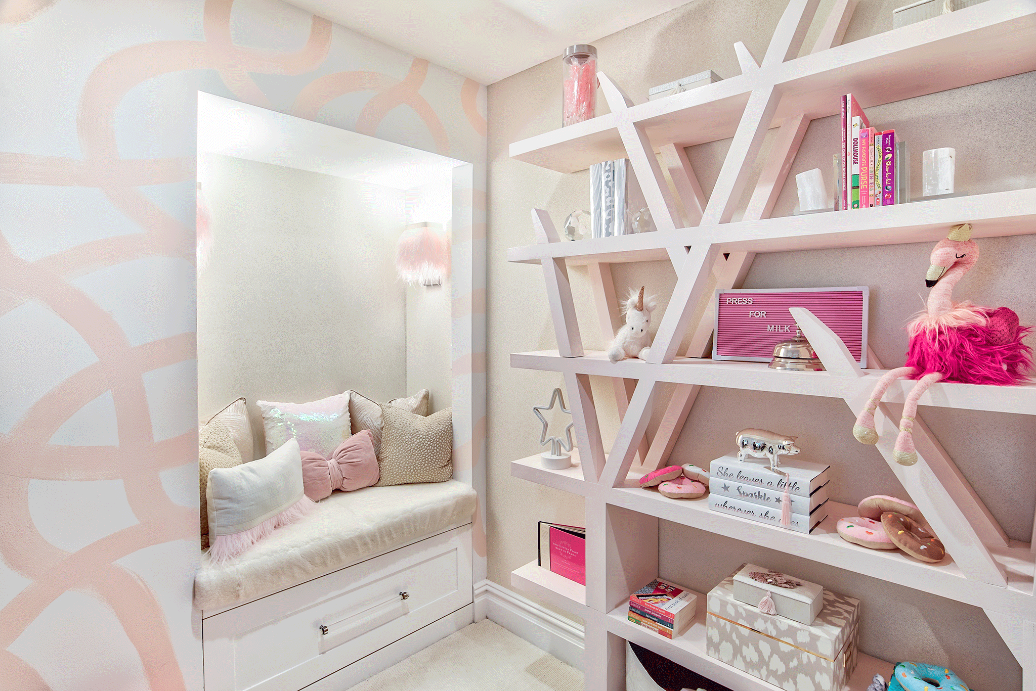
The mom-to-be really wanted to turn a portion of the space into a reading nook. I thought it was the perfect place for it, but I wanted to make sure that if we had this seating and then also a glider and ottoman that we didn’t add any additional chairs into the space. There’s a scene in the movie Knocked Up where the guys are sitting in a hotel room in Vegas commenting on how there are five different types of chairs in the hotel room, and while it was really funny, it is forever embedded in my brain. It’s really easy to buy cute little kids chairs, create a nook, put a rocking chair in and then just keep going with it. Then suddenly it becomes “the room with all the chairs.” I was extremely conscious of that, and I think the nook turned out to be one of the many special spots in the space. Those custom feather sconces are everything that girly design dreams are made of!

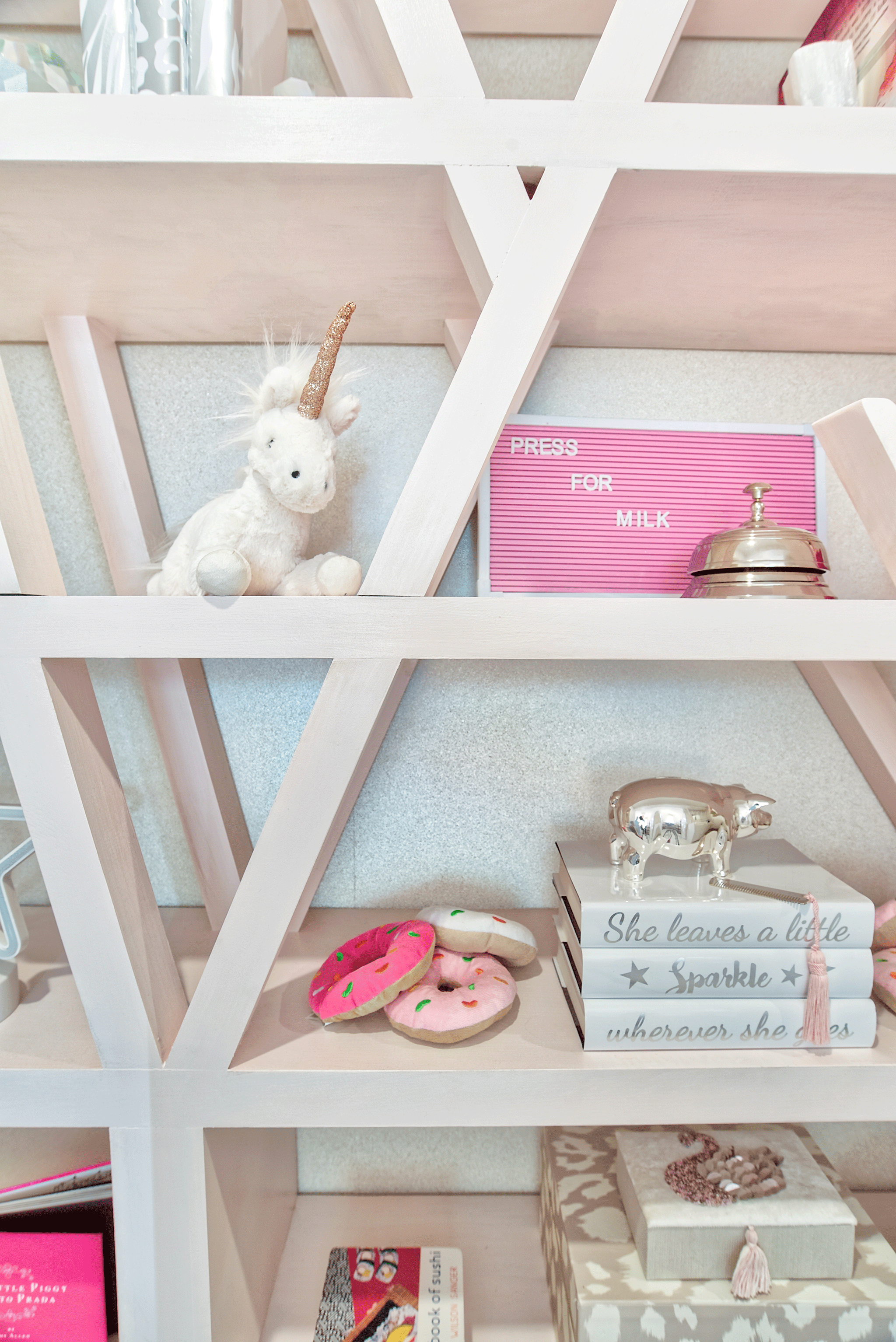
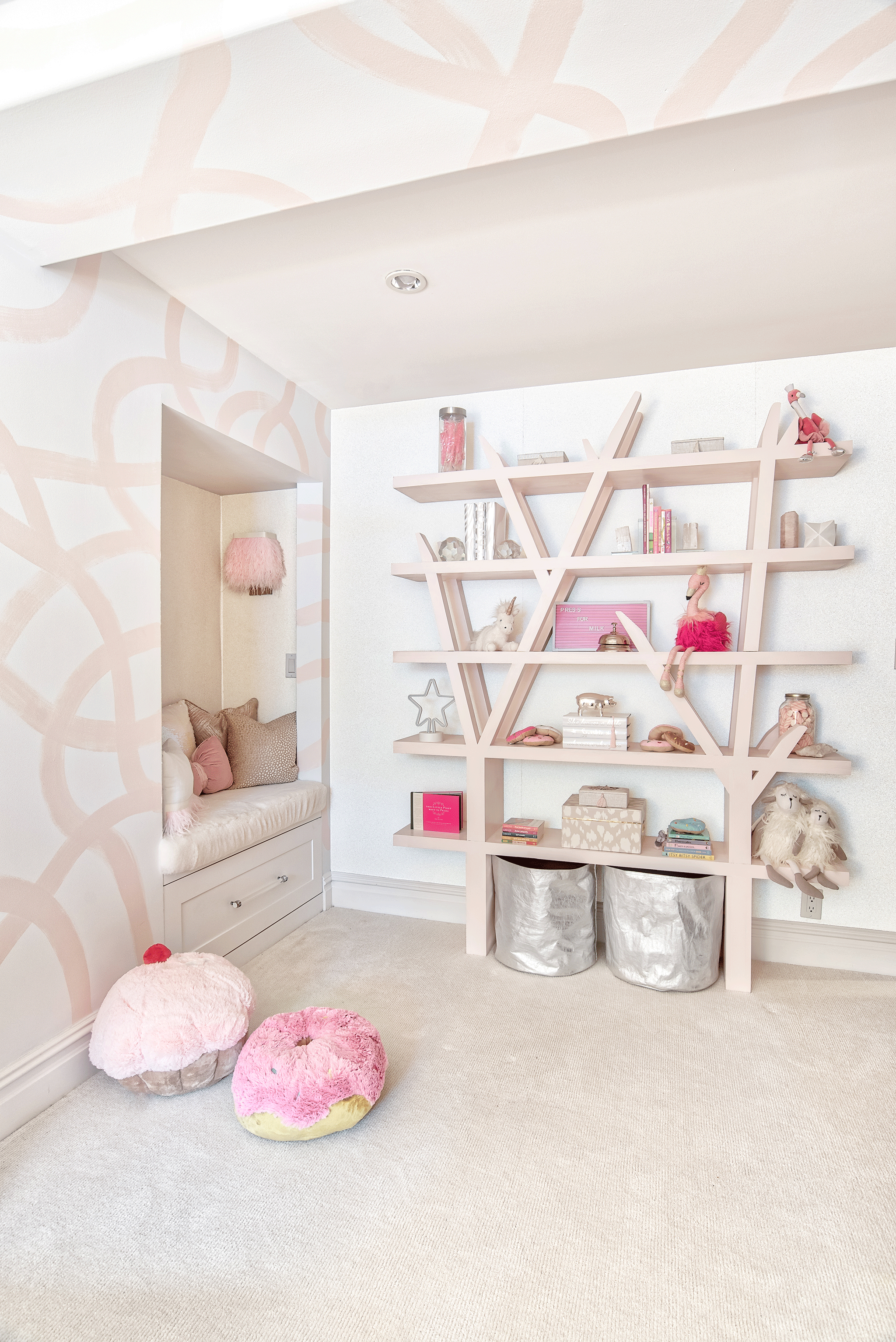
I also have to give a nod to some of the other really unique and spectacular elements in the space. The large piece of custom artwork is fun and fierce all at the same time. I’m not sure if there is anything cooler! The walls were hand painted in a large scale version of a design I found on one of my own daughter’s notebooks showing that inspiration can truly come from anywhere!

Photography by Chris Veith


Comments