When our friend Tori Swaim, of New Arrivals, Inc., came to us with this sweet nursery we knew we had to share it with you all. Tori helped with the baby bedding, of course, but the nursery design belongs to mama, Brittney Horton. Mother of two daughters, she had her first chance to design a space for a boy with baby #3, Paxton. (Spoiler alert: he was born at the start of this month and is just as cute as can be.) You can follow along with Britt’s family on her instagram account. Thank you, Brittney, for sharing your space with us; we’ll let you take it from here.
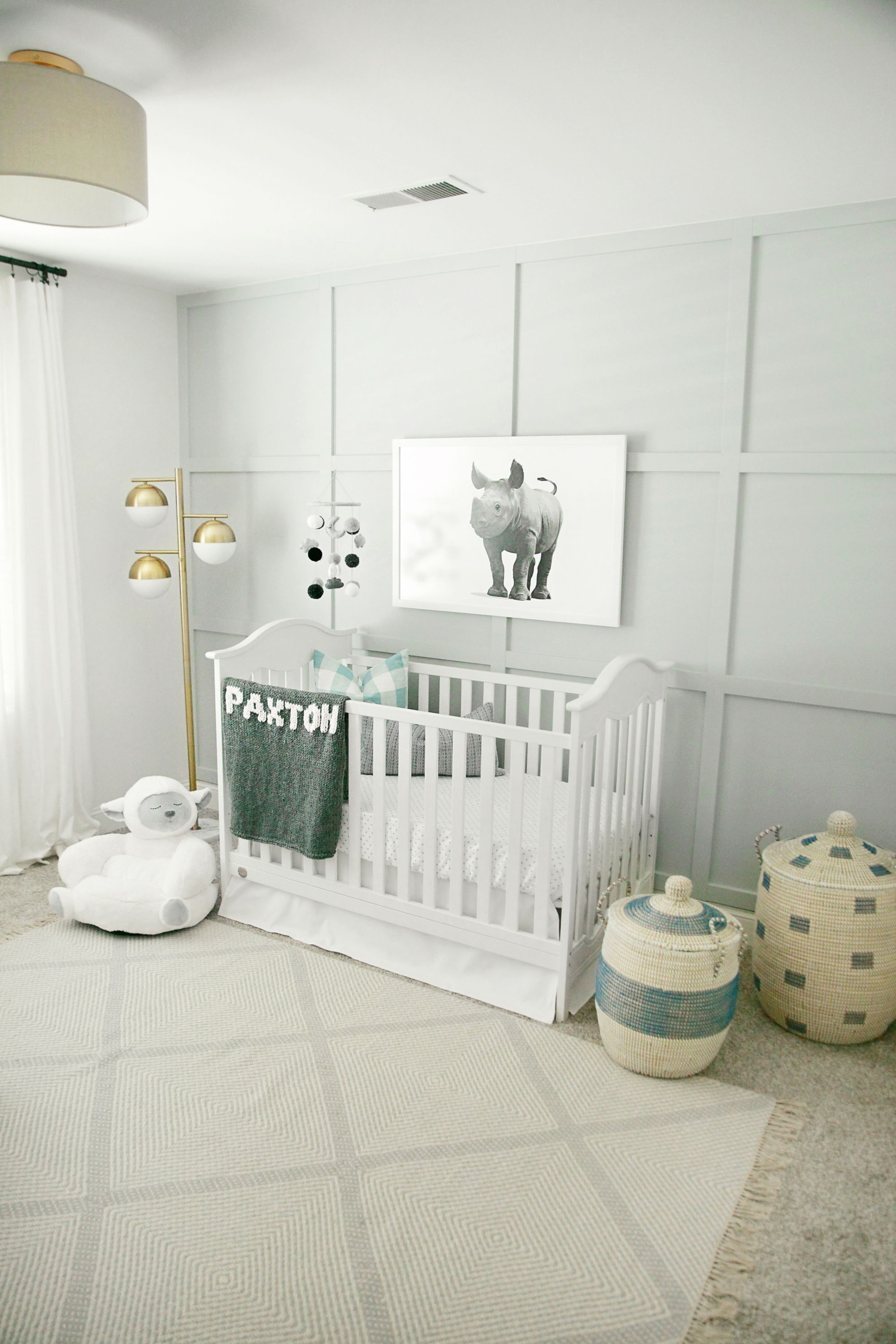
This space was so much fun to create! With having two girls already, this was the first time I actually ever had to think BOY! I will admit, at first it was very hard for me to think outside the box of my typical girly colors and patterns consisting of pinks and florals. I really had to think about what I would want our son’s room to be like! The inspiration for the room started when I saw this baby rhino artwork from Paper Llamas. As soon as I saw it, I knew that it had to be the focal point and inspiration in this room. The color scheme of the painting was exactly what I wanted to work with, and the sweet face of the baby rhino, mixed with the strength that rhinos embody, made me think baby boy. The ideas and inspiration all began from there!
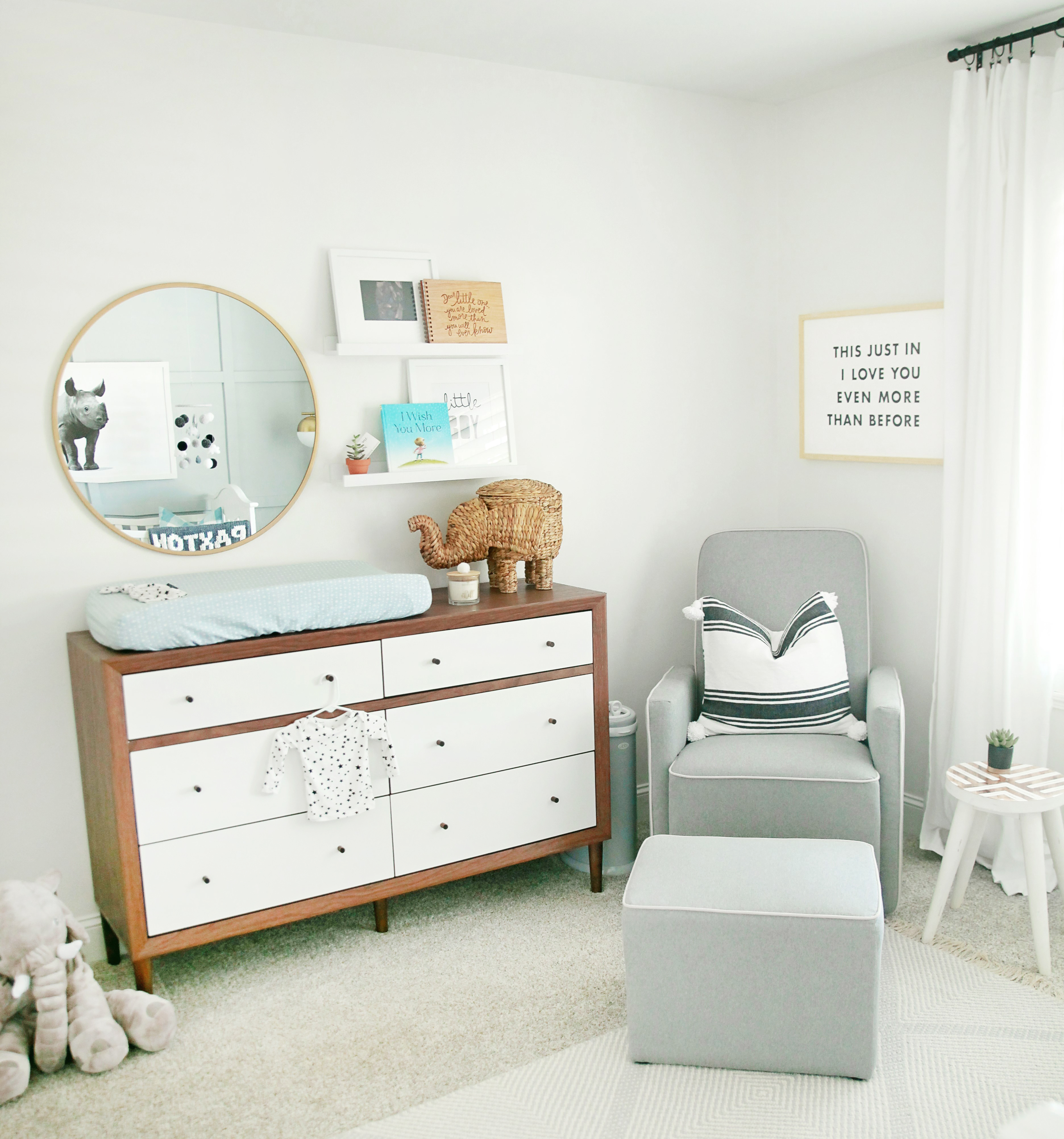
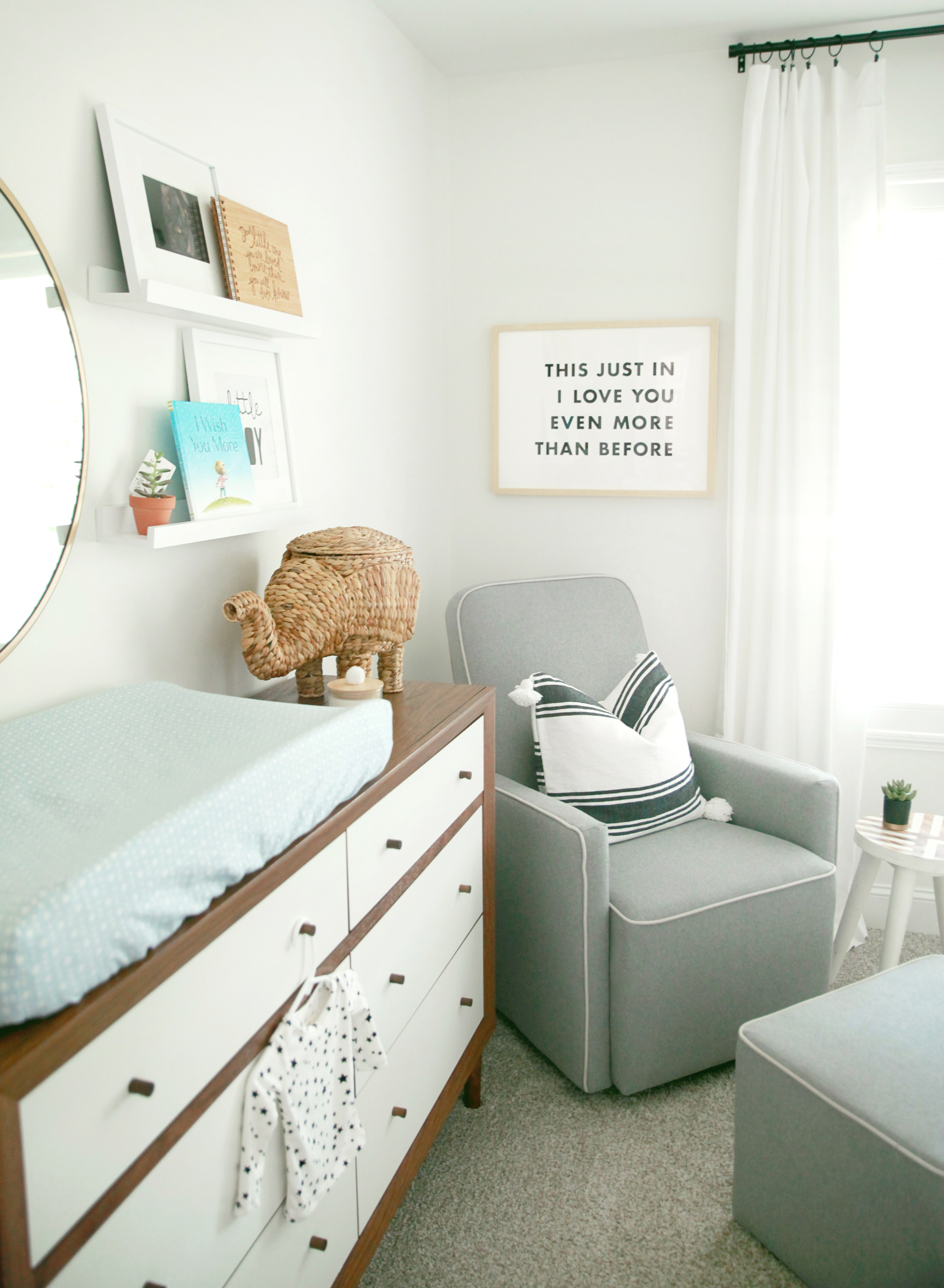
My design style would definitely be classified as transitional. I love a traditional concept, mixed with some fun, modern pieces. The one thing I made certain was that I wanted this room to have a baby feel and not look too grown up. With this being our last baby, I wanted to fully soak in all those newborn feels and touches! He will have his whole life to do big kid rooms, and I wanted to walk into this space and just think baby. By mixing the right touches, we were able to make this room feel like a baby’s nursery, without screaming “BABY.” By combining the star printed baby bedding and baby mobile, with the dark wood mid-century dresser, we were able to capture the sweetness of a newborn and also the masculine essence of a boy (which was important for my husband in his only son’s room).
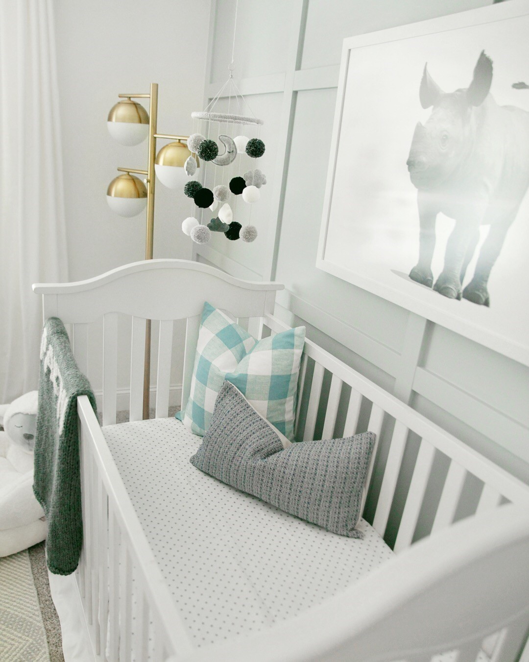
The main thing that really stands out in this space is the board and batten wall that my husband created. I went back and forth with the concept of doing wallpaper or a board and batten wall, and obviously that won! I’m so glad it did! The wall was such a labor of love on my husband’s part, and it really fits the traditional style that I love. It adds character and depth in a way wallpaper could not have. To make it pop a bit more, I decided to paint it Sherwin Williams Latitude to add some contrast. This color pairs perfectly with the star bedding and rhino painting, too. It took about five color samples to determine the perfect color!
We did have a little obstacle when finishing up this room. The rug was probably the toughest decision I had in creating this space. I had my heart set on a gorgeous shag rug that I thought would have matched perfectly. However, once it arrived, the background color was a dark beige/tan, and it really threw off the light and white feel of the room. I was devastated because not only did it take me forever to find the perfect rug, but once I did, my heart was set on it. After moving that rug to our playroom, the hunt was on for another coordinating rug. I ended up coming across this gray and ivory geometric rug, and actually, I like it even more than the first! It’s understated, which is great because it lets your eyes focus on the board and batten wall and artwork. Yet, it has just enough of a print to make it fun and add some texture to the space. Overall, this obstacle was a tiny, little bump that ended up working out for the better!
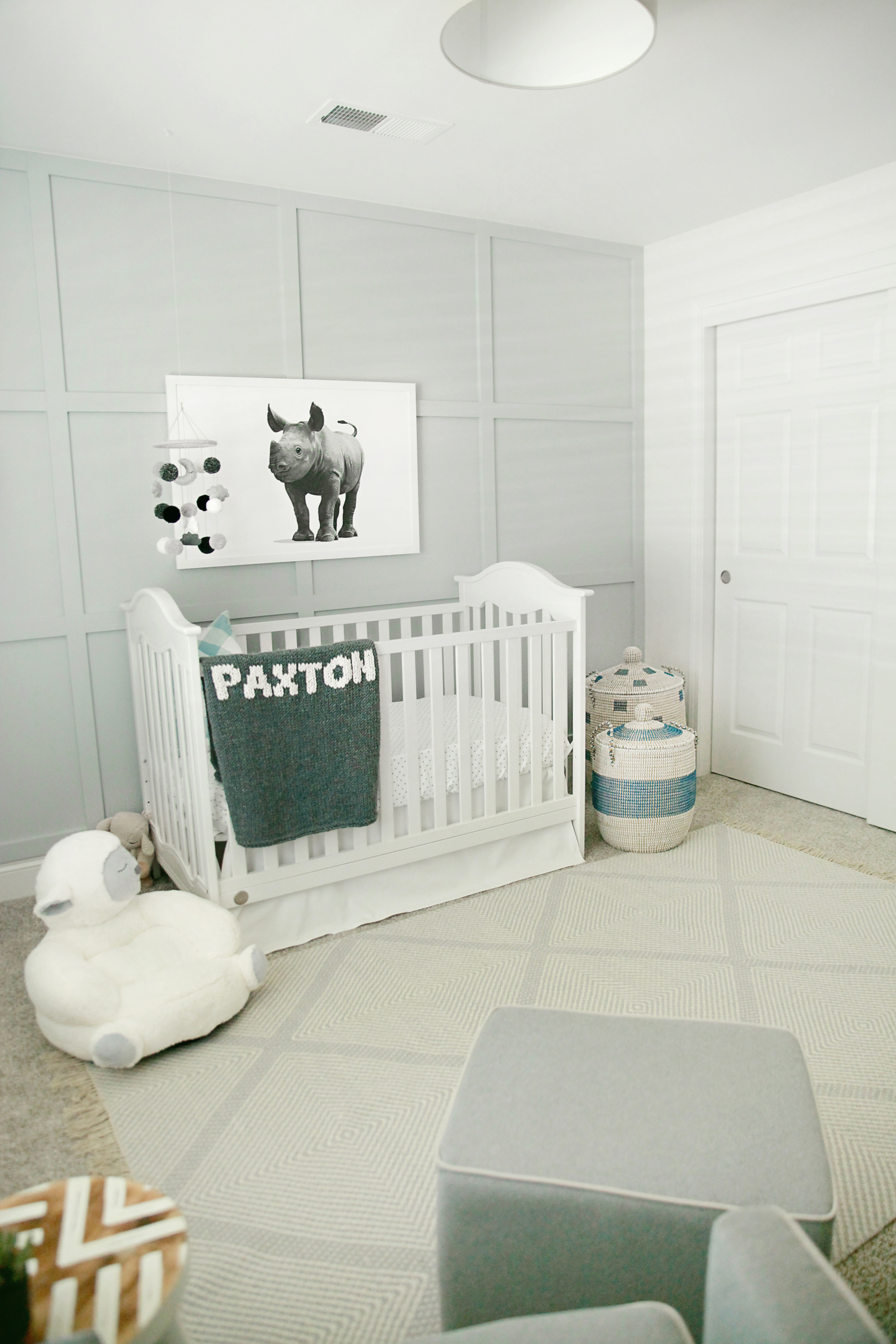
When I was waiting for our little man’s arrival, I would sometimes just go and sit in there and think of the day our son would be in my arms, rocking in this chair, or laying his sweet face in the crib. It still throws me off to see blues and grays when I’m walking down our hallway, but to be honest, I couldn’t love this room any more. To me, it’s everything I wanted and pictured our little baby boy’s room to look like and feel like.
Photography by Courtney McLemore with Dear Jude Photography
*this post contains affiliate links*
SaveSave
SaveSave
SaveSave
SaveSave
SaveSave


Comments
Amanda
Where did you get rug??
Snoober
Where is the blanket from?