We love when we get the chance to interview interior designers after they’ve designed a nursery. It’s always fun to get another insider’s perspective on the latest trends in nursery design. Not to mention they give the best advice to our readers! Today we are chatting with Willa Ford of the LA-based firm WFord Interiors, and she is telling us all about this graphic boy’s nursery with a fun point of inspiration. We love the combination of patterns and modern and vintage elements—the results are striking!
What inspired the nursery design?
Our clients actually met while he was working as the valet at The Beverly Hills Hotel (hence the drape fabric). I knew I wanted to do something that would be bold and fun for this amazing mama of three that would work for a girl or boy.

 Hip Hop Poster | Changer | Pendant Light Fixture
Your mix of patterns is masterful. Any tips for parents who are nervous to go there?
I say get small samples of things and lay them out. Live with them for a few days. If you like them more every day, it’s right. If you tire of it, try again.
What do you love most about the design?
Nurseries are designed for babies but rarely to grow with the baby. I love that you could see a teenager in this room without changing much more than removing the crib and changing a few accessories out. Or if baby moves to another room, it makes a fun office for mama.
Did you encounter any challenges when designing the nursery? How did you overcome them?
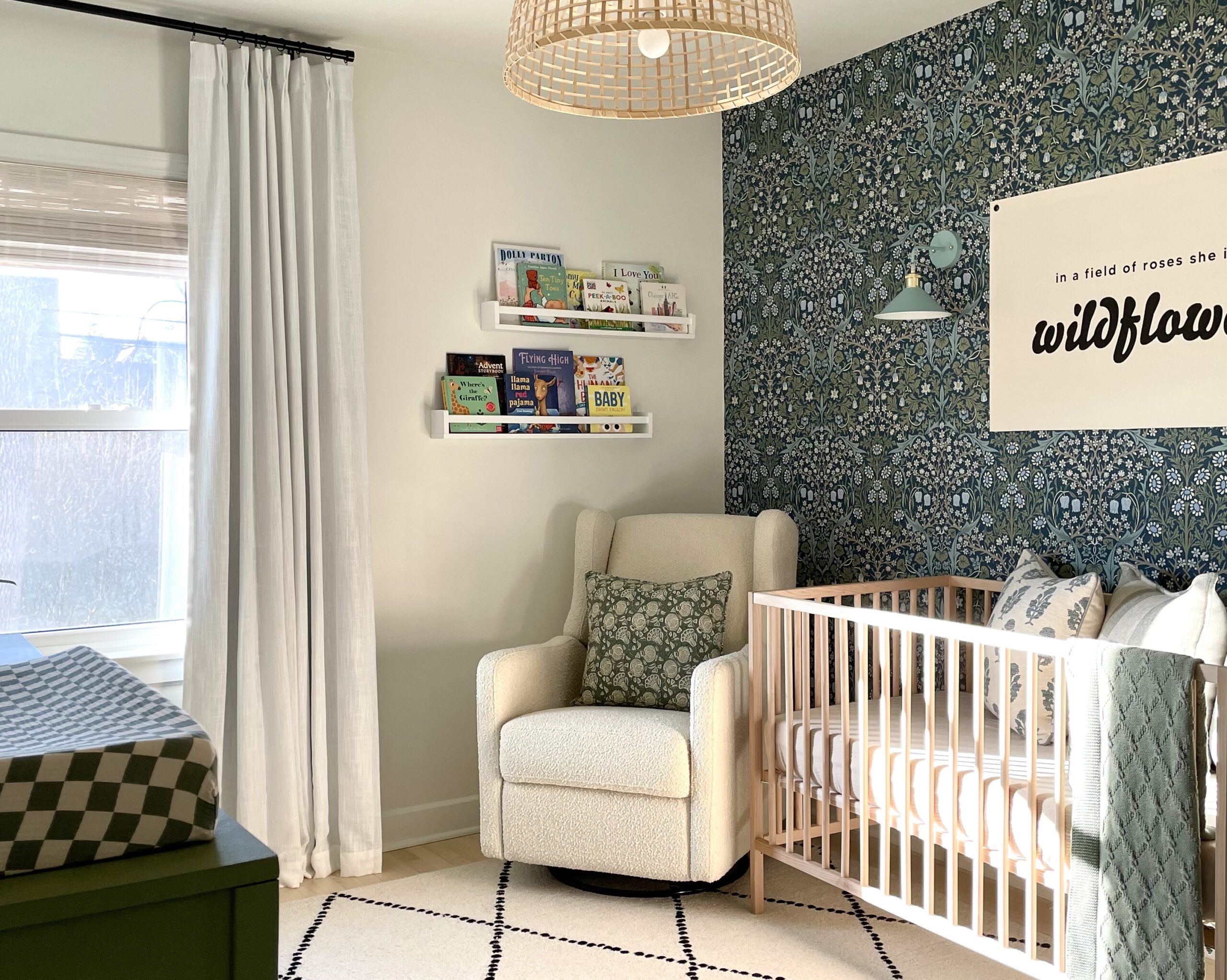
We planned pretty well for this install, so not too many challenges. We did decide to install this peel and stick wallpaper ourselves. When picking out a pattern, beware the more complex the pattern the harder it is to line up.
 Vintage Dresser and Chair
What’s your best piece of design advice you can give to other parents starting their nursery design?
Don’t stray from your own sense of style. A baby’s room doesn’t have to be pastel pink or blue or gray. In fact, babies love bold colors and patterns!

Photography by Ographr
*this post contains affiliate links*
SaveSave
SaveSave
SaveSave
SaveSave



Comments