Pam recently got a chance to check out the Decorator’s Showcase SF in person. Word was the nursery was pretty spectacular, and it did not disappoint. Dina Bandman, principal at Dina Bandman Interiors, San Francisco, was the creative force behind this unique nursery space. While not everyone embraces the “more is more” aesthetic in their own homes, everyone can admire the talent and the vision behind this stunning lemon drop nursery. Dina is giving us the behind-the-scenes scoop on her design.

Design inspiration can come from anywhere—what inspired your nursery design?
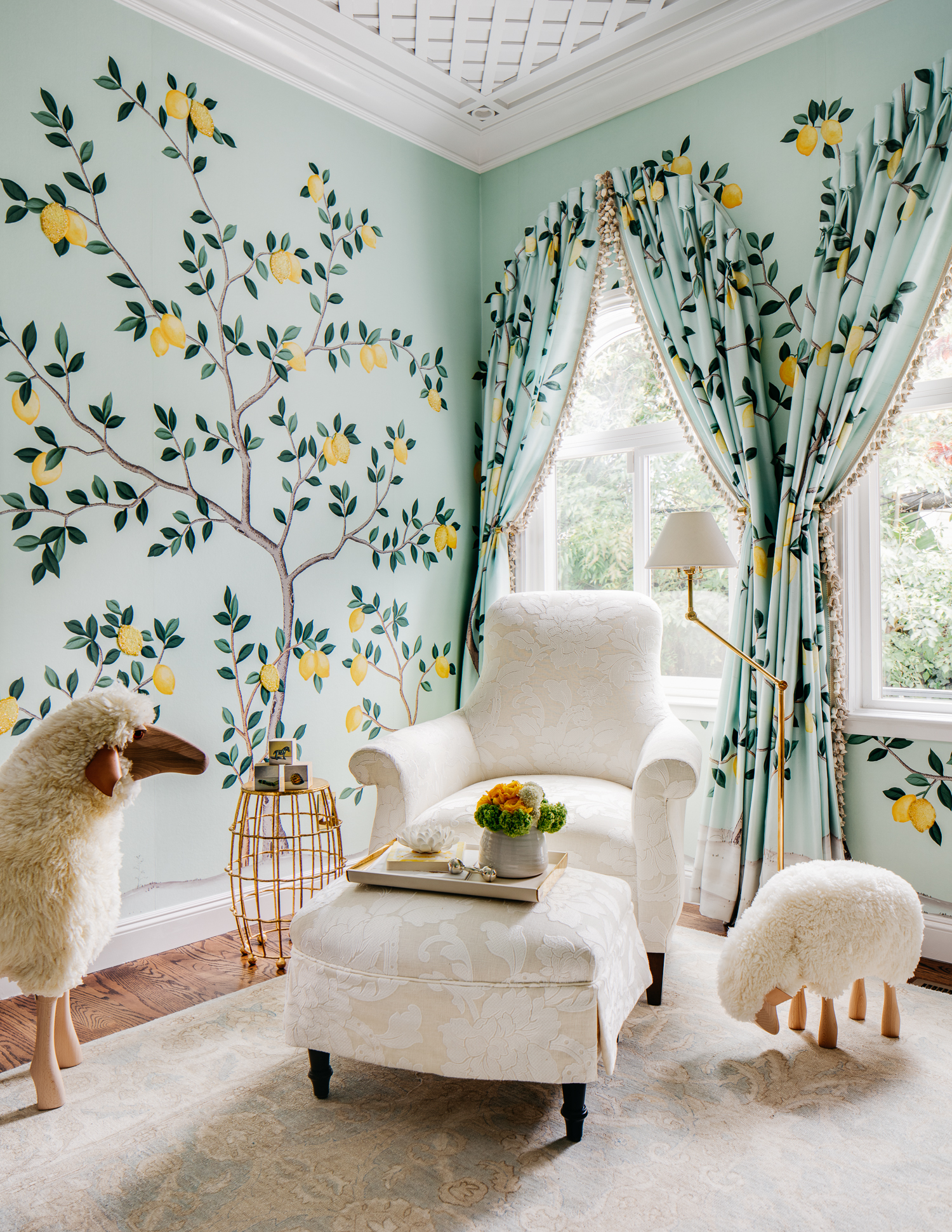
The inspiration for this particular room drew from my recent travels to Italy, particularly the Amalfi coast where I could not resist purchasing every lemon-shaped ceramic. When de Gournay approached me to design a wallpaper, I had already envisioned designing a nursery and wanted it to be suitable for a boy or a girl. Instinctively, my thoughts went to a color palette of green and yellow—the same colors found in a lemon tree and from there the room just grew!

How did your design evolve when you transitioned from the planning phase to the execution of your vision?
A showcase is fast and furious. You have about one week to come up with a design and hope that it can be executed. I knew I needed certain items in the room (crib, chair, ottoman, rug, dresser/changing table, lighting) and was lucky to have secured the rug from the get-go, but everything else had to be designed and sourced with very little time. There were lots of edits in the process. For example: the fabric used on the chair was out of stock with a back in stock date very close to showcase, so we had to source alternative fabrics just in case. Thankfully it arrived in time!
How did your personal style influence your design choices?
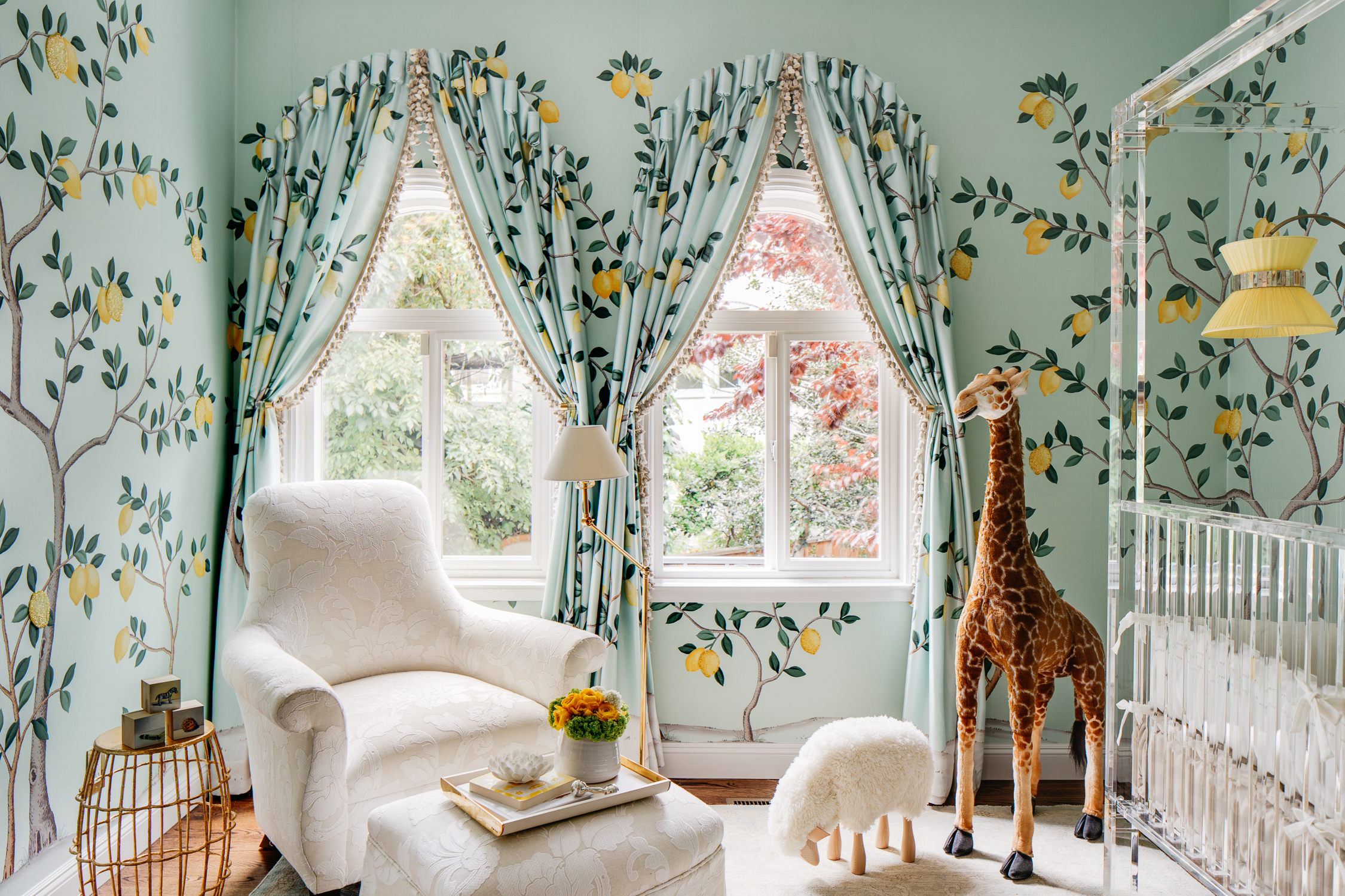
Although I grew up in California, I went to school in the South, and it forever changed my style. My mom said I left for college a girl and came back a woman who knew how to dress. The South definitely has a more formal style—in both everyday wear and home decor. I fell in love with the grand homes, with thought out architectural details developed from Georgian architecture and fell in love with “more is more.” This nursery is definitely “more is more” and has many elements with a nod to traditional design. In my personal style, I always like to have one thing that’s a bit edgy or unusual, and in this case, it is the custom lucite PlexiCraft Four Poster Canopy Crib.

Did you have any unexpected obstacles when creating this room? How did you overcome them or spin them to your advantage?
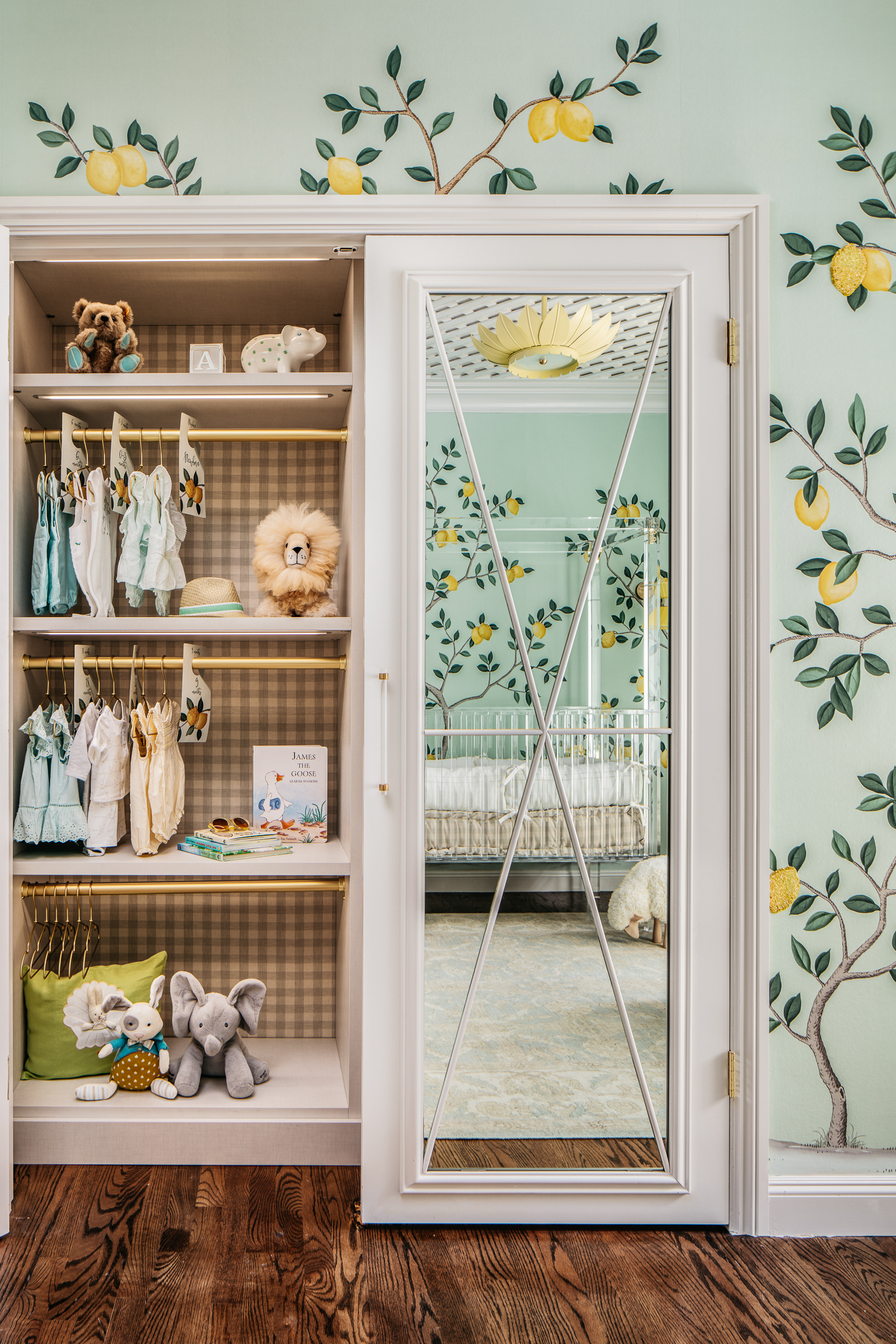
When designing with a quick turnaround there are always unexpected obstacles; for example, the closet doors I had designed were quoted at $6,000, which was really not an option. I reached out to my contractor with my design, and he said, “We will find a way to improvise.” And we did!

Now that the room is complete, what was your favorite part of the process? And what do you love the most about the finished design?
My favorite part of the process is definitely seeing people’s reactions. A nursery naturally plays to the senses of women, so I figured women would enjoy the space, but it’s been a pleasant surprise that men, too, have been commenting and reacting in a positive way. I truly love everything in this room—every item, no matter how small, is relevant and necessary in creating the overall experience in this room.

What is that one thing that everyone mentions when they step into this space?
It’s a tie between the handpainted, hand beaded de Gournay custom wallpaper (soon to be a part of their permanent collection) and the custom four poster Plexi Craft Lucite Crib.
If you had to choose one aspect of the design that is uniquely you, what would it be?
Probably the little details that enhance the room but are only really visible once you examine each piece. The mattress in the crib is a french mattress, and the fabric used on that mattress matches the fabric on the changing pad and the closet interior. The drapery has goblet pleats, trim, and the fabric on the drapery matches the wallpaper and the drapery actually pattern matches to the wallpaper. Additionally the hangers above the changing table spell out “Lemon Drop Lullaby”—the name of the room. Finally, in the closet, you will find closet tags, which have lemons that match the wallpaper lemons.

What is the one thing that you would tell other parents to consider when they’re starting their own nursery design projects?
Functional design is as important as beautiful design and it is possible to create both! As a room for showcase this room had to be beautiful, but I did not want to compromise function as beautiful design that is not functional is pointless. I really thought about how to place the furniture so that if someone did use this room as a nursery they would find it practical and could enjoy both the beauty without being frustrated by a lack of functionality.
Interior Design by Dina Bandman Interiors. Photography by Christopher Stark. Dresser by Revitaliste



Comments
Jeri J Mestayer
Where did you get the lemon trees on the walls?
NATALIE KATARI
This nursery is fantastic!!! Would love to know where the sconces are from? Thank you!