We are so excited to not only be sharing interior designer Emily Henderson’s daughter’s nursery today, but to also share some of Emily’s design advice. If you’ve spent any time on Emily Henderson’s blog, you know that she is known for sharing useable, relatable design tips. She’s transparent about the design process, which means there is so much you can learn from her. This is actually her daughter Elliot’s second nursery as the Henderson family moved when she was still very young, and, my gosh, it is just as amazing as the first. Thank you, Emily, for sharing your design and thoughts with us!
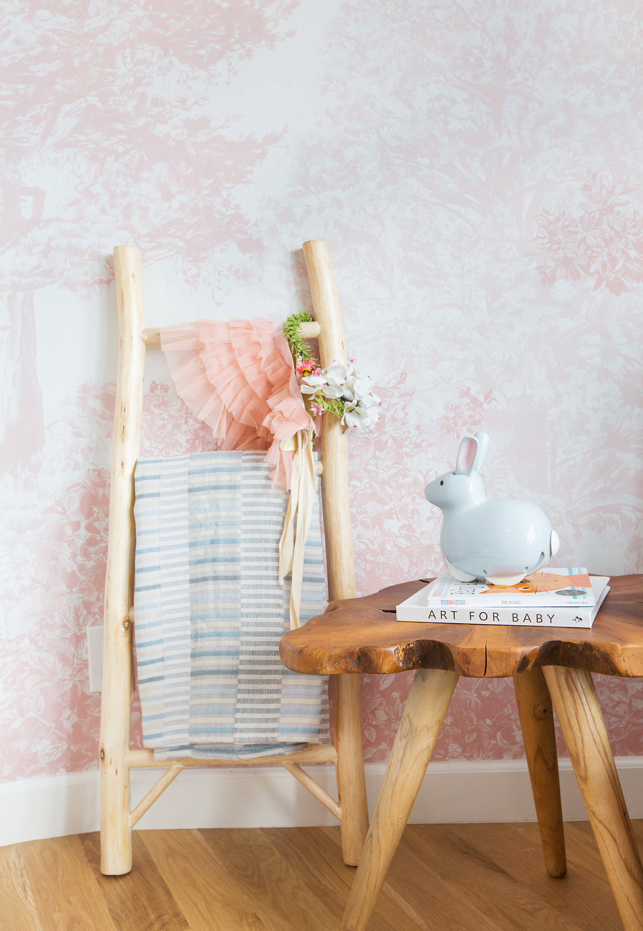
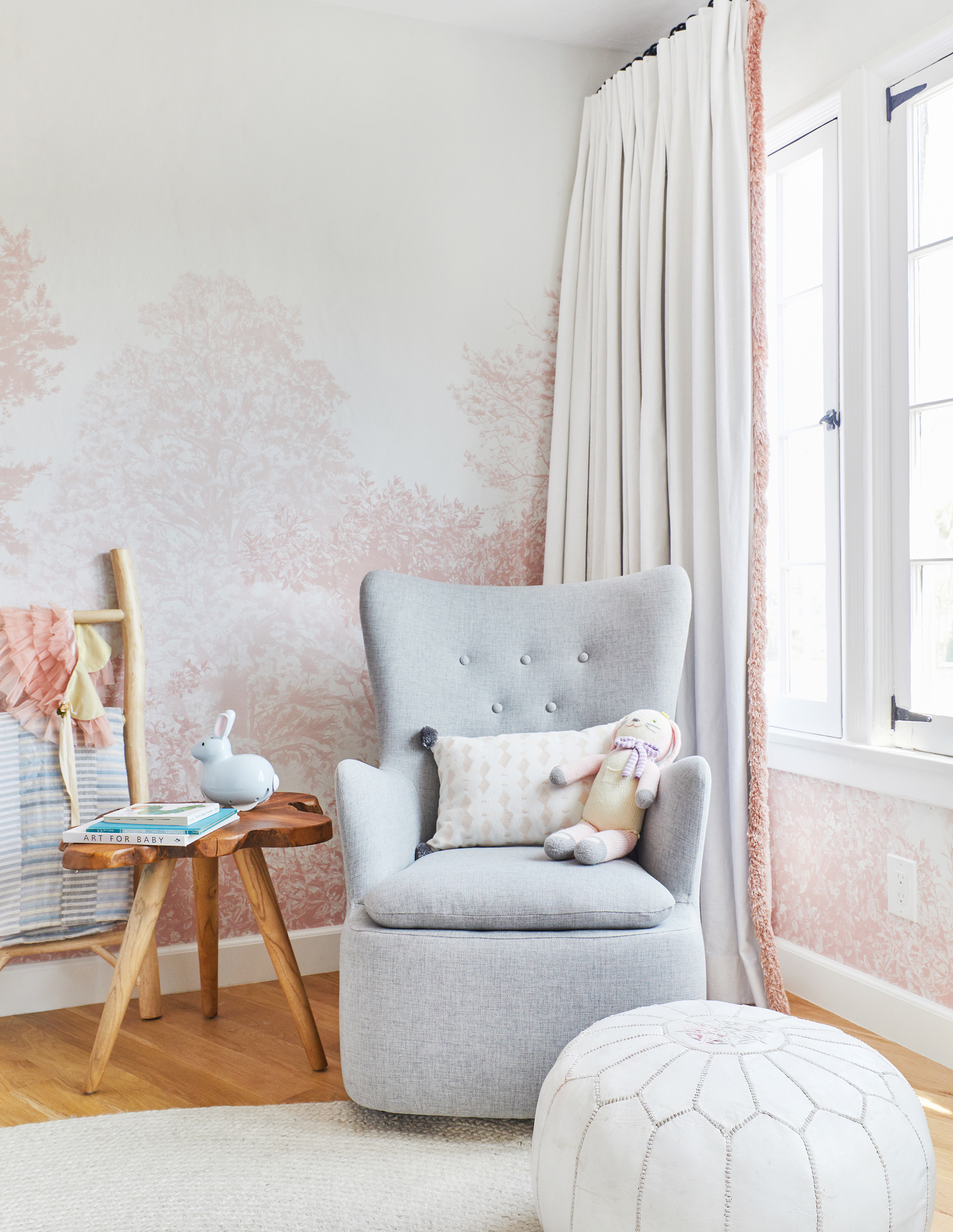 Glider | Curtains | Throw Pillow | Stuffed Bunny | Leather Pouf
Your first nursery for Elliot in your old house was a stunner, and this space is equally beautiful. What did you learn from that first nursery that helped you with the design for the second?
Both Elliot and Charlie’s nurseries from our first house were bold, both had mural wallpaper, pops of color and quite a bit of vintage mixed in with the new pieces. For Elliot’s new nursery, I wanted it to still be bold but in a much more refined, soft and feminine way. The tree mural wallpaper (yes, I know I did tree mural wallpaper in both of her rooms) is what really set the soft blush pink tones for the space and allowed everything else to be neutral and understated. It is something that feels feminine without being too young or girly, so it is something that she can grow with in the room.
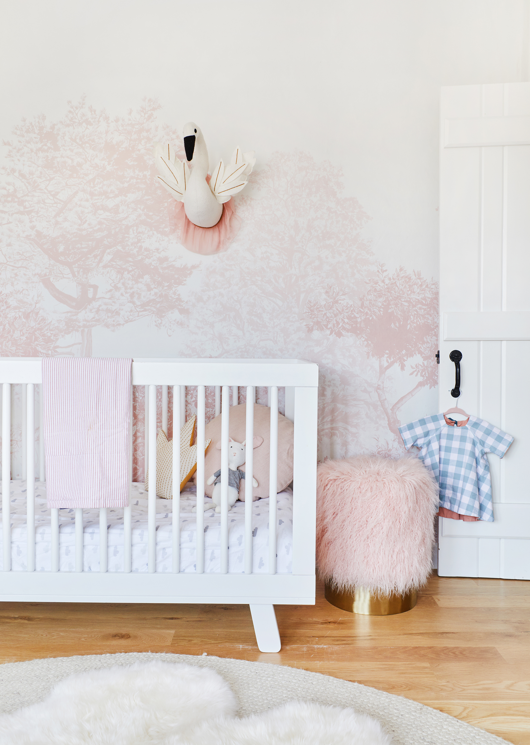 Wallpaper | Crib | Crib Sheet | Crown Pillow | Stool
I love that you let your kids have some say in their room designs, like letting Charlie give input on his wallpaper choice in his new room. Did Elliot influence this space at all?
When we first started designing Elliot’s room, she was a little young to be picking out anything, but I did know that I wanted to incorporate her favorite color (pink) into the nursery without it feeling like a “typical girl nursery.” So we brought it in, in a more abstract and organic way with the wallpaper. She seems to love that space, and I love spending time in there with her, which in the end is far more important than having the perfect drapes or accessories.
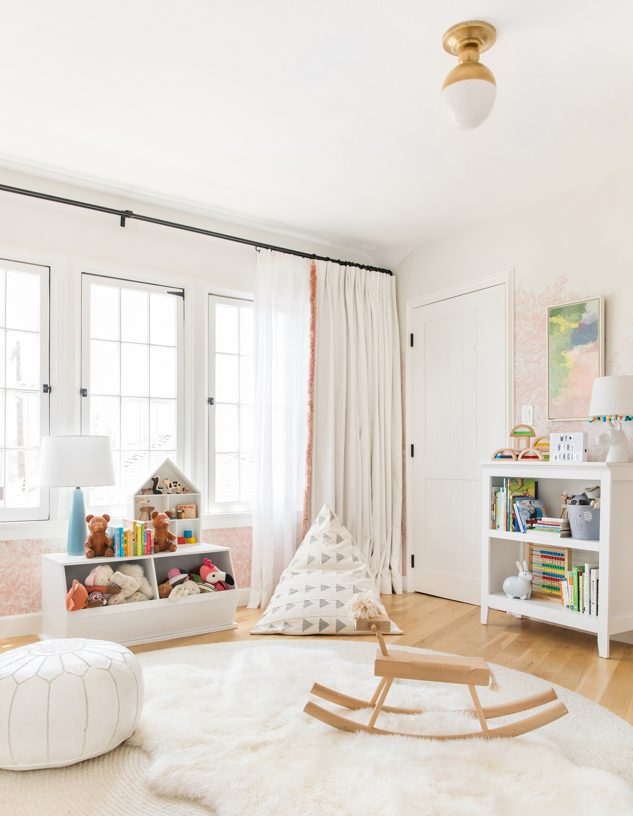 Rocking Horse | Bean Bag Chair | Bookcase | Sheepskin Rug | Ceiling Light Fixture
 Swan Wall Decor | Dresser | Unicorn Wall Decor
I’ve always loved that you are so honest about your process on your site and that you share your mistakes as well as successes. What is the biggest mistake you can help our readers avoid when designing their nursery?
Not having a design plan. So many people get caught up in the rush of trying to get the nursery done before the baby comes that they often blindly buy things without really concepting out how they want the nursery to feel, act, and look. Before you start anything, come up with a solid design plan for how you want it to look and feel, and then from there, you can get into a color palette you love and the room will come together without it feeling haphazard and disjointed.
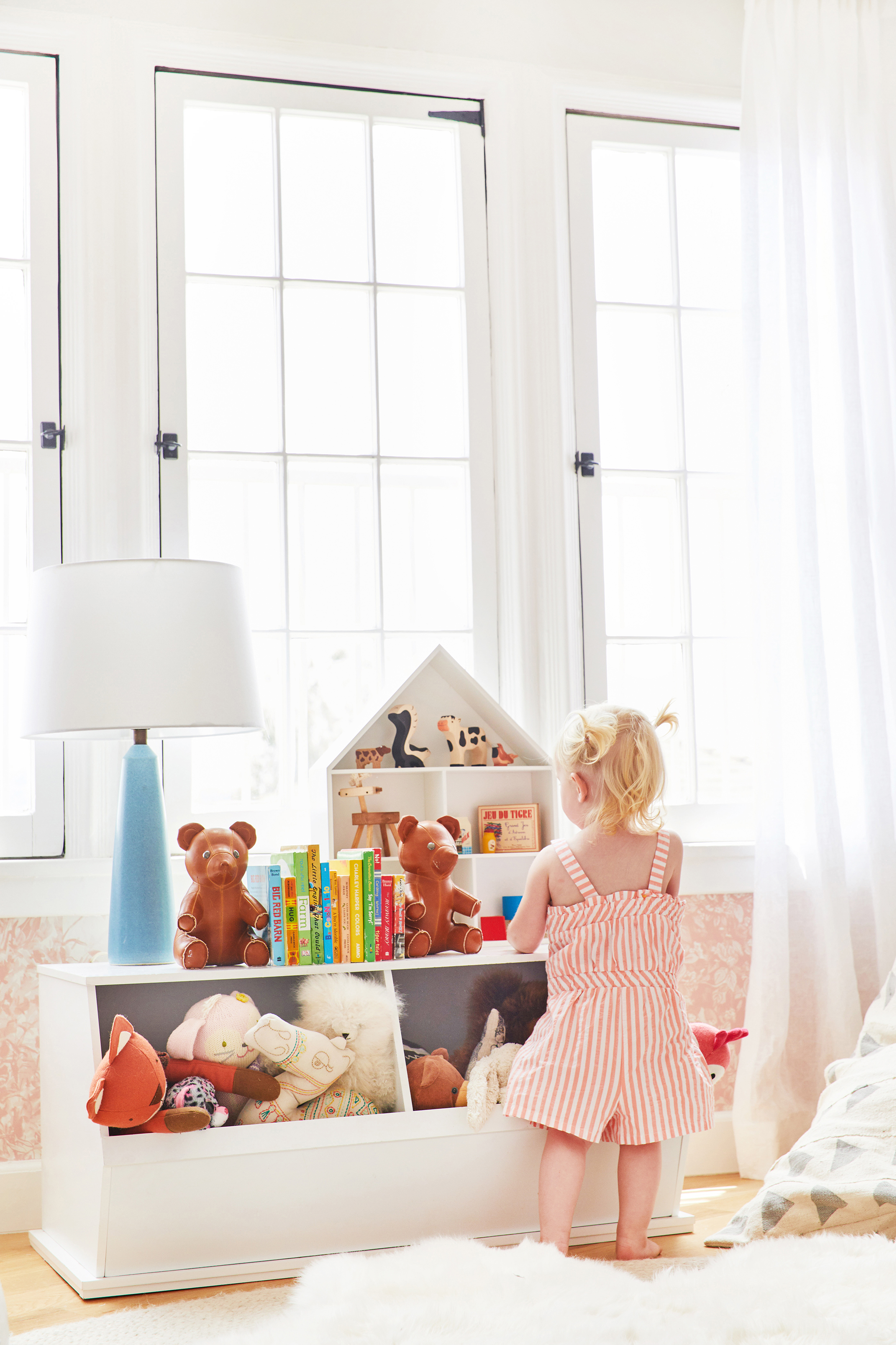 Toy Cubby | Teddy Bear Bookends | Dollhouse Shelf
For parents just starting their nursery design and feeling a little stuck, what is your best piece of nursery design advice?
Don’t be too perfect about it. Chances are you are going to want to change it in a few years anyway when your child gets a bigger bed, so don’t take it too seriously. Have fun with it and think about how your child will want to feel in that space.
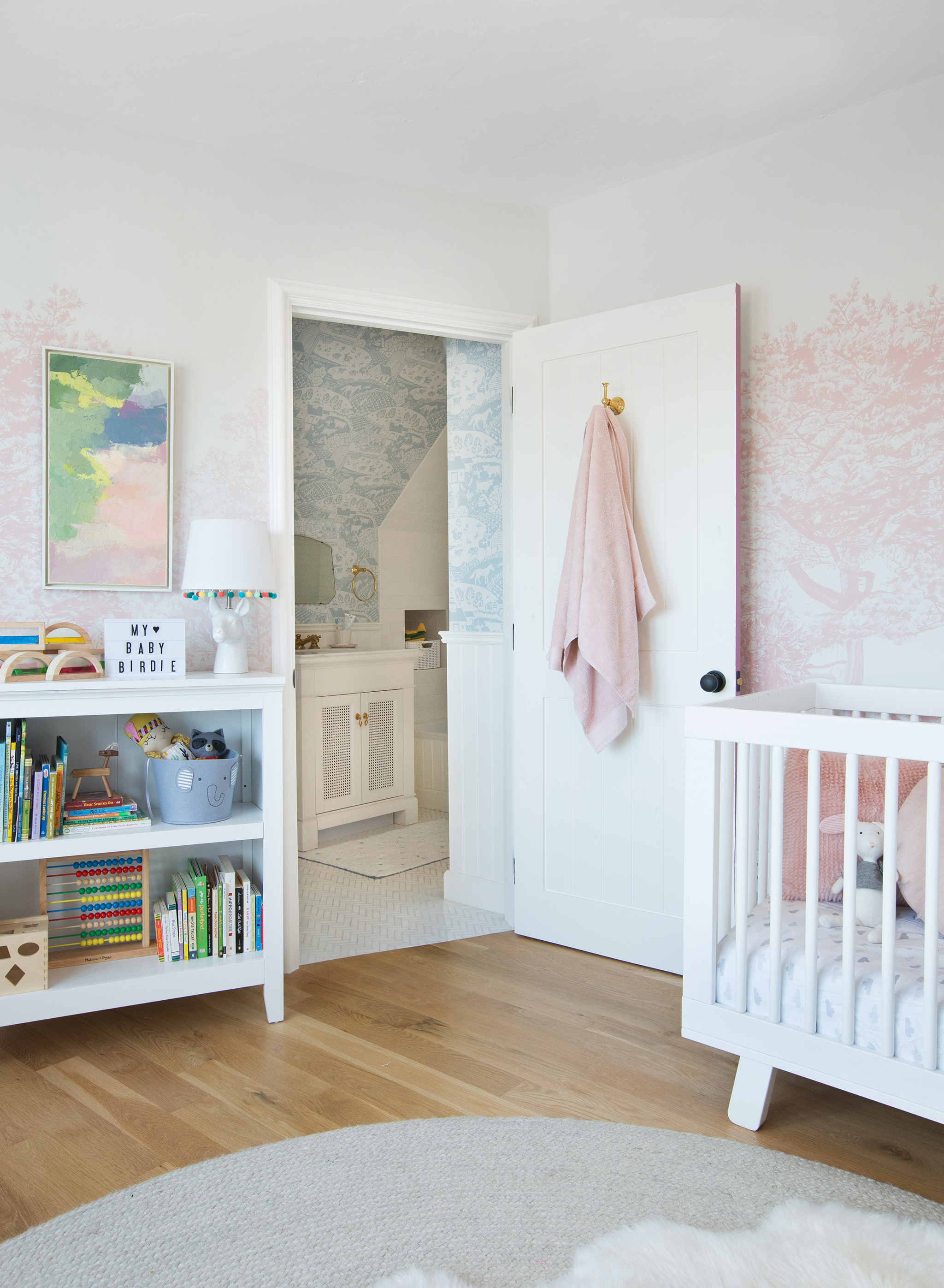 Water Blocks | Painting | Rug | Table Lamp | Bathroom Wallpaper
Photography by Tessa Neustadt for Real Simple
*this post contains affiliate links*
SaveSave
SaveSave


Comments