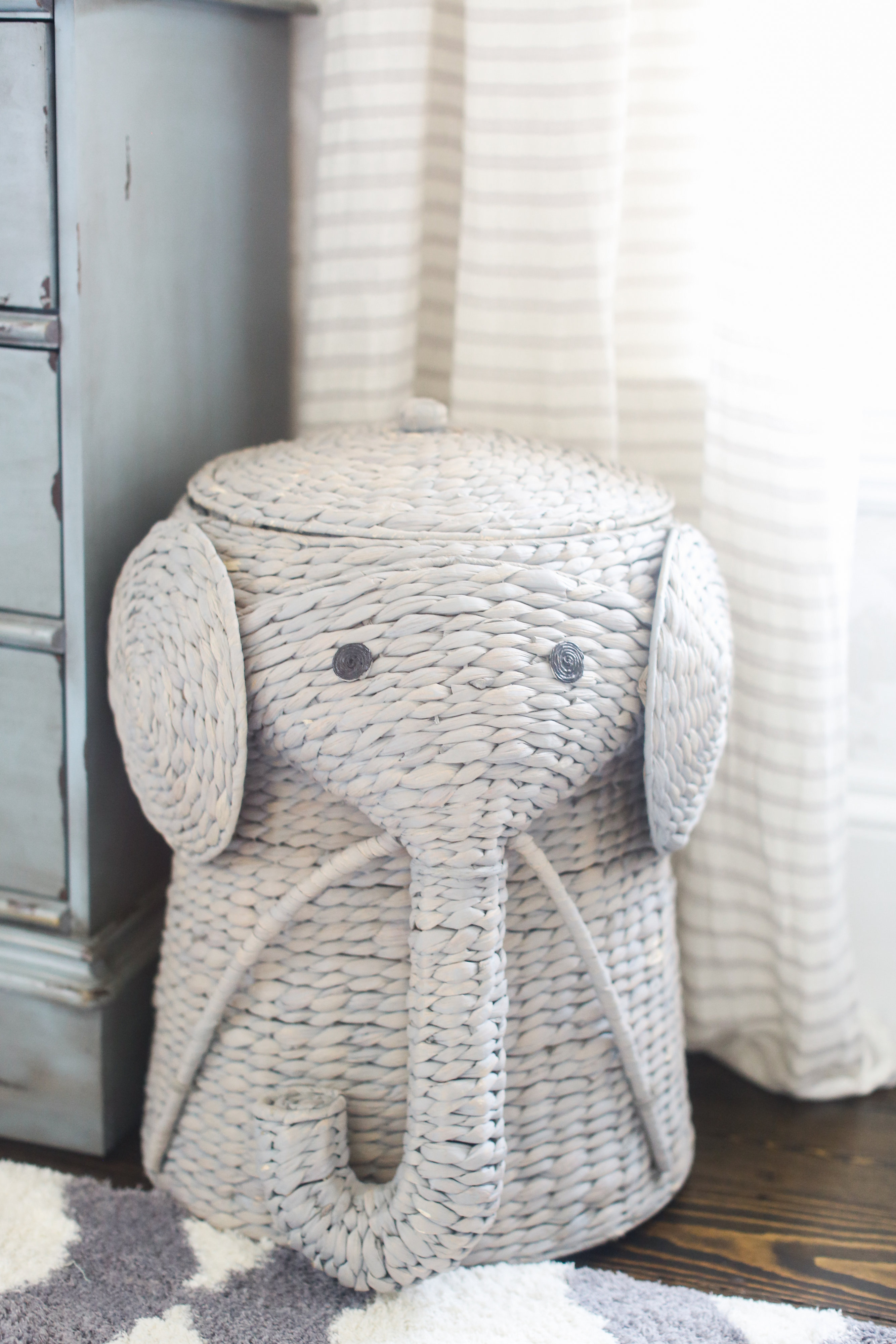
Today we are touring the nursery of Jackie Hempel’s little boy Kai. You may know Jackie from her blog Finding Lovely, where she writes about life with her young family. So Kai had a little bit of a crying jaunt when he was a baby—in fact it was “the worst case of colic” their pediatrician had ever seen. We love that Jackie started her lifestyle blog, following a same-named Instagram account, at that very time to help her find the “lovely” when she was rightfully so exhausted. Well, there is no shortage of lovely to be found in little Kai’s nursery. We’ll let Jackie take it from here.
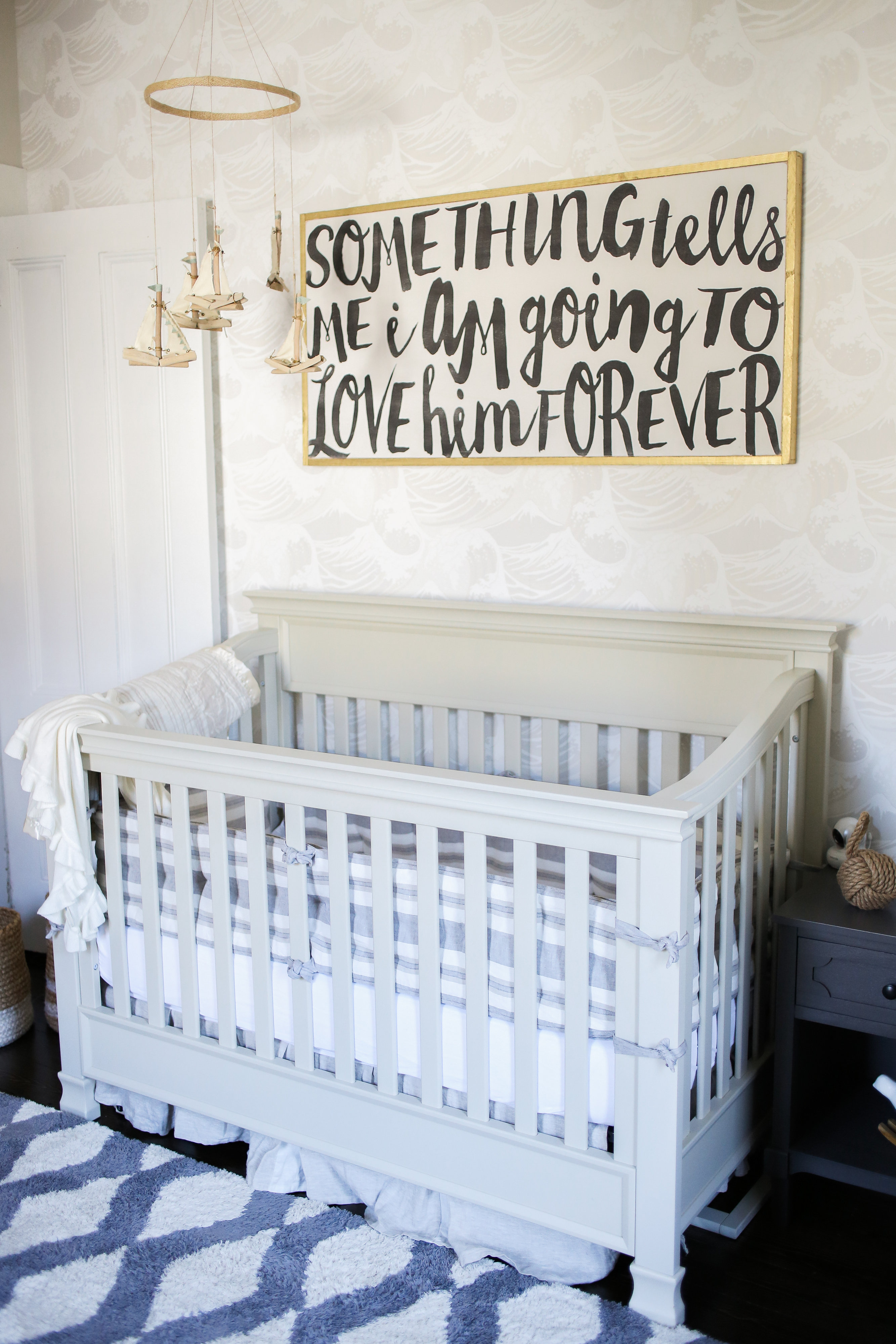 Crib | Crib Bedding | Wood Sign
How did your personal style influence your design choices?
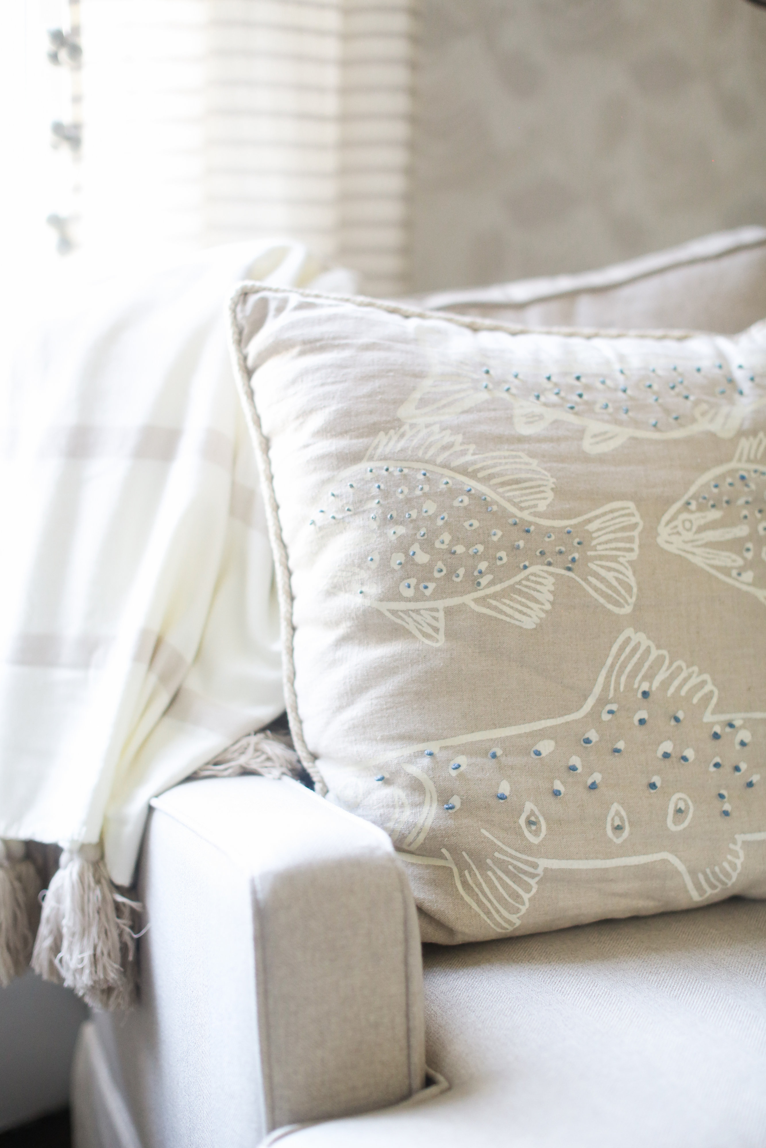
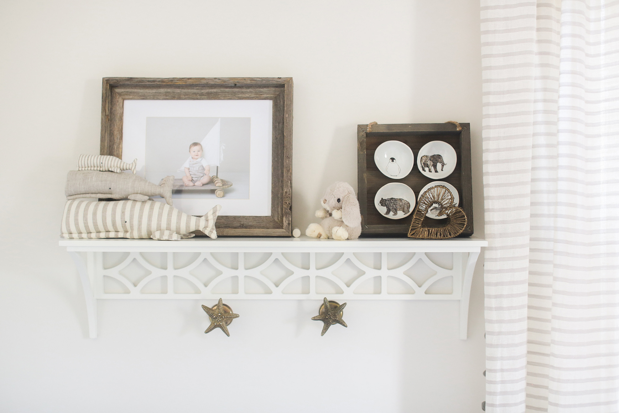
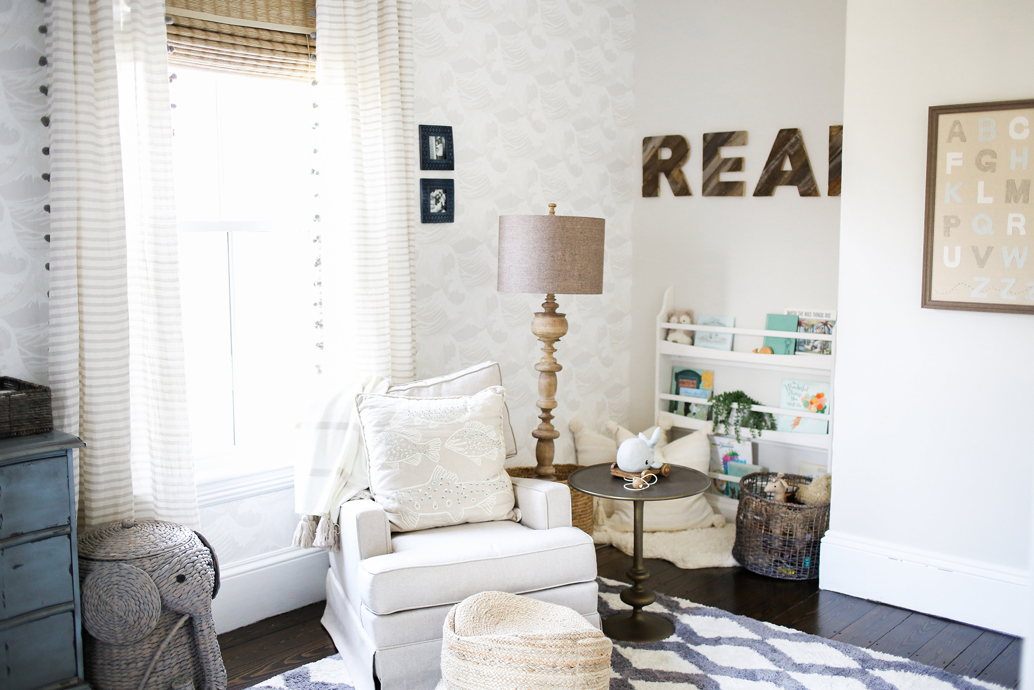
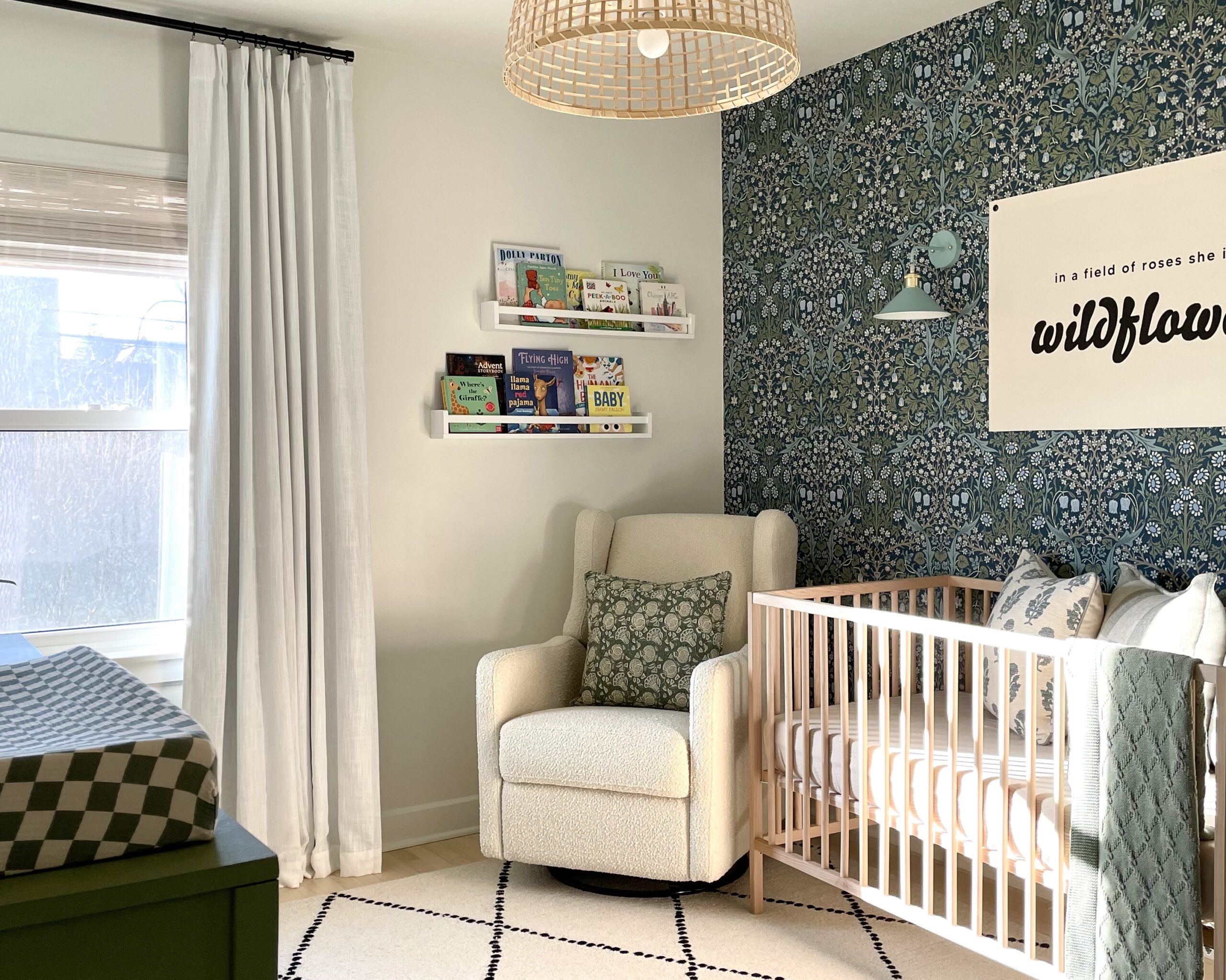
I’m a big proponent of playing up textures in a space, especially contrasting textures like woods and metals, hard and soft elements, and this nursery is no different. Paying attention to how patterns and features layer upon each other helps unite the space and gives you that lovely feeling of completeness.
Design inspiration can come from anywhere—what inspired your nursery/kid room design?
In this space, the inspiration came from the wallpaper. When we found out we were expecting another little boy, I knew I wanted a softer, more serene space than our first son’s nursery, which I had designed in vintage red and teal, bold suzanni print. The Cole and Son’s Great Wave wallpaper in Stone was neutral but added such a loveliness to the space.
How did your design evolve when you transitioned from the planning phase to the execution of your vision?
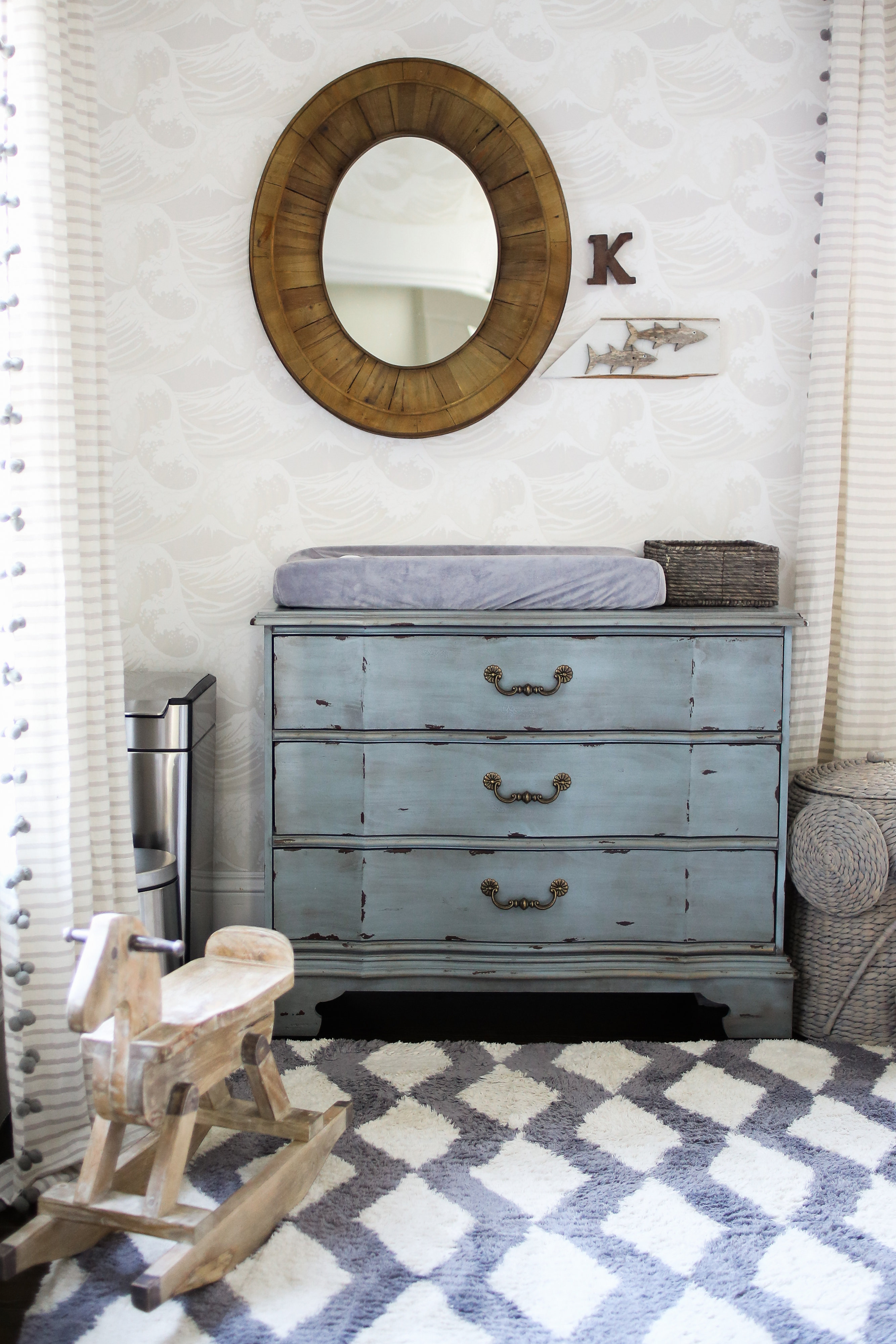
Once I had my launching point, or source of design inspiration, I kept my eyes open for the perfect pieces. With budget in mind, the rug and changing table were from HomeGoods and the crib was an inexpensive one from Target.
What were your nursery must-haves when you started? Has that changed since you started using the space?
When I had my first son, I designed the nursery to be lovely. And that is important, but what you quickly find out is that it also has to function. Our kiddos are 20 months apart, which meant my first son was still in a crib and I couldn’t take his for the new baby. We had to buy a lot of baby stuff, which we hadn’t expected because we were still using items for our first son. Staying on budget was important, so my must-haves were limited and very organization-based. My big splurge (besides the wallpaper and curtains) was a glider. My husband wanted to move our first son’s RH Baby & Child glider into this new nursery, but I had mama guilt. We read often to our first son in that chair and he used it all the time. And since having a brother was already a big change, I just couldn’t steal his chair too. We bought a much more budget-friendly option from The Home Decorators Collection.
What is the one thing that you would tell other parents to consider when they’re starting their own nursery design projects?
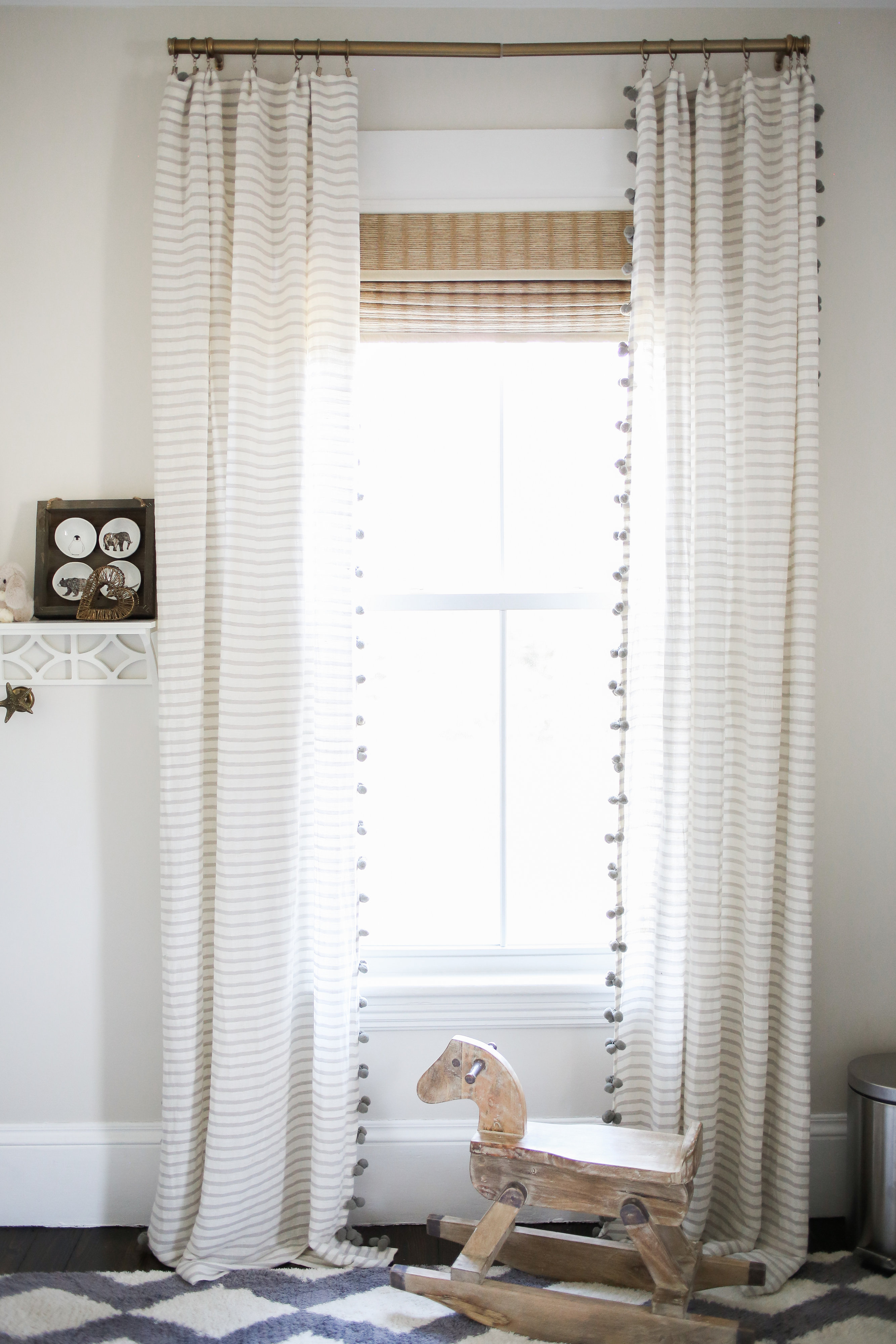
Design doesn’t have to break the bank, you just need to know where to spend it so you can get the most loveliness out of your space. I could only afford to wallpaper two of the four walls, and it still turned out beautifully. I found the curtains I wanted from Anthropologie and then waited for a sale. If you are thoughtful about the planning stages of a design, you can save quite a bit and end up loving your sweet baby’s space.
Now that the room is complete, what was your favorite part of the process? And what do you love the most about the finished design?
This room was such a family effort. The grandmas helped paint and hang the wallpaper and I love that special memory. I think this is my favorite room in the whole house. It’s just so bright, and the wallpaper and curtains complement each other so nicely, it’s as if they were made to be together.
Images by Ruth Eileen Photography
SaveSave
SaveSave
SaveSave
SaveSave
SaveSave
SaveSave
*this post contains affiliate links*



Comments
Sean Mahan
This nursery looks great! It’s a pretty good theme to work around, I’m considering it for our home!
Jeanne
Can anyone comment on the source of these woven shades?