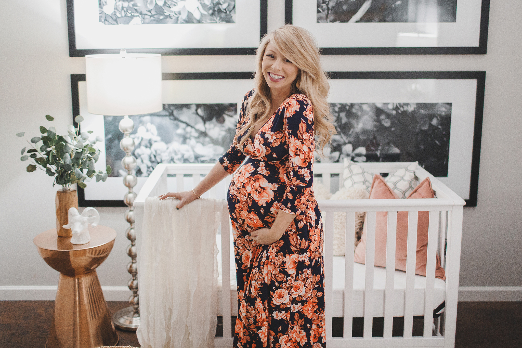
Today we are touring photographer and new blogger Megan Burges Gilliam’s nursery. Megan and her husband welcomed baby Emma late last year. This nursery is all sophistication and style, but Megan is a bargain hunting pro (wait until you see the sources!), so she made it happen in a super affordable way. Thank you for allowing us into your space, Megan!
My husband and I are a wedding photographer/cinematographer team based in Arkansas. Shooting weddings has taken us all around the country, and now we have slowed down on travel for a little bit since we just had our first child at the end of last year. We are in the process of renovating our home and doing it all ourselves! We’ve been documenting the process along the way and are just starting to share it all on our blog now that our house is finally getting close to being done.
What inspired your nursery design?
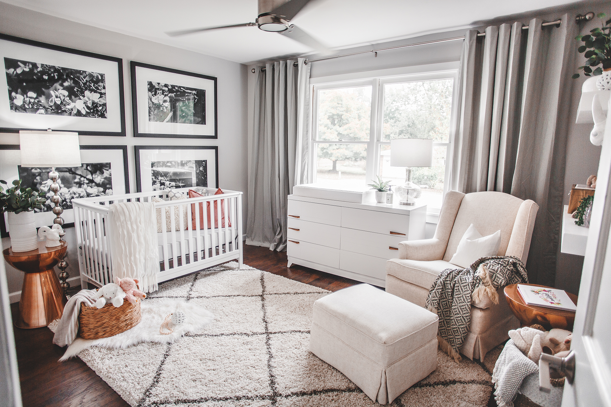
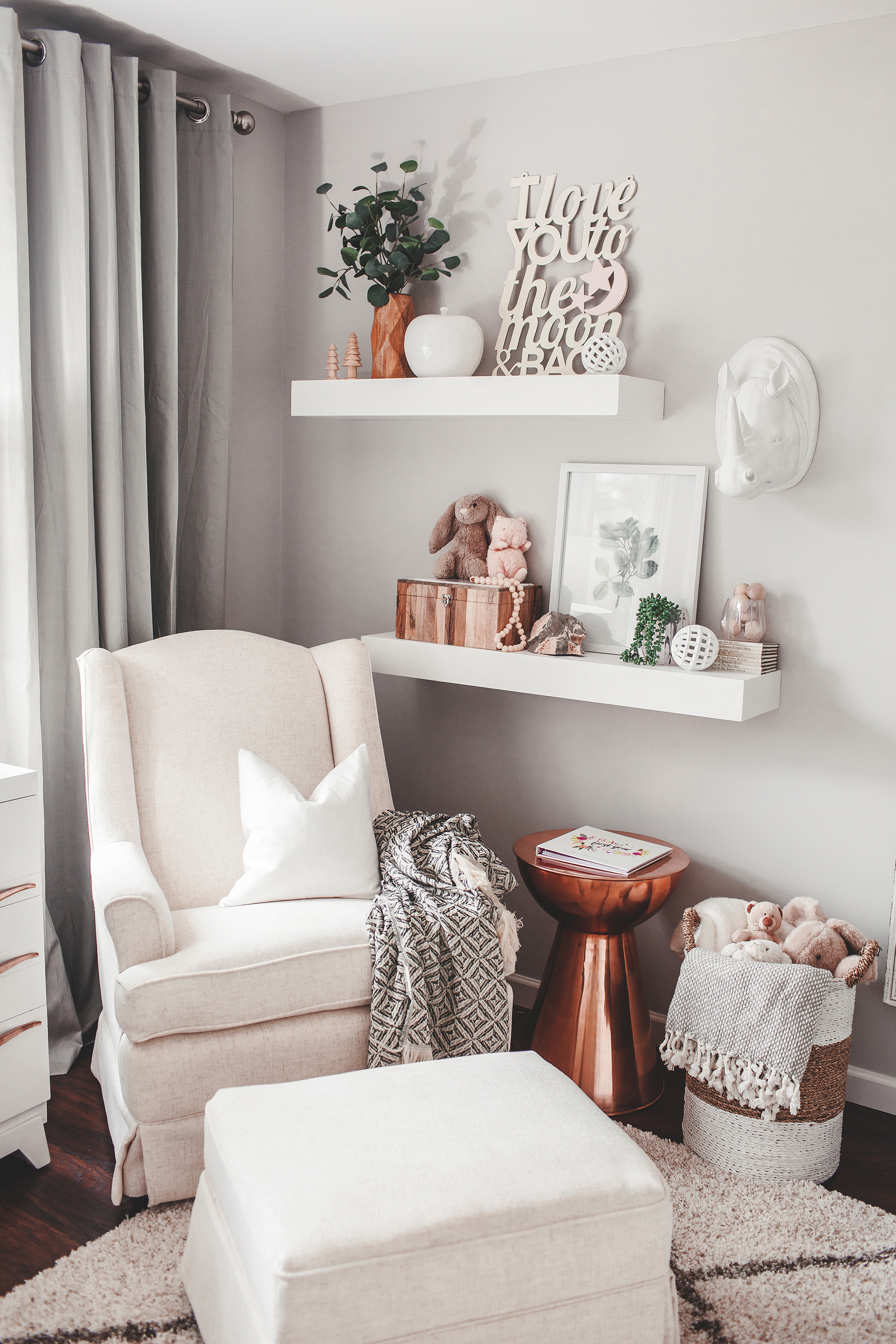
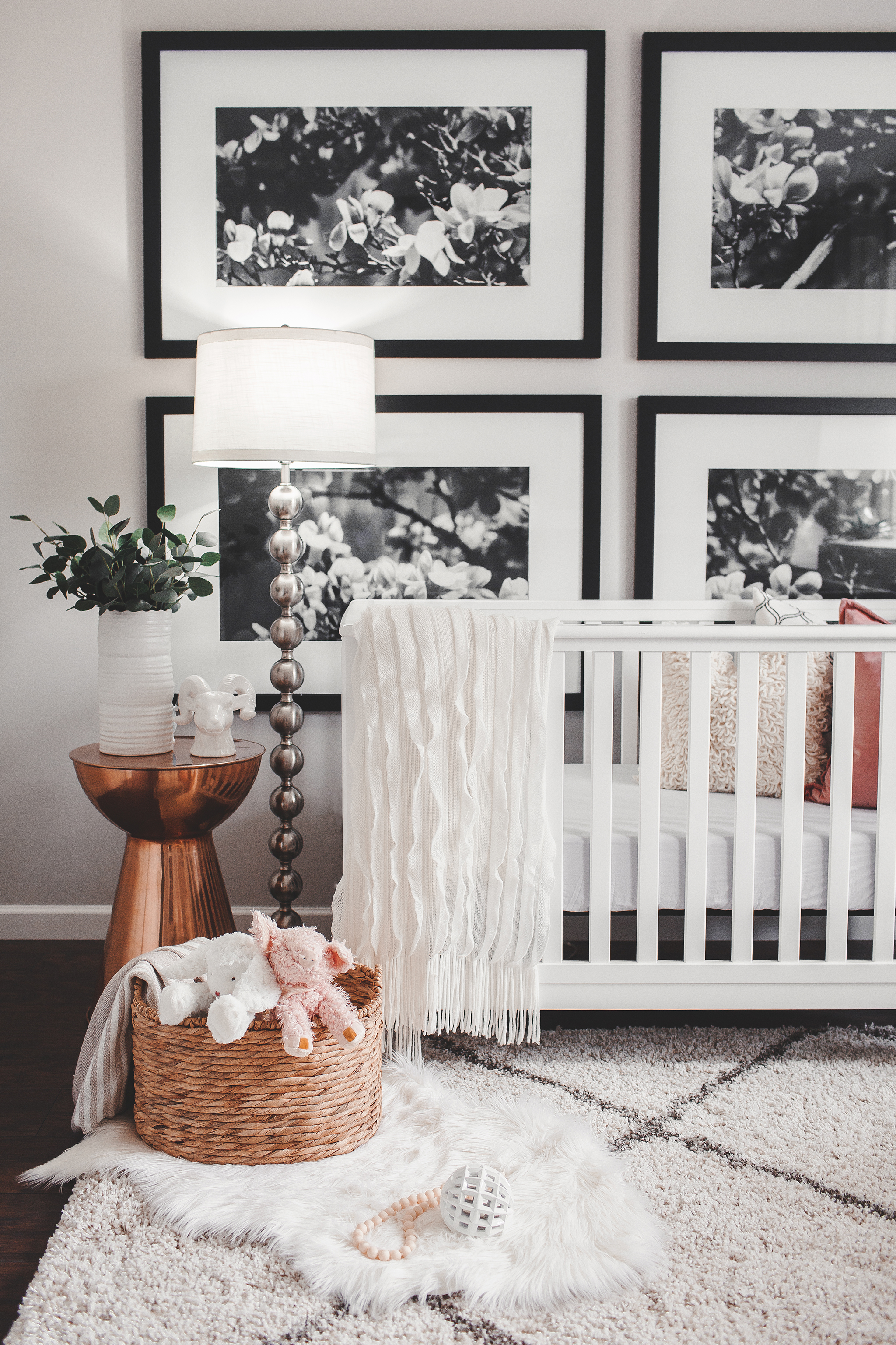
For the design of Emma’s nursery, I wanted it to fit with the style of our whole home—eclectic and a little bit modern. I wanted almost anything that we used for her room to be able to easily fit into another room if we wanted to change things up at any point. I found the copper side tables on a sale at Target, and then designed the rest of the nursery around them. I loved those pieces, but I knew that I wanted a light and airy feel for the rest of the room, so I used all neutral colors other than tiny pops of a coral pink that would complement the tables. I went piece by piece until the whole room was done!
How did your personal style influence your design choices?
I felt like Emma’s room was my chance to design a room with the perfect amount of girly, if that makes sense! I wanted it to be a bright space that felt more feminine than the rest of our home but still felt cool enough that an older girl would like it. I tried to pick design elements that can continue to be used in her room as she gets older and that were also neutral enough to make it easy to swap in different accent pillows or items on the shelves.
Did you have any unexpected obstacles when creating this room?
We had a hard time trying to figure out what to do for a changing table for a while. We were on a budget, and all of the changing tables and dressers that I loved were out of our price range. We ended up going to antique stores to try to find something that we could repaint and totally lucked out when we found the dresser that we did. We loved the mod style of it, and once we painted it white, it looked perfect in the room.
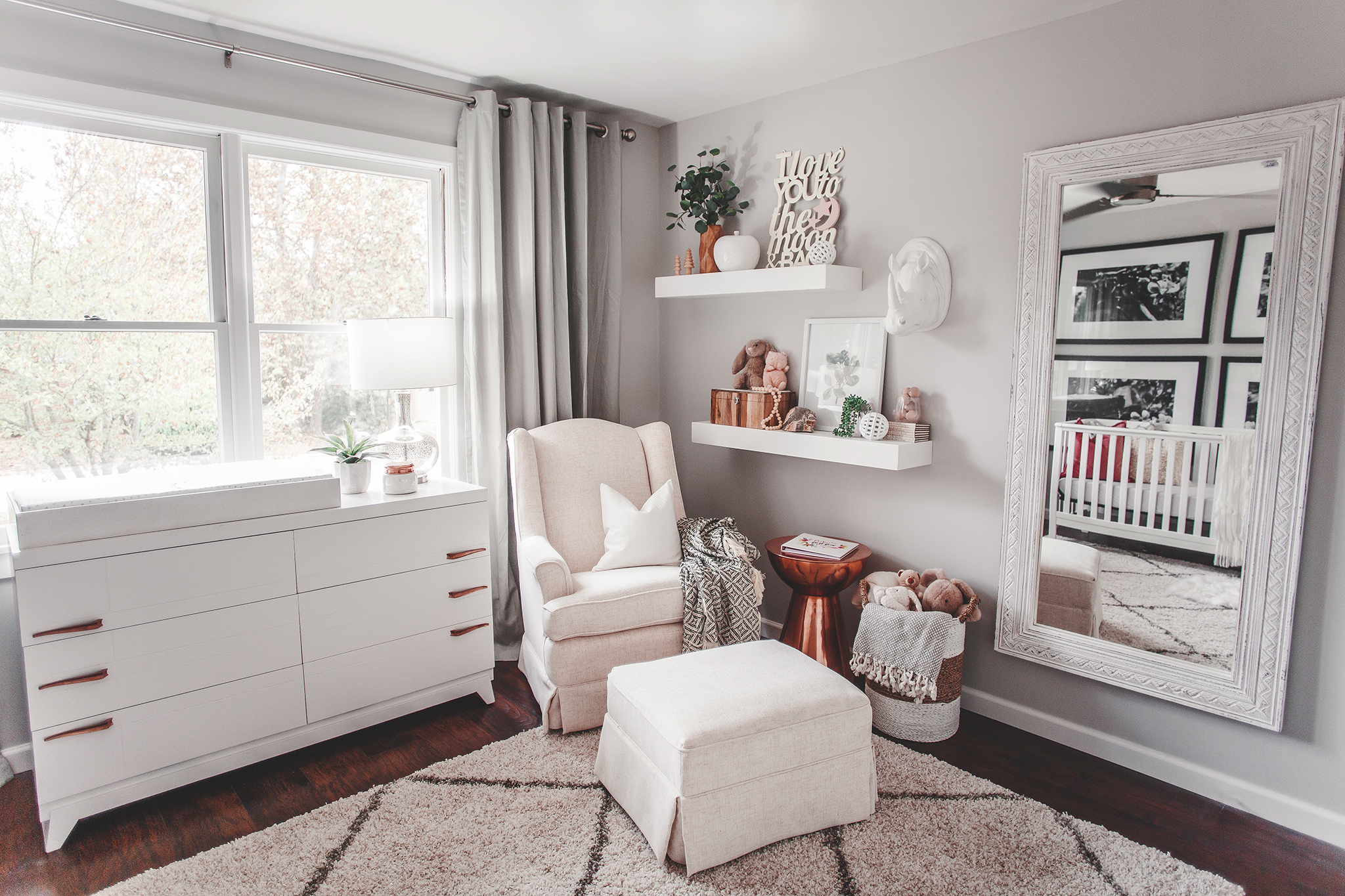 Dresser (antique)
Now that the room is complete, what was your favorite part of the process? And what do you love the most about the finished design?
I honestly loved the whole process of designing the room. I would go to TJ Maxx or Homegoods, and if I saw something that I loved and it fit the white/ivory color scheme, I would get it and then figure out where it might fit after! Once I had the main pieces, I then had to get more of a general idea of what I needed in a particular corner before I bought it.
My favorite part of the finished design is definitely the gigantic prints on the wall behind her crib. I think my family thought I was a little nuts (and I was a little worried too) when I bought four of the biggest frames I could find for the smallest room in the house. I had a photo that I took in college of this beautiful flowering tree. I knew if I made it black and white it would fit in the room better, so I did that and split the photo into four before getting them all printed and matted. I have all the specifications of the sizes I used on my blog and there’s a link below to buy the downloads of the images since so many people asked me about it!
What were your nursery must-haves when you started? Has that changed since you started using the space?
When I started thinking of what I wanted for the nursery, I didn’t realize how much white and ivory I would use in the end. It ended up that mostly everything was white, with just a few pops of color or black. I love how that turned out, and I wish I would have realized that having that much white is okay, because I definitely questioned it when I was in the process!

What is the one thing that you would tell other parents to consider when they’re starting their own nursery design projects?
Think outside the box when you are trying to figure out what you want the nursery to look like. It’s going to look like a baby’s room regardless, so don’t feel like you have to choose super babyish prints and colors if that’s not your jam. Pick things that make you feel good in the space.
Images by Megan Burges Photography
*this post contains affiliate links*



Comments
Sylvia
Love the nursery! What paint color did you use for the walls?
Ashley Warner
Hi! i came across your nursery on Pinterest. Do you remember where the shelves are from?
Inna
What a lovely design. Where did you get this “love you to the moon and back” deco? I am looking for something similar for a long while already.
Thanks
Inna