On World Down Syndrome Day, we are so pleased to be touring the toddler room of Welles and hearing from his lovely mama, Oakley Peterson, who brings such a fresh outlook in her own blog Nothing Down About It. We think you’ll love this colorful, fun space, designed by Oilo Studio, that reflects the joy that Welles brings to his family. Thank you, Oakley, for sharing with us.
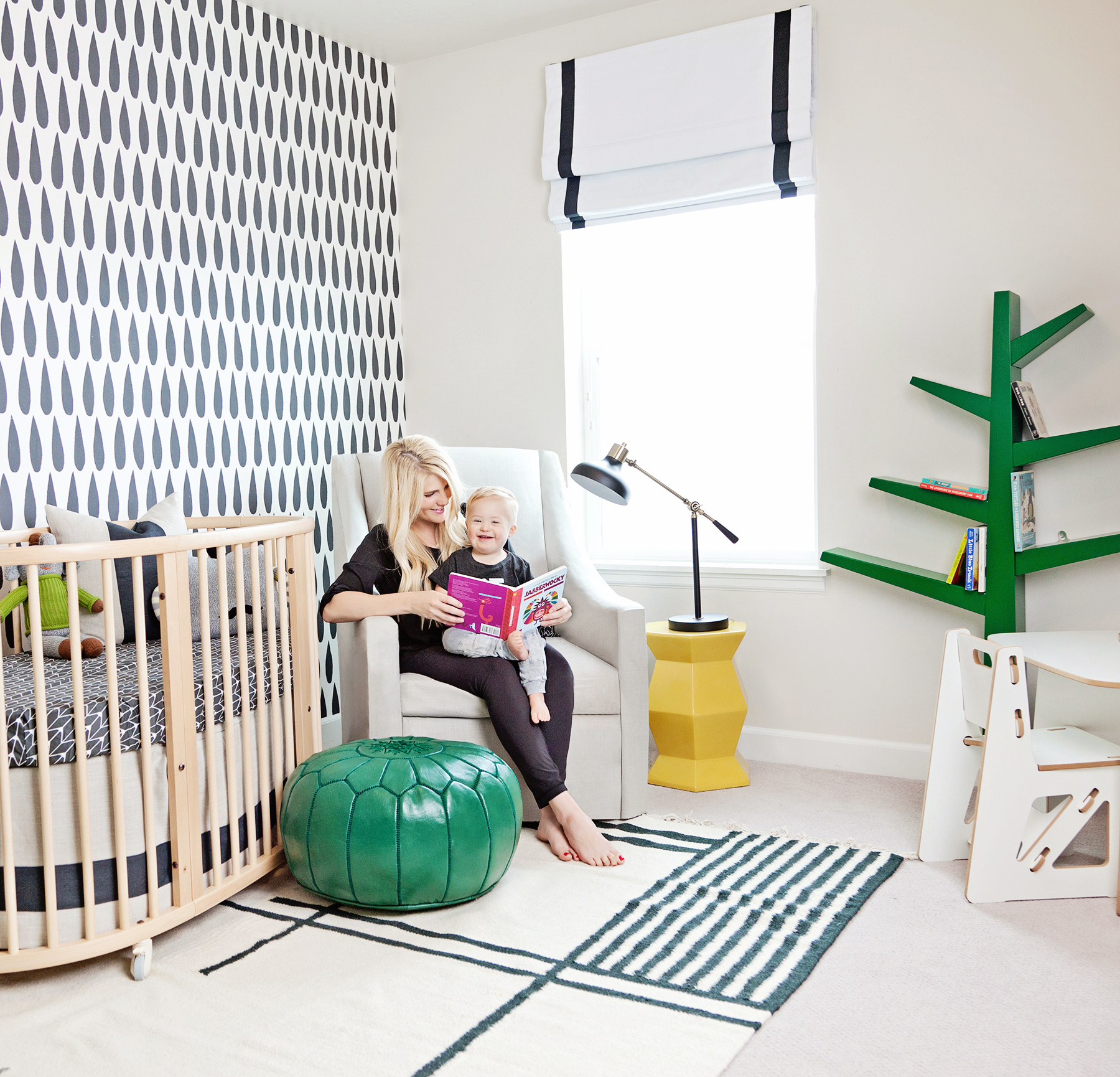 Rug | Pouf | Side Table | Lamp | Tree Bookshelf
I’m mom to three littles and wife to my man. My days are filled with diapers, imaginary play and snuggling. Oh, AND chaos, but I wouldn’t have it any other way. We call Down Syndrome “up syndrome” because it brings our family up and not down. Welles makes everyone smile, and his happiness is contagious. We love sharing our family’s journey and advocate “up syndrome.”
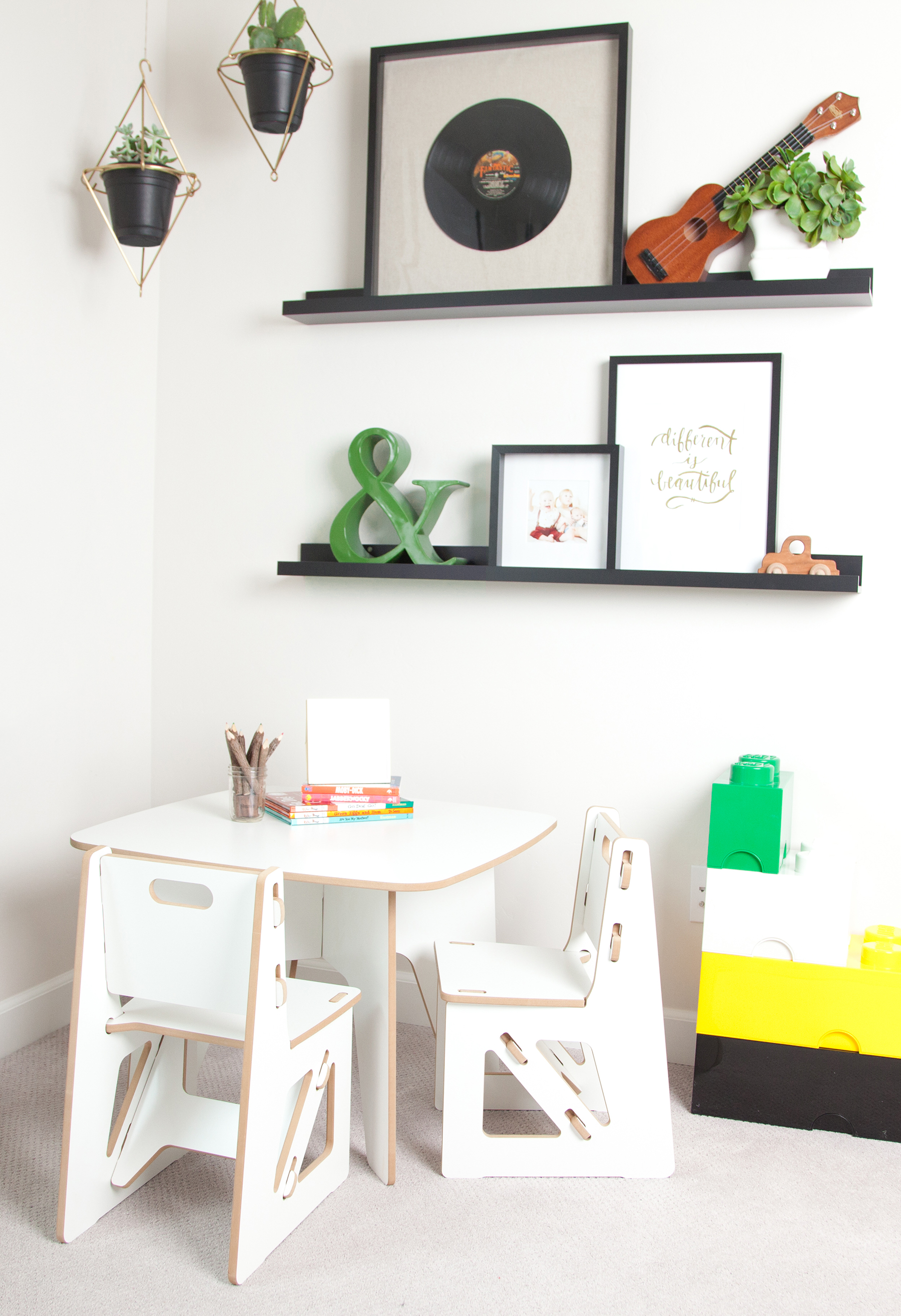 Picture Ledges | Play Table | LEGO Boxes
I used my mommy mind and dreamt up a fun-loving and bold play area that will match Welles’ personality and be functional to his needs. Putting it together, I wanted bright and happy colors to surround my happy boy with.
How did you transition from the nursery to a big kid’s room? Was it a total makeover or were you able to continue to use many of the items?
We started fresh! Clean slate. We left his baby room exactly as is for baby brother (third child problems!) and moved Welles into an empty room with a blank canvas!
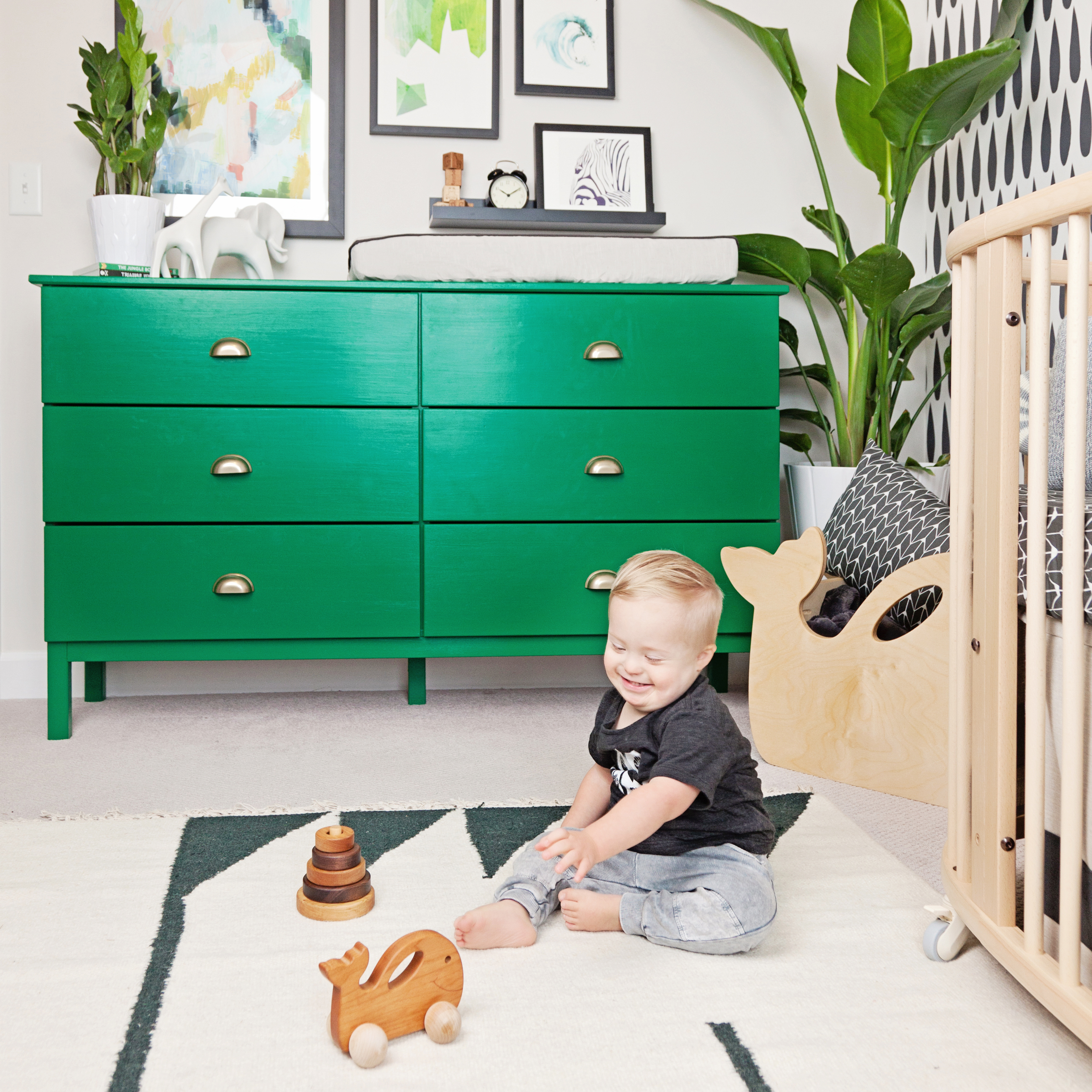 Dresser (painted) | Whale Toy Box | Large Art | Stacking Toy
What is your favorite thing about the room?
The green and yellow accents, including our yellow side table from The Project Nursery Shop! The pops of color are boyish and playful. LOVE that.
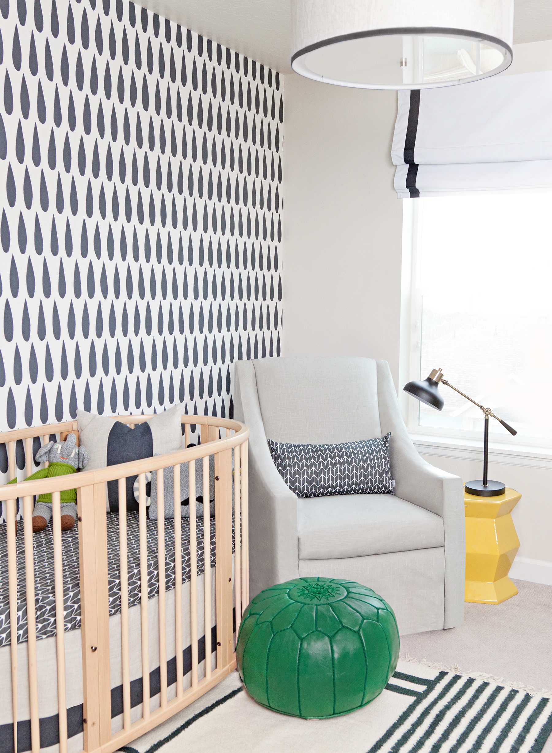 Crib | Sheet | Crib Skirt | Glider | Glider Pillow | Wallpaper
What was the most important thing you wanted to achieve when creating this space?
I wanted lots of fun play space for Welles. I really wanted to include an area for him to be creative—to color, read and explore. I think we achieved that with his little table and reading nook. Also, his toy bins added a fun touch.
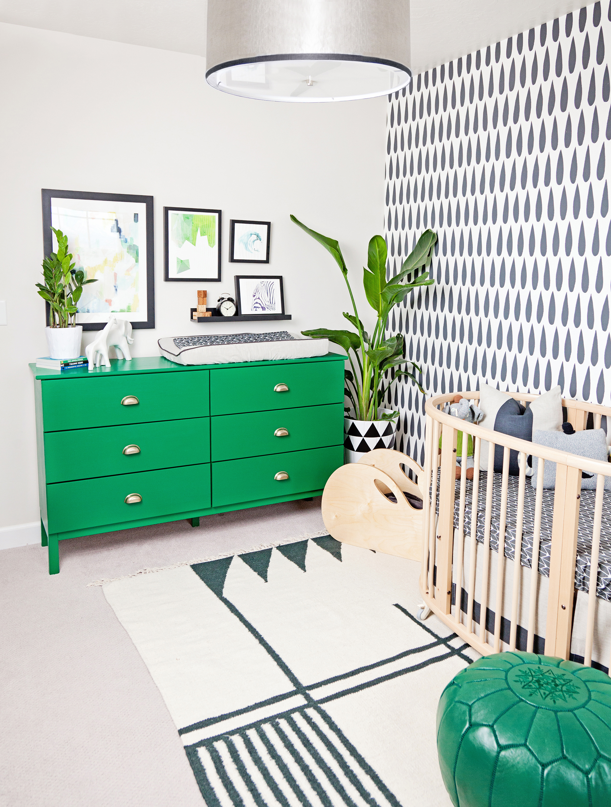 Pendant Light | Changing Pad | Planter | Planter Decals
What’s the first thing people notice when stepping foot into this room?
Probably the Sissy and Marley wallpaper! It’s so bold and hypnotizing!
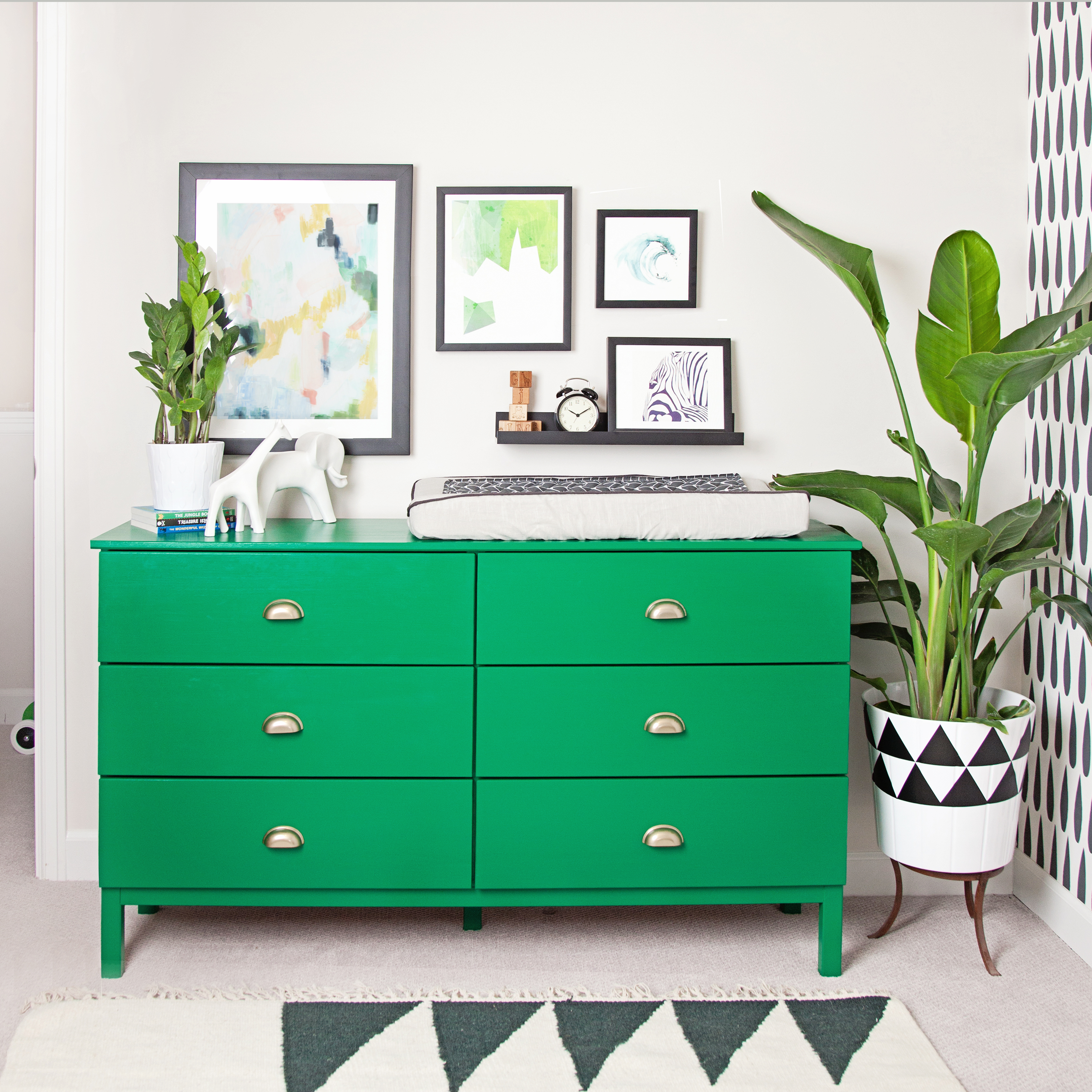
Do you have any words of advice for other designers and parents?
Do what’s functional for that child. Resist going too elegant or adult. Make it a fun place they’ll want to spend time in!
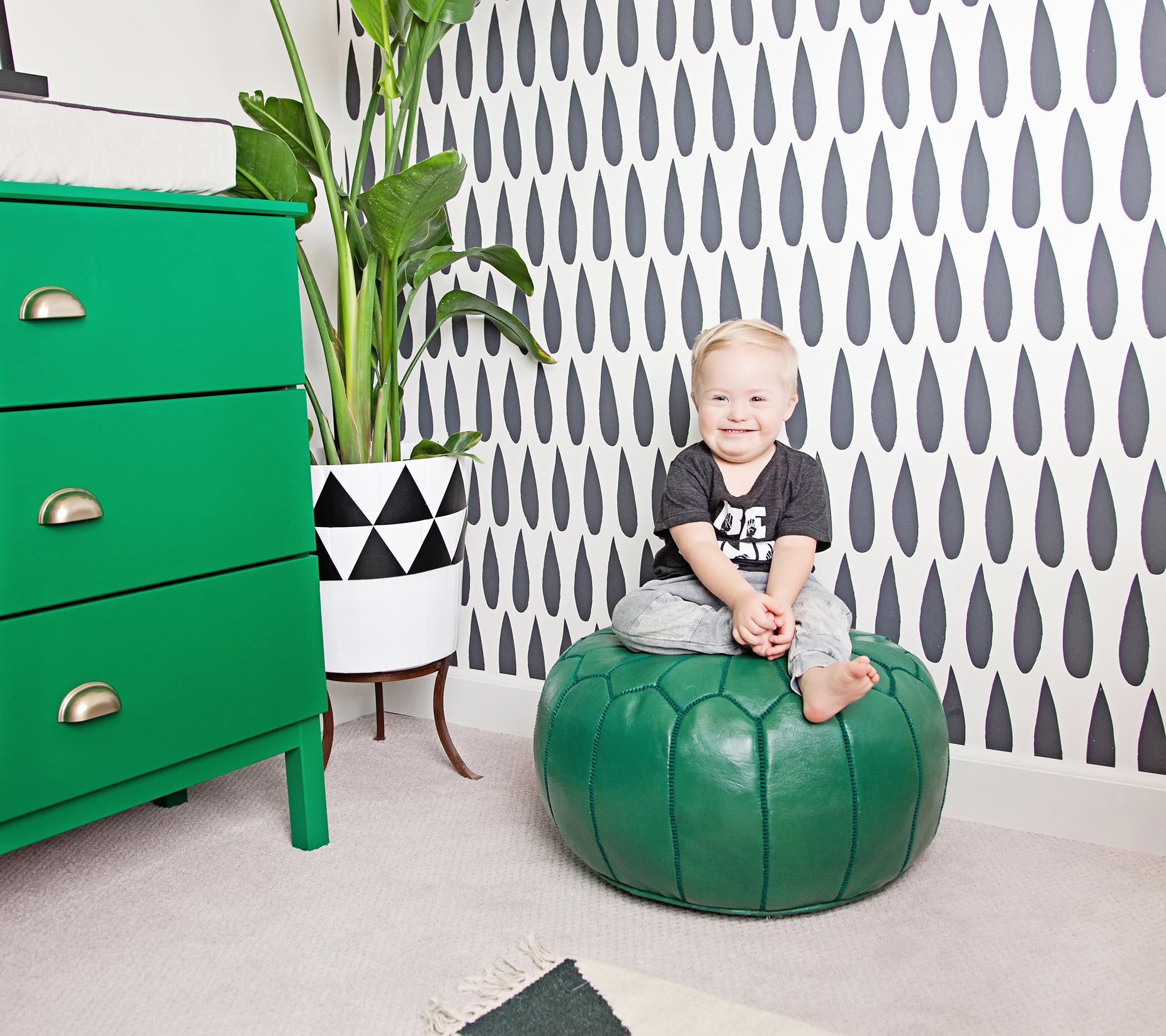
Photography by Britt Anderson



Comments
Jacki
Such a gorgeous room! I am using it as inspiration for my little one’s nursery. Do you happen to remember the paint color of the dresser?
Thank you so much!
Bev
Hi! I love the dresser. Which IKEA dresser did you paint? The link just takes me to the IKEA website but not the specific dresser. Thanks!
Beth
Hi Bev, It looks like the original product link is redirecting to the IKEA homepage. This usually happens when a product is no longer available. They have several dresser options at IKEA that are a similar style to this one. Good luck in your search!