Another trip around the sun is almost complete, and as I sit at my friend’s house—I’m hanging at his place looking in on his cat, Janet Jackson—I’m taking some time to look back at 2015 and some of this year’s standout projects and trends.
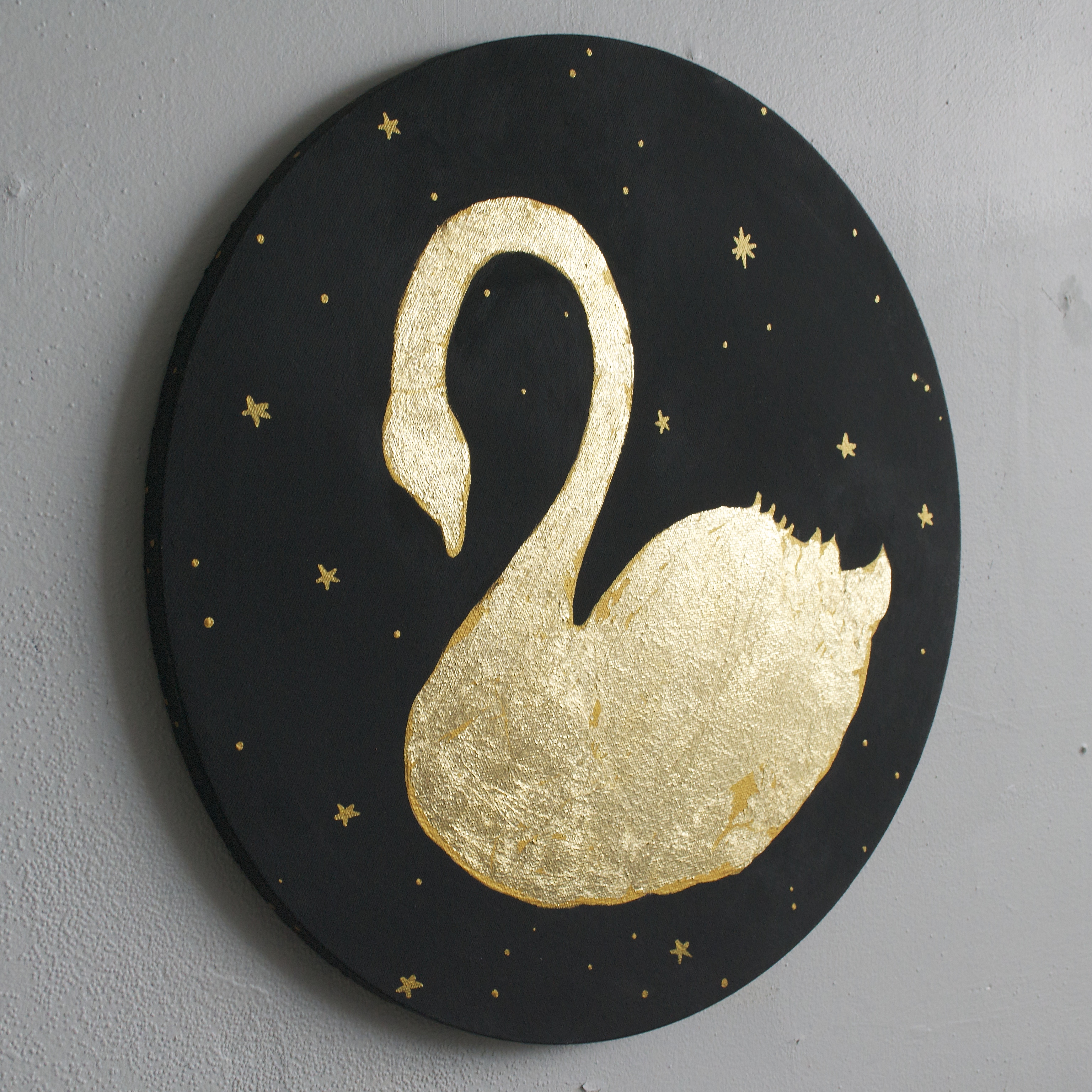
So Robert Frost wrote a poem entitled “Nothing Gold Can Stay.” Ummm, if he were still with us, I think he’d see that gold is totally here and she wants to stay. In fact, this is a trend that’s still rising. All things GOLD and gold leaf became a rich-looking yet very accessible nursery trend in 2015. Be it a gold dot crib sheet or a gorgeous Jetsons-inspired brass chandelier, there are ways to include this look in all your designs. The eleganza of this gold swan silhouette is from a collection of handmade artwork that may be customized by image, size and background color.
2015 saw black become the new black! Old superstitions around the color black gave way to bold graphic patterns and rich saturation of the fashion world’s favorite hue, black! This is a room my studio designed for a boy just transitioning out of the crib. Pairing two wild patterns made the space exciting and fun! The star of this design is the Mustachio wallpaper from Flavor Paper. Glossy black ink is hand screened onto silver Mylar, and it’s made right here in New York City. It makes the room very reflective and rich and gives it a style that’s undeniably rockstar.

Bubble gum pink gave way to colors like Paris romance, bubble gum’s chic French cousin. This rosy hue is softer and deeper, evoking a vintage quality. This oversized butterfly mural was painted in just one hue, and then we added a drop shadow with metallic pearl white. You can see it gleam in the lamp light.

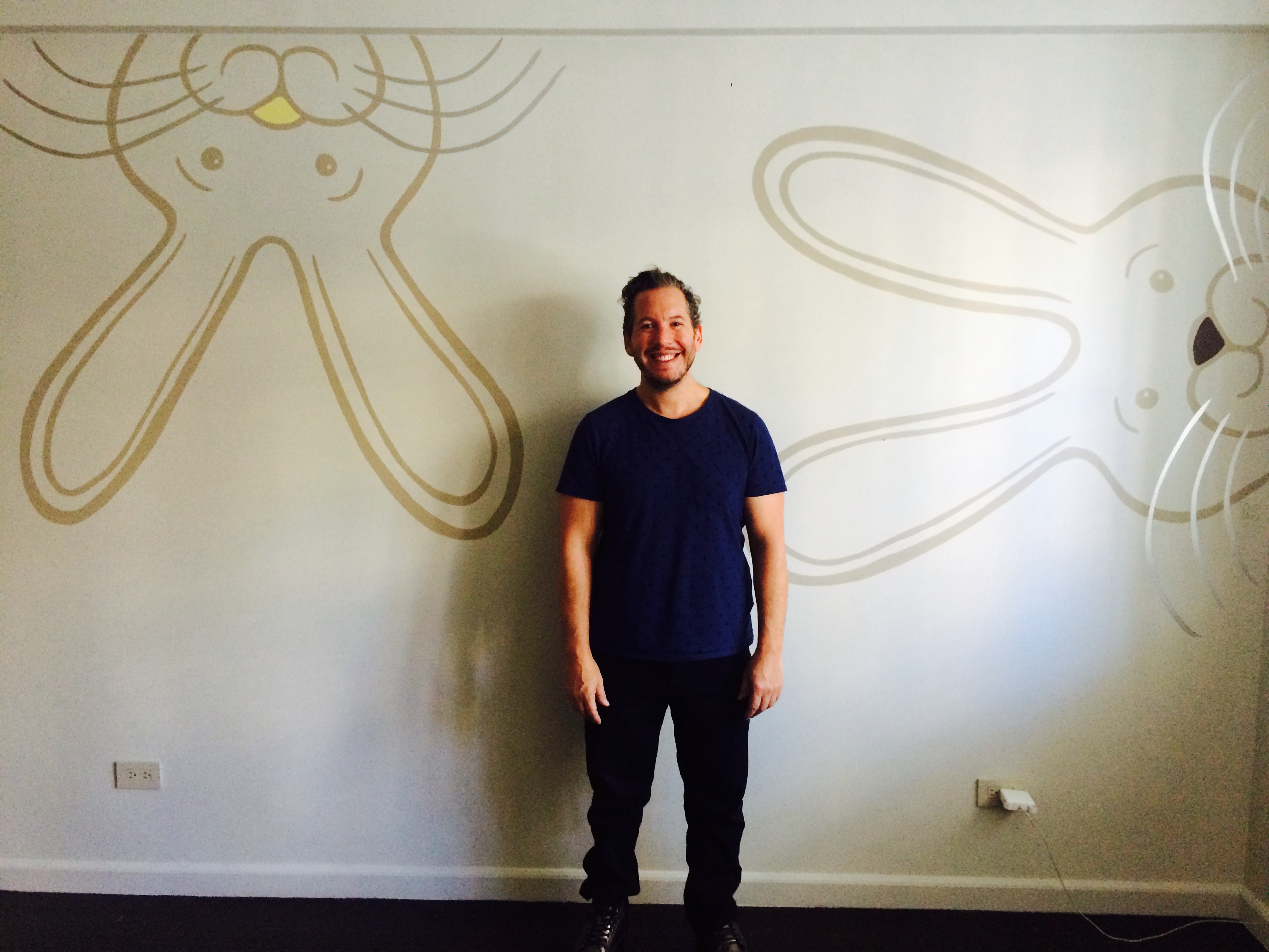
Playing with the size and scale of things is always on trend. Lock eyes with these twin super bunnies that we painted in a New York City home for a pair of twins! The soft, minimal color palette balances the statement-making scale. The whiskers were painted in metallic pearl white, one of my favorite paint colors. You can see the whiskers’ reflective quality on the rabbit on the right.
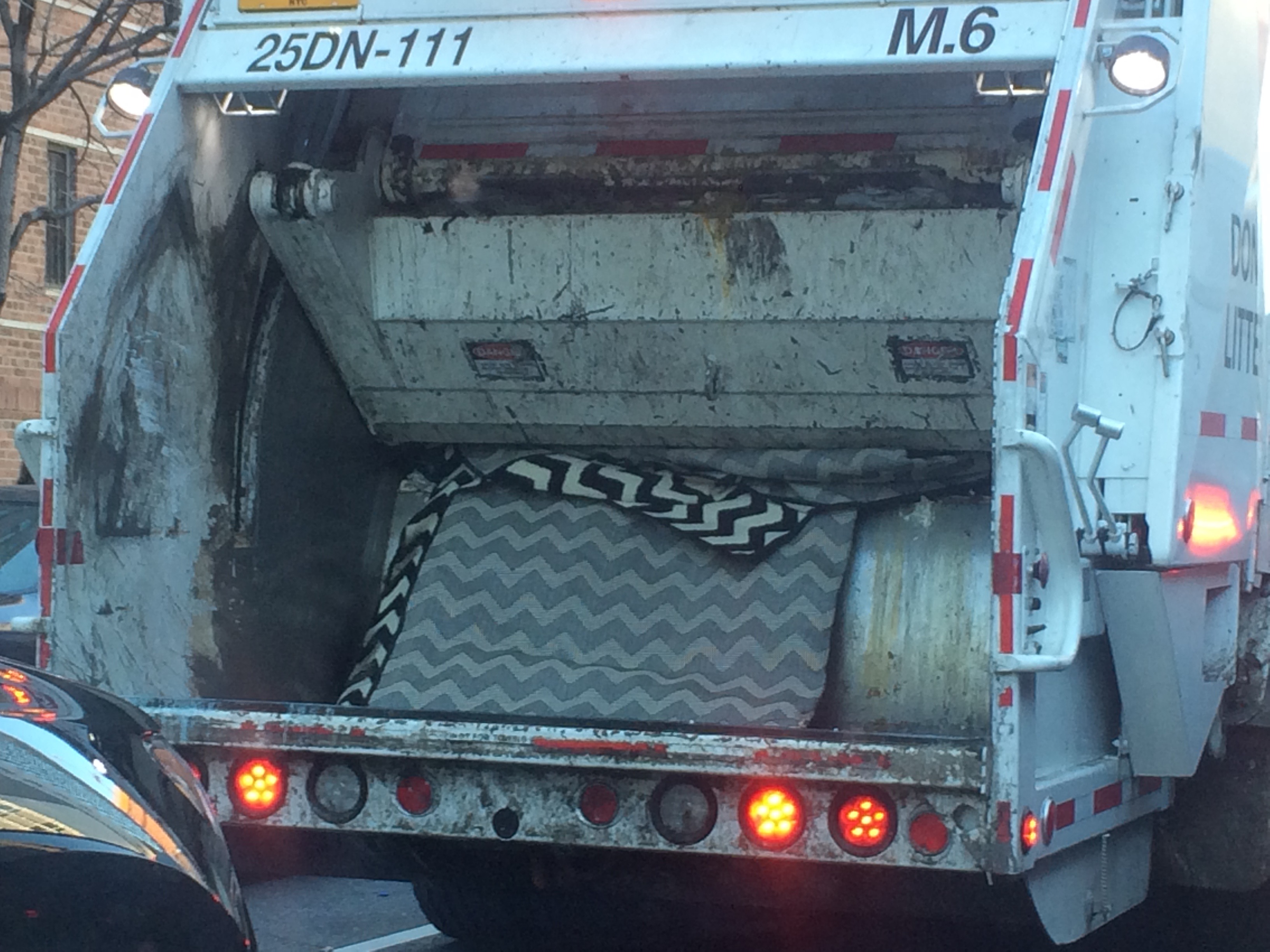
And last but not least, last week I was driving up 1st Avenue, blasting “Sorry” by the Biebs, and yes, I was singing along loudly, duh. Whatever, it’s a really good song. Anyways, I saw in front of me a very unlikely harbinger of interior design style, a New York City garbage truck. I’m spiritual, so I try to see the signs however they come to me, and if this is not a clear sign of the end of a trend, I just don’t know what is!
Wishing everyone a Happy New Year filled with good health, joy, peace and a lot of fun design!


Comments
Melisa Fluhr
Thanks for putting a big smile on my face! First with the vision of you rocking out to the biebs and then the garbage truck crushing chevron. Dying over here. Here’s to a great 2016!! xo, M