Now this is a couple that hardly needs an introduction. Pioneers of the DIY blog, Sherry and John Petersik spent seven years writing about their lives, their homes and, most of all, sharing their tricks and tips as they DIY’d their way through three houses on their blog, Young House Love. They’ve hung up their blogging titles for now but have been busy as always creating and designing. If you miss them as much as we do, we hope you’ll enjoy getting a tour of their one-year-old son Teddy’s nursery and hearing from the YHLers themselves on what they’ve been up to. Thanks, John and Sherry!
Okay, first things first, you know we’re dying to hear what’s new with you guys. What have you been up to?
We’re really excited about our second book, Lovable Livable Home, which comes out on September 22nd. It’s all about creating a home that is meant to be lived in, not just looked at. It’s chock-full of awesome families and homes with different styles and challenges and budgets and really shows that there’s not one right way to make a room your own. We also included never-before-seen updates to our own home and fun DIY projects and tutorials for adding beauty or function (or both!) to your home. You can preorder it and read more details about it here.

How did your lives as bloggers and designers impact the design of your nursery?
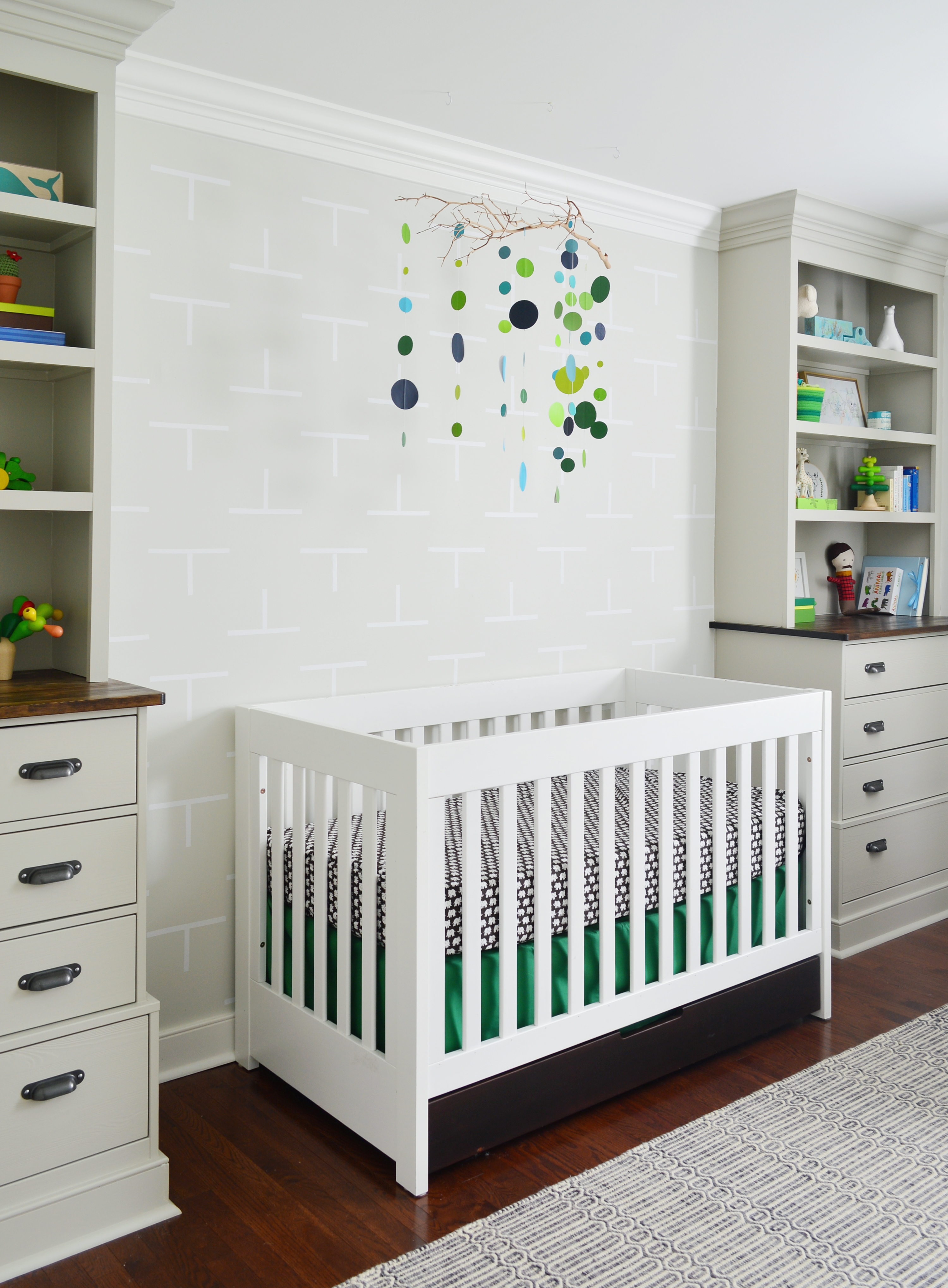
We were designing a showhouse for a local builder around the same time we were putting this nursery together, so working with a carpenter to dream up interesting custom built-ins in that home definitely inspired us to go for it in our nursery too. We ended up adding two corner built-ins that flank the crib, which give the room some cool architecture, as well as adding awesome clothing and supply storage. Going vertical and taking the bookcases all the way up to the ceiling also helped make the standard 8 foot ceilings feel taller, which helped us get over our envy of the showhouse’s 10 foot ones!
Tell us about your design process. Did you start with one central item or idea that served as your inspiration?
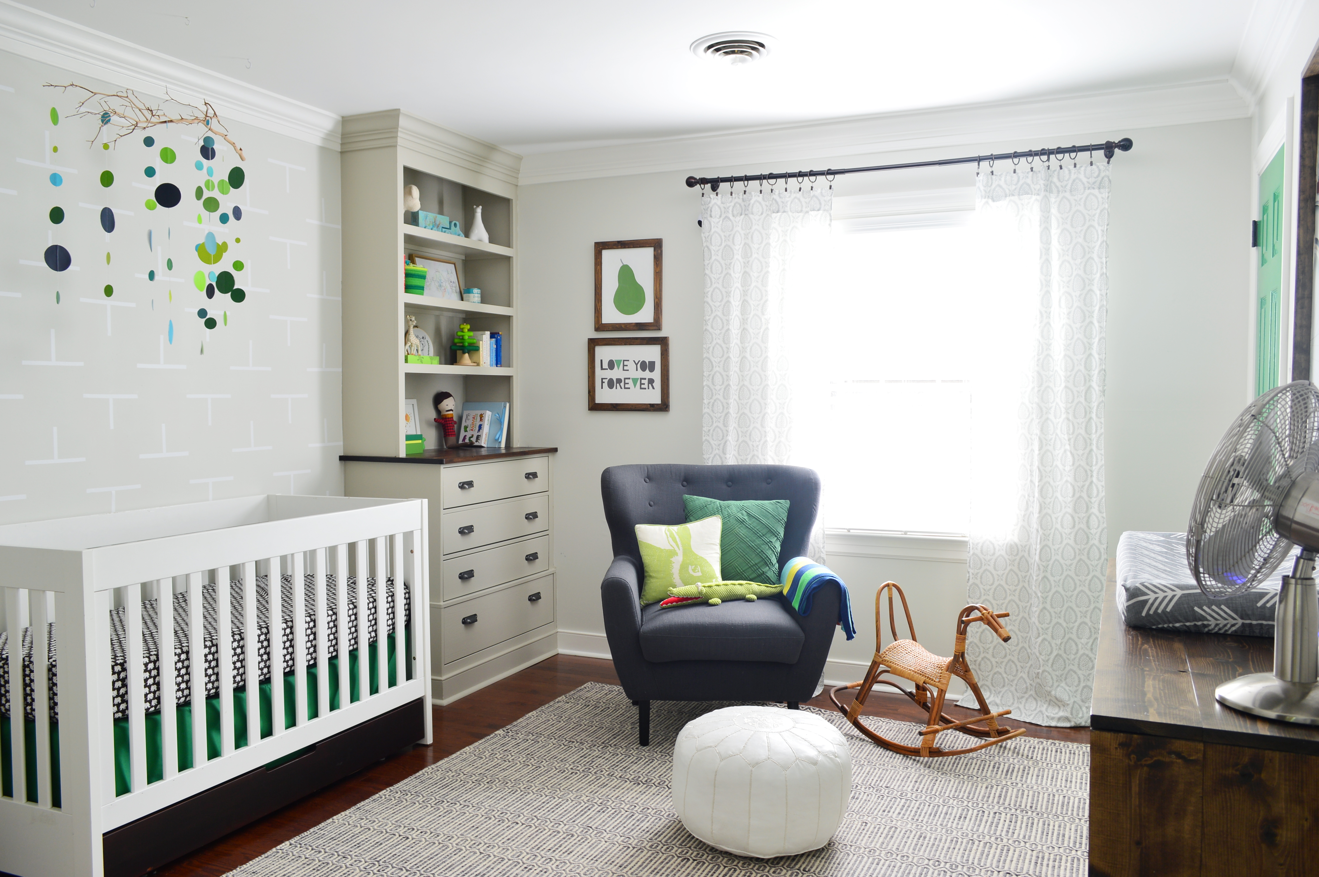
Like our daughter’s room, we knew we wanted the walls fairly neutral so that we could bring in color through accessories, art and lots of colorful toys. But it was finding the rug at HomeGoods that steered us towards the warm gray walls, as well as inspiring us to layer a variety of subtle, small-scale patterns throughout the space—like in the curtains and an accent wall full of vinyl decals behind the crib. From there, we brought in some large scale bike art that had hung in our last house’s sunroom to add more of the cheerful green color we loved so much for the space.
 image by Todd Wright
What was the most important thing you wanted to achieve when creating this space?
We really wanted a smart space that would not only work for our son when he was an infant, but that would grow with him and evolve as his tastes change over time. For example, we made sure the built-ins in each corner would not only accommodate a crib in between them, but also would work with a twin or even a full-sized bed when he gets older.
As we all know, you are very experienced DIYers. What’s your favorite project you completed in your son’s nursery? Any other favorite aspects of the design?
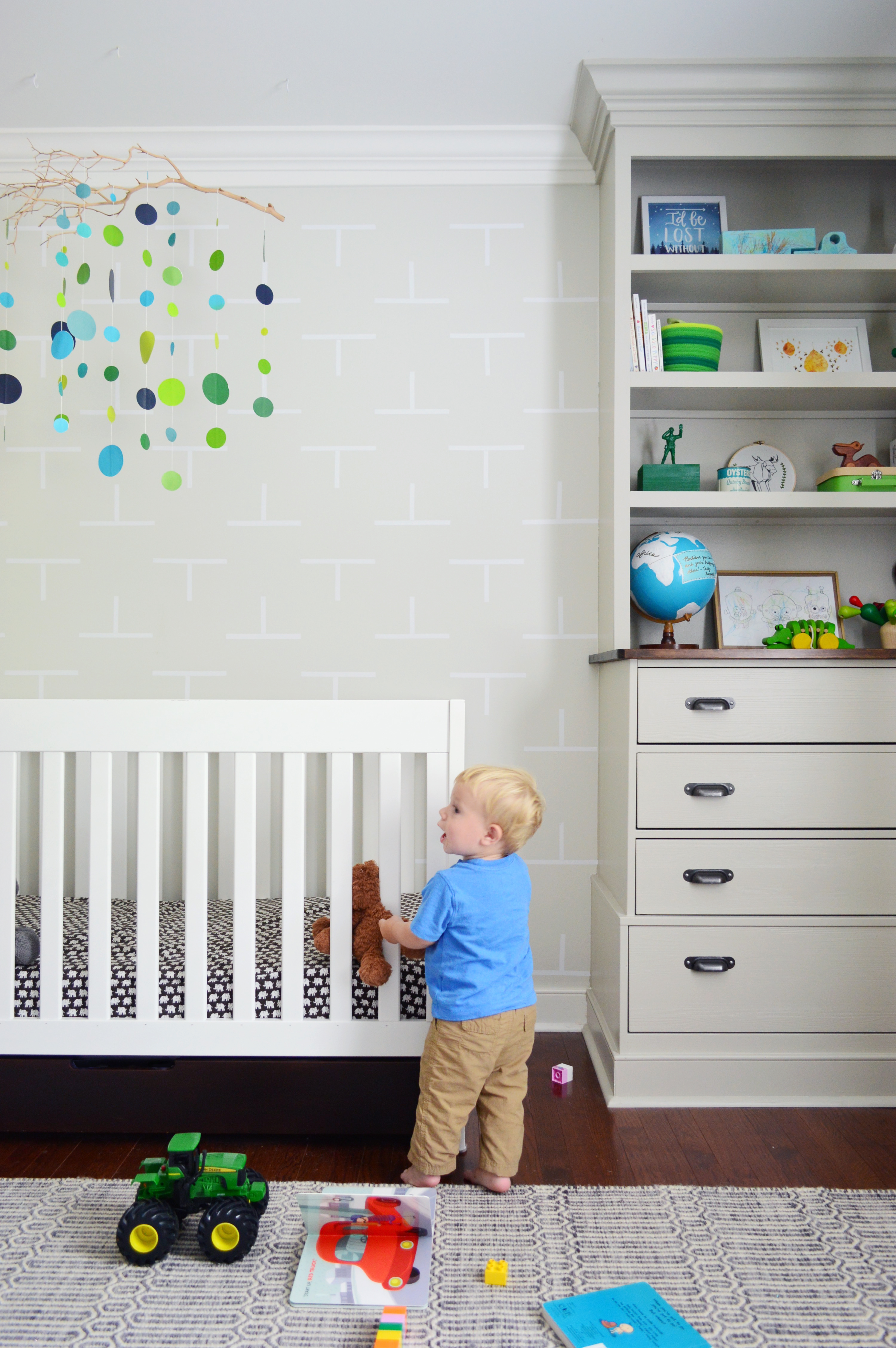
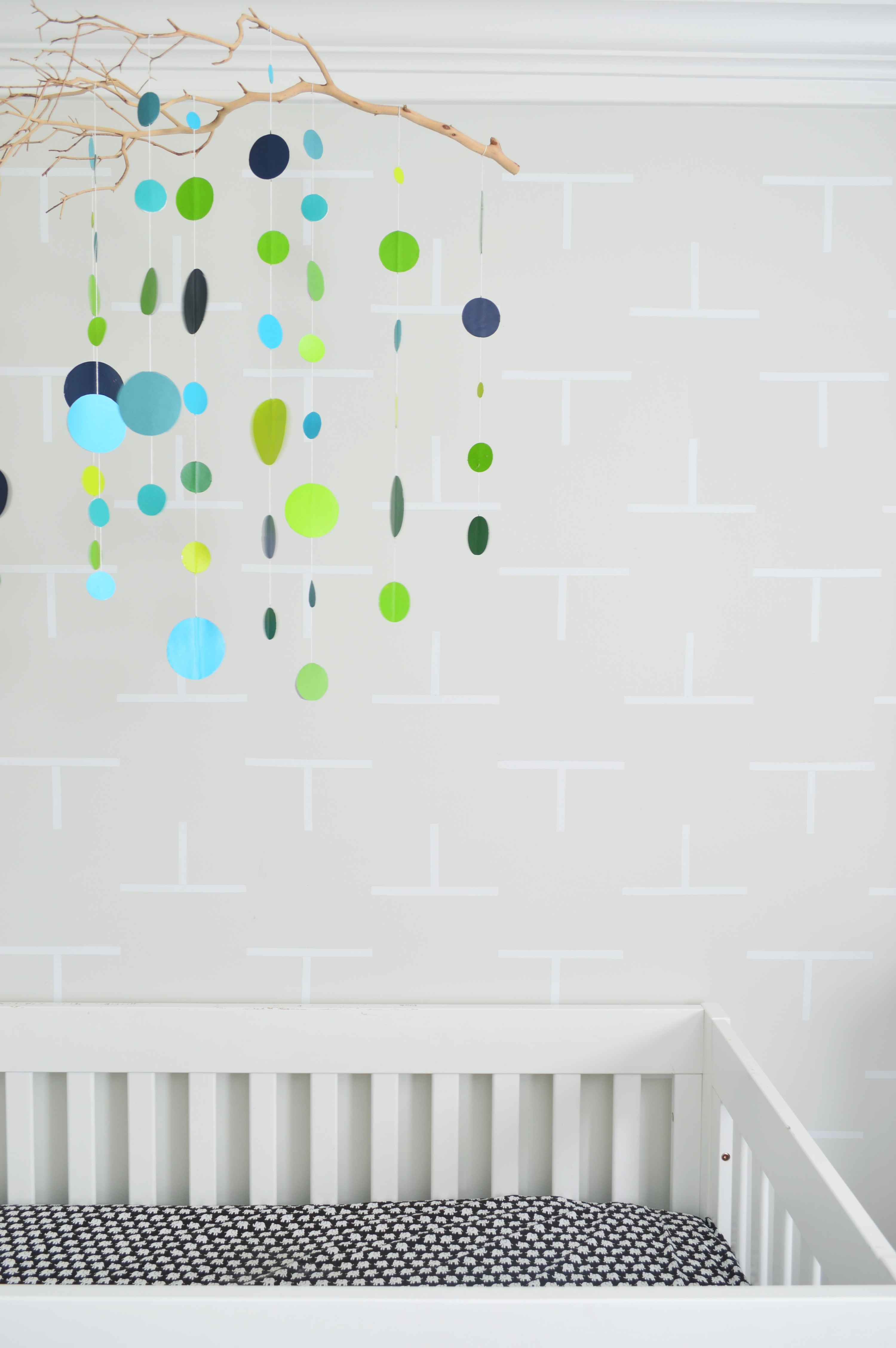
Oh man, John had so much fun DIYing those corner built-ins (he adapted two wooden dressers and added shelves above them along with crown molding and baseboard to make them look more built-in). I really loved some of the smaller touches we put on the space (like the homemade mobile I created with colorful paper circles and an old manzanita branch). We also had a lot of fun making an accent wall of Ts behind the crib using $5 vinyl decals that we cut into strips and stuck up in a pattern for Teddy. After we stopped blogging, we also wallpapered his closet with a bunch of illustrated maps, which we squeezed into our new book.
What’s the first thing people notice when stepping foot into this room?
We get the most comments on the corner built-ins—especially from other moms and dads who remark how awesome it must be to have all that room to store stuff down below and display books and toys up top. We’re so glad we took the time to add them, because we definitely use them every single day.
Did you have any unexpected obstacles when creating this room? How did you overcome them or spin them to your advantage?
We’re pretty used to running into at least one or two road blocks as we attempt to pull a room together, and in this space we ended up changing the curtains from a bright lime green tone to a more subtle color. Thankfully the replacement curtains were leftover from our second house, so it wasn’t a big expense to switch them out, and the funny thing is that in our second house we attempted green curtains in our bedroom and ended up trading them for more neutral ones, so maybe there’s a lesson in there about green curtains being tricky?! Haha!
What did you enjoy most about the design process?
I think we both love creating kid spaces more than any other room in a home. You really can make such a meaningful space by pouring a lot of sweat and love into them, and the items you make yourself or personalize (even if it’s just sewing a wonky little handmade quilt or whipping up a paper mobile) really can make it a magical and sweet little space. Plus, it’s nice that these rooms never take themselves too seriously.
Do you have any words of advice for other designers and parents?
It’s really important to dive in and make sure you’re creating a room that you love. Don’t worry if it’s trendy or if your mother-in-law or your neighbor would “get it”—just do what you love in your own home so you love walking in the door every day. The rooms that often feel the most special are the most personalized, so really look for at least one way you can make a unique choice that makes it feel distinctly you. You spend a whole lot of time at home, and it really should be your favorite place in the world.
With your second book out soon and a book tour to follow, what are you up to next?
We’re so excited about our book tour, which kicks off the same day that our book comes out, on September 22nd. We are hitting up twelve cities and can’t wait to see everyone and have fun eating cookies and signing ceramic animals (and books, of course!). We also have some new hardware designs in the works for Home Depot (you can see our latest collection with them here), along with some new lights that we’re working on for Shades of Light (here’s our current collection with them). We also recently signed on to help a local builder design five spec houses here in Richmond, so that is keeping us busy along with some advertising projects and, of course, the kiddos!
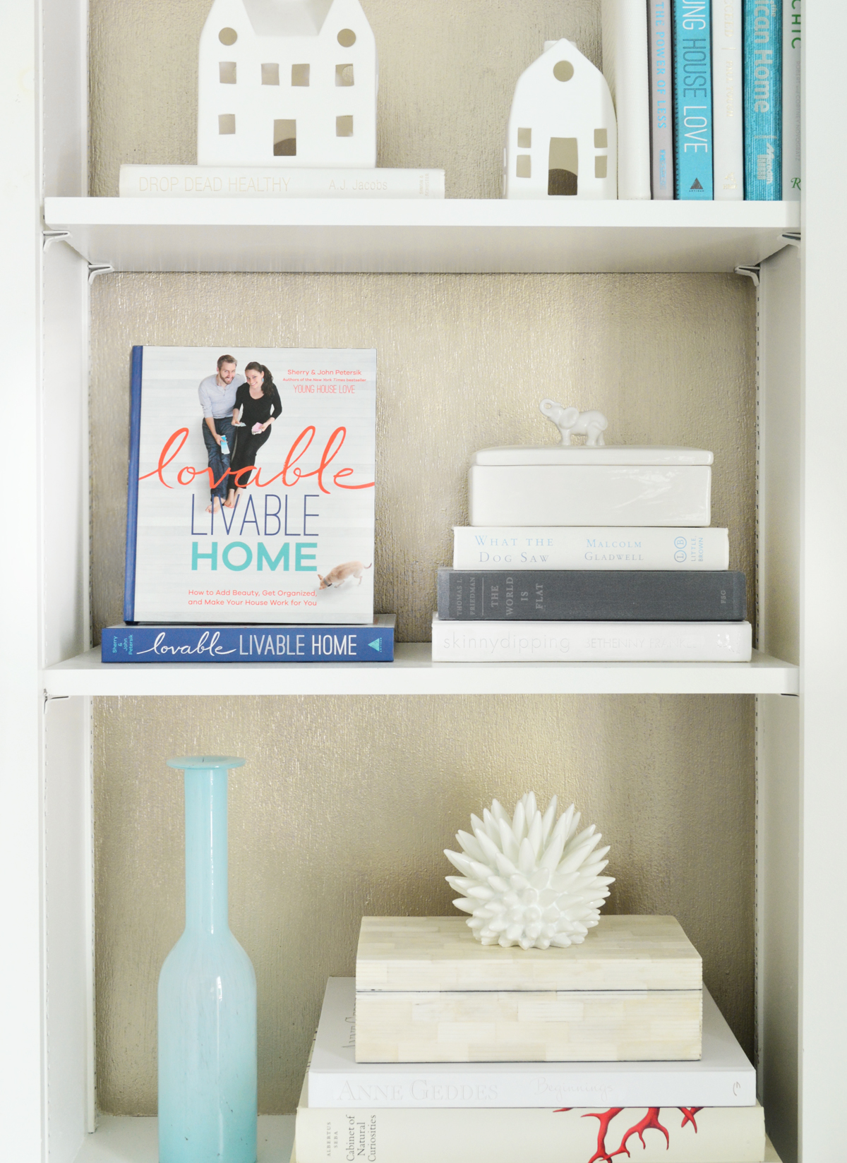
Thank you, Sherry and John, and congratulations on your new book (pictured above). We can’t wait to get our hands on a copy!
All images except where noted by Young House Love




Comments
Lauren
Super cute room!