This is our interview series where we bring you the nurseries and kid rooms of successful designers, entrepreneurs and moms. Through this series, our featured guests will divulge some of their design secrets and share stories of how their nurseries came to be.
From nursery design to healthy recipes to wedding planning, we find ourselves looking to the blog world for inspiration to make our daily lives and celebrations more meaningful, colorful and unique. Green Wedding Shoes, which you are probably familiar with, is a daily blog that features beautiful photography, fashion, styling tips and handy DIY tips to inspire and guide brides through the process of planning fashionable and personal weddings.
Founders Jenny and Jason Campbell created Green Wedding Shoes as the perfect outlet for them to collaborate, while helping women realize their dreams about one of the most important days of their lives.
When the pair found out they were pregnant with their daughter, they started featuring design and inspiration for babies, while still adhering to their core design sensibilities and principles. Let’s see how they collaborated when it was time to create daughter Sienna’s nursery.
Who kicked off the first design ideas for the nursery?
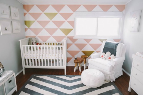
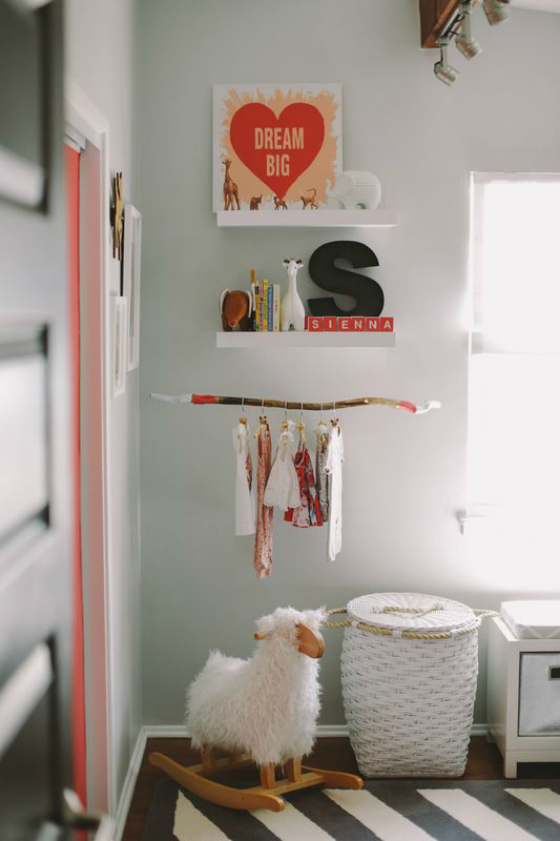
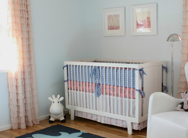
We partnered with Serena & Lily for the planning and design of our nursery. Their input was invaluable because, while we have plenty of experience designing rooms and photoshoots, we were not yet experts on designing a functional and safe nursery. One key takeaway from our work with Serena & Lily was to consider the view of the room that our little one will have. It’s not fair, or necessarily safe, to have everything up high. As such, we selected a combination of elements that are safe and pleasing for both Sienna and us.
It sounds like you have kid friendly and safe covered. Were there any other important aspects of the room that you gave focus?
We wanted it to be functional. A properly designed nursery needs to serve as a diaper changing station, playroom and as a place to relax and get your little one to fall asleep. It also has to store a lot of new baby-related items.
Now that you’ve had a few months to enjoy Sienna’s room, what’s your favorite part about it?
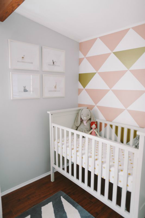
We just love the cuddle corner, comprised of the big and comfy chair paired with the dip-dyed stools. This is such a great place to unwind with Sienna, read her books and take a nap. We quickly learned the value of a great chair! We also love how we were able to integrate great pieces from indie artists and photographers. Art is important to us, so we had to find a way to make it work for Sienna’s room.
Photo Credits: Brandon Kidd Photography
Do you know of a fantastic nursery or big kid’s room designed by a successful designer or business owner? Please send a photo of the room to Adrienne@ProjectNursery.com for consideration.





Comments
Angelea
That’s a unique accent wall. Quite stressful for the eyes though.
JuhSampaio
love this decor
Frauline
Love all the lines everywhere!
Aneta
Lovely room! Where is that dream big print from?
Audrey
I am in love with this wall paper!!! Please, can you tell me where you found it? I would like to buy the same !!
Thank you very much, audrey
Beth
Hi Audrey, They are actually large wall decals applied in a pattern. It looks like the company this family used is no longer available, but you should be able to get a similar effect with any large triangle decal. Good luck!