Our brand new interview series brings you into the nurseries and kids’ rooms of successful designers, entrepreneurs and moms. Through this series, our featured guests will divulge some of their design secrets and share stories of how their nurseries came to be.
Meet Annalisa Thomas, President and CEO of Oilo. Oilo is known for their clean, simple and modern decor for the home and nursery. Parents love this company because they get high-end products without the designer price tags. Annalisa is expecting her third child and credits her inspiration to her two children Cohen and Kennedy.
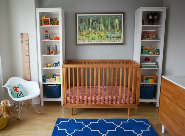
With baby number three on the way, any mom would have her hands full. This didn’t hold back Annalisa from moving forward with upgrading her first baby, Cohen, to a big boy room. Take a look at what she came up with. Don’t be afraid to fall in love because almost everything you see is available through her website.
This room looks so chic and effortless! However, we know there’s a lot of effort that goes into an effortless look. Did you have any unexpected obstacles when creating this room?
When I design, I always hit a wall of frustration where I just can’t seem to catch the vision. I feel stuck and lost, and I don’t know where to go. This is usually in the beginning stages of my designs. I then research and research and slowly build a file of things I like; then I start to find common colors and themes within my research and narrow down my selections. Once I have a solid color palette and a few good pieces of furniture, it’s all smooth sailing from there. Things start to come together and flow nicely. I’ve done this enough to know that you have to plow through your frustrating creative wall before you get something original and fabulous.
The art behind Cohen’s dresser looks original and fabulous. Any tips for our readers on how to incorporate the often messy world of a young child into a beautiful room?
When you have a baby you don’t need a lot of storage for toys. Once they are toddlers and start preschool, they have so many papers (which they refuse to throw away!) and tons of teeny tiny mystery toys. Soon they start to spill out of every nook and cranny. My son doesn’t have a huge closet, but I knew I needed every square inch if I was going to keep the toys at bay, so I bought an IKEA bookshelf, turned it vertical and loaded it with bins. I then went to Target bought a bunch of large bins and filled them with the toys that were causing the room to overflow. I now rotate his toys every month or two. I love it because the toys in his room are the ones he actually plays with and he loves it because he thinks he gets new toys every couple of months.
To tame the papers, I made a wall with magnet boards. He can now hang up his favorite pictures, and when it’s time for new art, I can scan or file away the oldies but goodies and toss the not so fabulous in the trash.
Your reading nook looks like it could be in any room of the house. Do you find it easy to transition rooms by working with neutrals?
People always comment on how Oilo has very sophisticated, calming or neutral colors. I actually really like bright, vibrant colors; I just have a hard time living in it. And since I design around what environment I like to live in, my color palette at home is very similar to what we offer in the Oilo collection. So it’s no surprise that this room definitely flows with the rest of the house.
Now that Cohen’s big boy room is in place, what’s next?
My next project will be my new baby’s nursery. My baby is due in May, so I plan to start designing once the holidays are over. This is my third baby, so I want it to not only look good but also be very functional. We are not finding out the sex of this baby so it will definitely be a gender-neutral room and a room where I can relax and in which I can enjoy spending a LOT of late nights!


Comments
Amber Powers
I really like the fact that you put in live plants. Really effective for air purification. And the art above the dresser look so cute. They add a pop of color and kiddie creativity to the room.
cara
Such a clean and lovely space. Lovin’ the greys and neutrals. This would make it easy to add more colorful elements in the future.
Gina
This room is so nice! Yes, it’s so easy to fall in love with the room design!