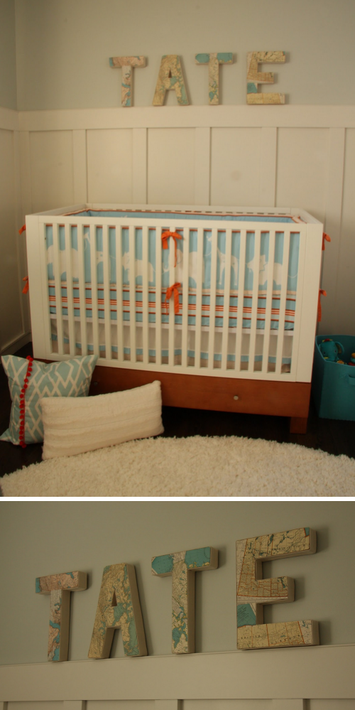
New mom, designer and editor of Cottage Modern, Kristin, recently shared the darling nursery she designed for her baby boy. The result is a beautiful mix of traditional, contemporary and modern styles. Simply put, it’s clean and classic.
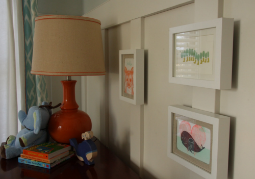
Kristen selected a calming color scheme of whites and blues with accents in bright orange and subtle nautical touches. My favorite is the simple drum shade light fixture embellished with a splash of whimsy by way of orange pom pom trim and blue paper whales—such an easy way to dress up a shade!
Kristen found the perfect crib bedding at Serena & Lily this past summer for 70% off. The orange and white pouf was also a great find on Etsy.
The map letters spell out the baby’s name, giving the room a personal touch. They also pull in just the right shades of blue and orange. Kristen made them herself, and to make them even more special, she used maps from regions in Canada and Minnesota where she and her husband are from. Love!
Above the dresser, hangs a simple framed letterpress greeting cards that complement the color scheme. The table lamp added a pop of orange, while the burlap shade provides some great texture.
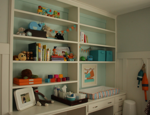
My absolute favorite part of the room, however, is how Kristen transformed this built-in shelving unit. Painting it white and adding the soft contrast of the light blue back revived the dated bookcase. The organizational specialist in me adores how she made the counter into a practical and well-organized changing station. Beautiful work Kristin!


Comments
Jessica Williams
Wow! This nursery is gorgeous!! I love it! My favorite part is the shelving unit too. Very, very cool!
amy r
Love the colors. Very cute and cozy :)
Nicole F.
Everything looks GREAT! I LOVE the wall color. Looks like you used two different shades for the walls and the inside of the shelving unit. Would you mind sharing the name and make of the paint shades?
Nicole
Amanda
Really love this room! It’s just right.
Carrie Sommer
Yeah, the built-in shelf is pretty neat. It would have been great if there was a before and after photo so we can truly appreciate the transformation.
Kristen
Carrie Sommer,
Thanks for the comments! Head over here to see before and after photos of the project:
http://www.cottagemodern.blogspot.com/2011/12/tates-nursery.html#comment-form
Enjoy :)
Franklyn Kuchenbecker
Nice blog !
Cath
This room is stunning! It’s hard to find really great color combos for boys, but this one is fantastic!