Shop Suggestions
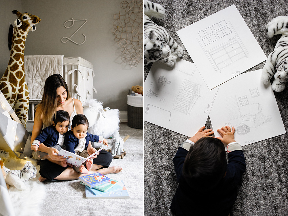 When I found out we were expecting twins, I was very tempted to get a decorator to help us put the nursery together. We bought our home not so long ago and are in various stages of decorating. Each room has at most 3-4 pieces of furniture and each have one thing in common – they are all incomplete. I wanted to make sure the nursery wouldn’t end up in the same category.
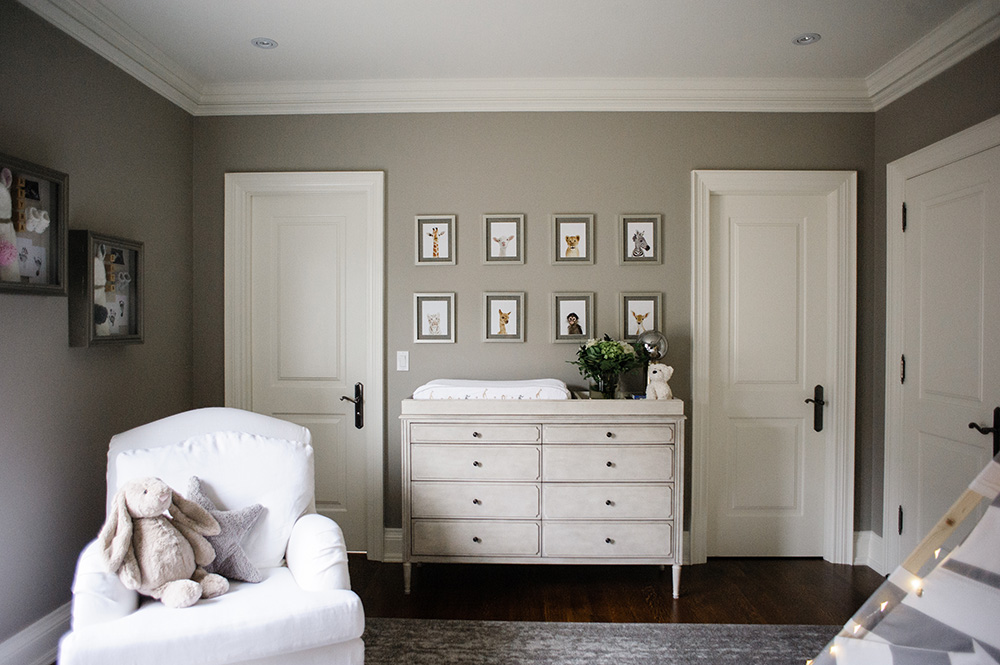
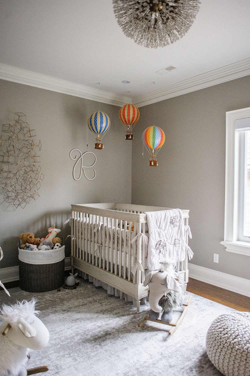
After we selected the room that would become the twins’ nursery, I knew I was not interested in having it painted white. Instead I went for this soft grey color to give the room a luxurious feel with a hint of contemporary and traditional. The color would ultimately help me identify what pieces of furniture I would select for their room.
The nursery would reflect my personal style and aesthetics, and at the same time provide room to adapt to the twins’ taste. I wanted elements that would make the space fun so the twins would enjoy spending hours playing with their toys. When I was creating my mood board filled with nurseries that I was drawn to, I noticed a common theme. I fell head over heels in love with nurseries designed by luxury interior designers in London. I don’t have a large budget but I wanted to create that same luxe feel for my twins’ nursery, so I set out to identify what elements I needed to help me create that luxurious feel I was drawn to, and at the same time make it functional (and budget friendly).
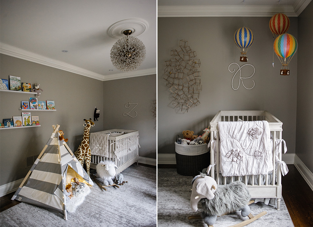
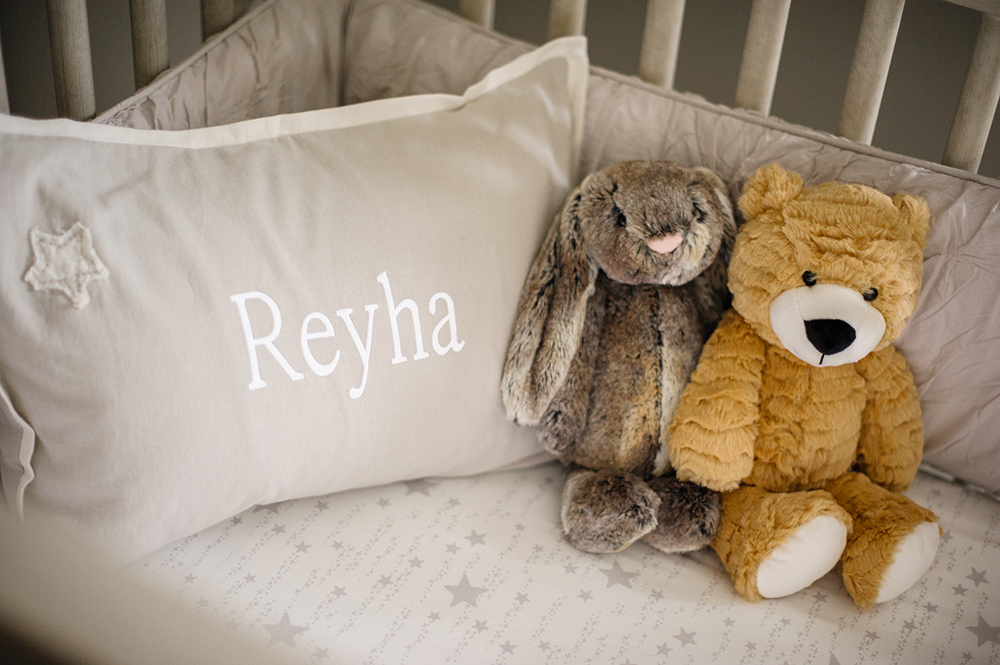
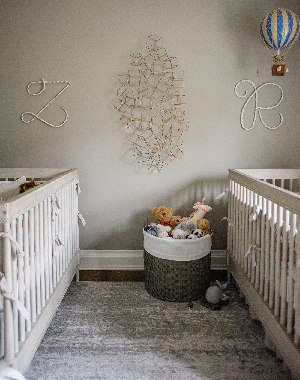
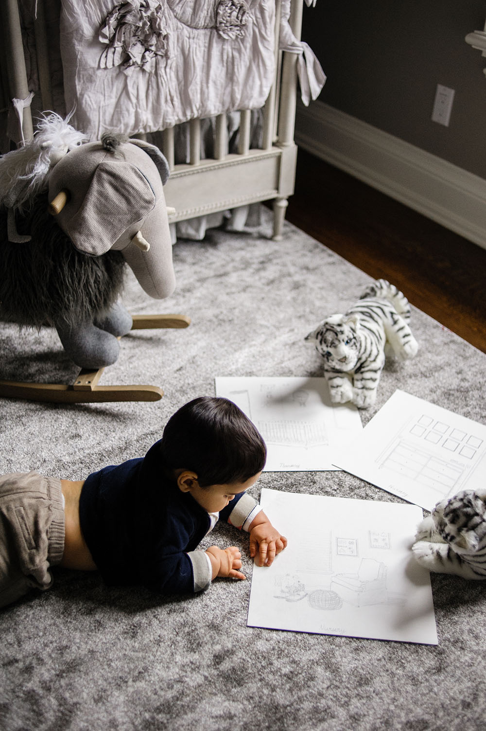
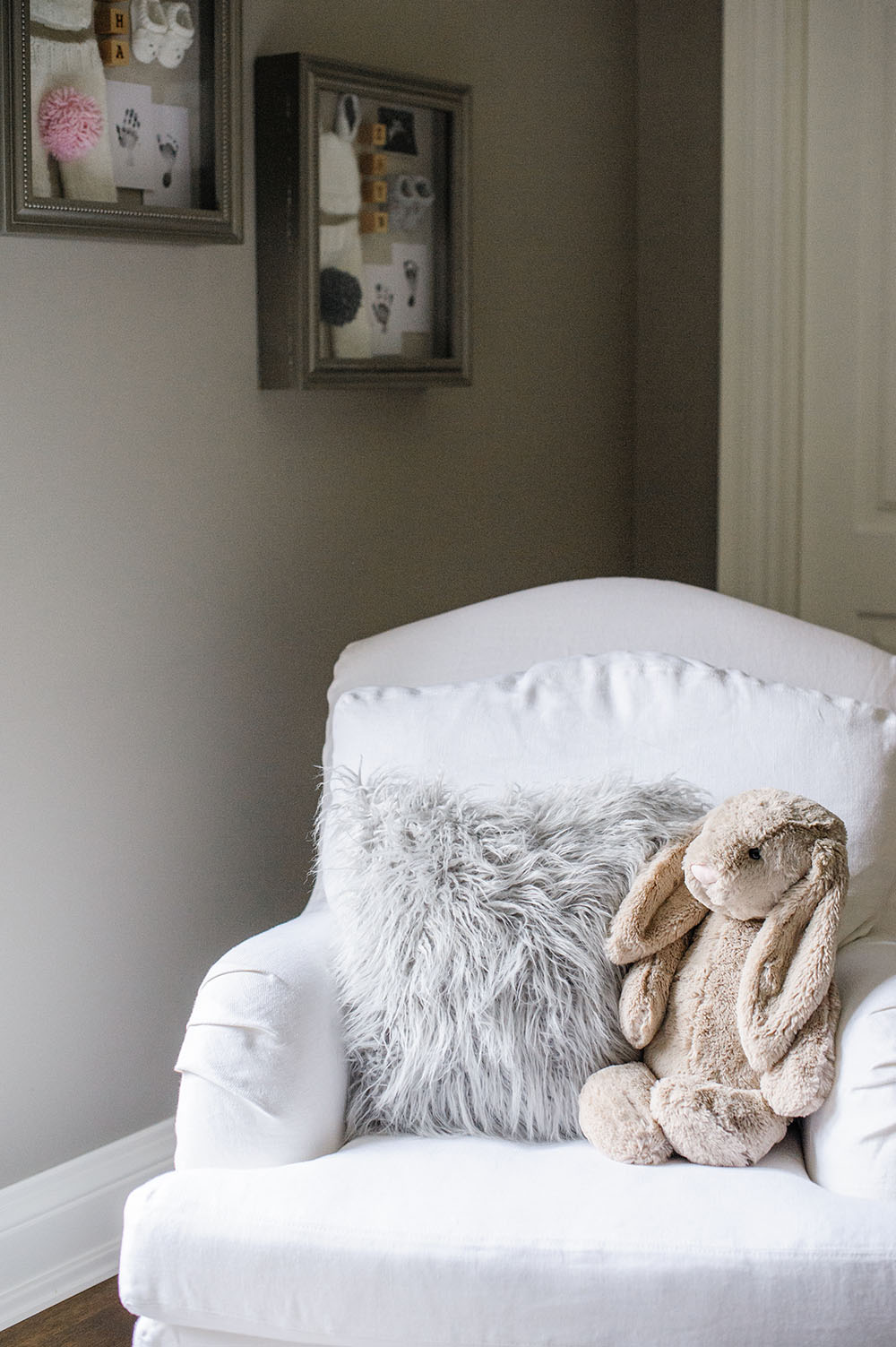
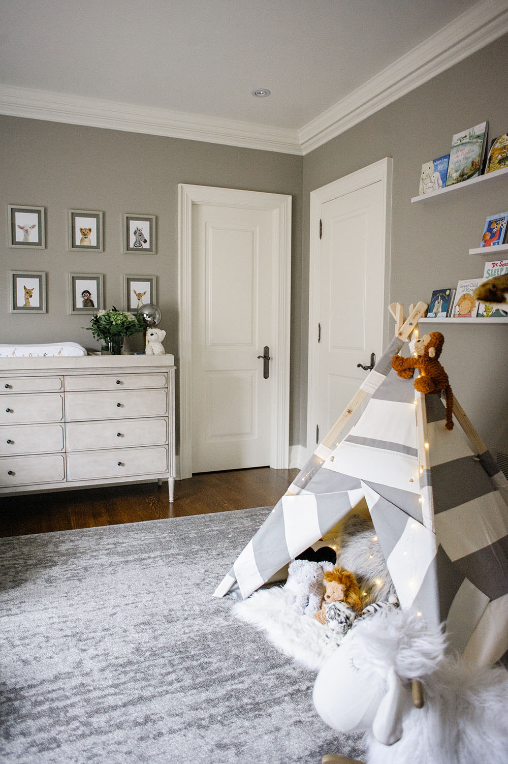 After we painted the room in this gorgeous shade of grey, I fell in love with these cribs we found during our trip to Santa Monica. I had heard so many wonderful things about Restoration Hardware and how they had a beautiful showroom for their Baby & Child section in Santa Monica, so we made a special trip to check it out during our baby-moon. It was well worth it because we picked up two beautiful cribs, the perfect changing table and the most comfy rocker. I knew I would be spending a great deal of time breastfeeding, so it was important for me to invest in a comfortable chair where I would spend a large portion of my day for the first year.
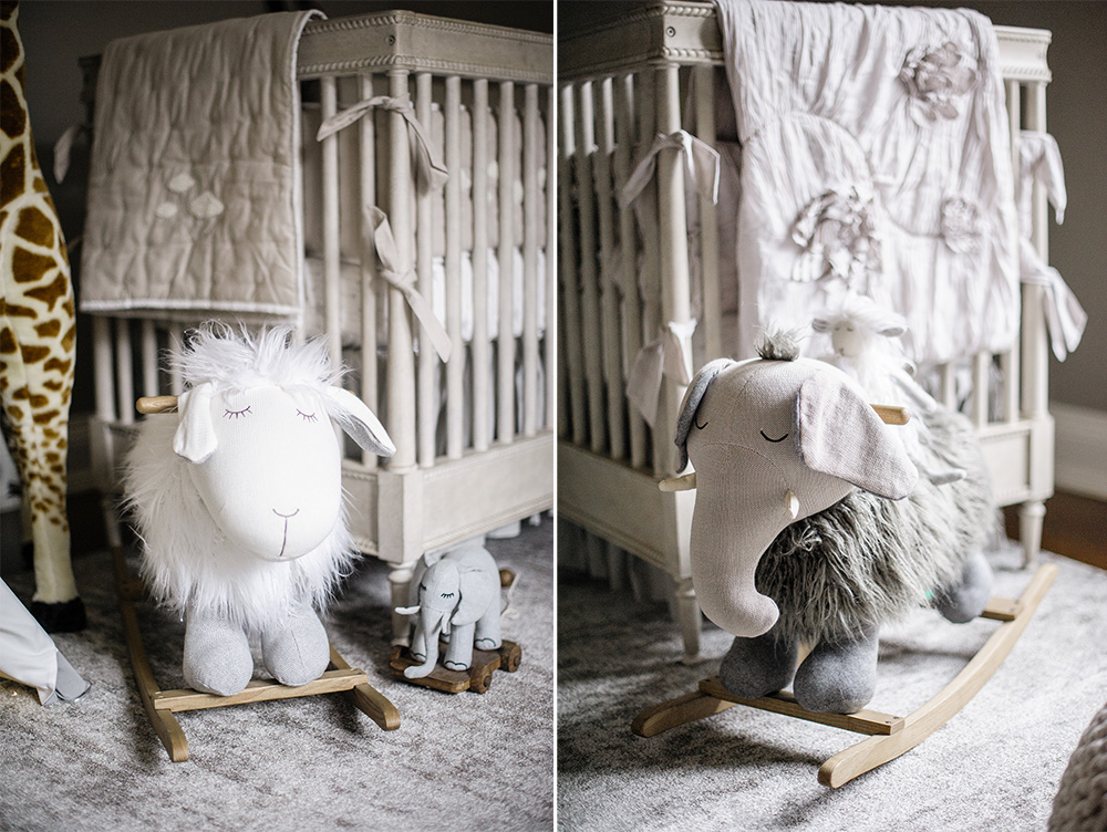
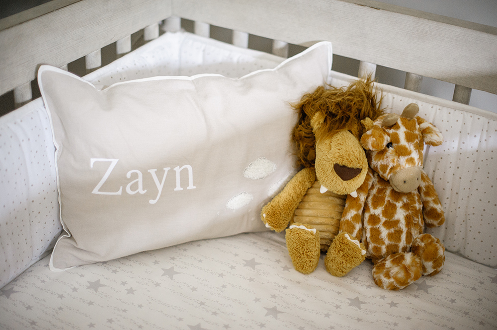
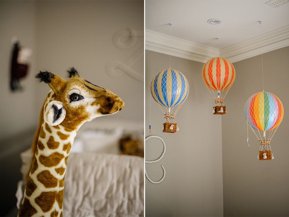
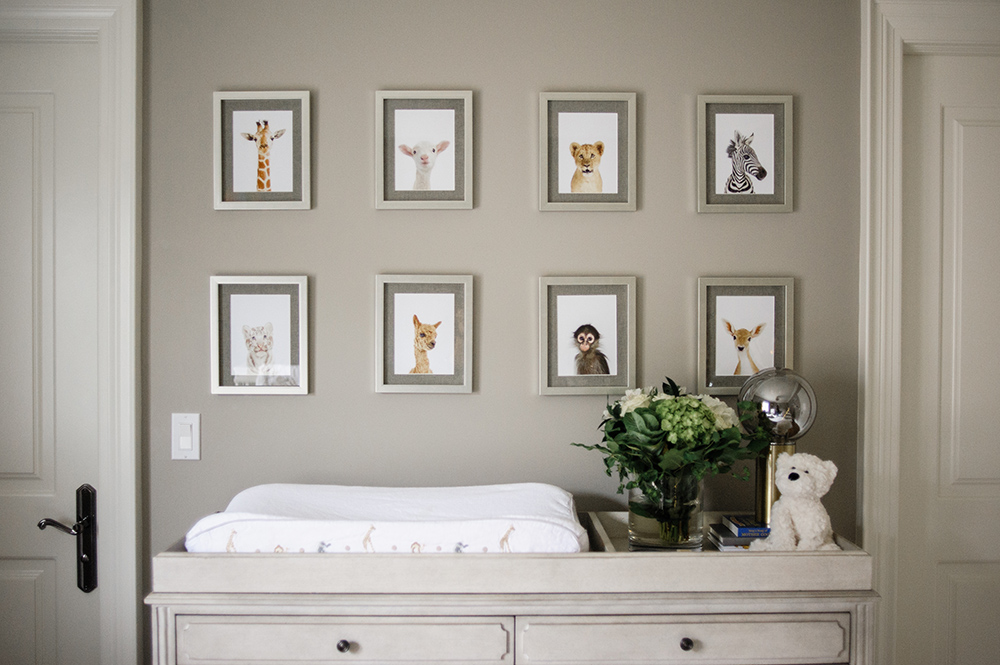
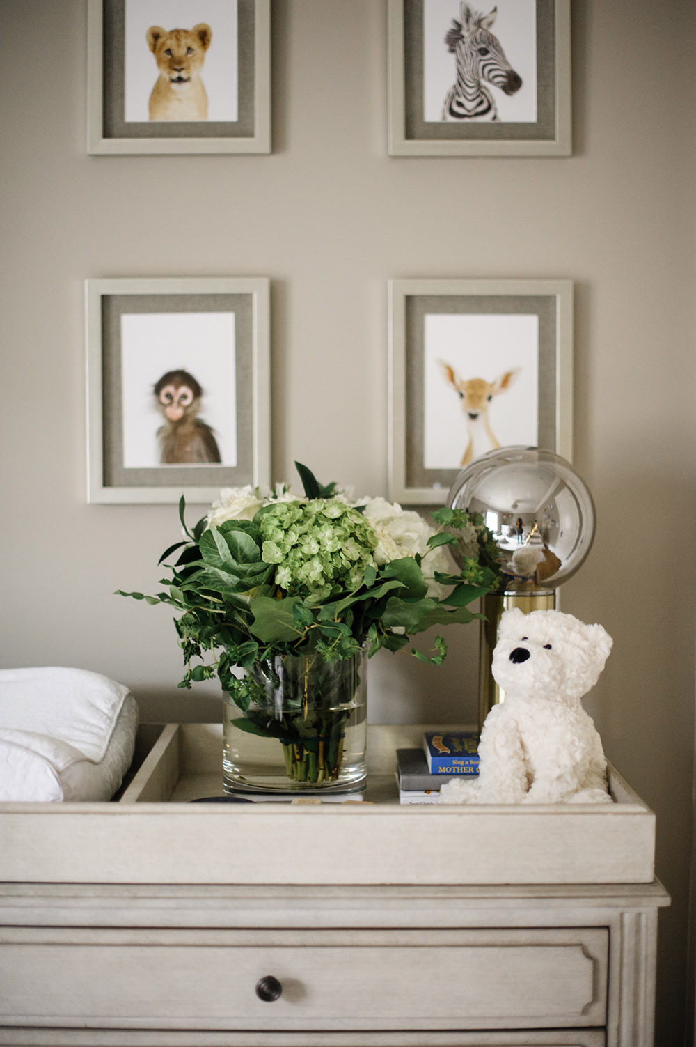
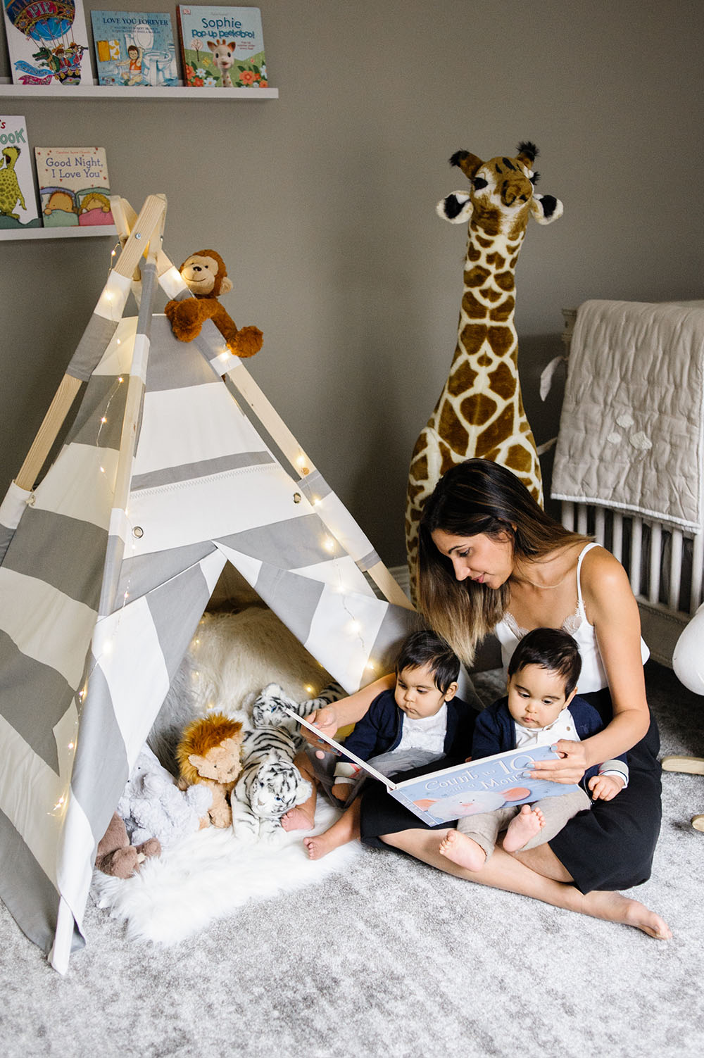
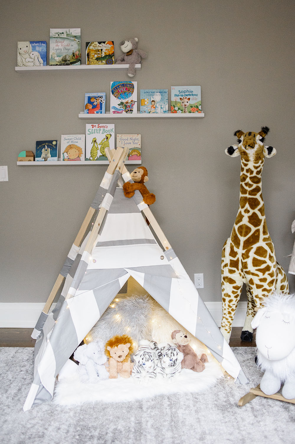
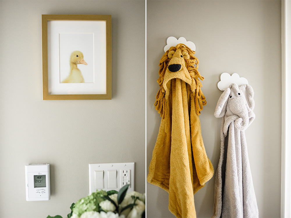
From there, I wanted to add a personal element to the room that came from both my husband and myself. Our last trip before we decided to start a family was to Africa. It was a wonderful trip for the both of us because we went to Africa with both of our parents. We had the ultimate tour of where they were born, lived, fell in love, got married and the last place they stayed before they migrated to Canada. So it felt natural that we brought some elements of that trip into the room by adding this beautiful jumbo giraffe and this cute elephant rocker. A month after we did this, I stumbled across some beautiful prints from the little animal print shop and knew they were the perfect addition to hang over the changing station.
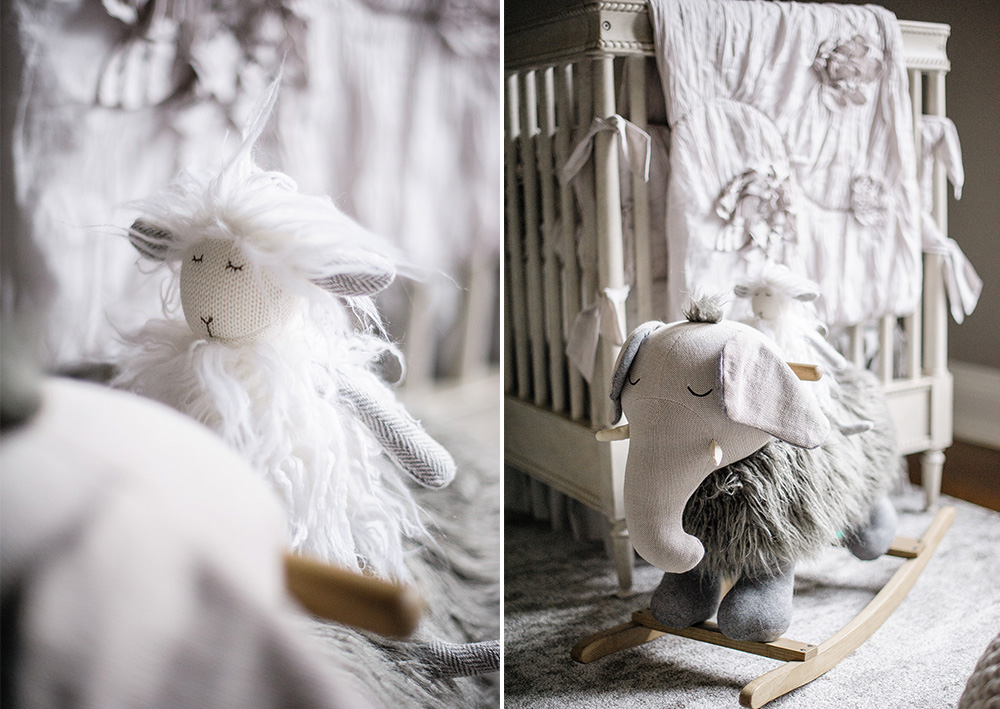
When I was kid, the very first big kid book I read was Around the World in 80 Days by Jules Verne. It was from that book that I became fascinated with travelling and of course hot-air balloons. So for sentimental reasons, I purchased these miniature hot-air balloons to hang over my little girl’s crib.
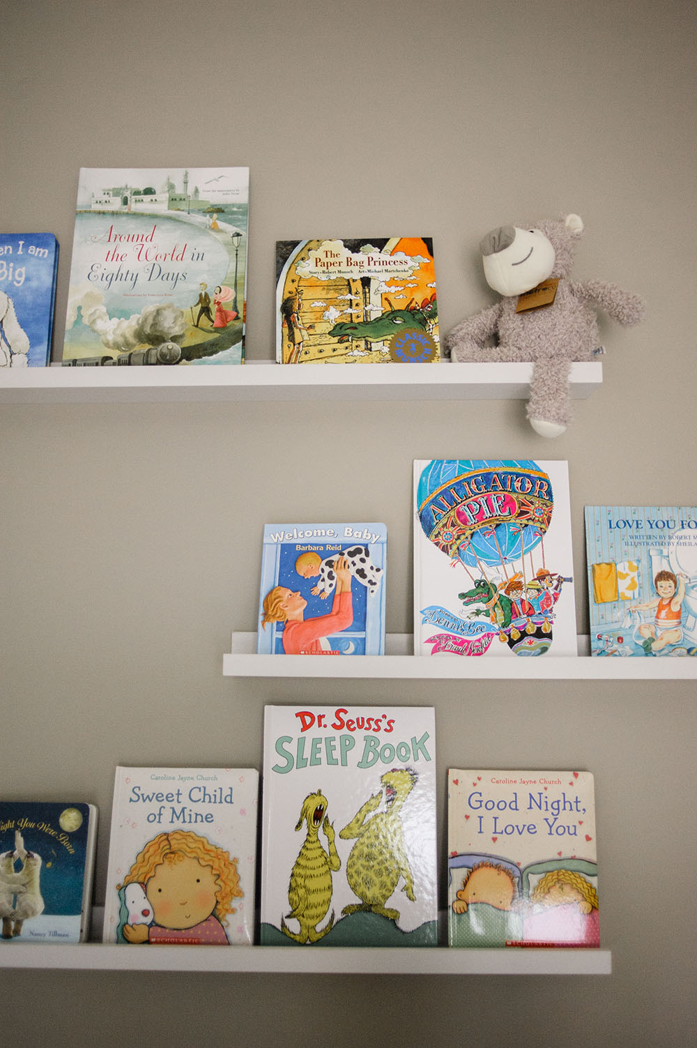
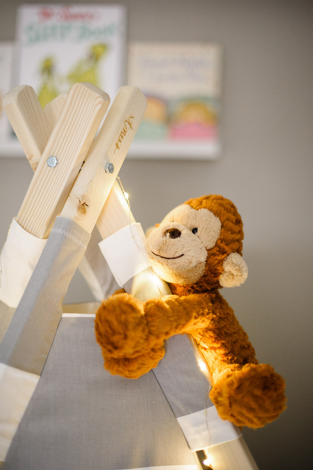
When my husband and I started family planning, I envisioned sharing my love for reading with them and creating a cute space for them to read. To capture both elements, I got these floating shelves that store the books our close friends and family gave us from the baby-shower and nestled underneath it is their teepee that they can read inside of (and fall asleep in).
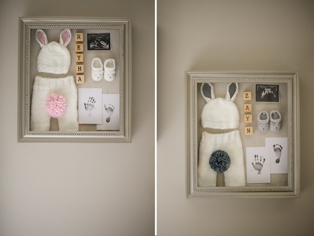
On a personal note, I am a very sentimental person. I wanted to create something that the twins could take with them when they transitioned from the nursery to their own room. I originally planned on framing their hand and foot prints in a small picture frame, but the moment I saw these shadowboxes I knew I could do something creative and personal. I framed these cute bunny outfits I bought during a moment of weakness and their booties that they could fit into during the first 1.5 months. I also had ample space to add my favorite ultra-sound picture of them and their names in wooden blocks.
The last piece I added to the room was this beautiful geometric artwork I picked up from HomeSense. The moment I saw it, it was love at first sight! I felt it was the perfect piece to help integrate this gorgeous chandelier in the room, plus a fun piece for the twins to look at.
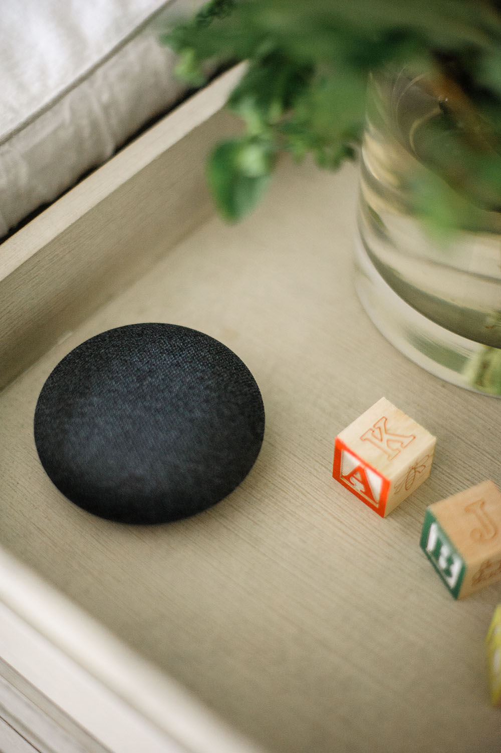
One thing you will notice that we recently added to our nursery is the Google Home Mini. Our Google Home Mini has been amazing when it comes to getting into the room in the middle of night and requesting it to turn on the lights or draw the blinds. When it’s time for the twins to go to bed, the Google Home Mini always plays their bedtime music to help lull them to sleep.
I truly enjoyed creating this luxurious feeling functional space for my twins and I’m sure they’ll enjoy it in the years to come.
Photography by Heidi Lau


